
Accessibility in the Arts, 2019
publication and website design for A no nonsense how-
to guide for nonprofit arts organizations to take direct
action IN MAKING spaces and programs more accessible
publication and website design for A no nonsense how-
to guide for nonprofit arts organizations to take direct
action IN MAKING spaces and programs more accessible
for recess projects, CPNY, Carolyn LazarD
design and dev with rosen tomov
A lesson in accessability both for the reader, and as it would turn out, the designers. Our initial instinct was to find a way to flip the script on the able bodied by creating a design that would favor the margins of ability. While this would have been great in theory, all attempts to do so failed. They failed not so much because they weren’t clever, good looking or well intentioned, but because at the end of the day contemporary, concept driven graphic design is largey inaccessible. Furthermore, most people living with disabilities are already using software to interpret the chaos of the web for them.
![]()
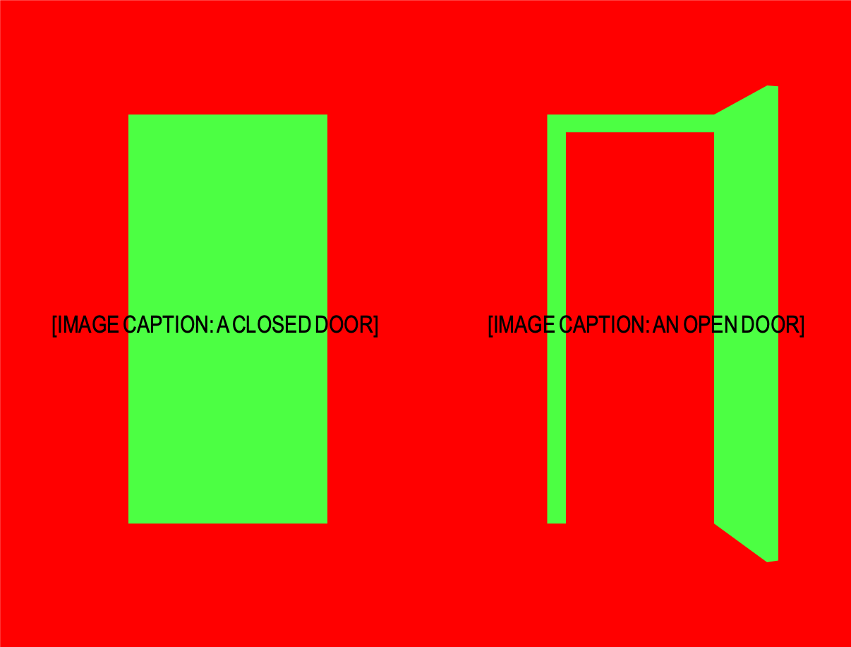
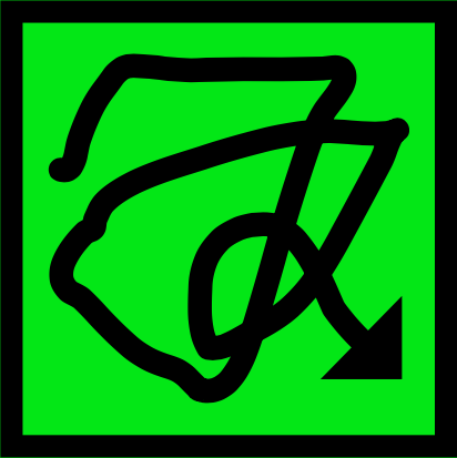
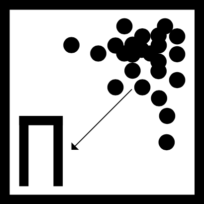
We went through an exhaustive design process trying to find the way to make it anything other than a straight-foreword exercise in legibility. I became fascinated with web accessibility standards and color schemes that often fell outside of the good taste cannon. We thought it would be cool to really lean in to the reality of accessibility on the web. We tried using image ID tags (then unheard of by most nice liberals) as top level typography, garish but accessible color schemes, wacky diagrams that were indecipherable without captions and even typography that was impossible to read without the tools used by visually impaired readers…to name a few.
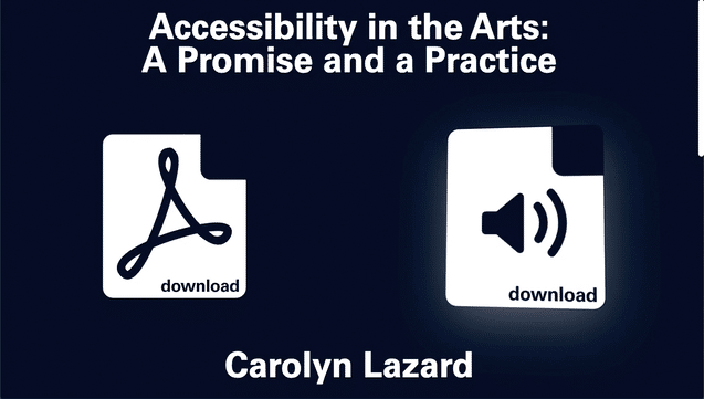
We went through an exhaustive design process trying to find the way to make it anything other than a straight-foreword exercise in legibility. I became fascinated with web accessibility standards and color schemes that often fell outside of the good taste cannon. We thought it would be cool to really lean in to the reality of accessibility on the web. We tried using image ID tags (then unheard of by most nice liberals) as top level typography, garish but accessible color schemes, wacky diagrams that were indecipherable without captions and even typography that was impossible to read without the tools used by visually impaired readers…to name a few.


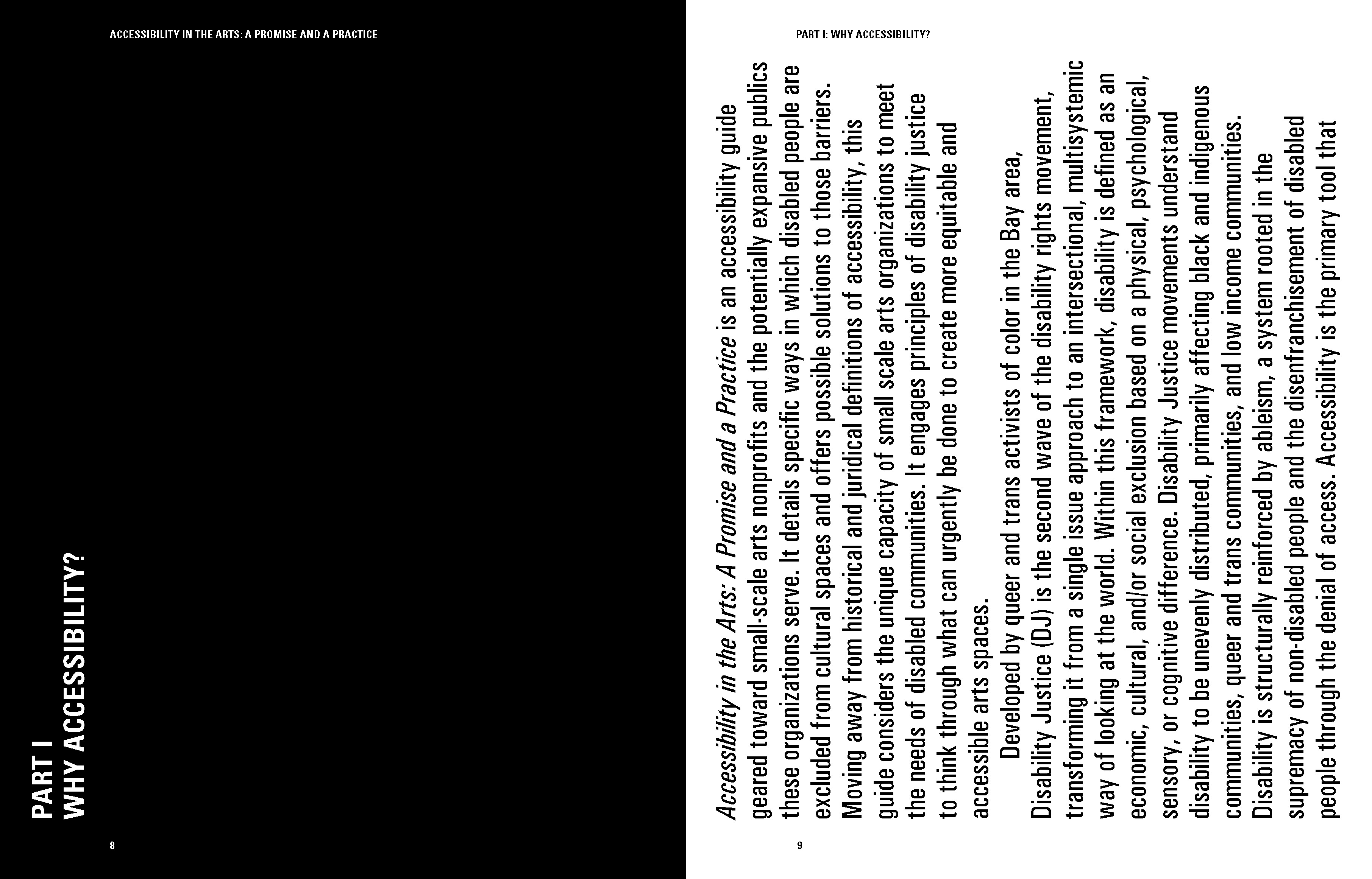
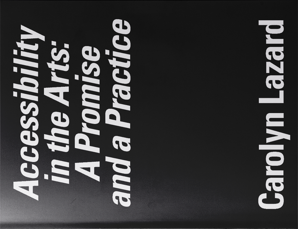
Even then, we still somehow hadn’t exhausted the burning desire to do something clever so for the first edition of the publication, printed on the occasion of the CPNY conference in Philly, where the project was to be presented, we designed the book sideways. The idea was that by foregoing the convention of orientation we would make a statement by inconveniencing able bodied non-profit art-workers. We also estimated that the type size could be larger with a wider column width.
Once again, we failed to impress any of the project stakeholders, and the attendees of the conference were not amused as they held their publications lengthwise and struggled to read without the comfort of a binding edge that fit nicely in to their lap. We then did a reprint with a normal orientation, and much to our surprise/dismay we didn’t even need to reduce the size of the font.
POST-SCRIPTUM: In the end clever tricks and inside jokes are much of what makes design inaccessible. Accessibility is about legibility and clarity of structure so that the tools that exist to AID AND EXPAND access can do what they were made for.