
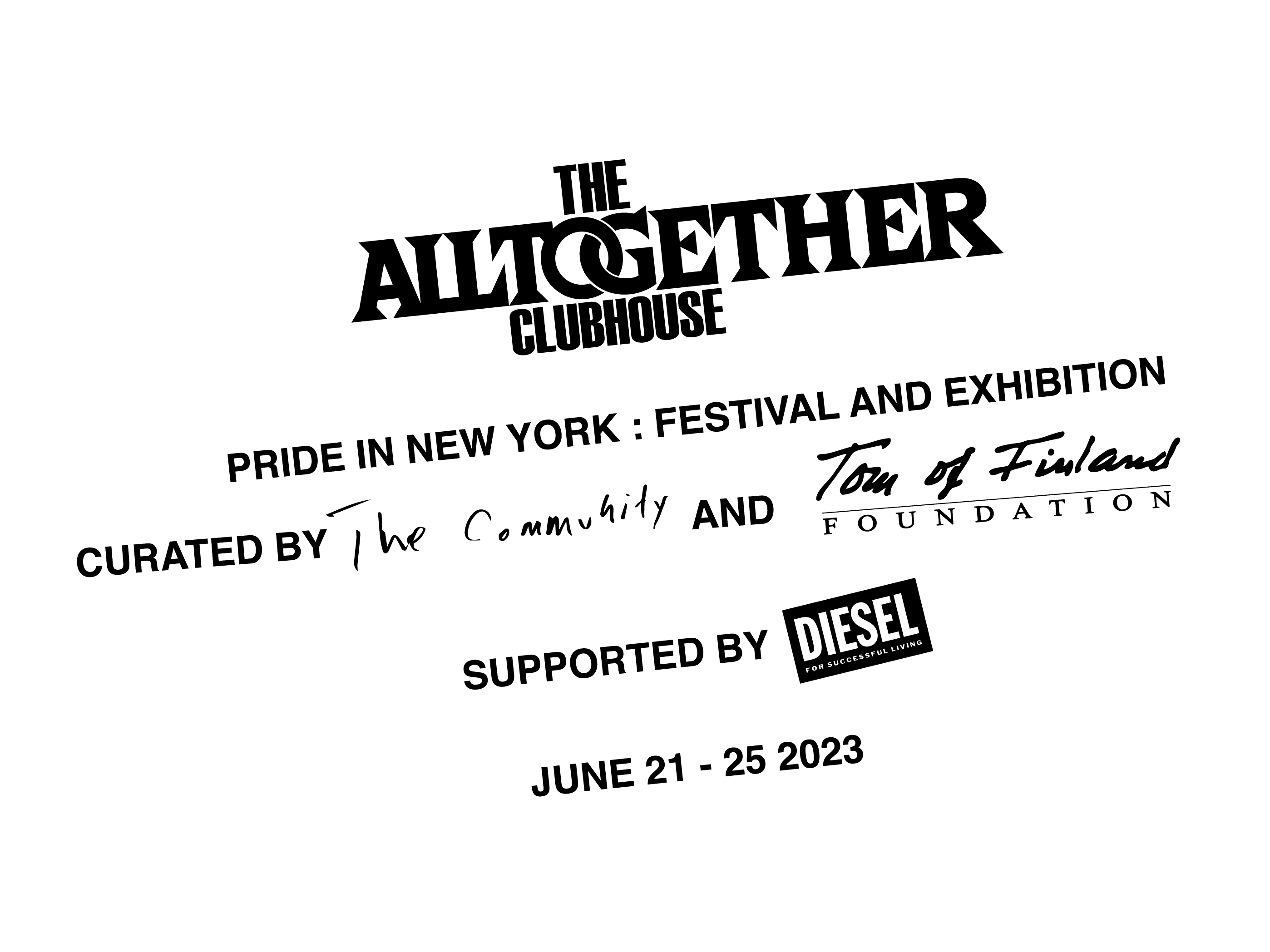
Alltogether Clubhouse
visual identity for an exhibition of erotic gay art
from the Tom of Finland Archive featuring
night life from the new york underground
spanning 3/4 of a century
visual identity for an exhibition of erotic gay art
from the Tom of Finland Archive featuring
night life from the new york underground
spanning 3/4 of a century
for the community, paris
via the tom of finland foundation
sponsored by diesel
design with christian velasquez

This project was a perfect storm of good content/smart client/and solid collaborator that came with a healthy budget (a-la Diesel). While working with Christian on the Anonymous Club Book, it was clear that we have different and very complimentary strengths. We’re also both scene veterans of the queer art/fashion/nightlife underground of New York—a nuanced sensibility that forms the basis of our collaborative work.
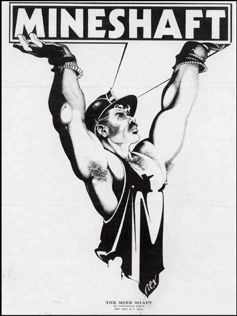
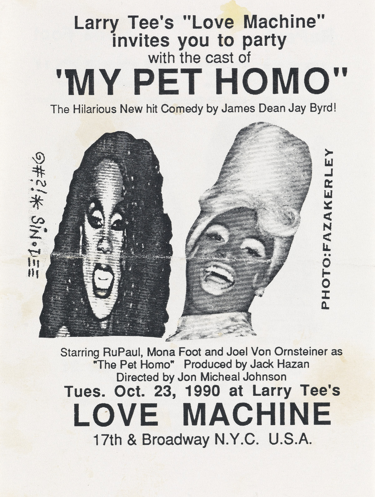
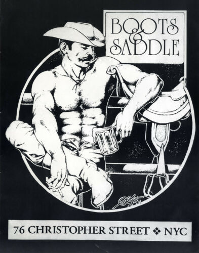
Tuukka Laurilo, who runs The Community, Paris and curated the show provided some great references up-font which really set the tone design-wise. We knew we wanted to tap into the 1970’s gay bar “ad in the back of a fag rag” aesthetic, characterized by erotic (not quite pornographic) image-lead, black and white layouts with simple, bold typography. We also wanted to channel the 1990’s DIY drag scene aesthetic, which really celebrates cut-and-paste ilustrations made from high-contrast xerox images and off-kilter typography set in helvetica bold.
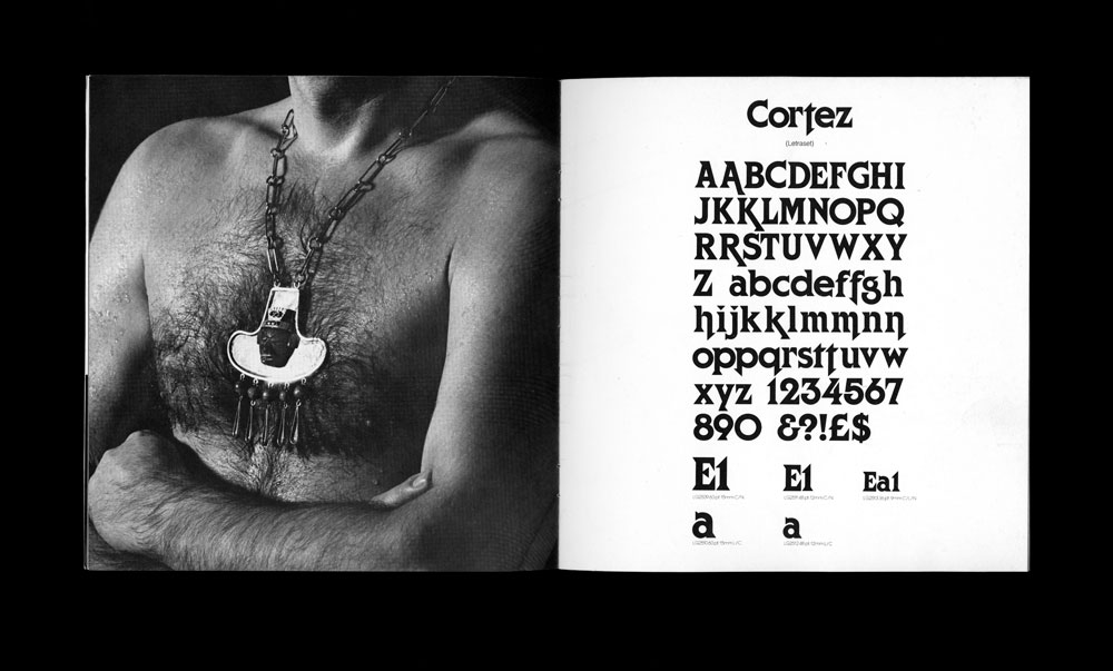
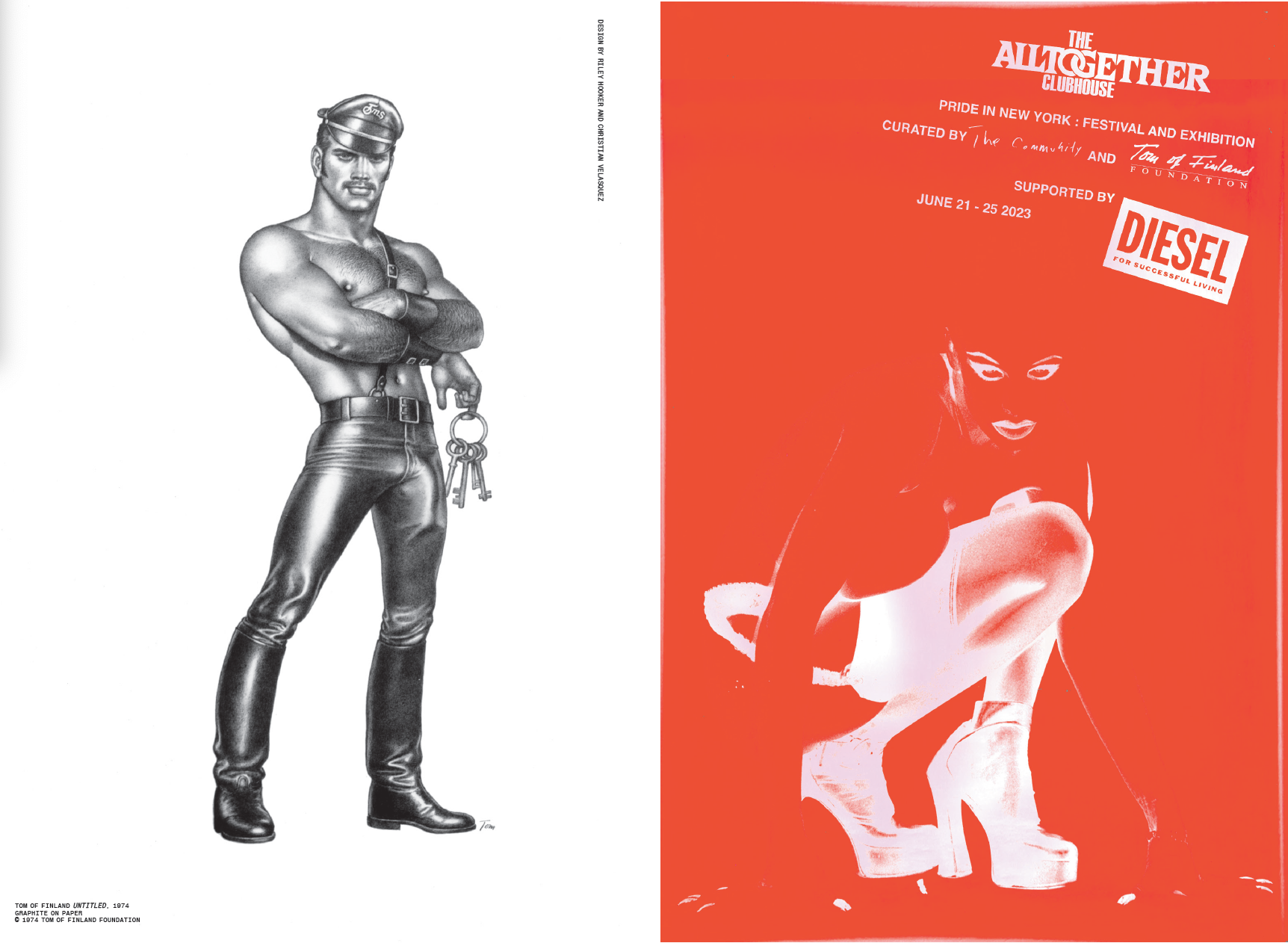
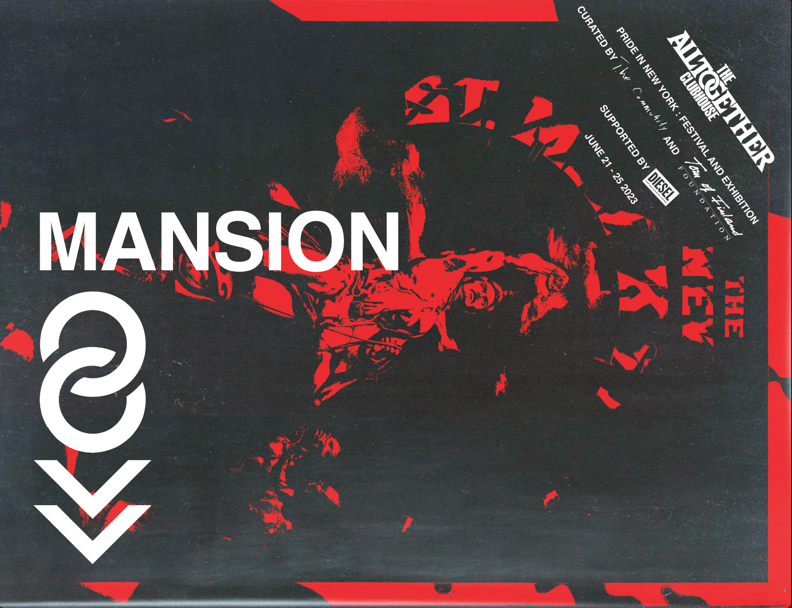
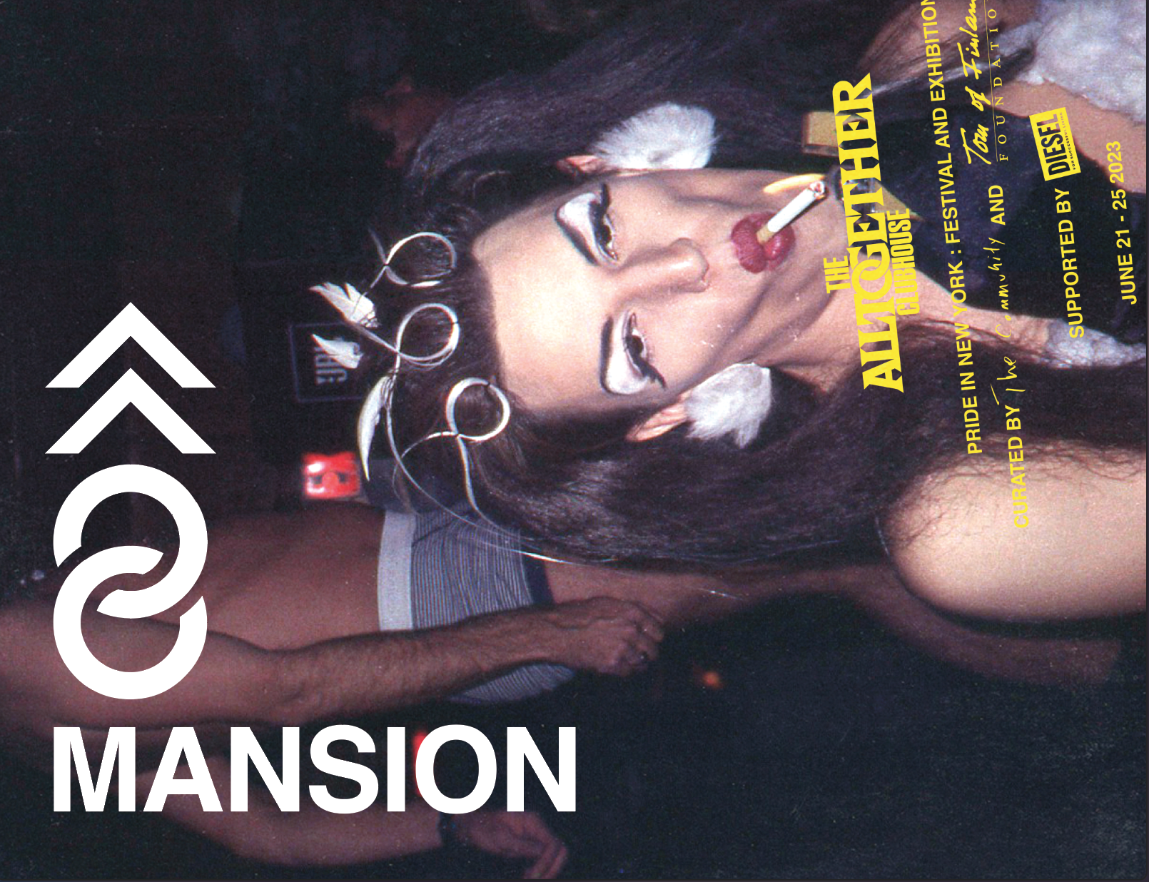
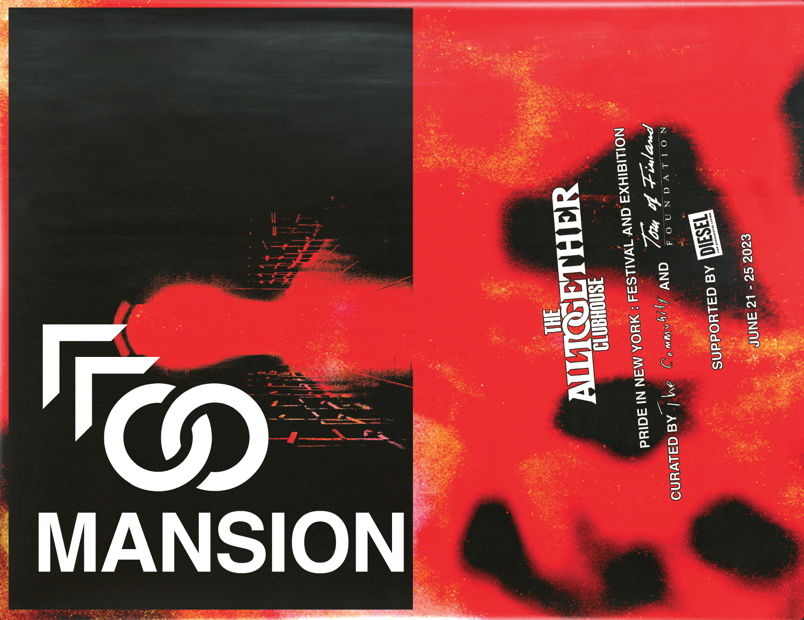
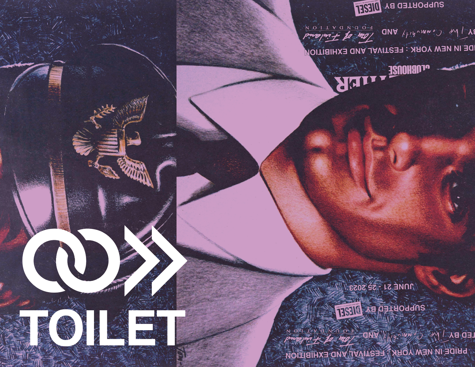
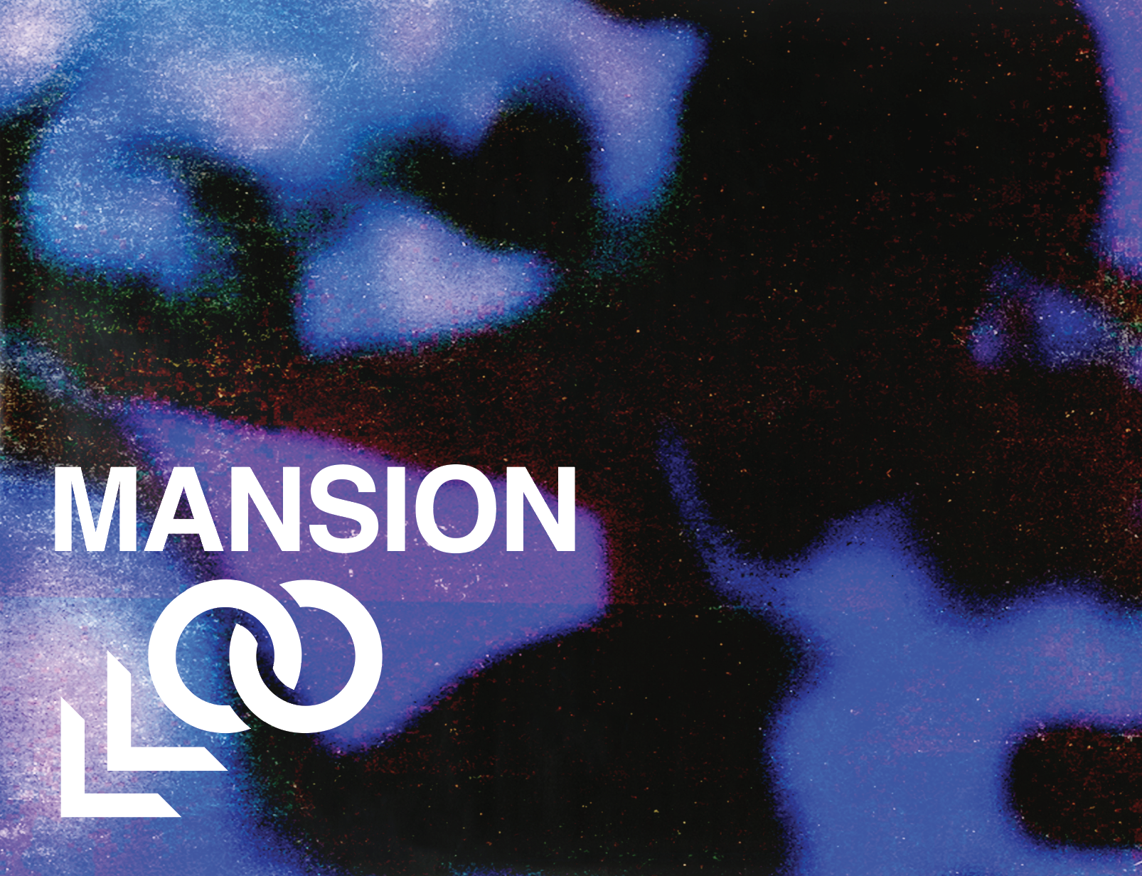
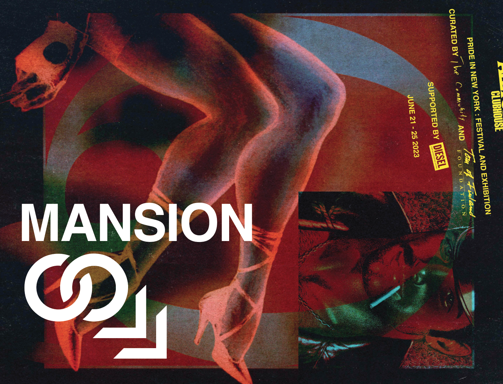
For the logo I used of typeface called Cortez, which I’ve always thought of as being very gay—mostly because I first encountered it in an uncharacteristically provocative type specimen from the 1970s. Cortez is an oldie but goodie I’ve been sitting on for over a decade, which features large triangular slab serifs that remind of metal studs on leather jackets. I also took the opportunity to do the overlapping circles thing, which has been used an abused without sense in recent years but actually makes very good sense in the word “together” —reminescent of chain links, (or handcuffs) while forming an “OG” ligature nodding to a byegone “original” golden era of gay sex and culture in New York. Christian then very cleverly combined the logo, all important information and partner logos into a DIY stamp inspired lockup that can be placed in the corner of anything we make.
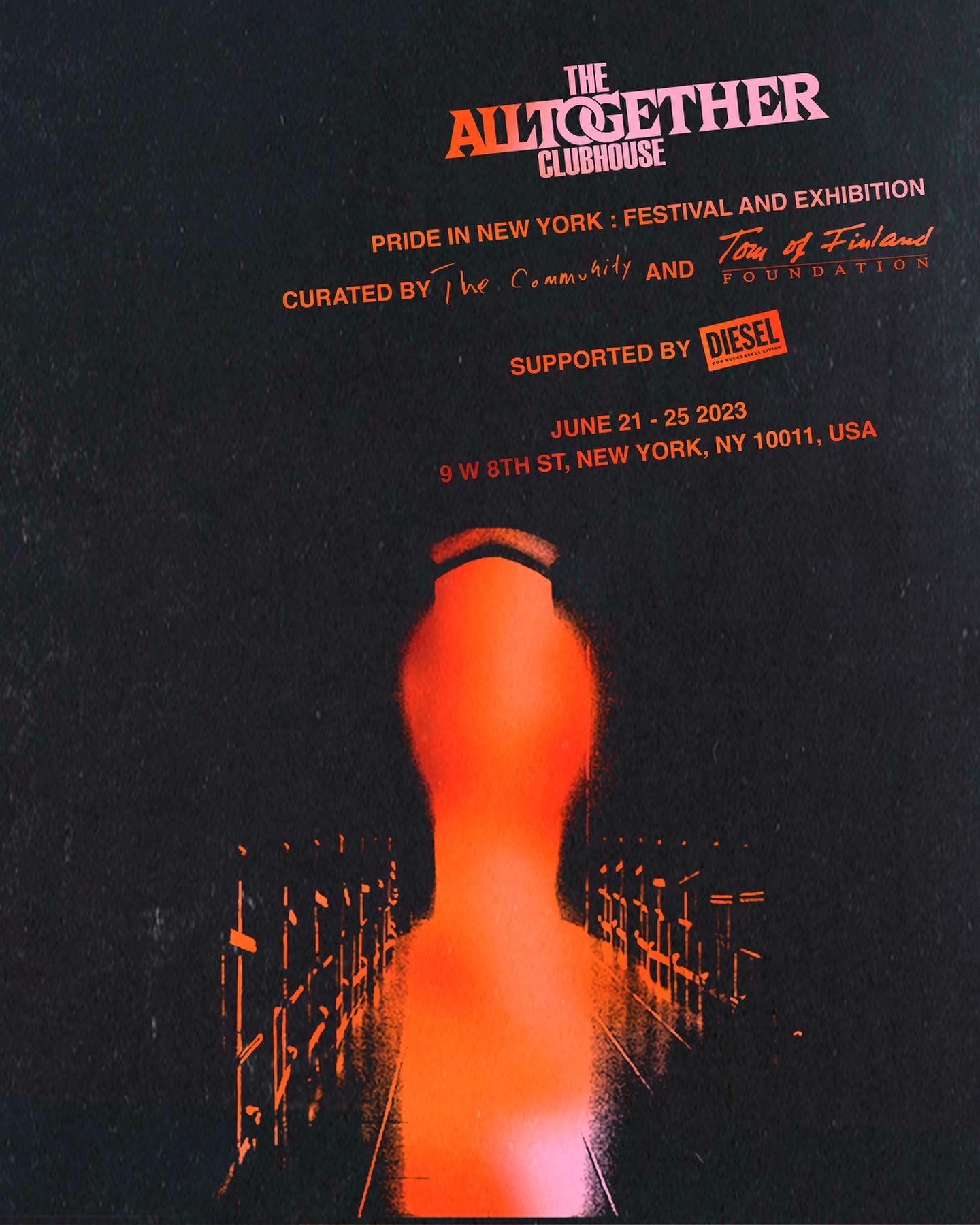
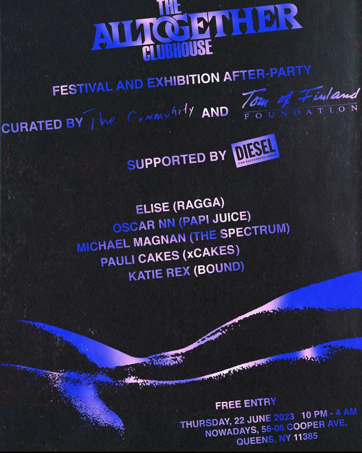
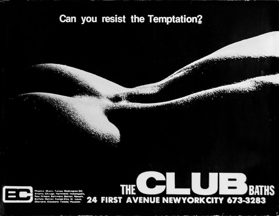
We liked the idea of an open door, and the idea of the “club as sanctuary,” so the first image we made is an abstraction of light coming through the door of a chapel, which was used to announce the project. The abstraction leaves room for interpretations, for instance, the gays at the Tom of Finland Foundation referred to it as the “butt plug” design, which we loved. Another friend saw the open door as a salacious entry. We also made a flyer in a contrasting colorway for the after party, using an image from an ad for a gay bathouse (shown above).
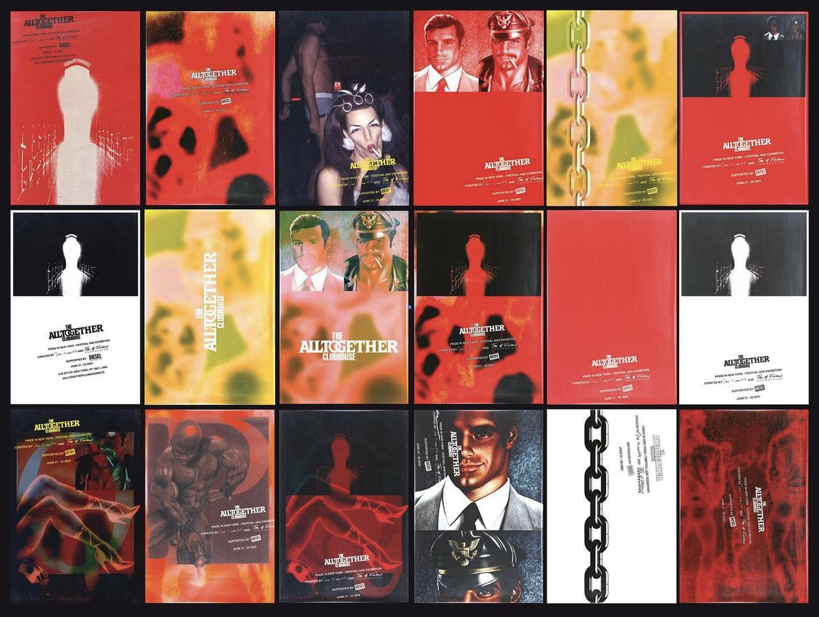
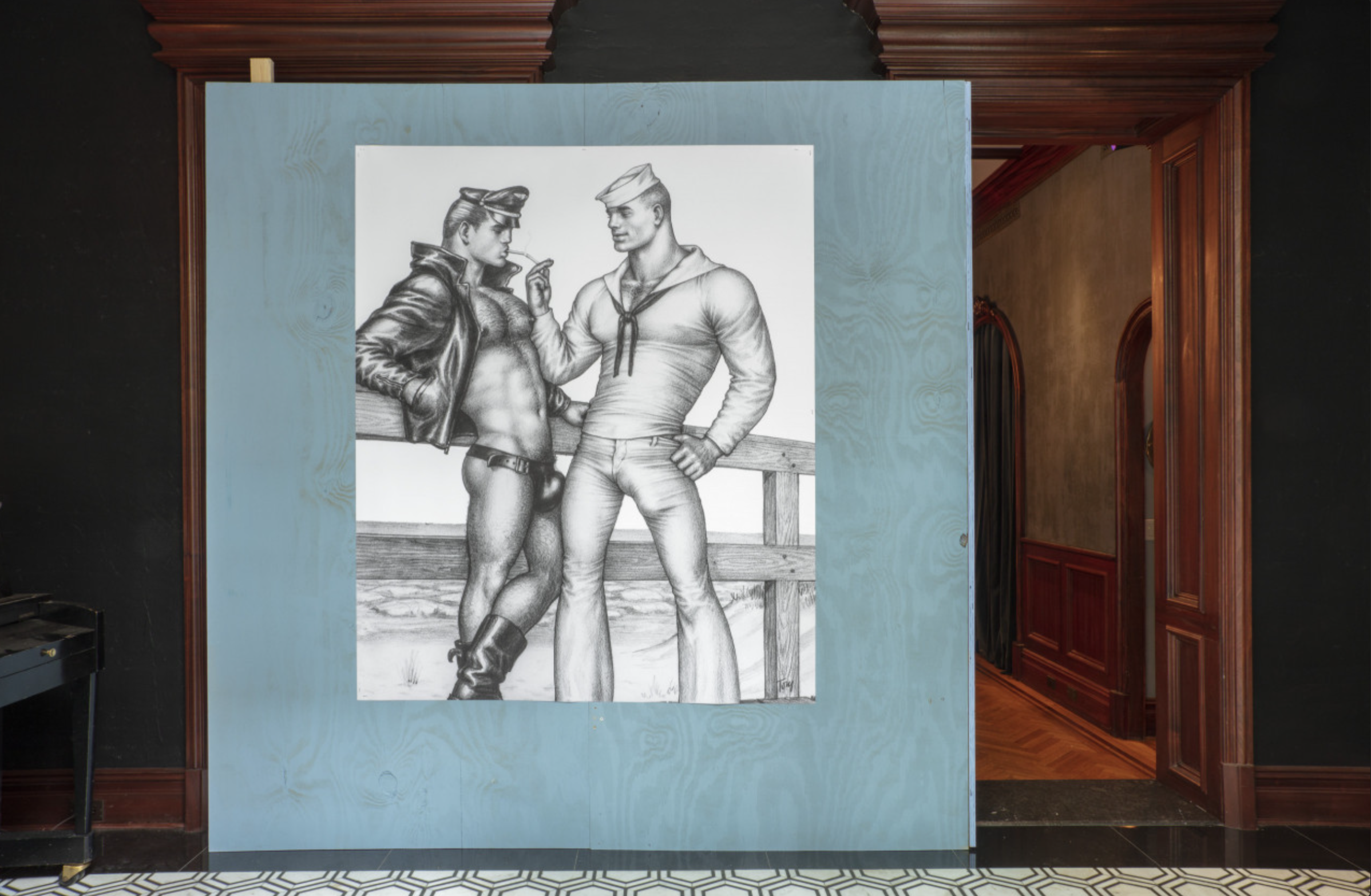
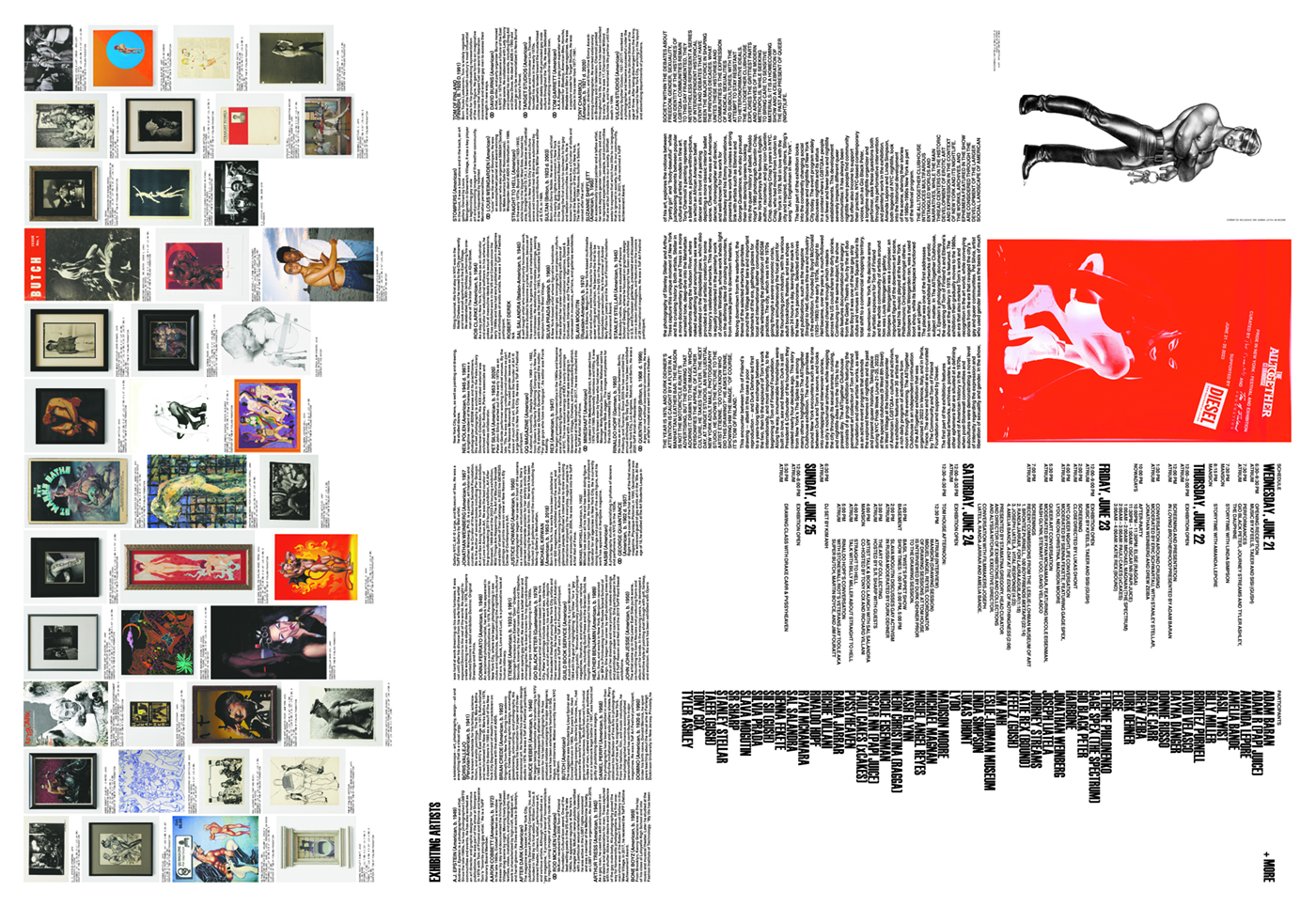
Tom of Finland’s work is so well-known at this point, that everyone felt comforatble being less precious with it. Once our general approach was defined we created a bank of images by making collages of images from the ToF archive, which we used for all of the promotional imagery for the show.
![]()
![]()
![]()
![]()
![]()
![]()
![]()
![]()
![]()
![]()
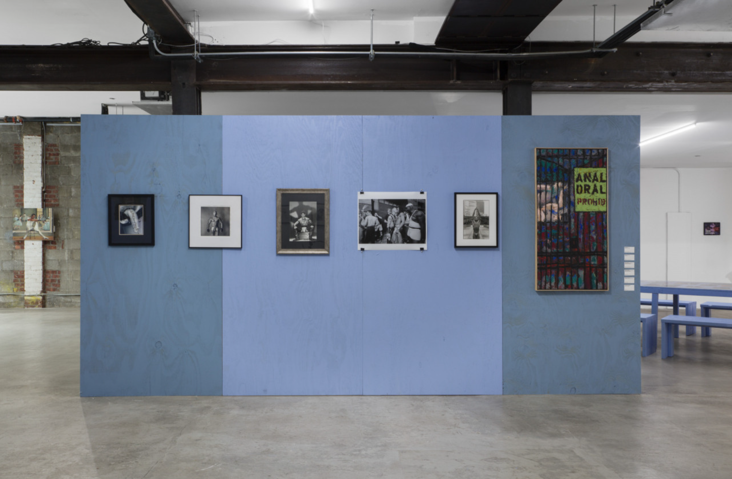
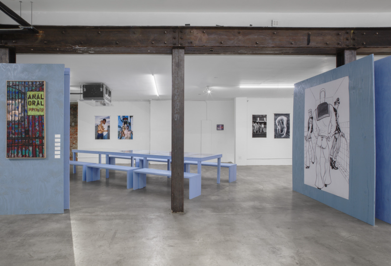
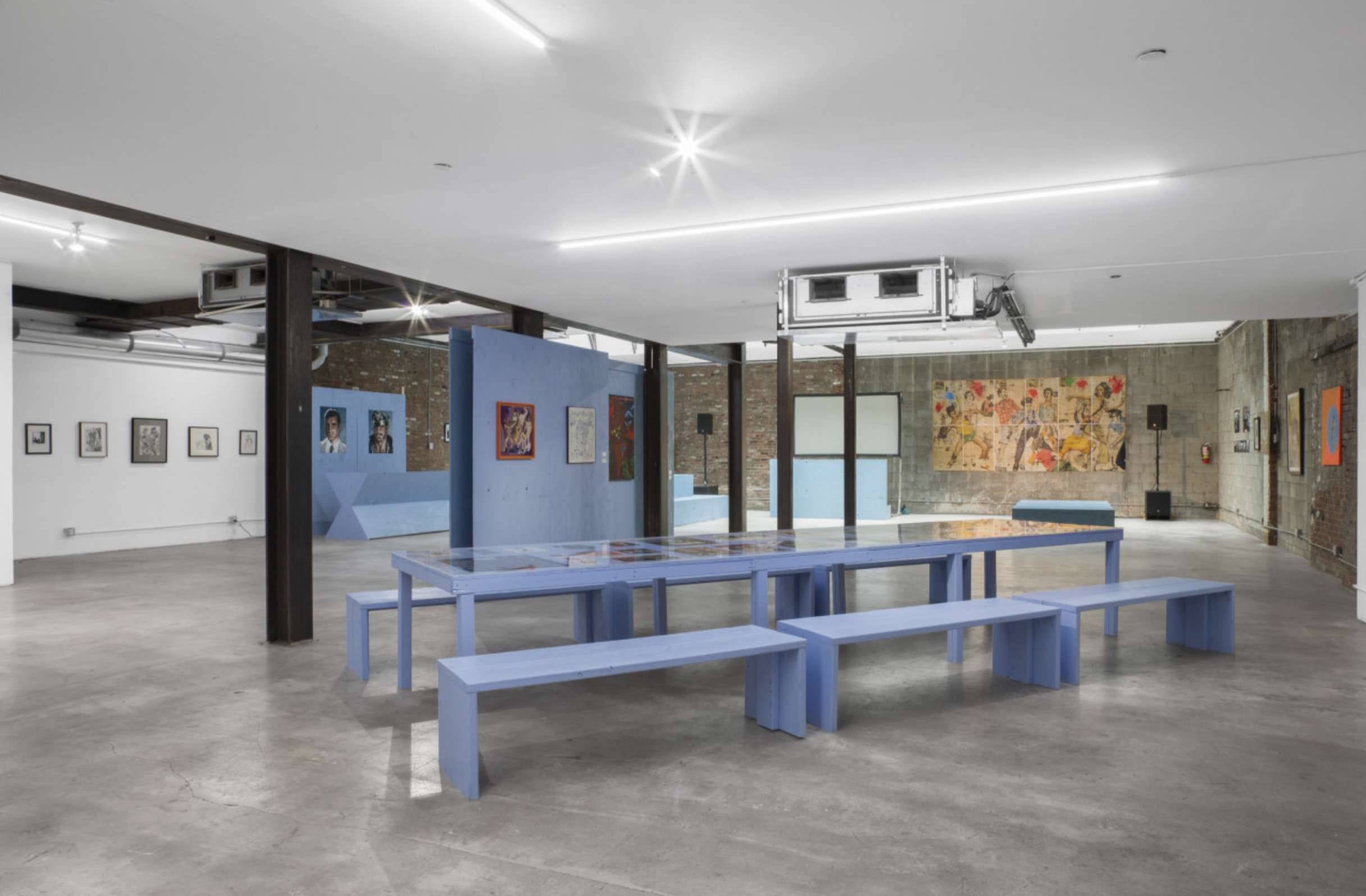
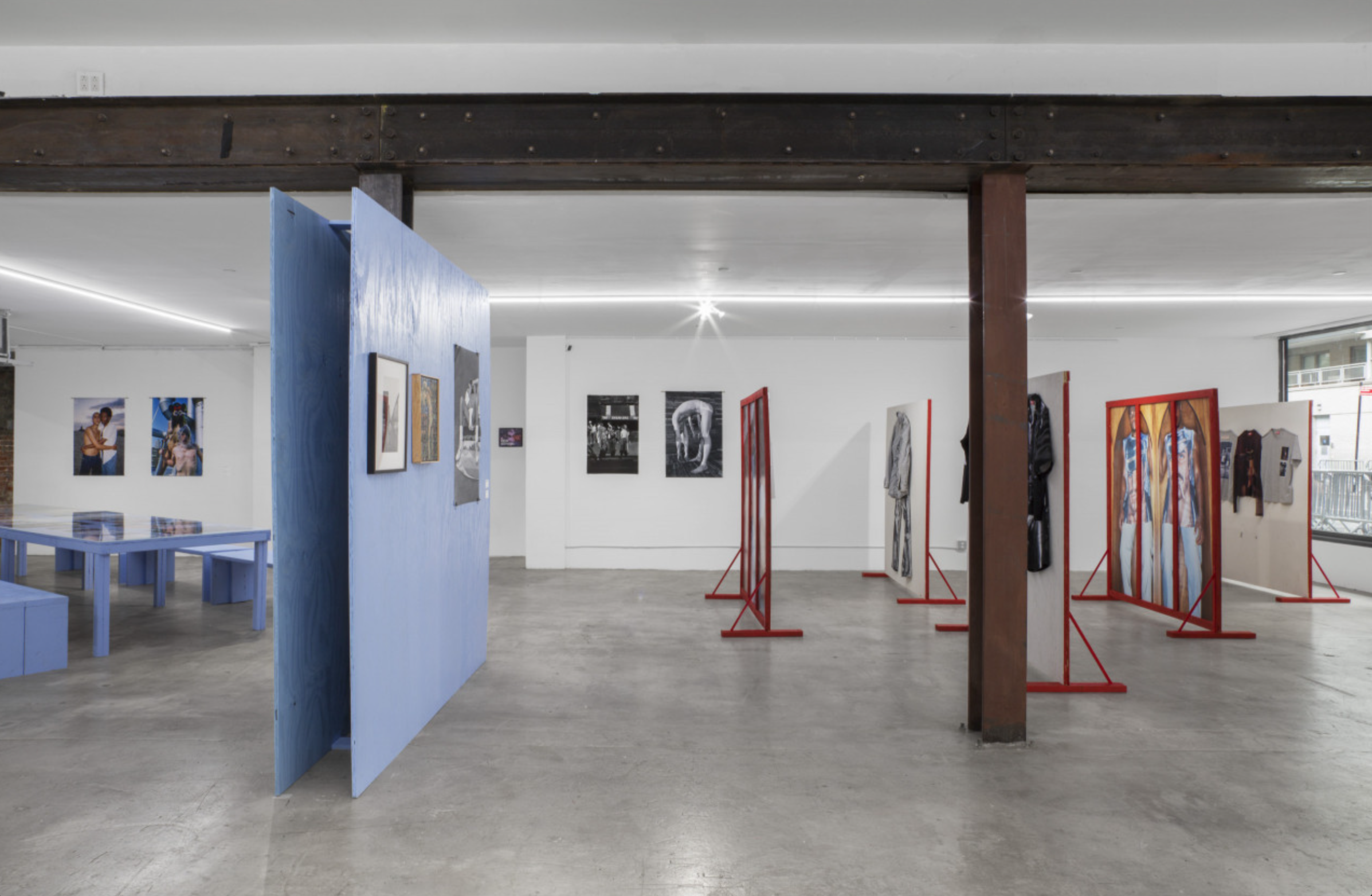
The exhibition was in a beautiful space in the West Village with a large industrial area on the ground floor, and a more intimate “mansion” upstairs for the extensive, nonstop programming. The exhibition design featured provisional walls painted in a cool blue color that complimented Diesel red, which was used for the provisional walls that displayed Diesel’s capsule collection, along with the warmer tones we used in the design system.
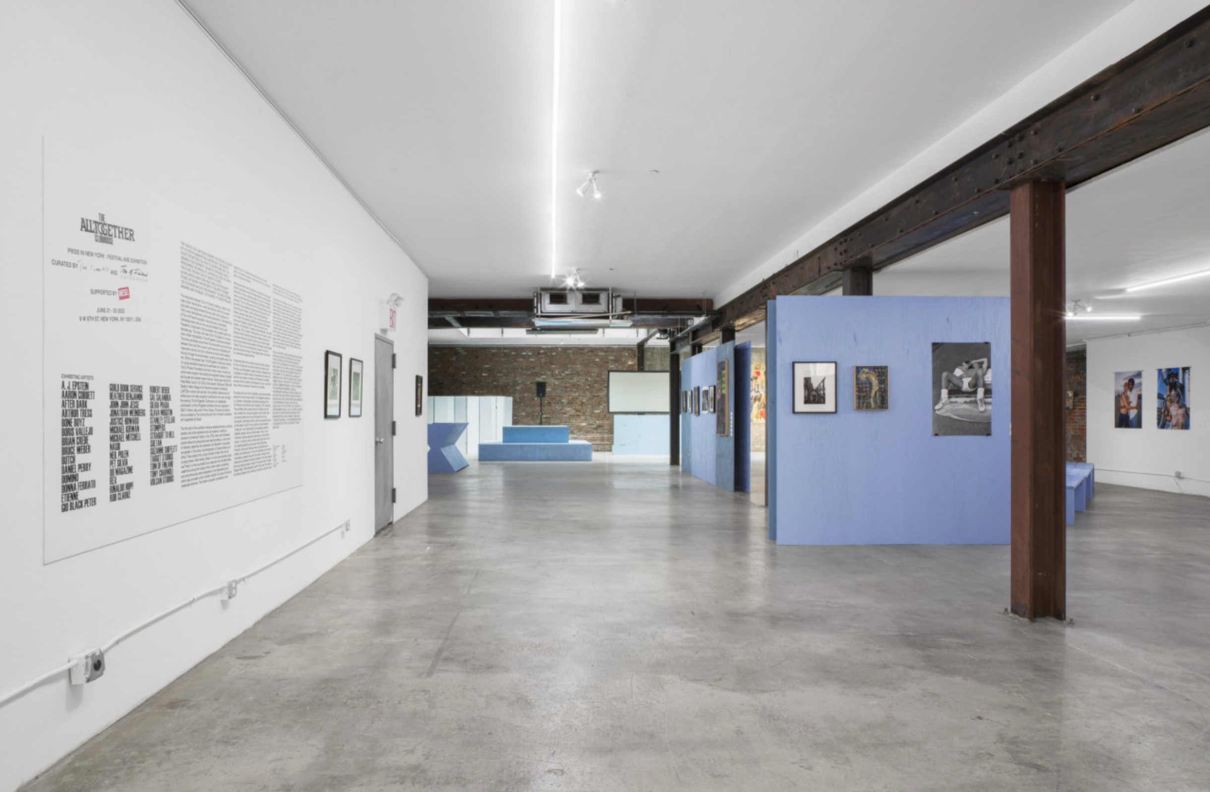

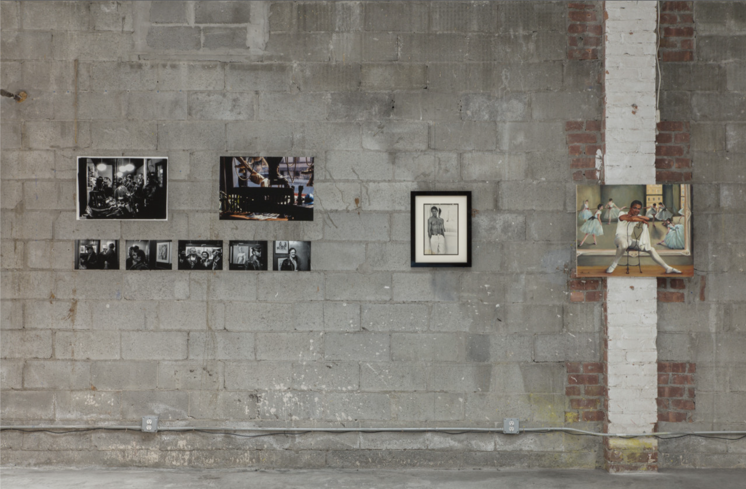
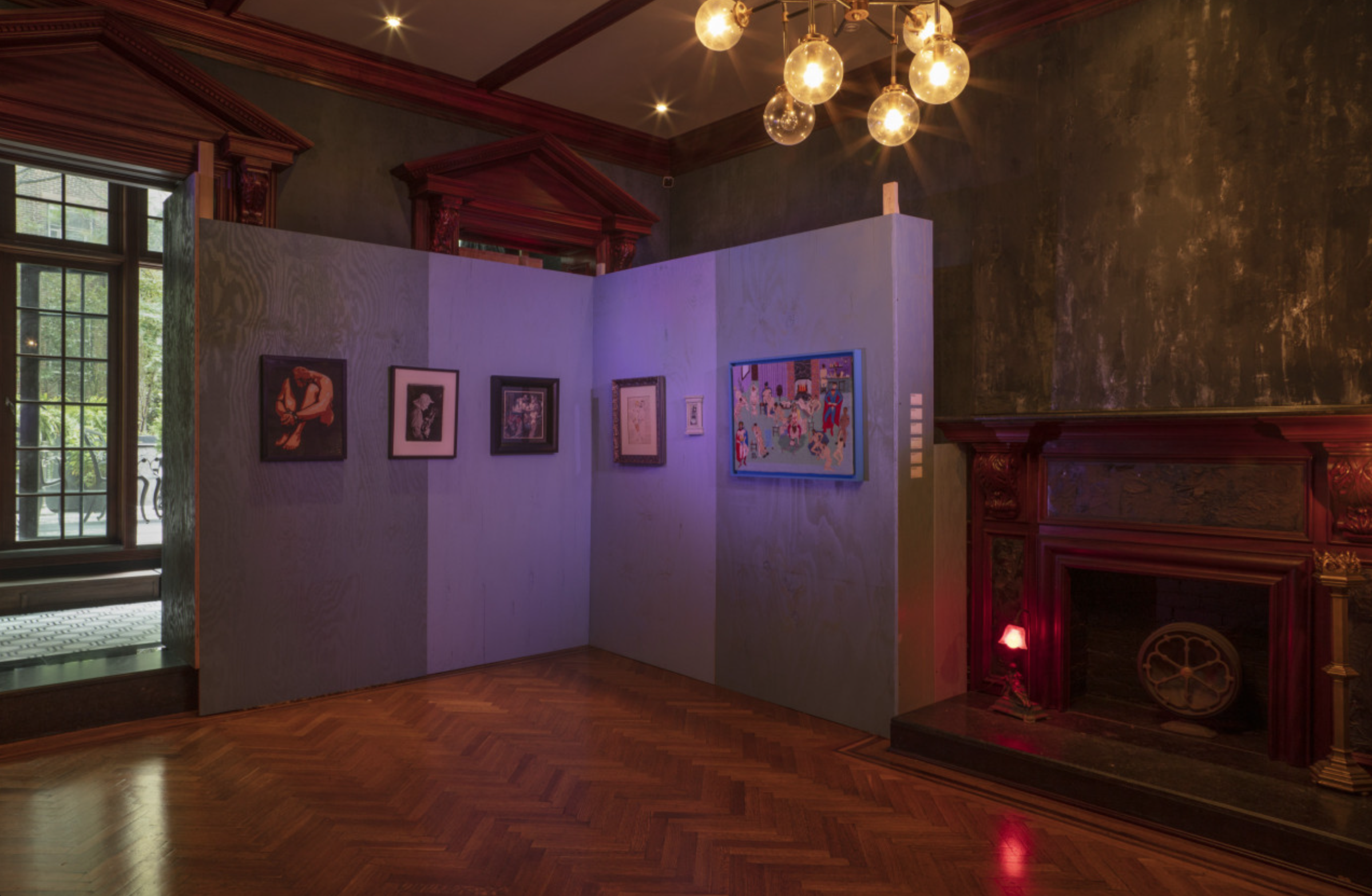
The exhibition was in a beautiful space in the West Village with a large industrial area on the ground floor, and a more intimate “mansion” upstairs for the extensive, nonstop programming. The exhibition design featured provisional walls painted in a cool blue color that complimented Diesel red, which was used for the provisional walls that displayed Diesel’s capsule collection, along with the warmer tones we used in the design system.
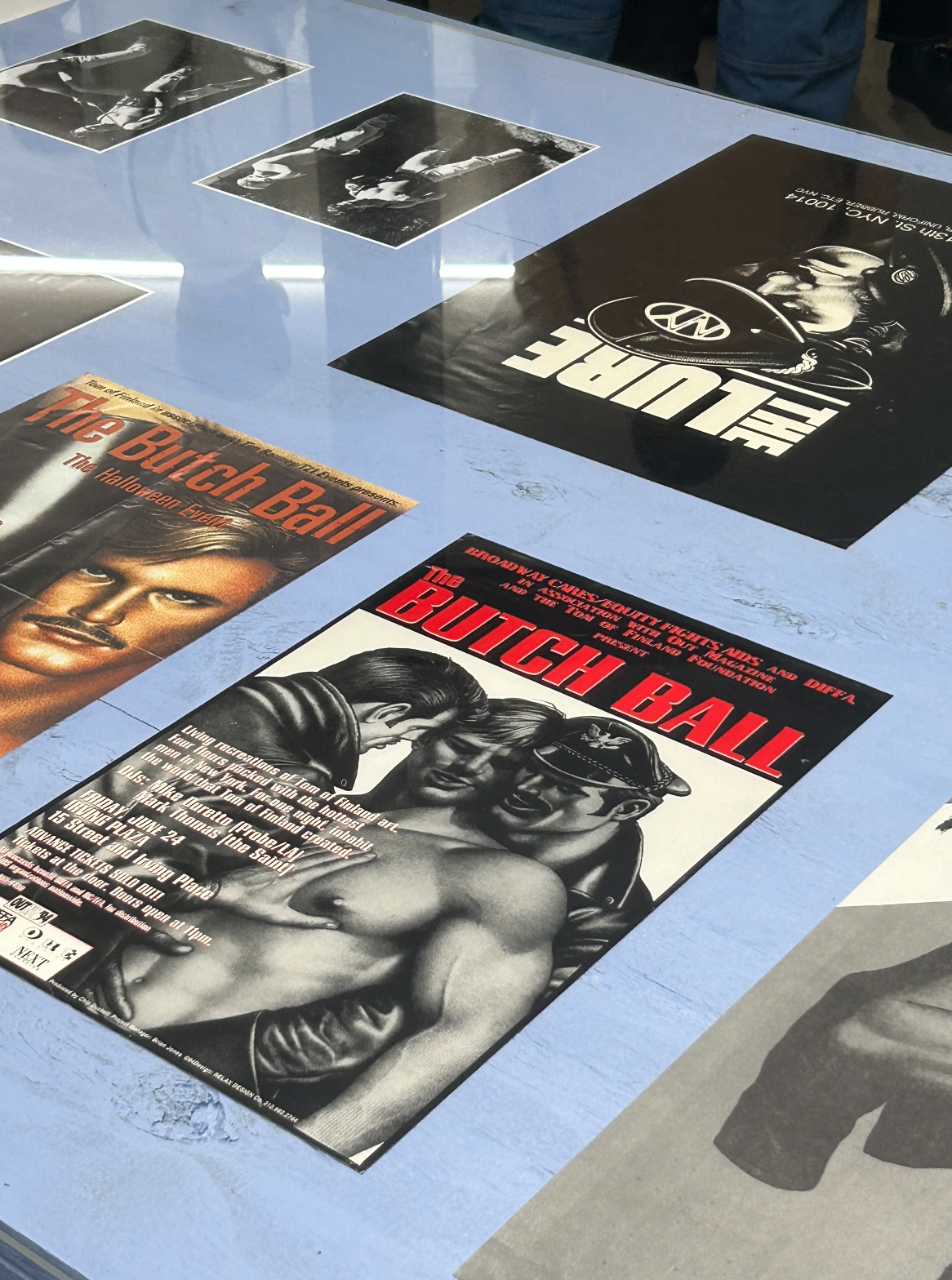
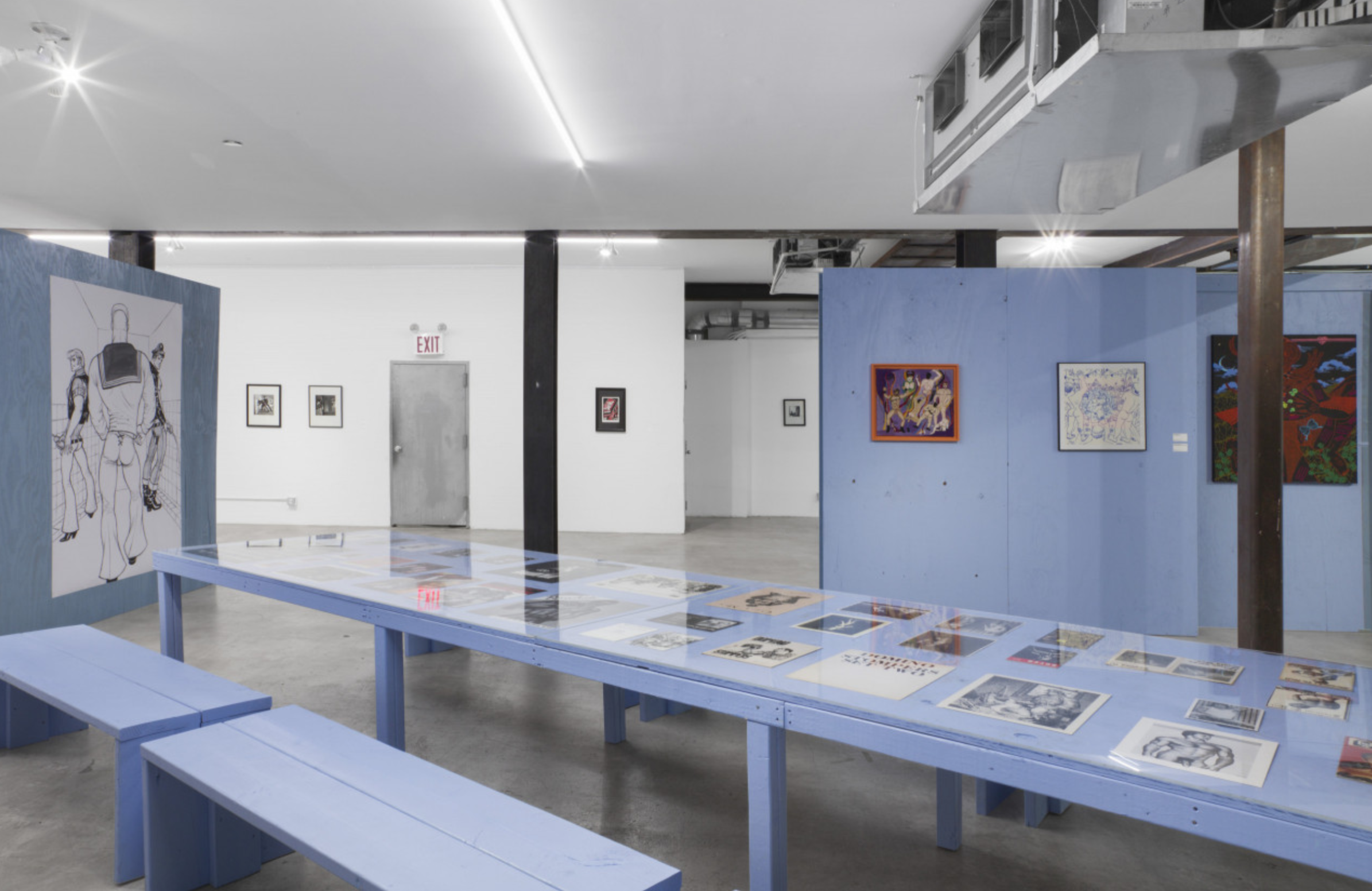
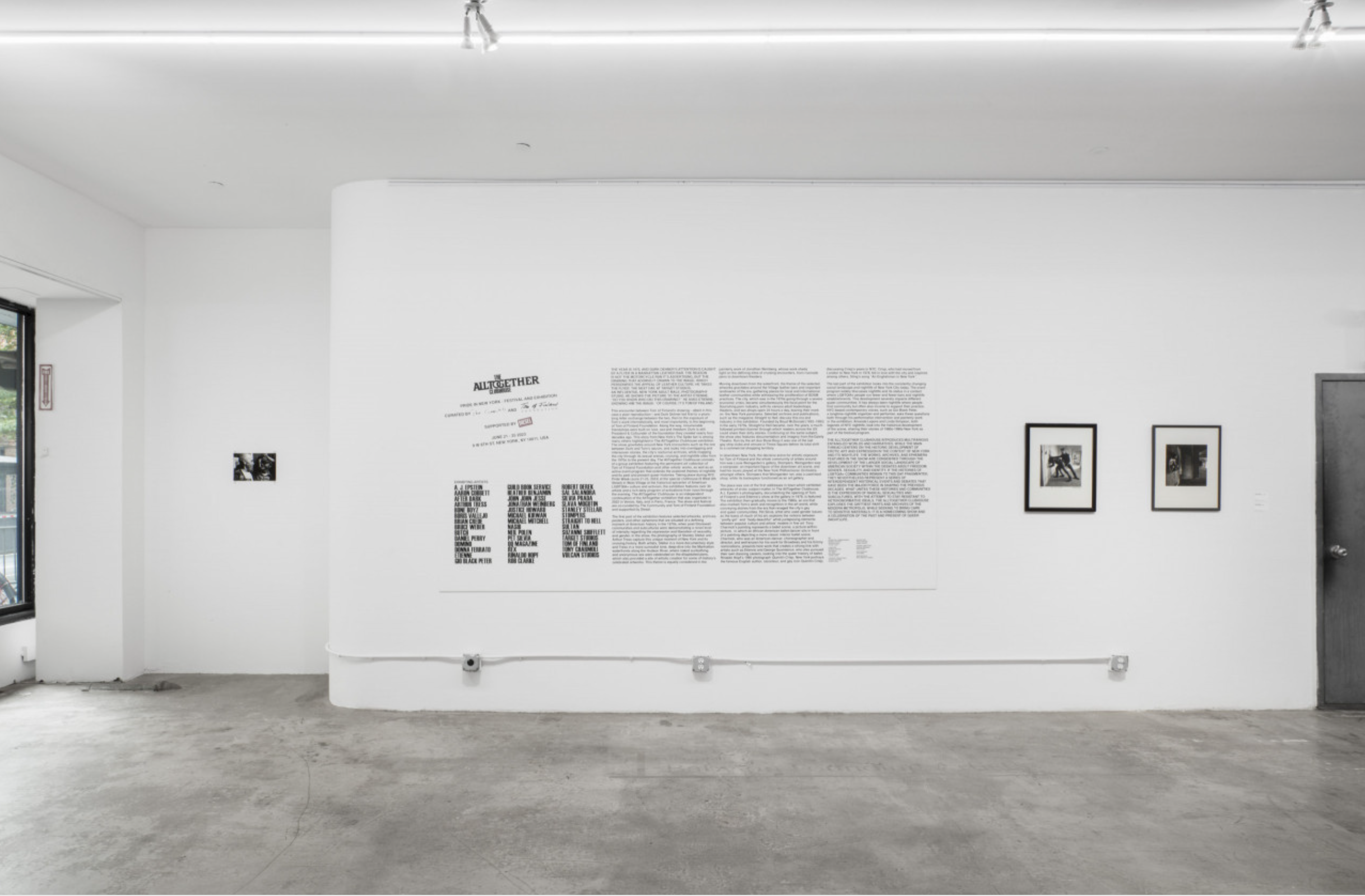
The exhibition included a lot of magazines featuring erotic art, ranging from the 1940s onward. Some were overtly gay with titles like Queen’s Quarterly, others like Physique Pictoral attempted to hide in plain sight under the guise of men’s fitness. The curators devised an ingenious (in my opinion) way to display these archival materials by placing them under a sheet of plexi atop a large canteena-style table, custom built for the show. This not only provided an informal respite, it also allowed you to engage them with your body in much the same way you would at home. Throughout the extensive programming you’d commonly see people’s drinks and other belongings strewn about the surface. A simple but effective shift away from the formality of the wall, or a traditional vatreen, which can often feel more like a mausoleum.

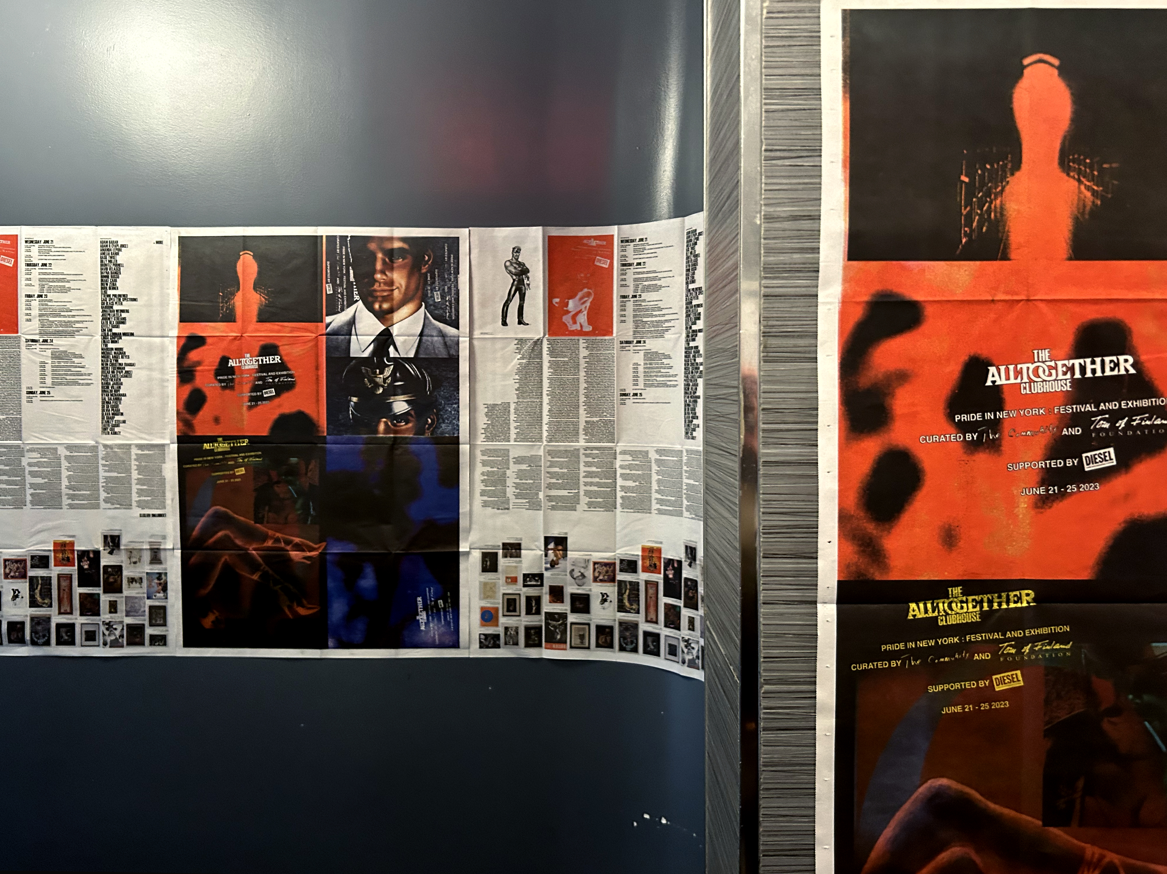
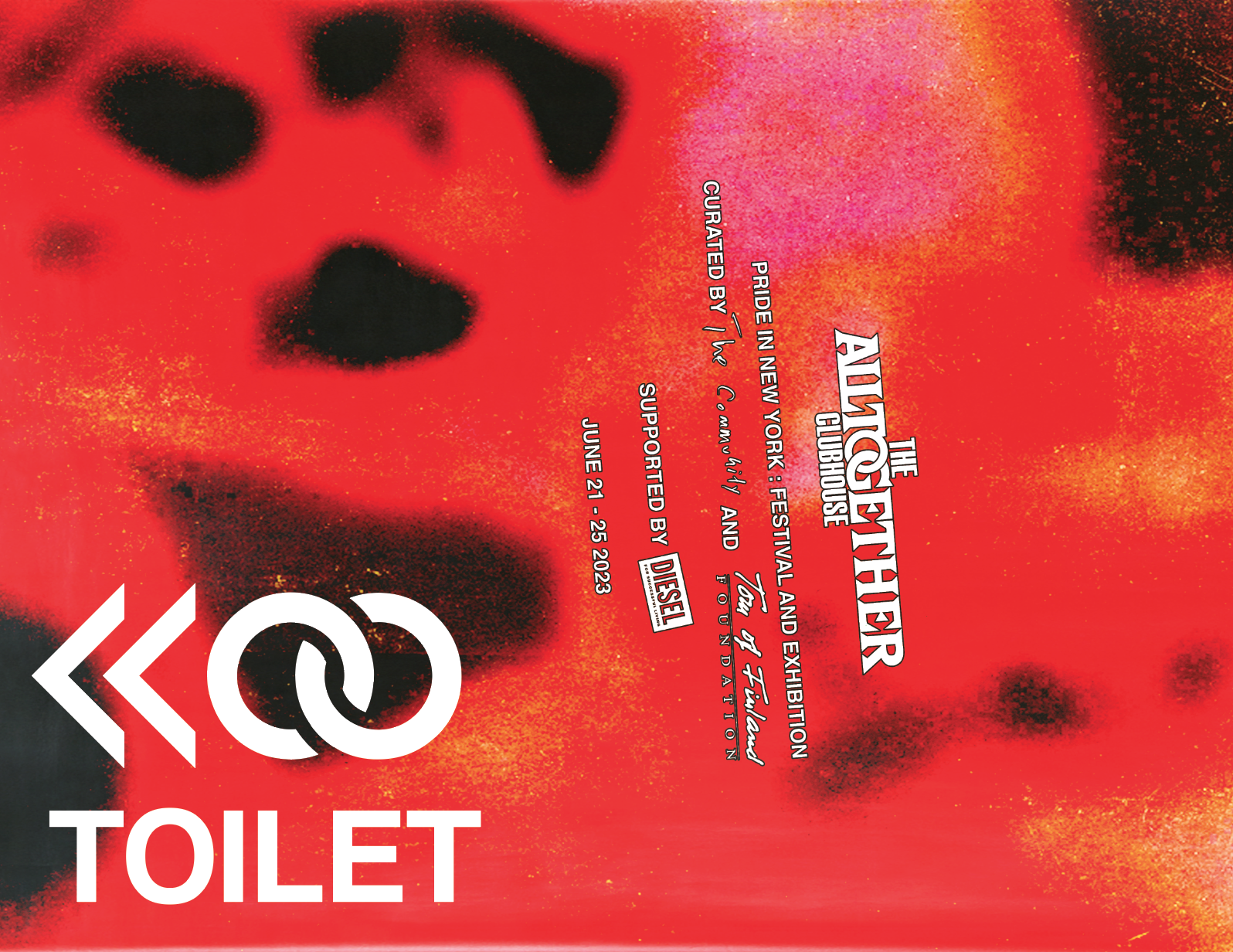
The chain-link motif in the logo appears throughout the printed materials, perhaps most prominantly featured in the building signage, which utilizes more of the imagery we created from the archive.