Creative Time Think Tank, 2022
Identity and website FOR a think tank
to reimagine An art world-in-crisis
for creative time
Identity and website FOR a think tank
to reimagine An art world-in-crisis
for creative time
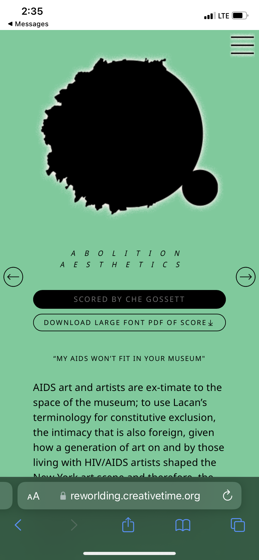
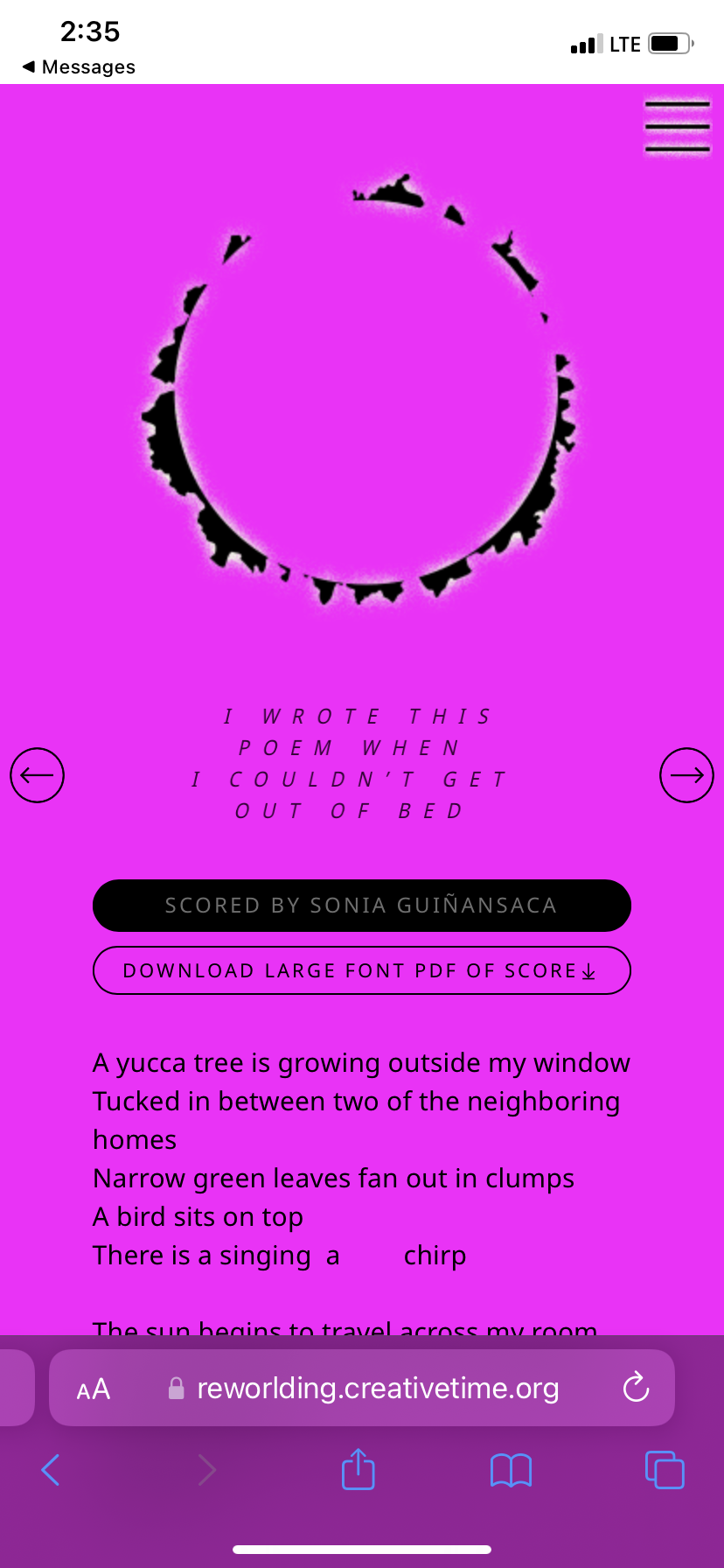
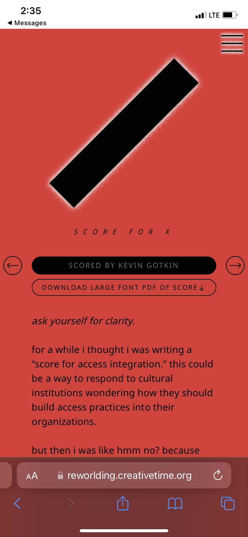
The Creative Time Think Tank: Invitations Towards Re-Worlding was a meeting of academics, activists and art workers who all agreed that art is powerful, and the way the art world operates is pretty disempowering, if not just ethically bankrupt alltogether (I’m paraphrasing). Though rooted in critique, the group aims to provide possible ways forward, hence the subtitle “Invitations Towards Re-worlding.” The project is organized into scores, instructions, conjurings, and provocations. The Think Tank cohort included: Che Gossett, Emily Johnson, Hentyle Yapp, Kevin Gotkin, La Tanya S. Autry, Namita Wiggers, Prerana Reddy, and Sonia Guiñansaca.

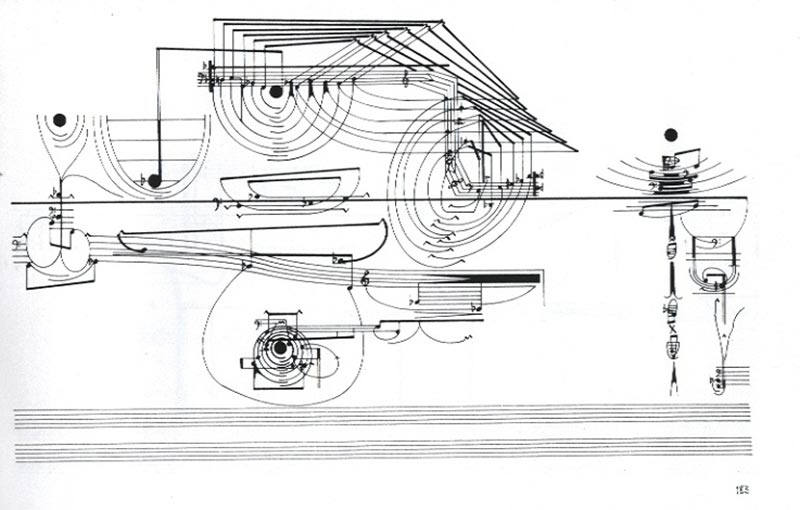
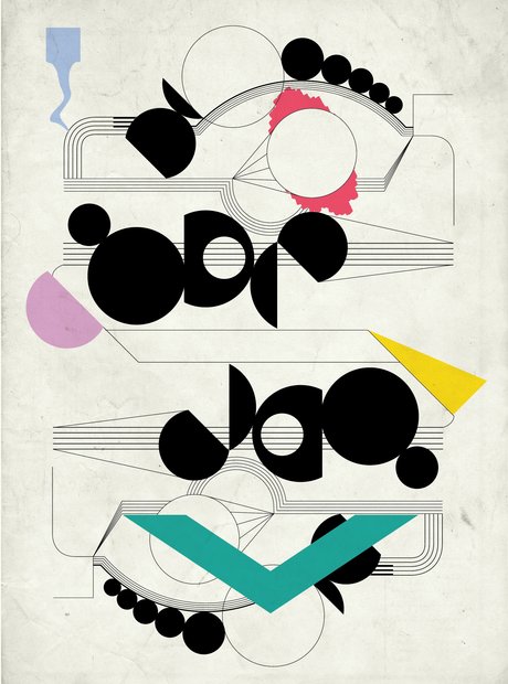
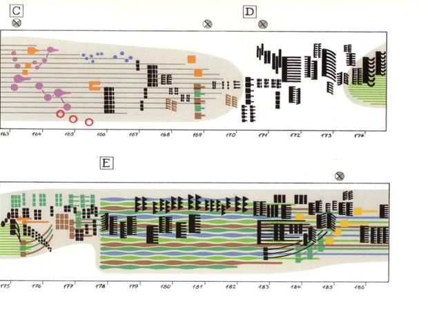


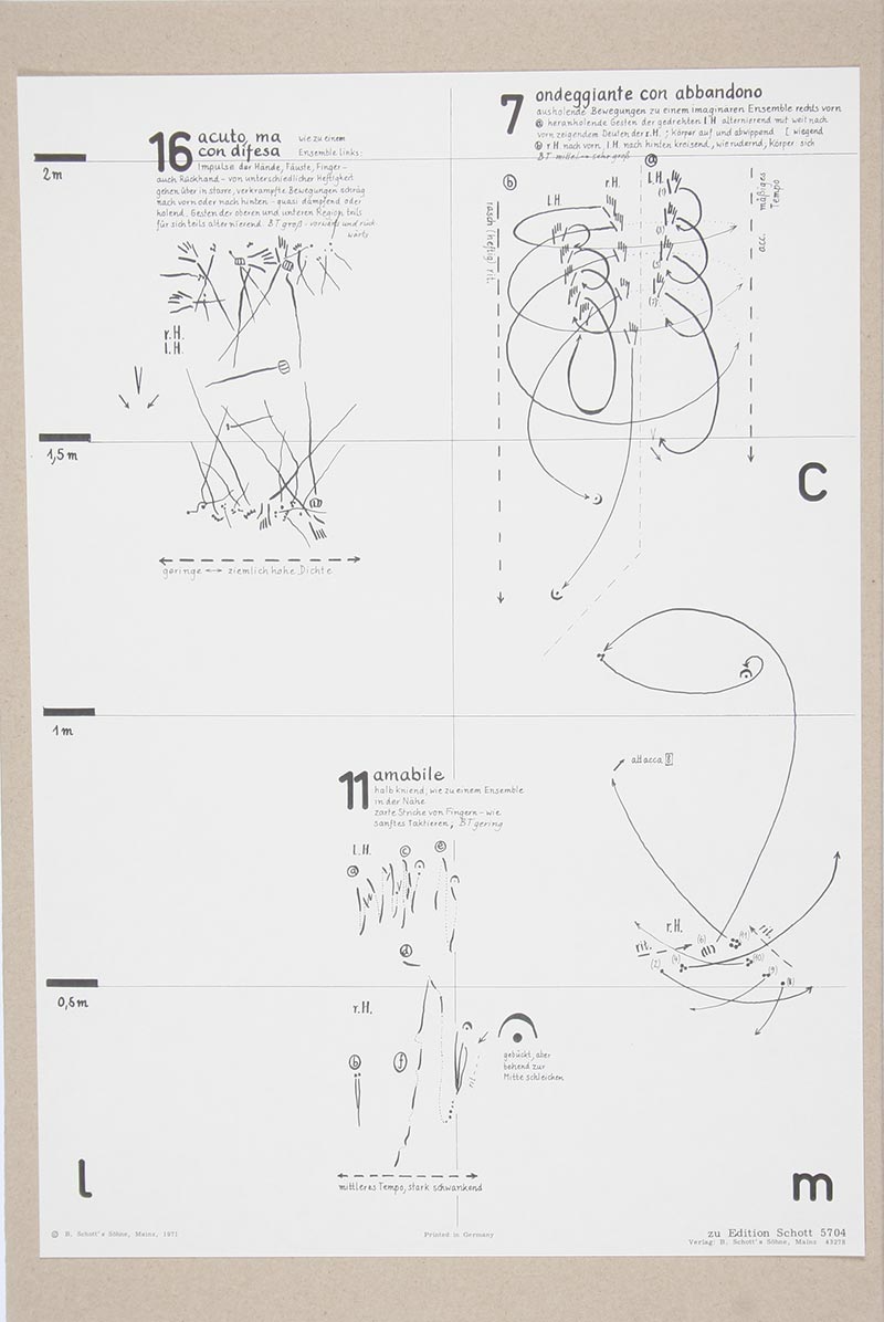
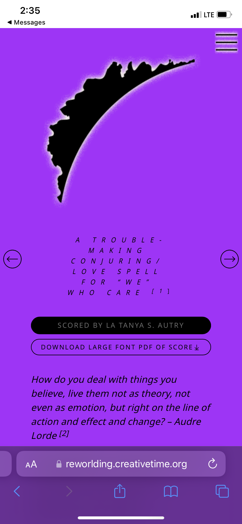
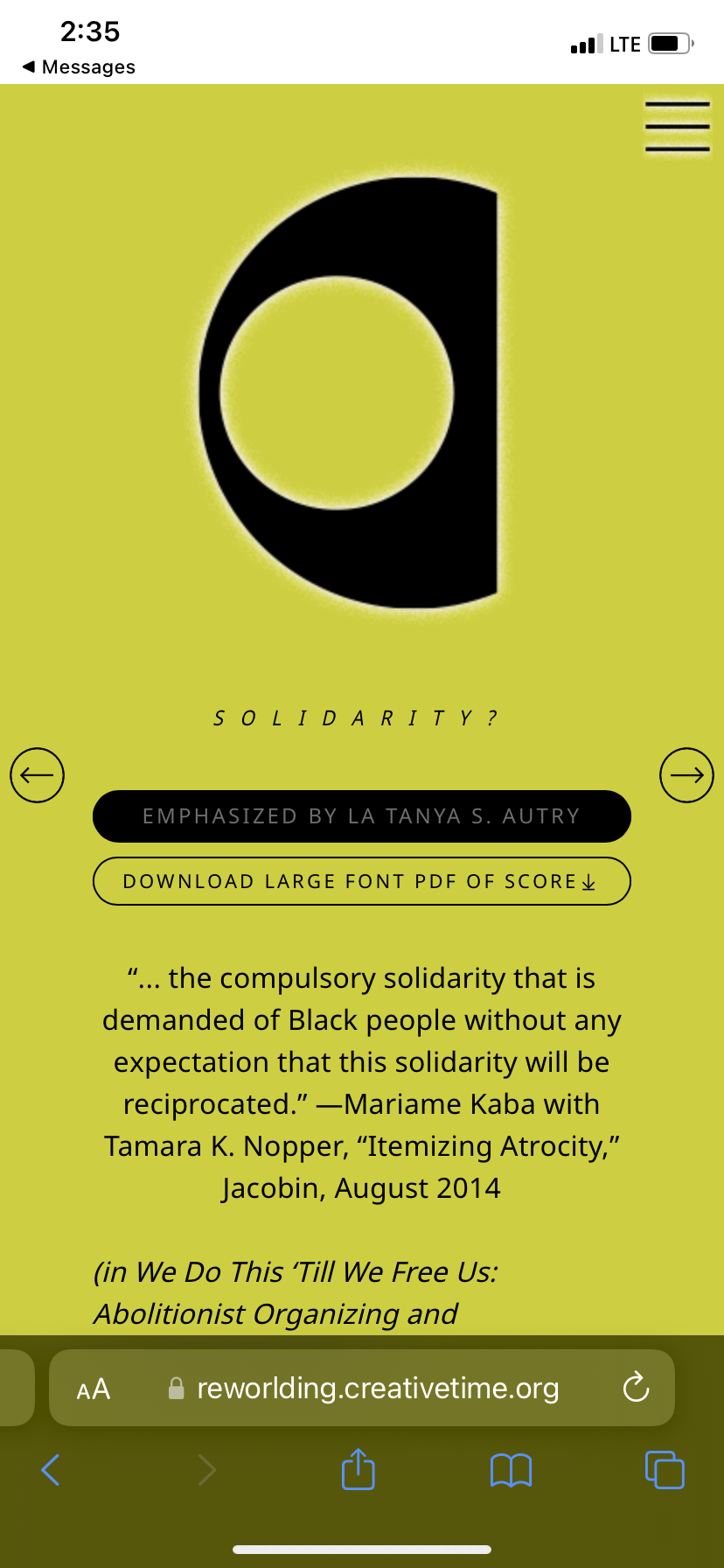
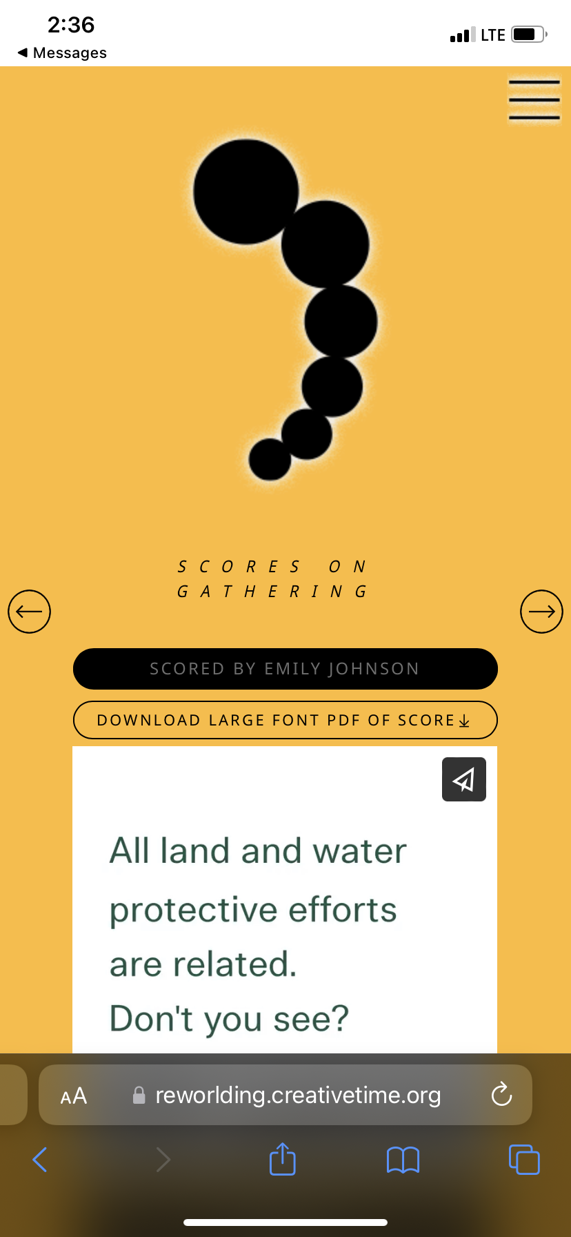
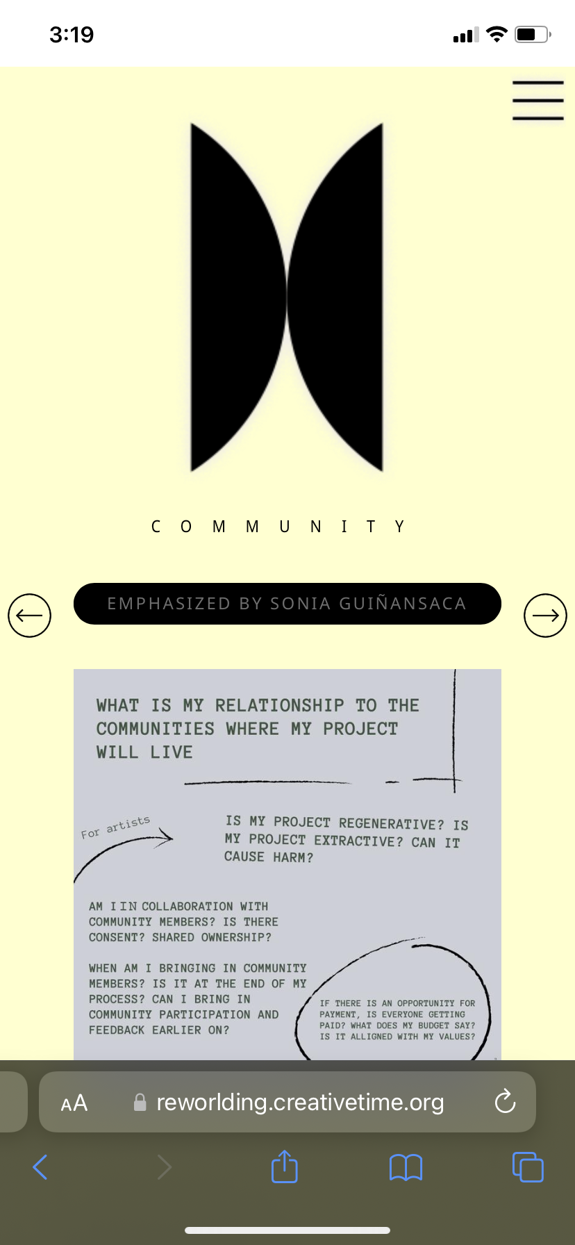
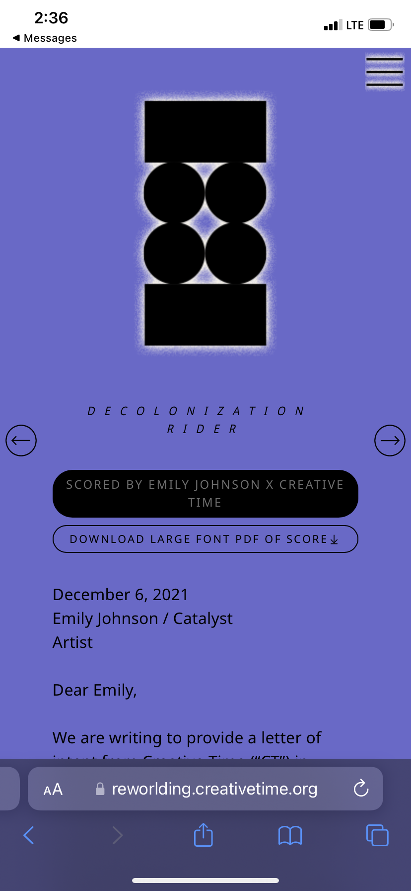
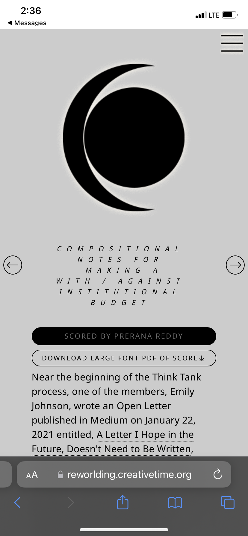
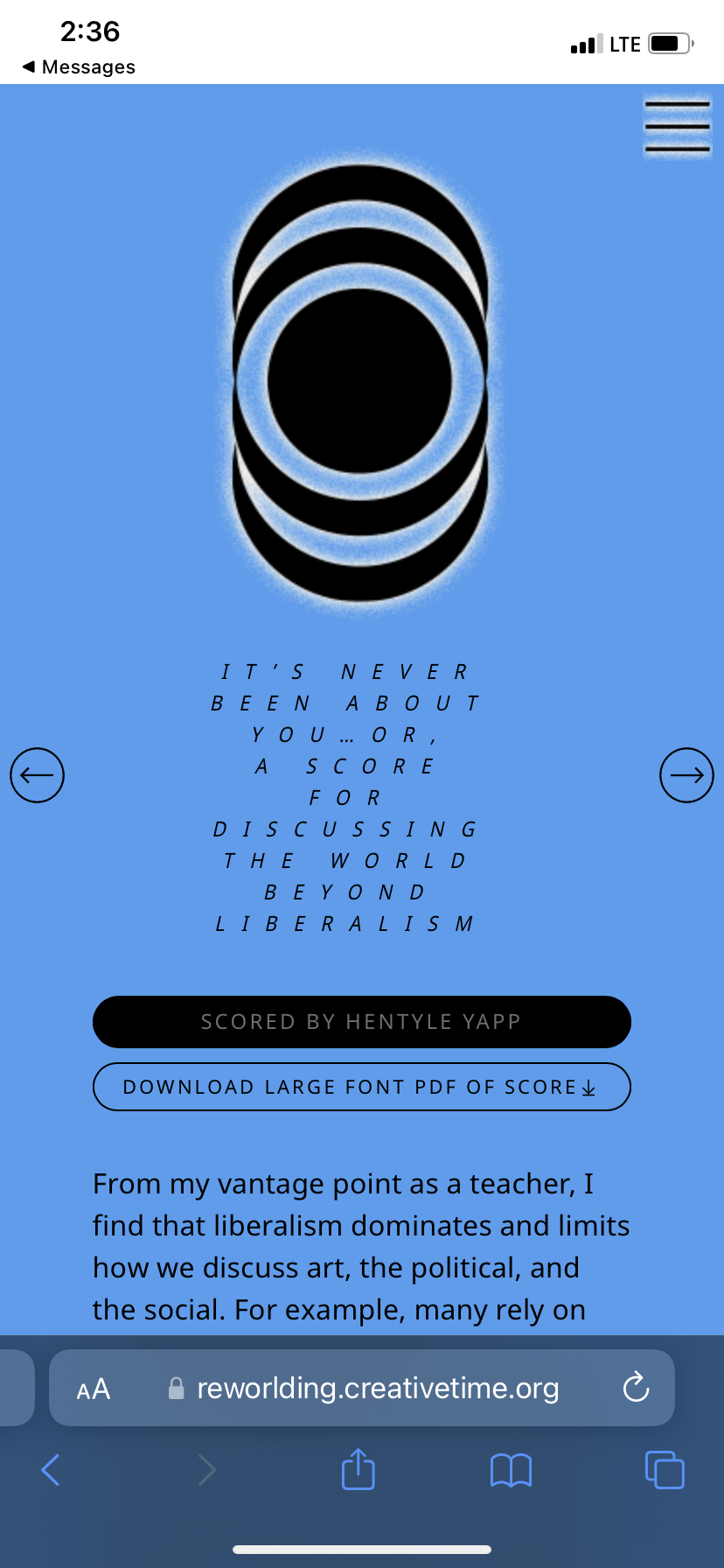
Each memeber of the cohort produced a “score,” making up the core of the content. I immediately thought about artists making visual scores, building off that history to create the visual identity.
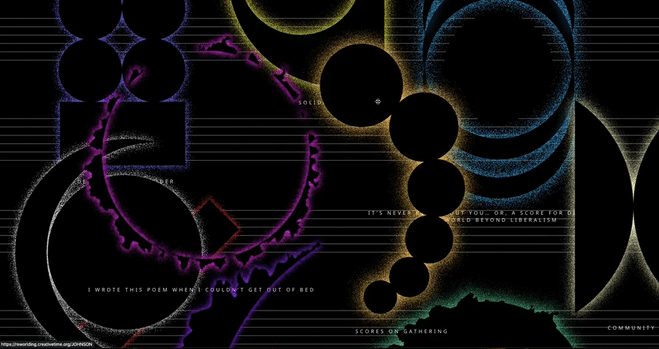
The homepage (pictured above) is populated with a composition of moveable, overlapping abstract symbols, arranged as a visual score—each representing one of the scores created by the cohort—displayed across a lined background in reference to musical notation. The “night mode” color scheme of the homepage evokes celestial bodies and stellar phenomena, riffing off the promt of the program title“invitations toward re-worlding.”
The homepage (pictured above) is populated with a composition of moveable, overlapping abstract symbols, arranged as a visual score—each representing one of the scores created by the cohort—displayed across a lined background in reference to musical notation. The “night mode” color scheme of the homepage evokes celestial bodies and stellar phenomena, riffing off the promt of the program title“invitations toward re-worlding.”


Each shape has a pixelated glow, with a corresponding hue in an offbeat palette reminescent of the Y2K era web and it’s vibrant utopian glow rendered in a bumpy texture as if to signal a contsant state of decay. The color palette is reiterated in the background of each individuals score page, which makes for an optimistic and chromatically stimulating click-through experience.
![]()
![]()
![]()
![]()
![]()
![]()
![]()
![]()
![]()
![]()
Another feature worth mentioning is the typography, which was all set in BC Sans—a free downloadable typeface developed by the Canadian Government (for accessibility reasons) which includes glyphs used in indigenous languages that are otherwise impossible to translate properly. It is tragically rare to find a font file that includes indigenous languages, so rare in fact that virtually no cool or even modern typefaces that exist have this feature. SAD! The sad, modern and colonial truth that graphic design is built on. So on one hand it’s great that this typeface exists. On the other hand it’s haenous looking. I had to deploy quite a few tricks to defeat the dowdy, bureaucratic sensibility embued onto the letterforms by the Canadian Government—and like the cherry on top of Diana Troy’s replicated chocolate Sunday—a very sci-fi inspired tracking animation resulted.