If you hear something, free something
campaign creative direction for a public art project
by arist Chloe Bass
installed across the mta system
campaign creative direction for a public art project
by arist Chloe Bass
installed across the mta system
curated by diya vij for creative time
with MTA Arts $ Design
photography by ally caple
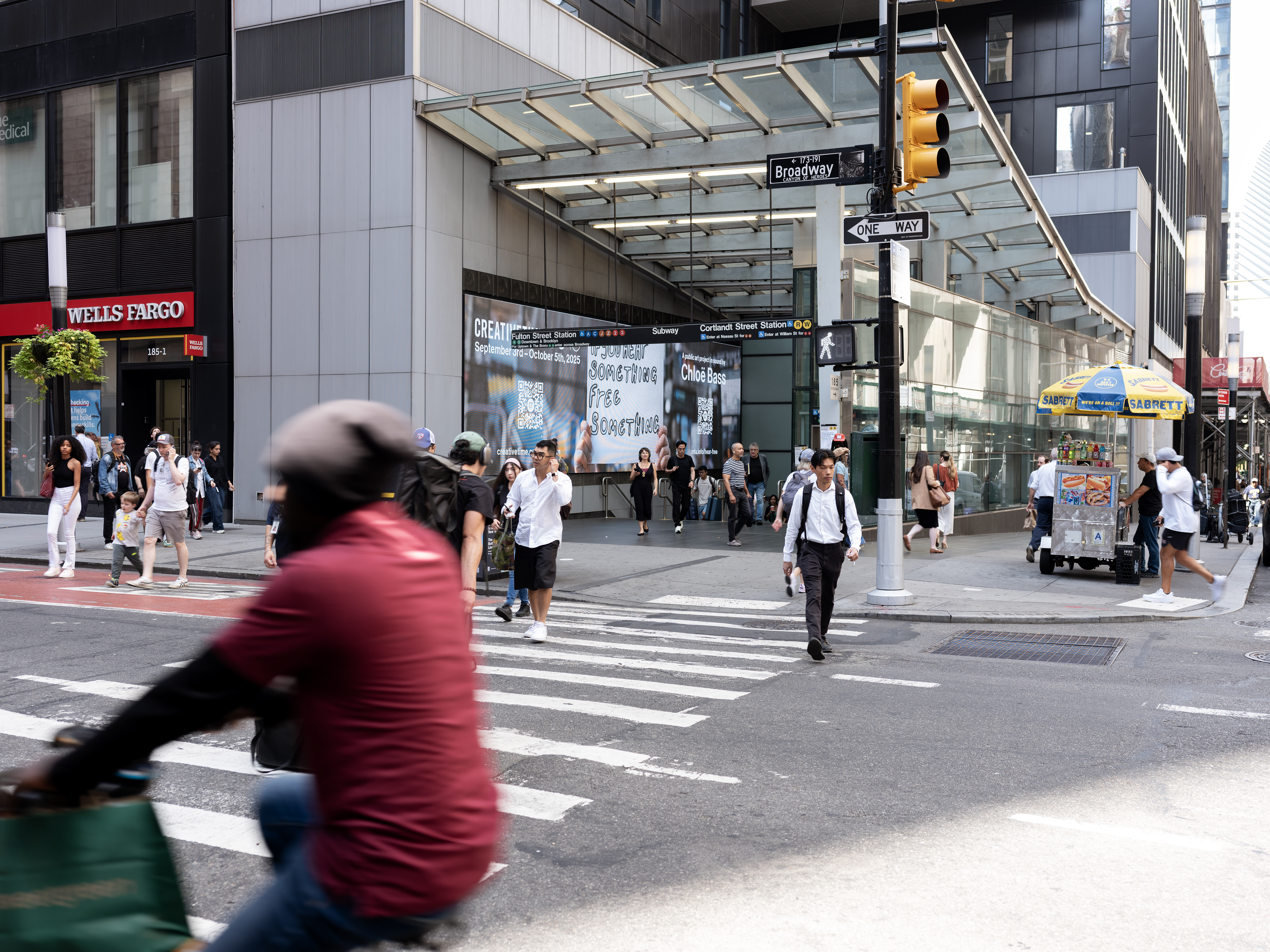
What do we hear when we ride public transportation?
Who is speaking to us?
What are we being asked to do?
The challenge was in making the voice distinct from the dominant cadences of MTA language: the seduction of ad-space and the authoritative tone of public address.
Furthermore, to do with respect for the project ethos—to subvert the instructive tone of public address with a softer suggestion that might disarm or momentarily break from growing feelings of fear and distrust—offering moments of surprise, reflection, levity, and connection.
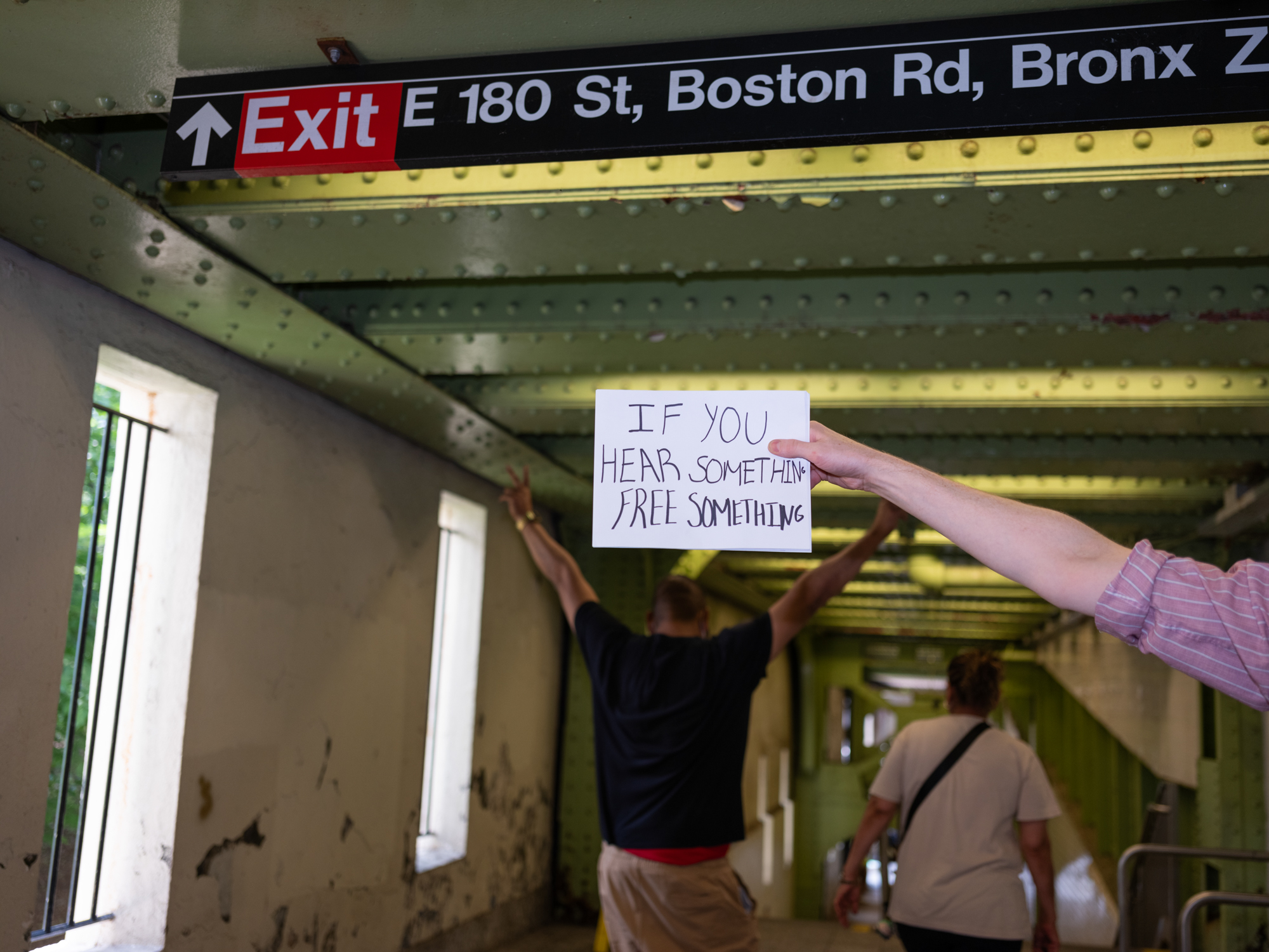
Early on, Chloe gave me direction that went something like “what would it be like to feel held by a very loud sound.” I’m not sure if I acheived this, or if graphic design can, but eventually I found a way to inhabit the ethos of the project.
Somewhere between chance and necesity I let go of authorship began to think in a more civic-minded mode of collective production. This was expressed by inviting others (anyone, really) into the process of creating the look and feel of the campaign.
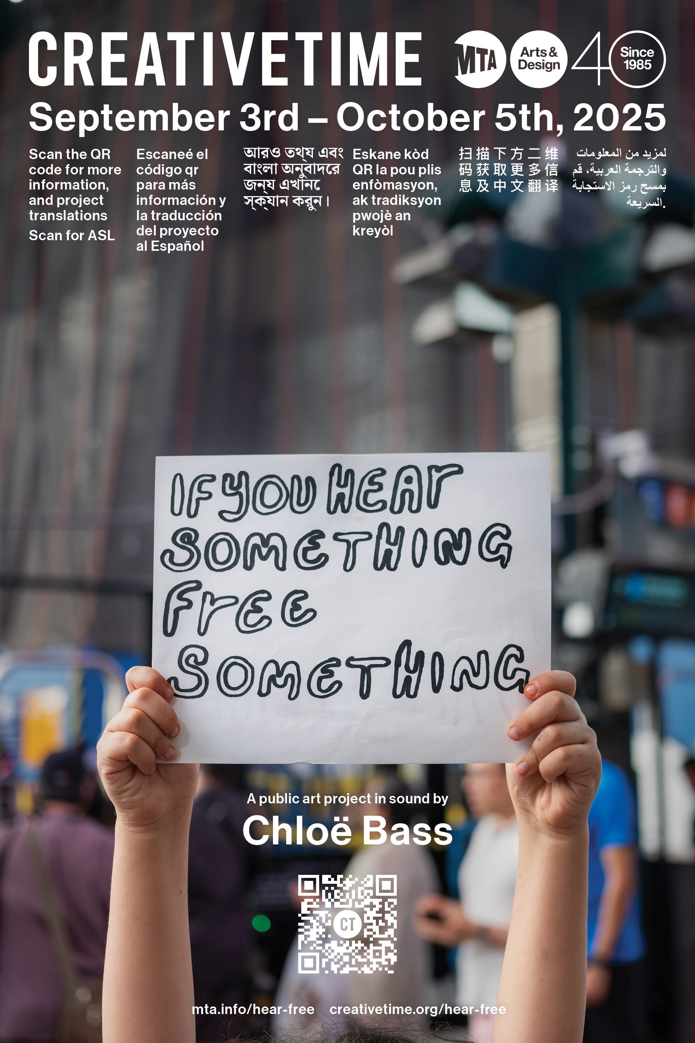

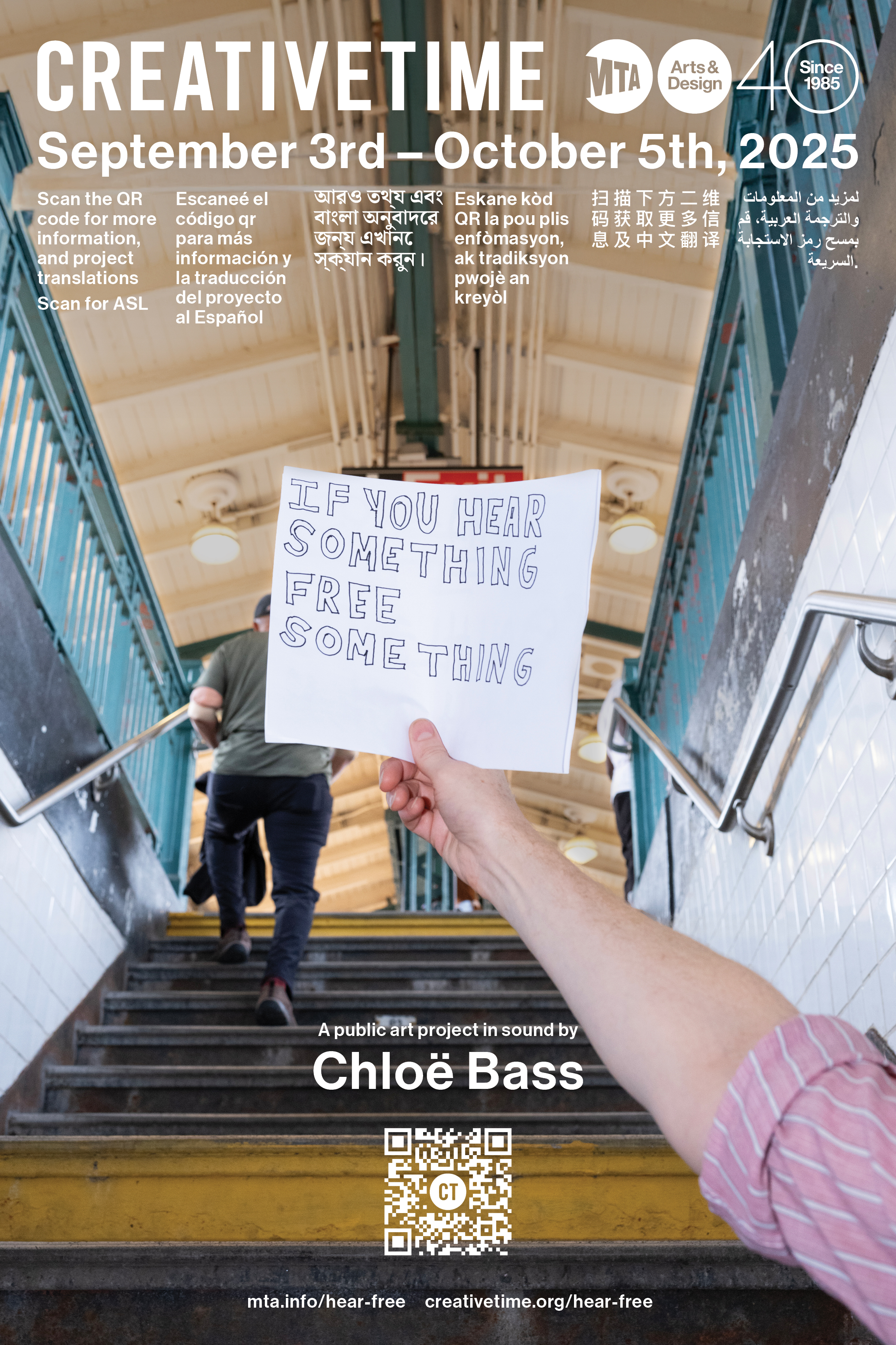


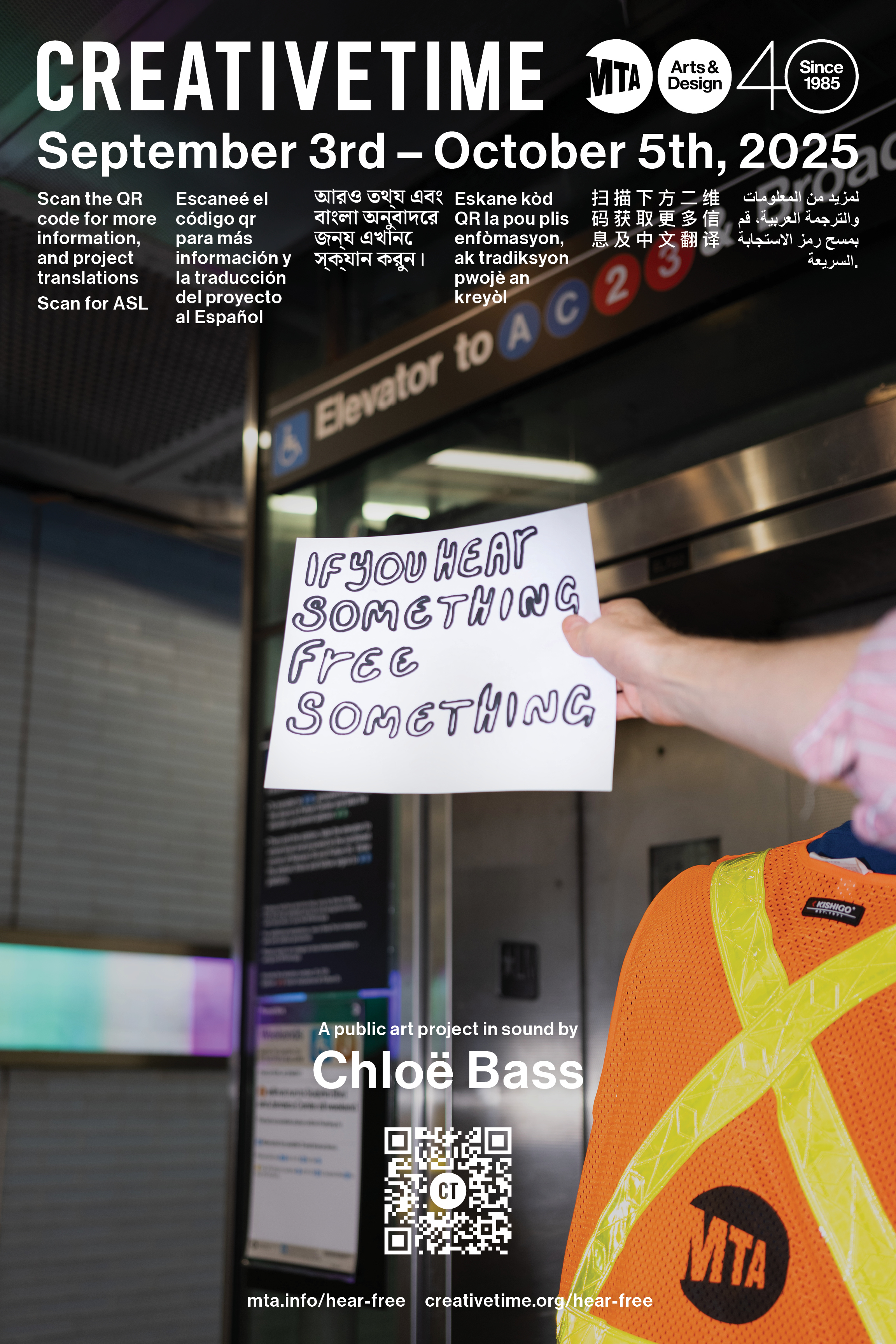
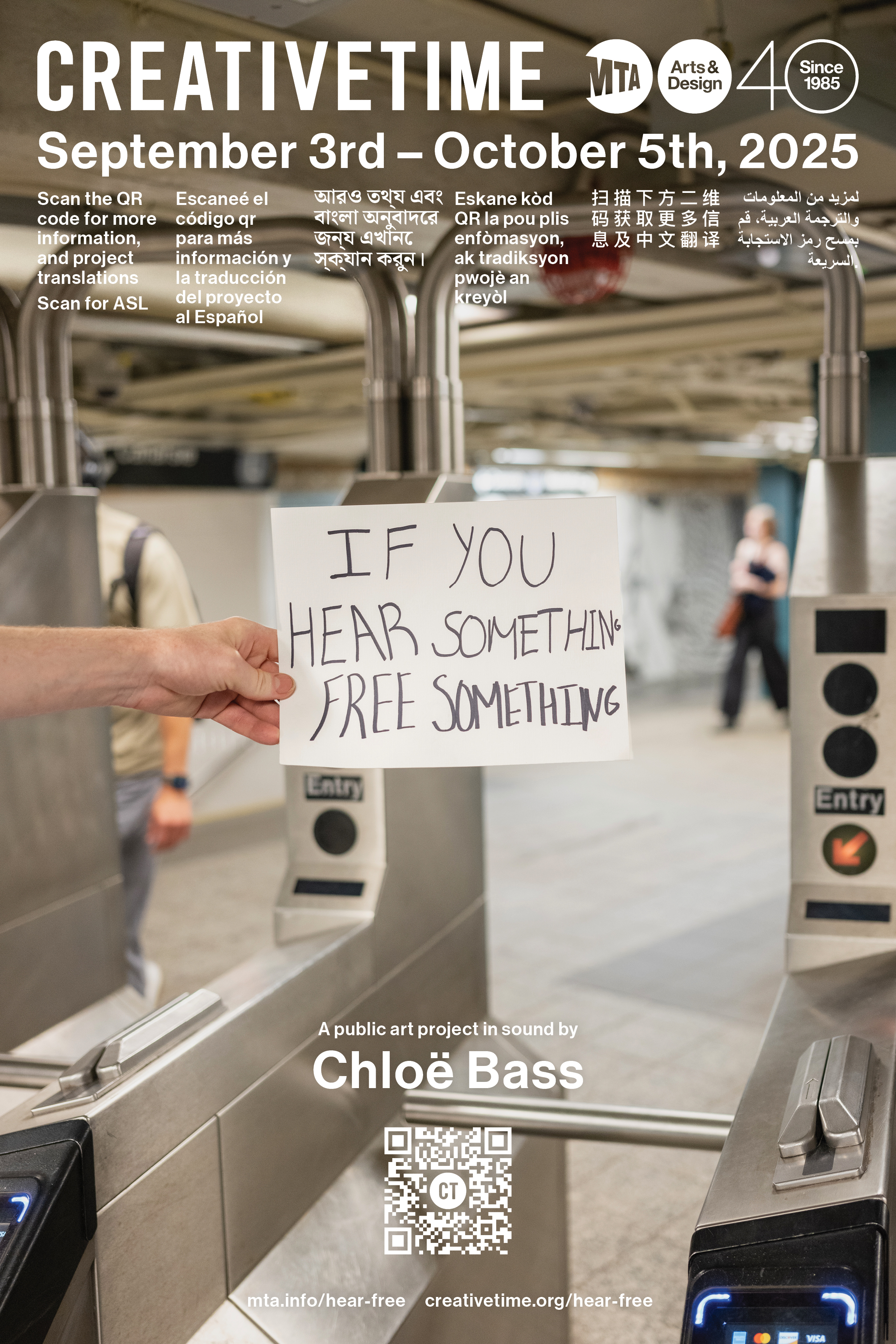

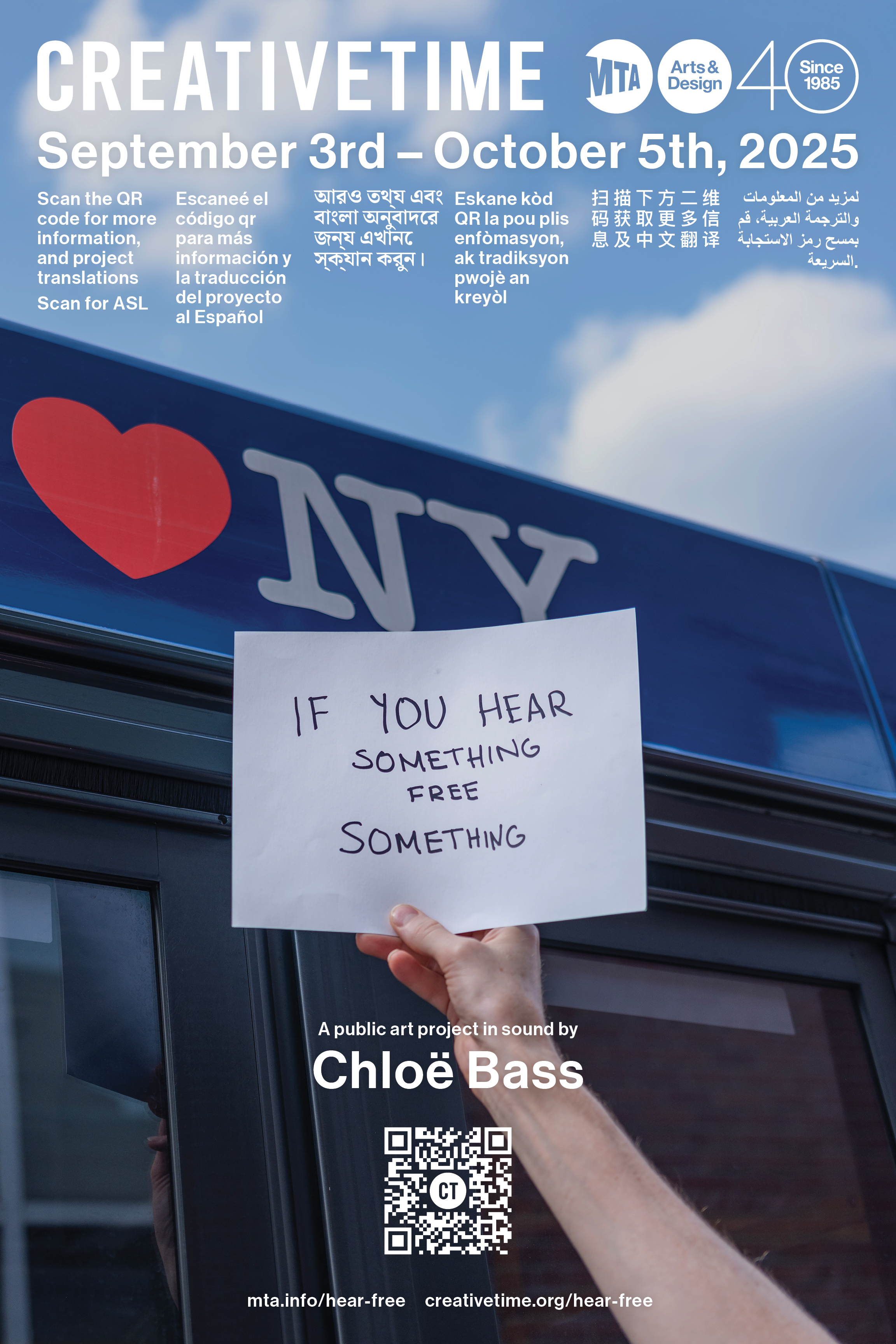

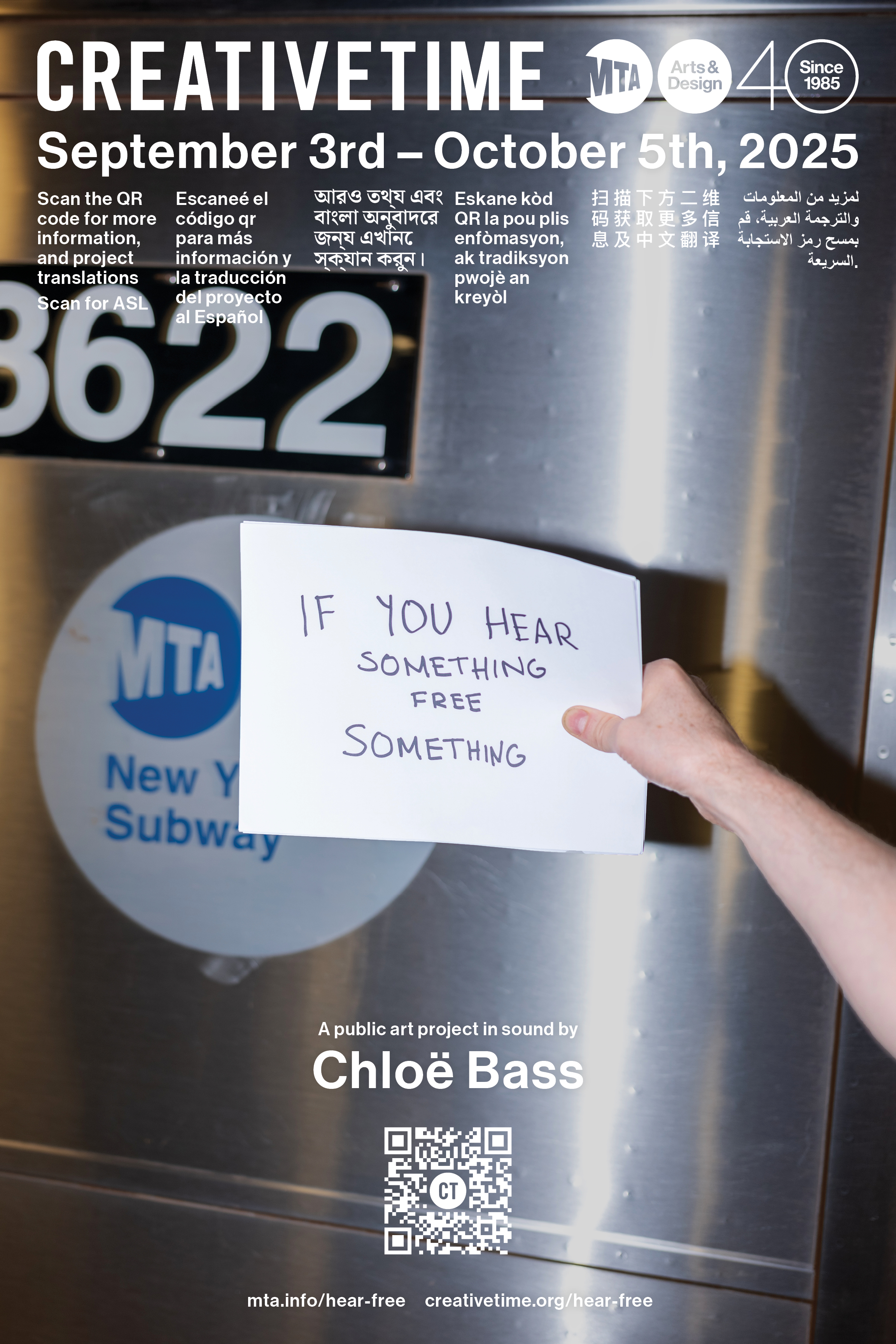


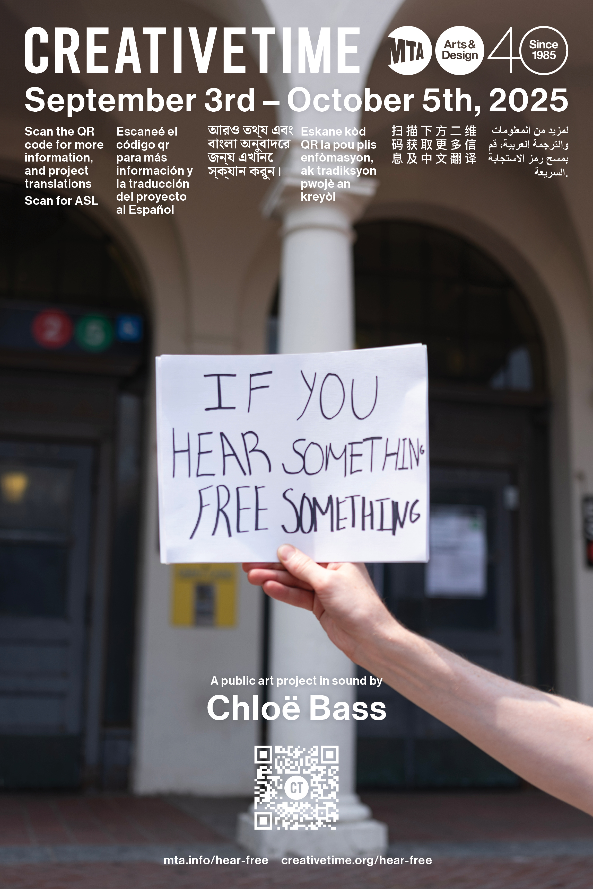
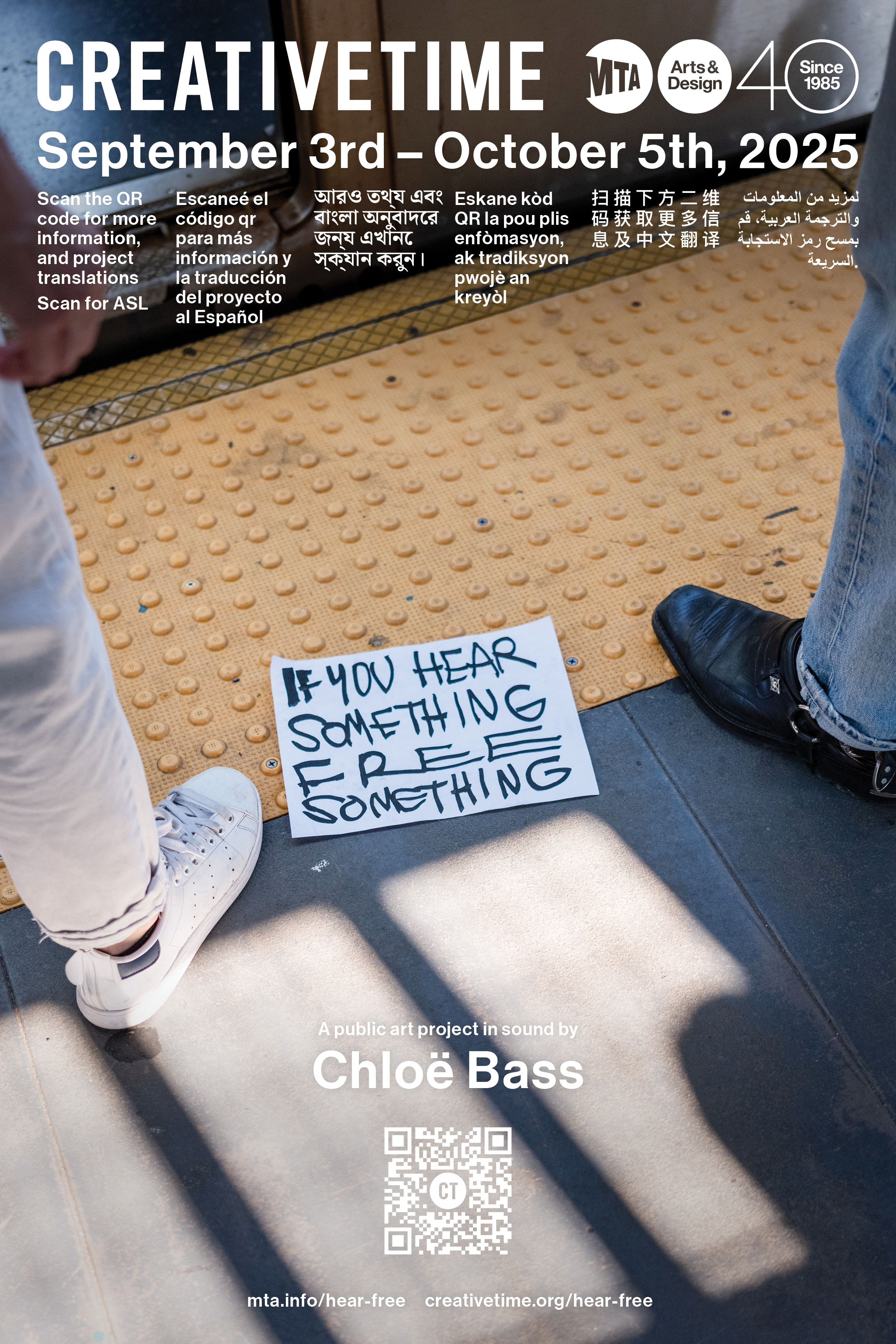

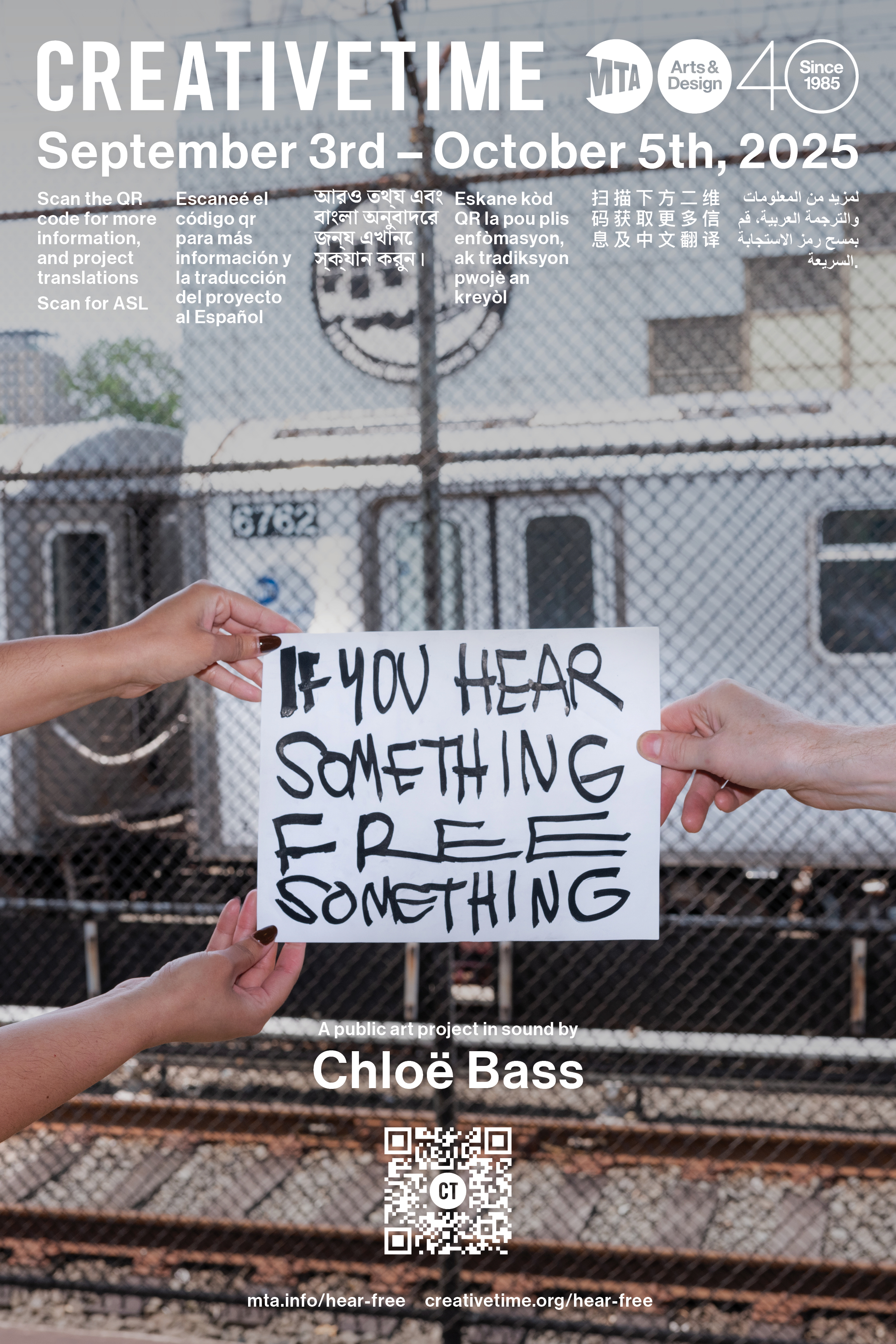
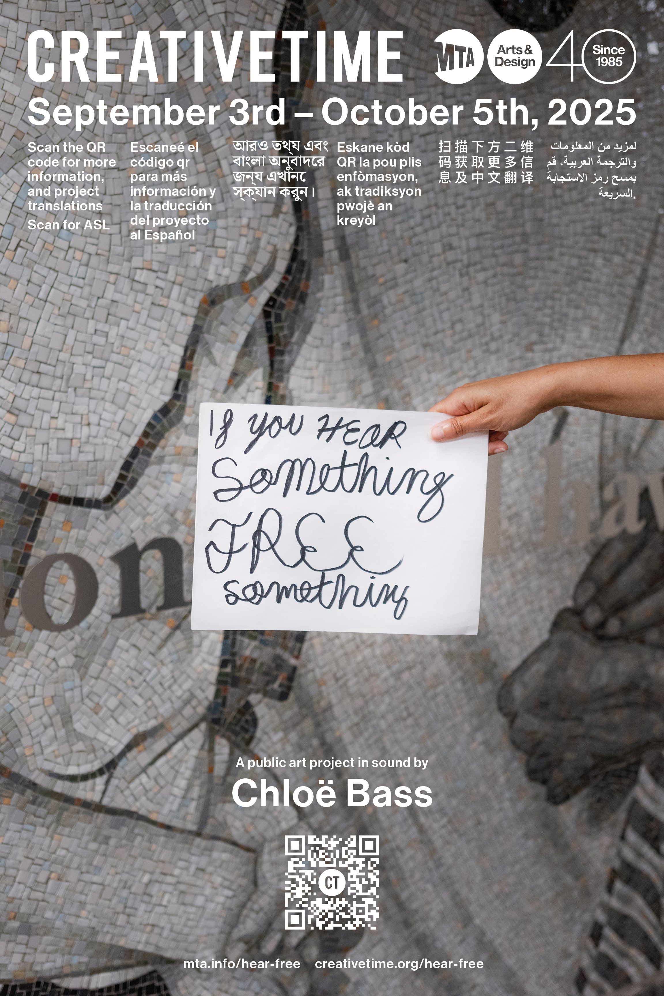


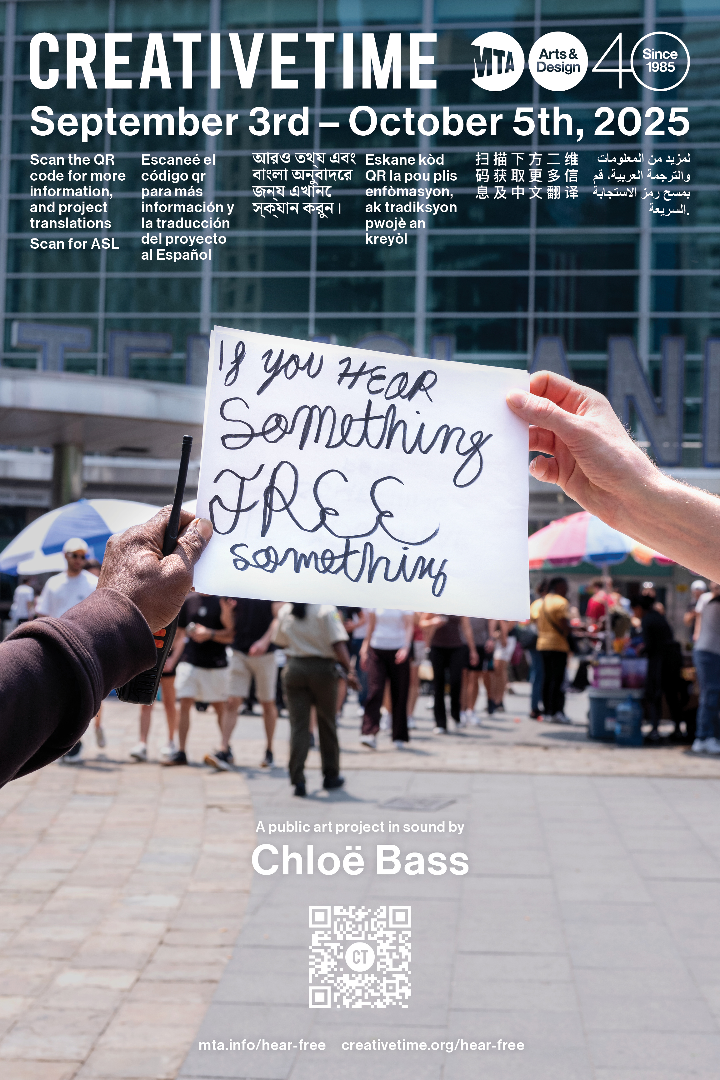
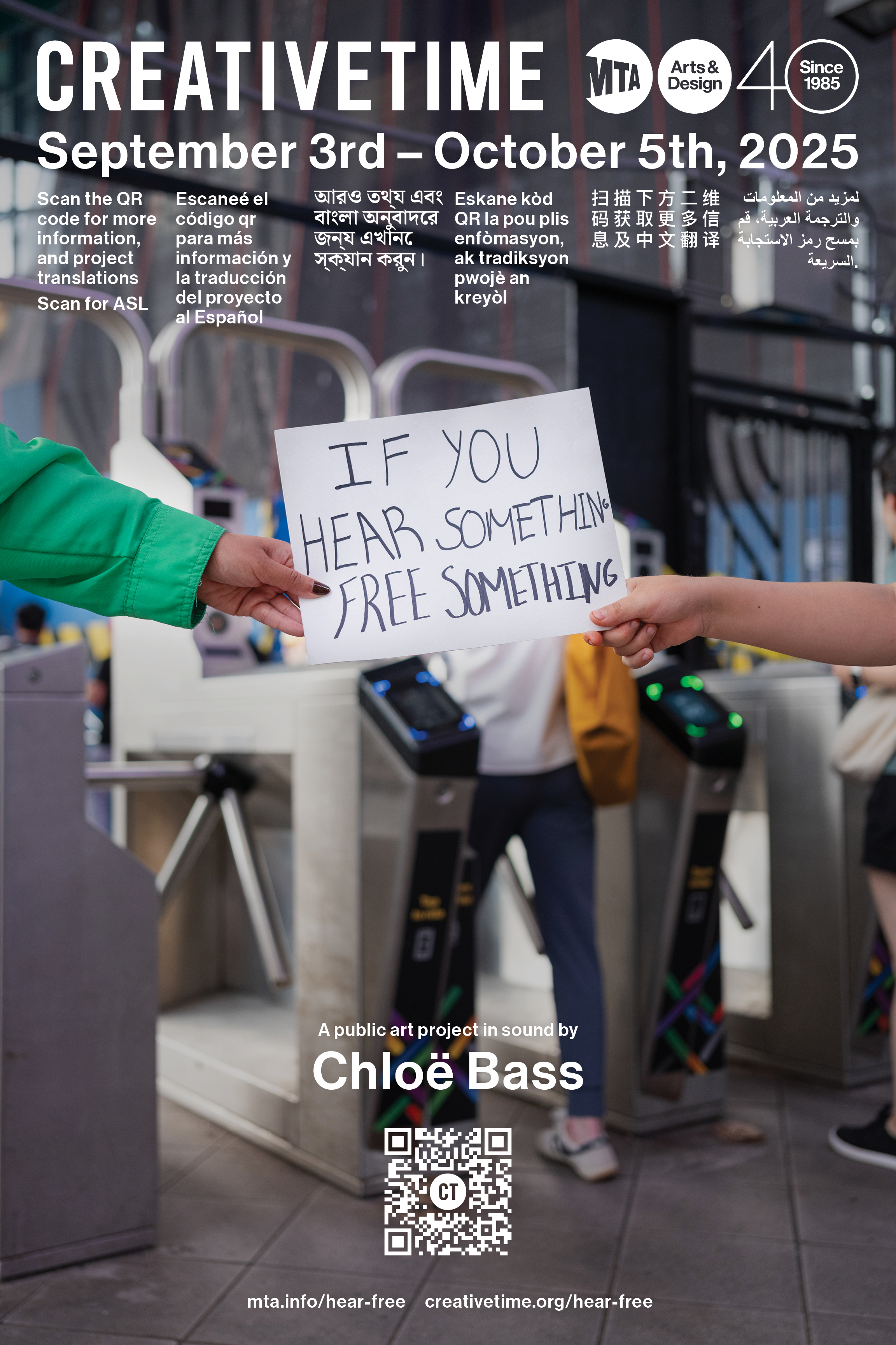
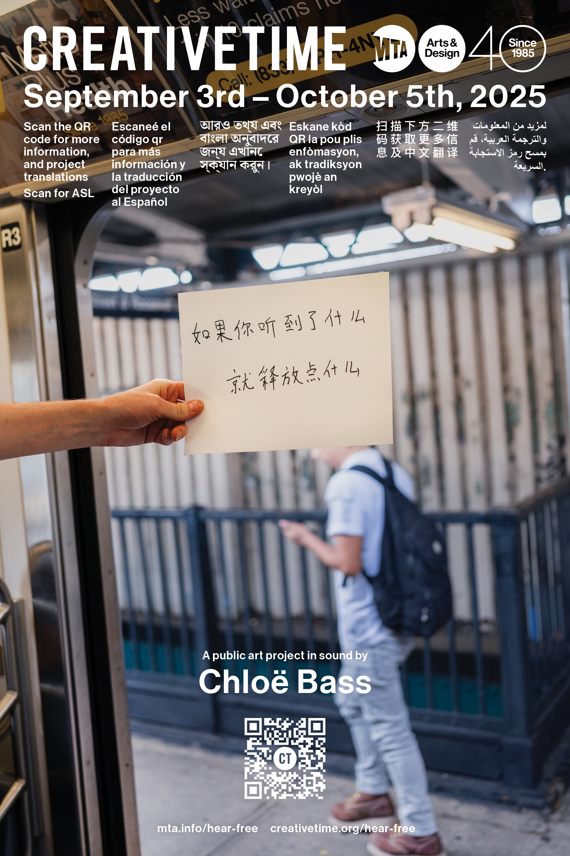


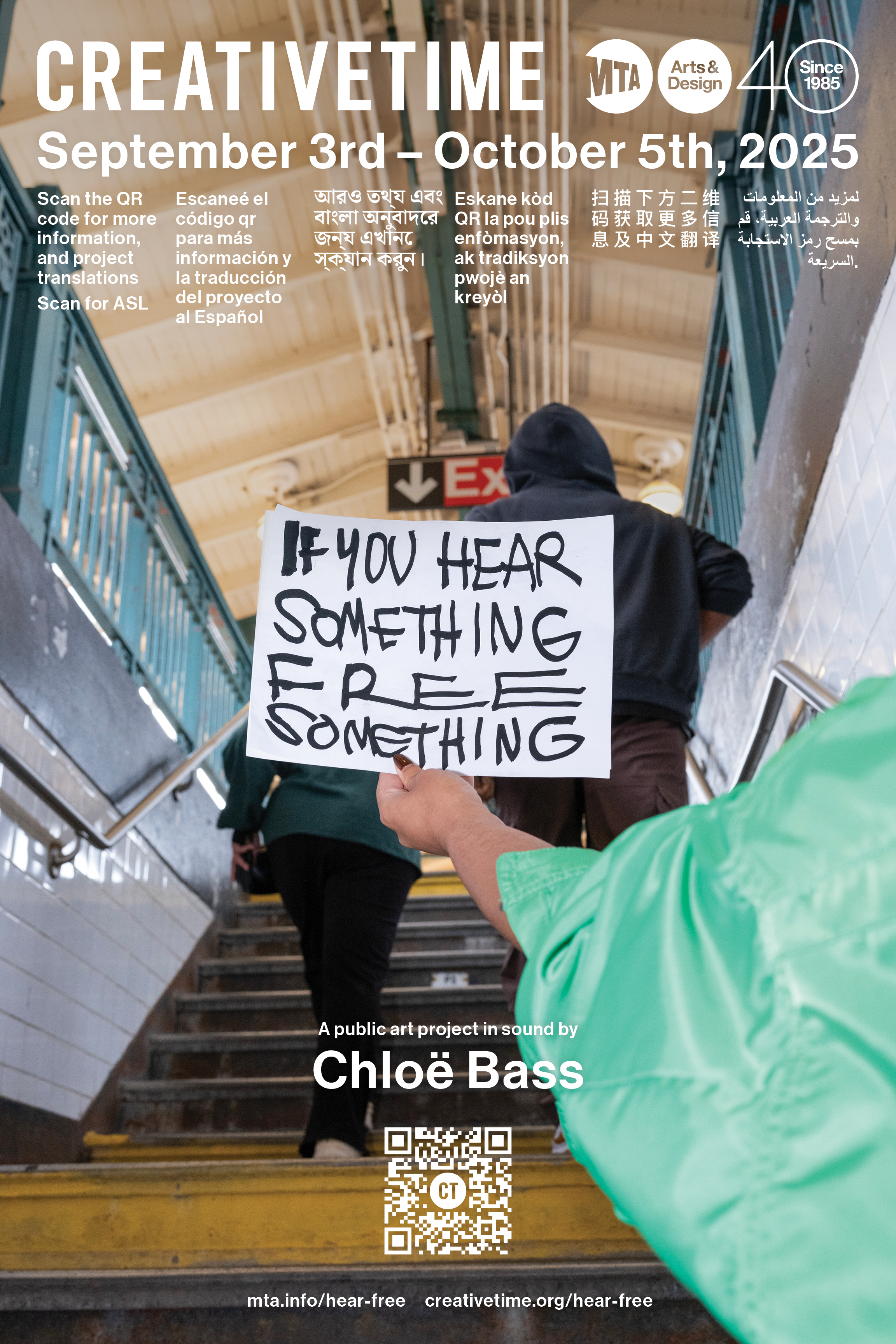

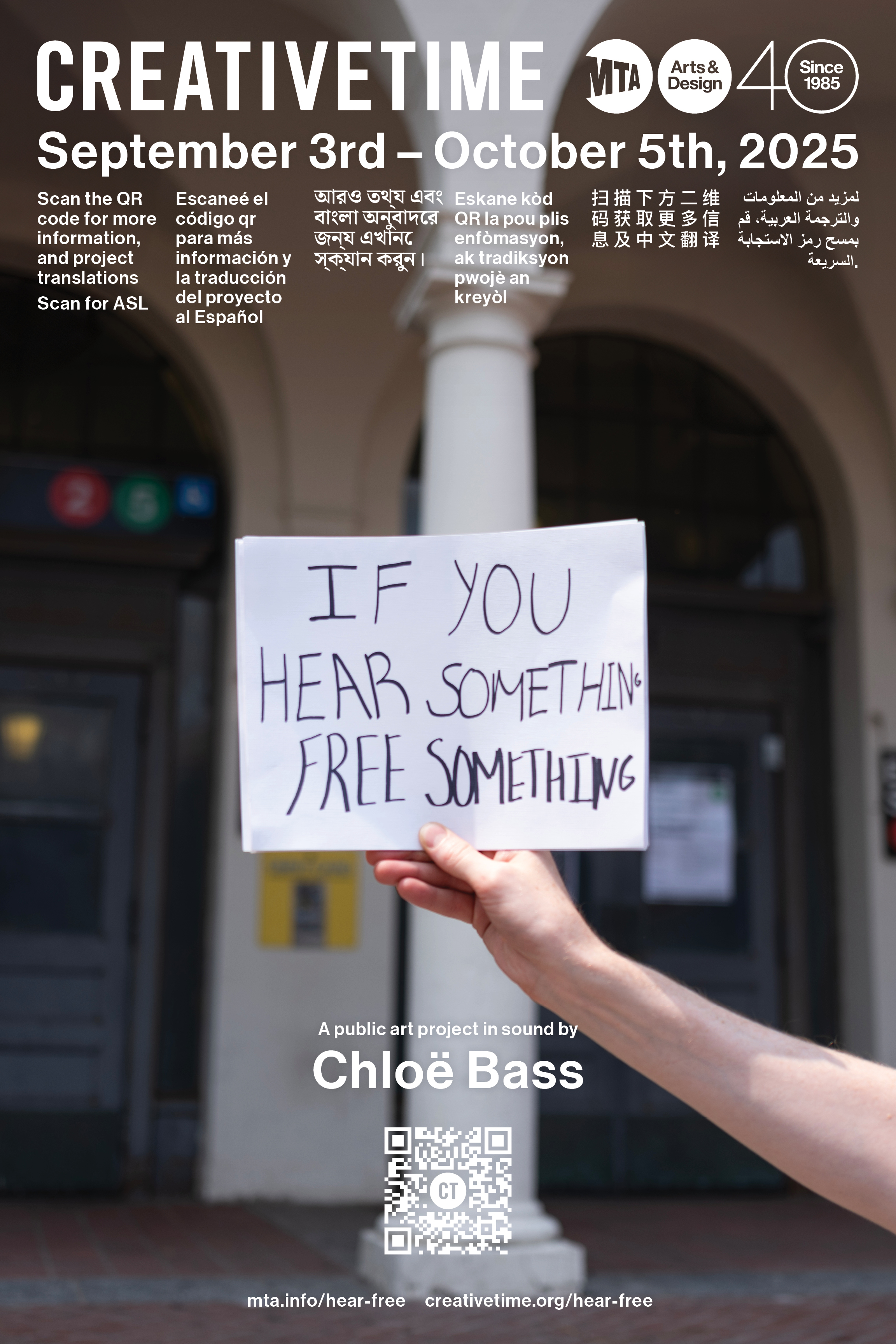
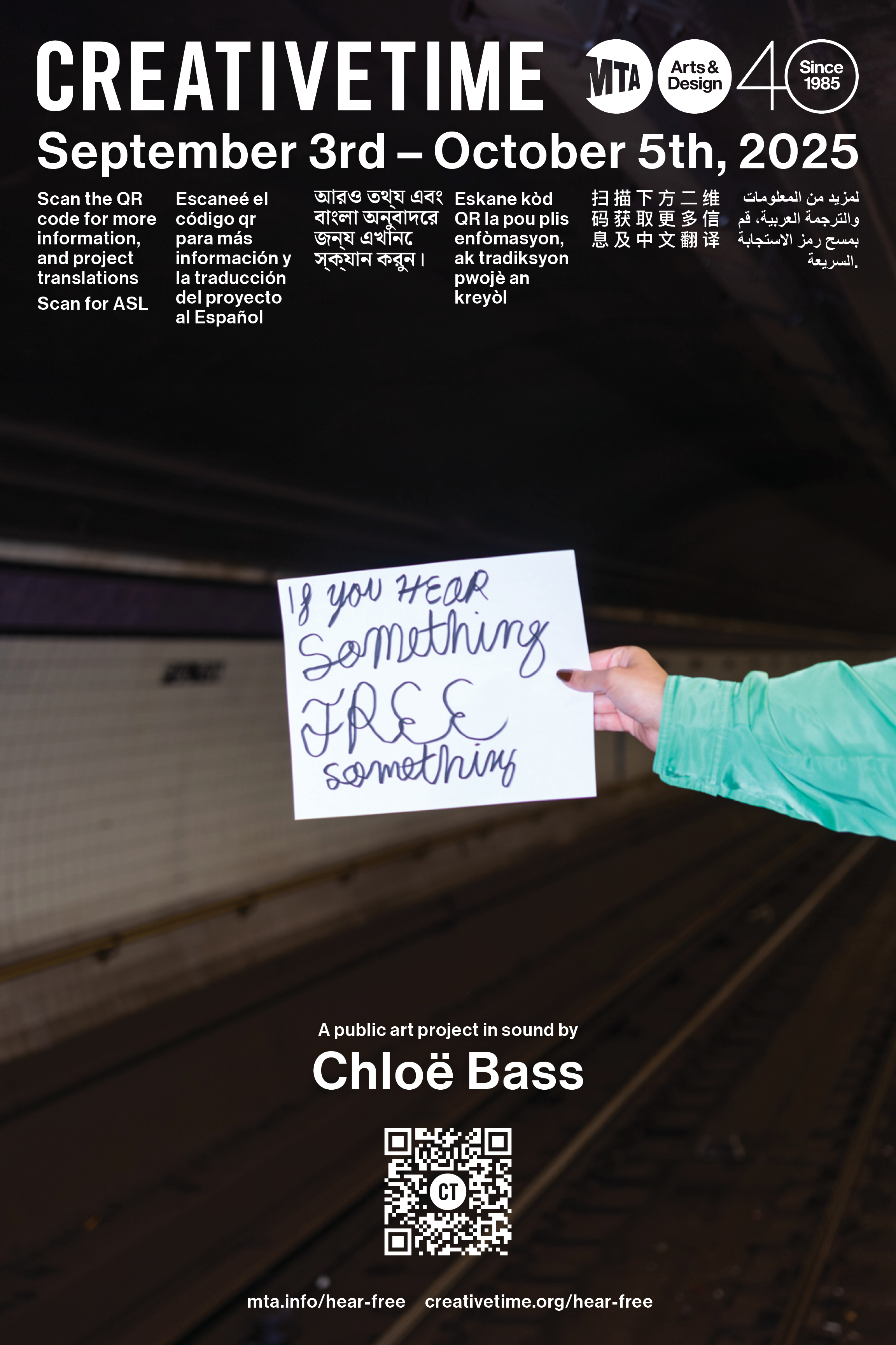
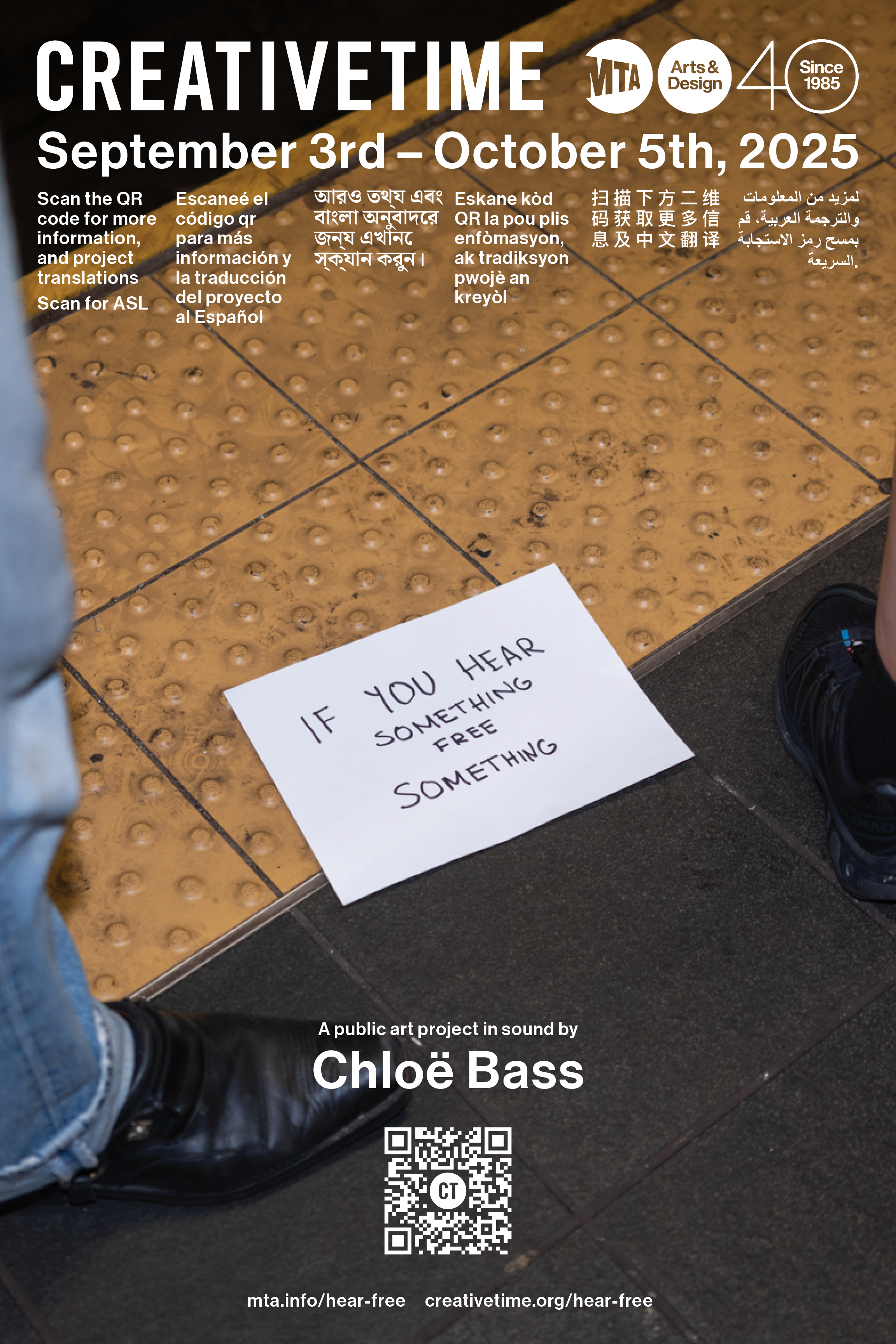
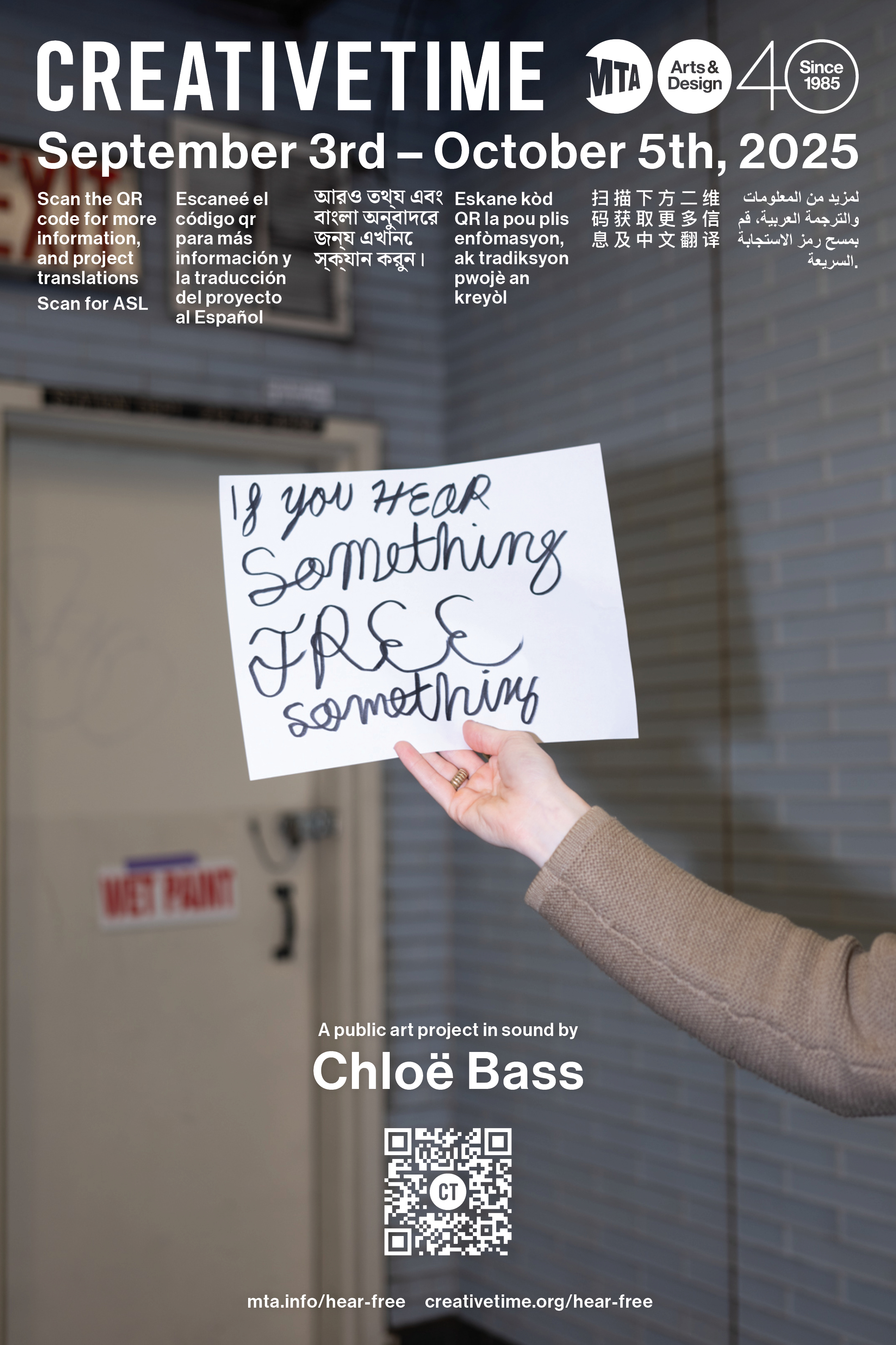
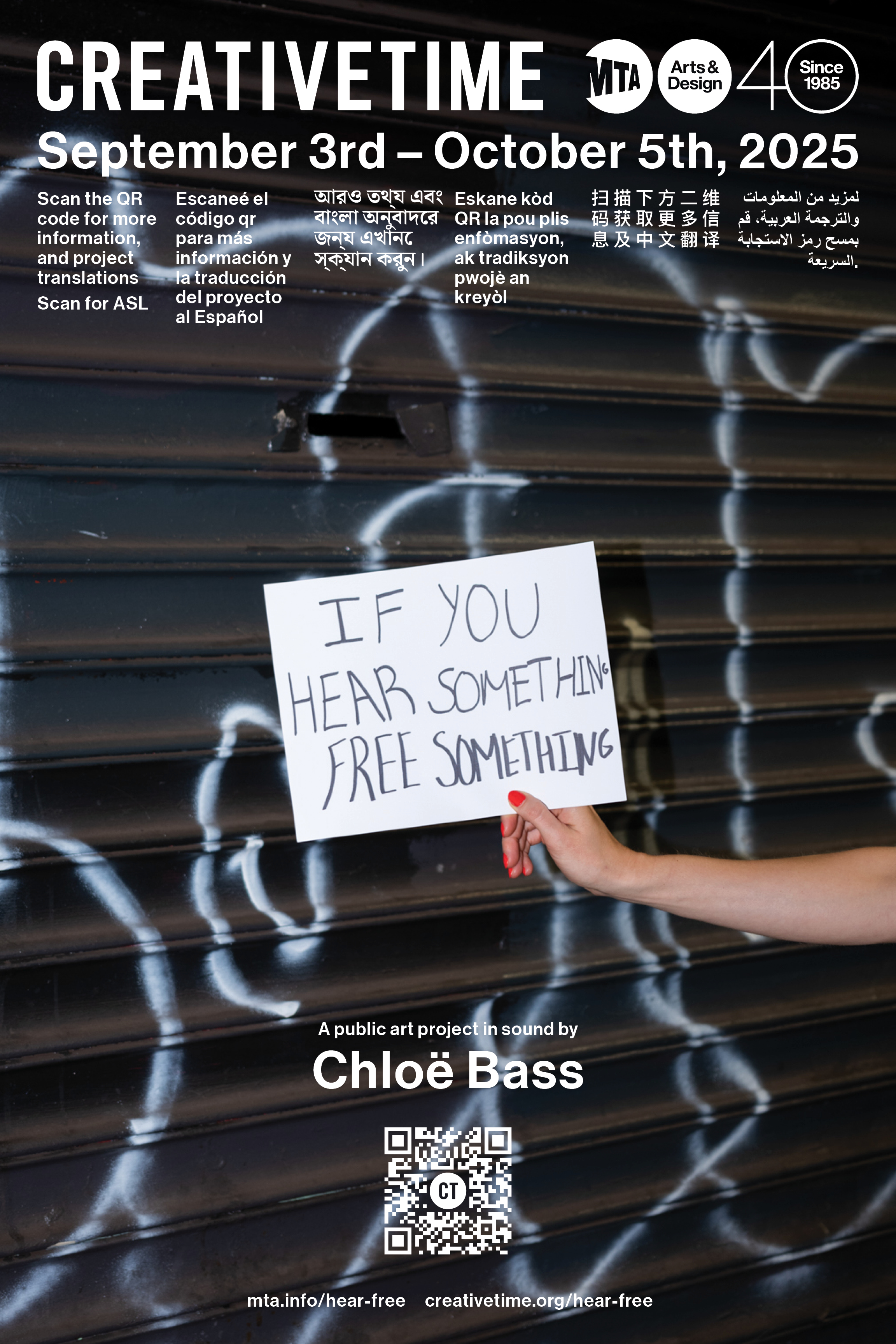

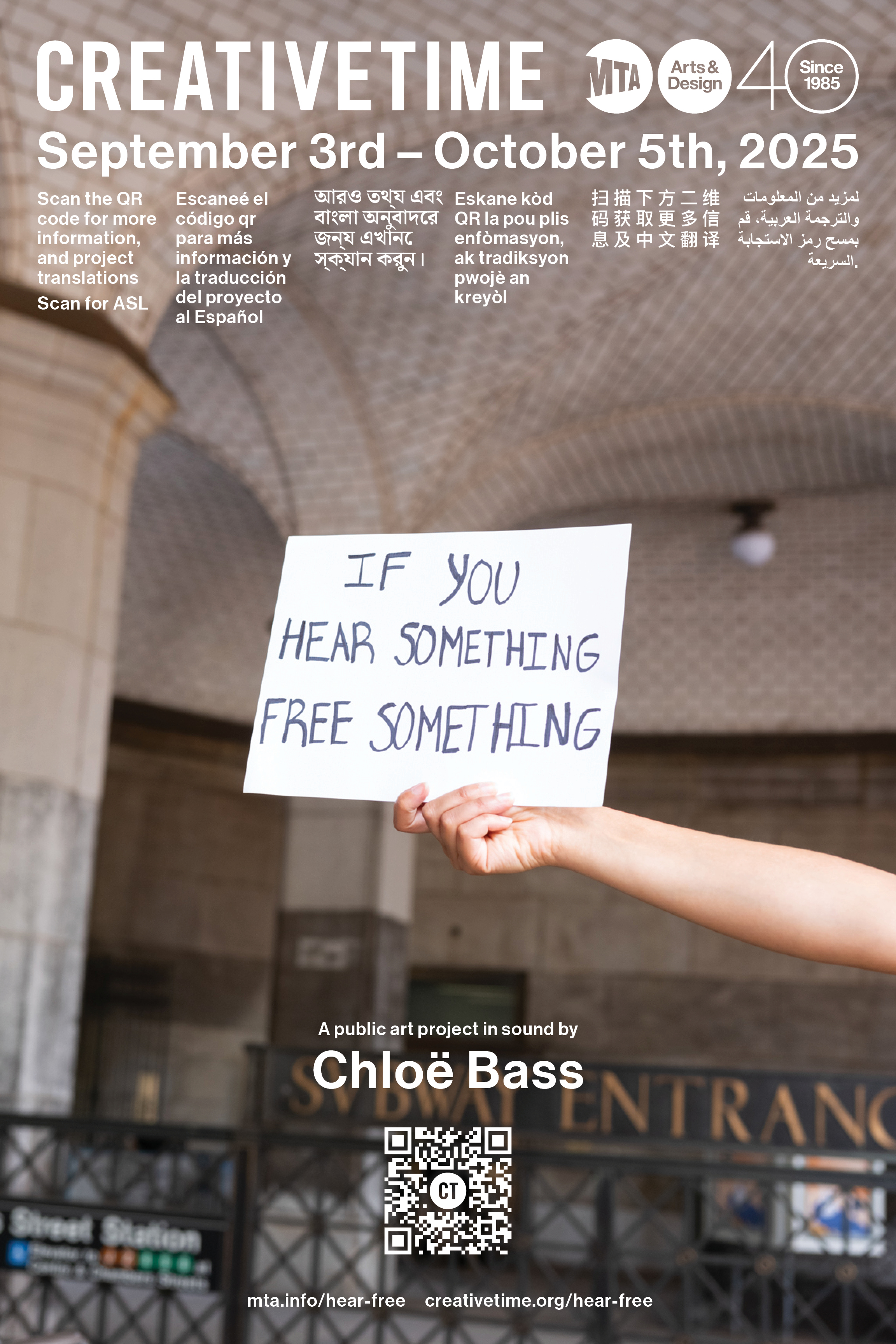
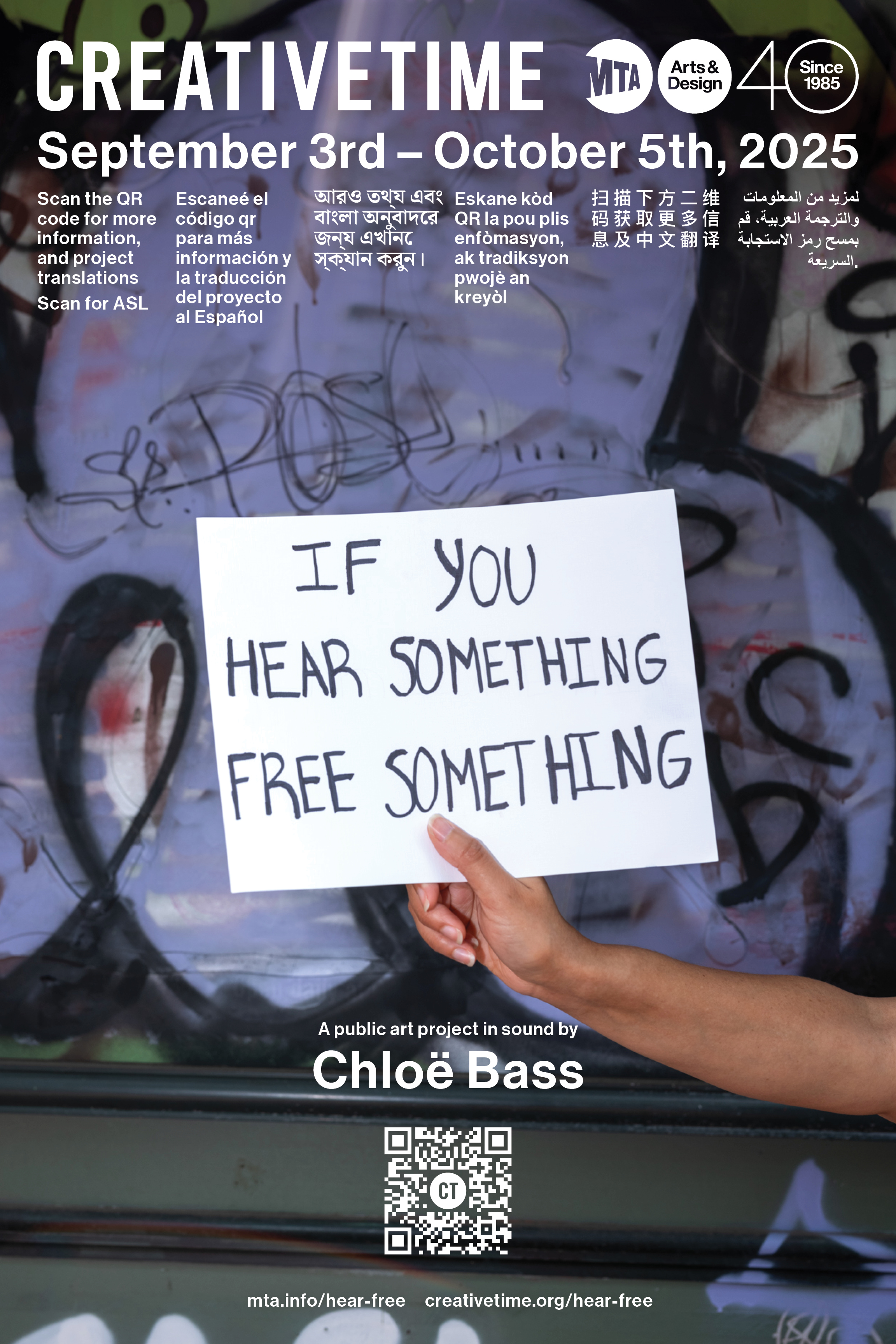
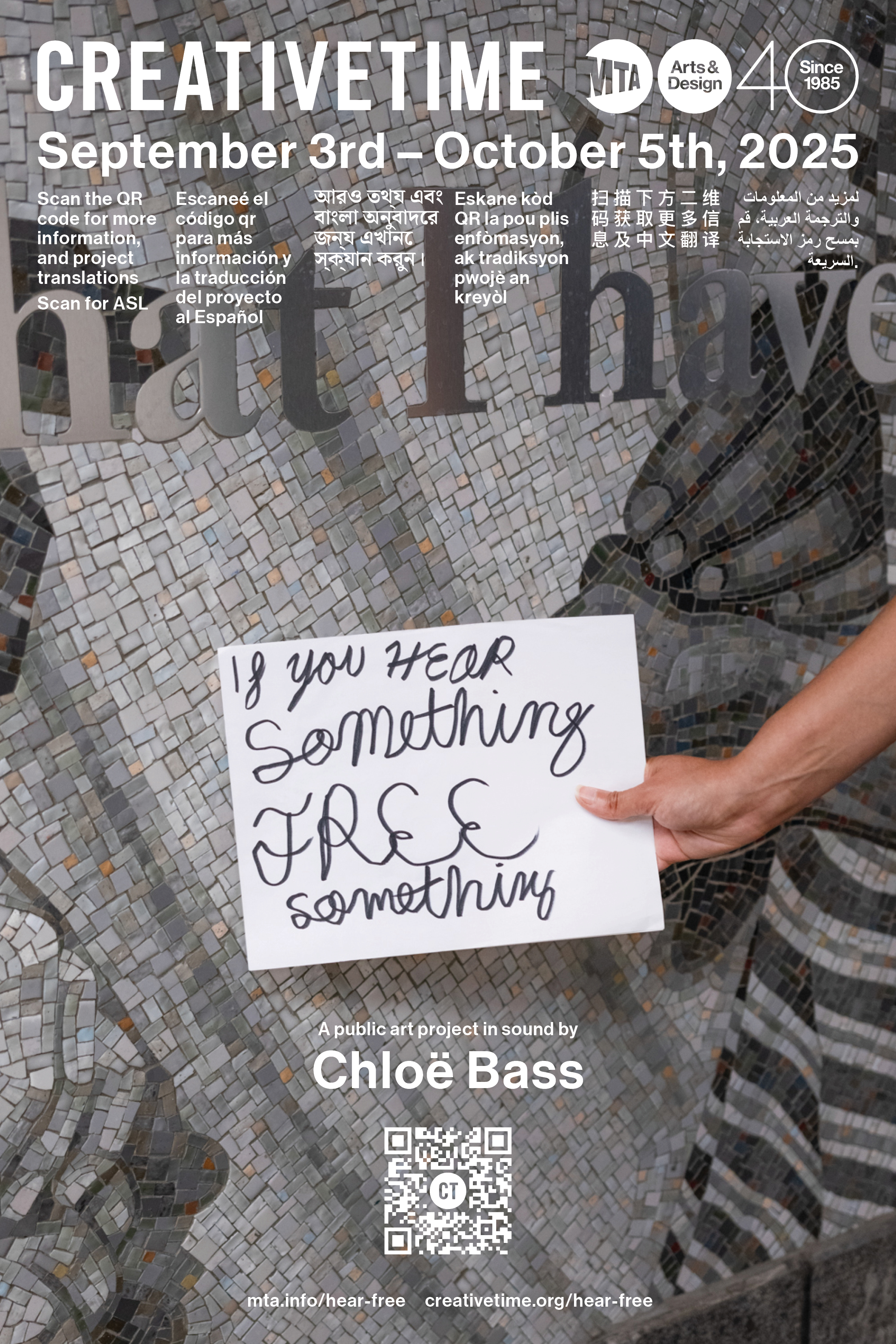
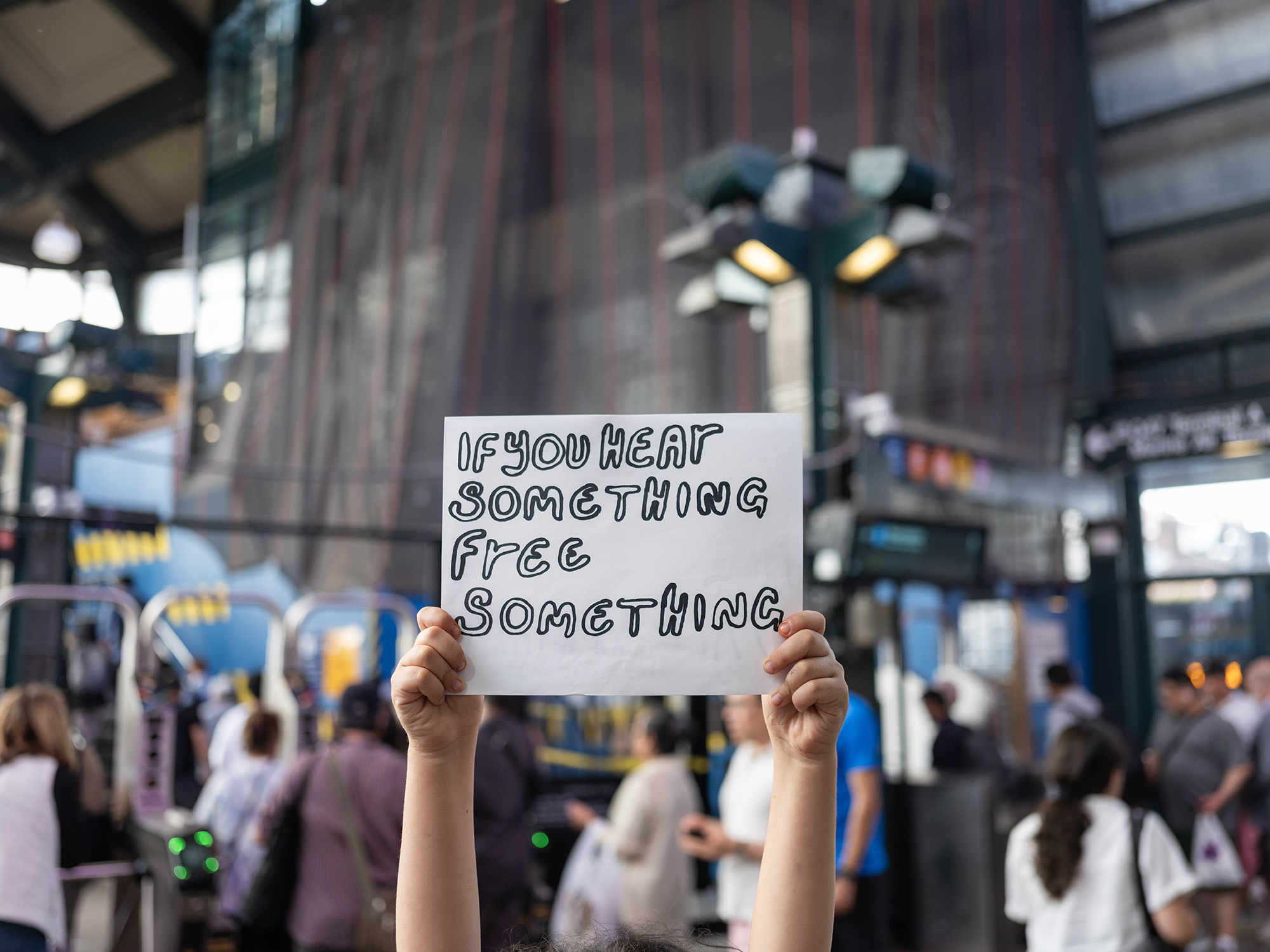
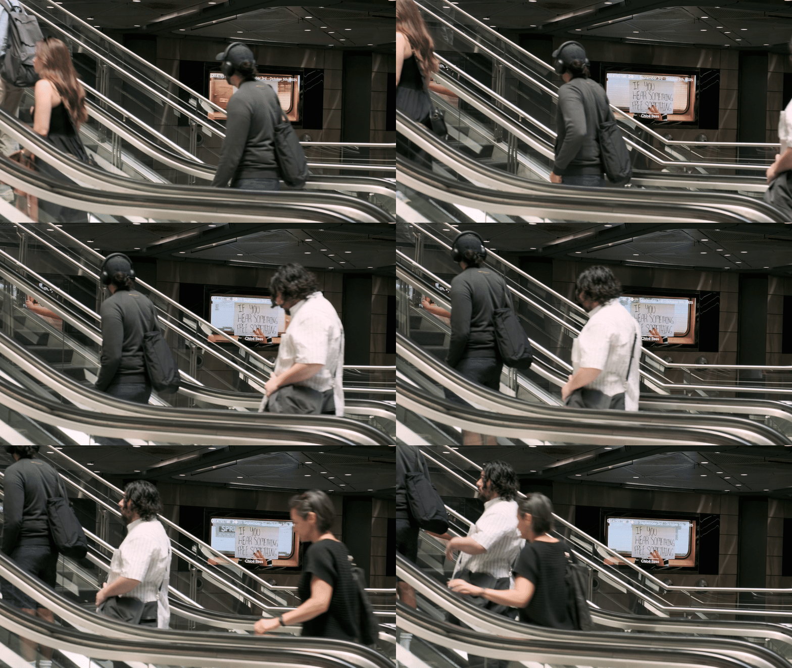
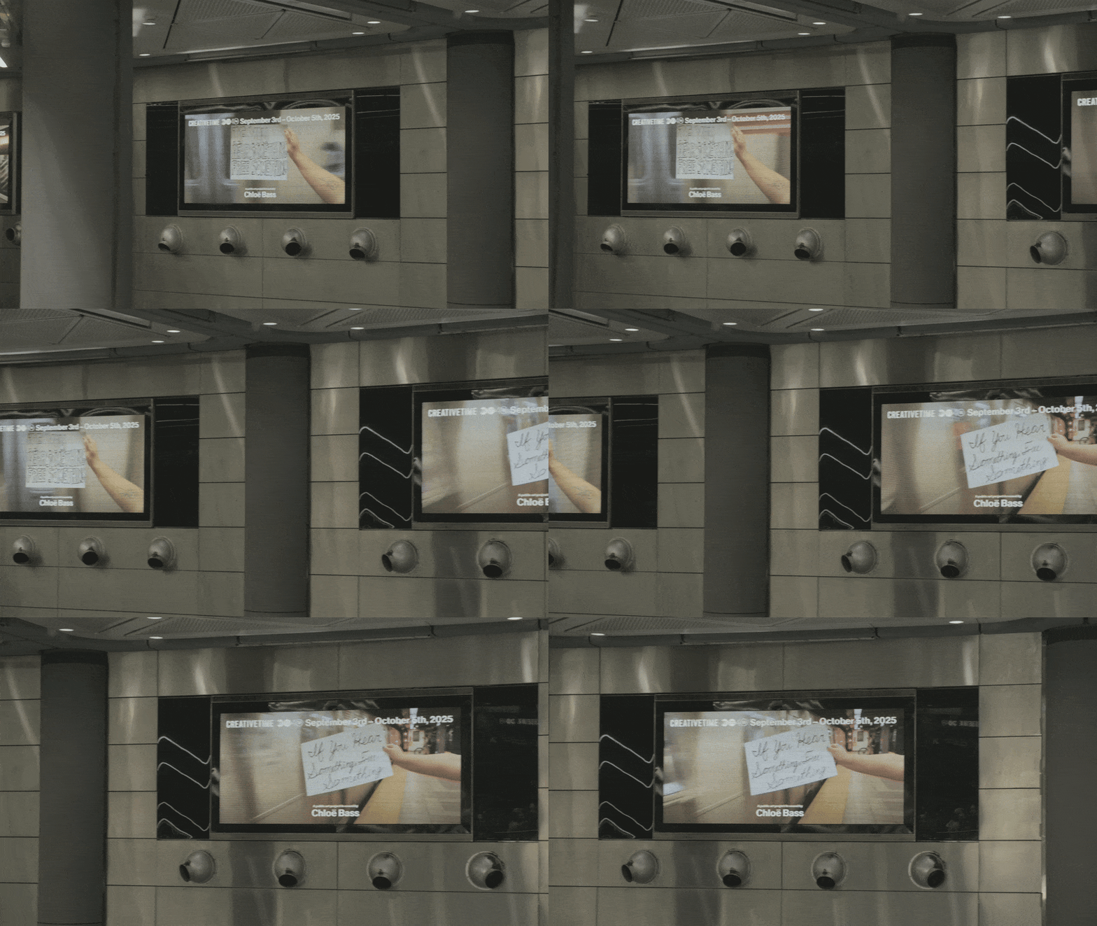
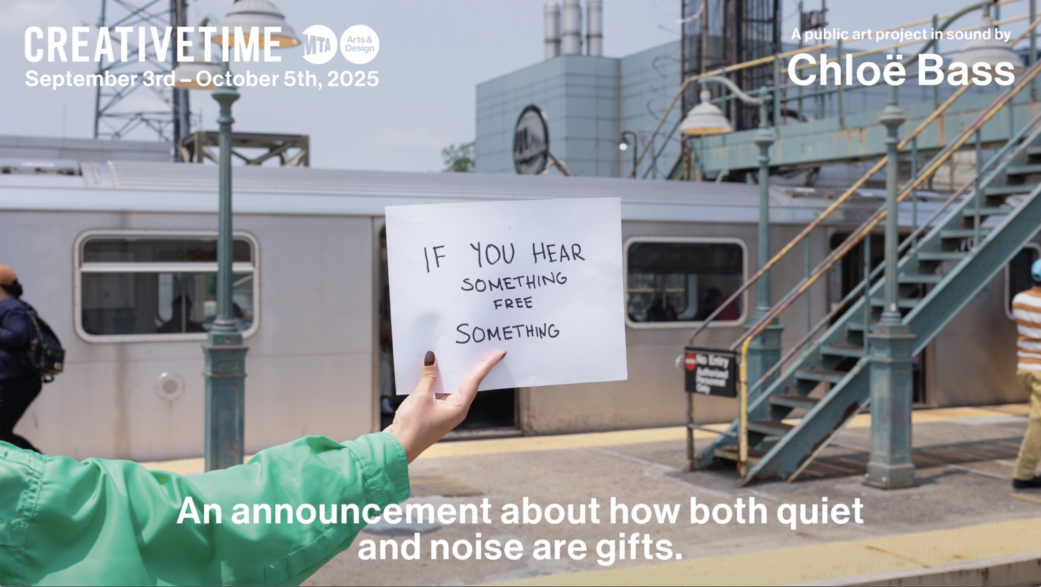
The resulting feature the project title written in black sharpie on bond paper by people with no formal design training. These signs were then inserted into image shot across the MTA by the hands of whoever was available and willing on site while shooting.
This gesture works on multiple levels. It refers to Chloe’s previous work, breaks the “4th wall” by bringing the public into the frame, and highlights the site specificity of public art work.
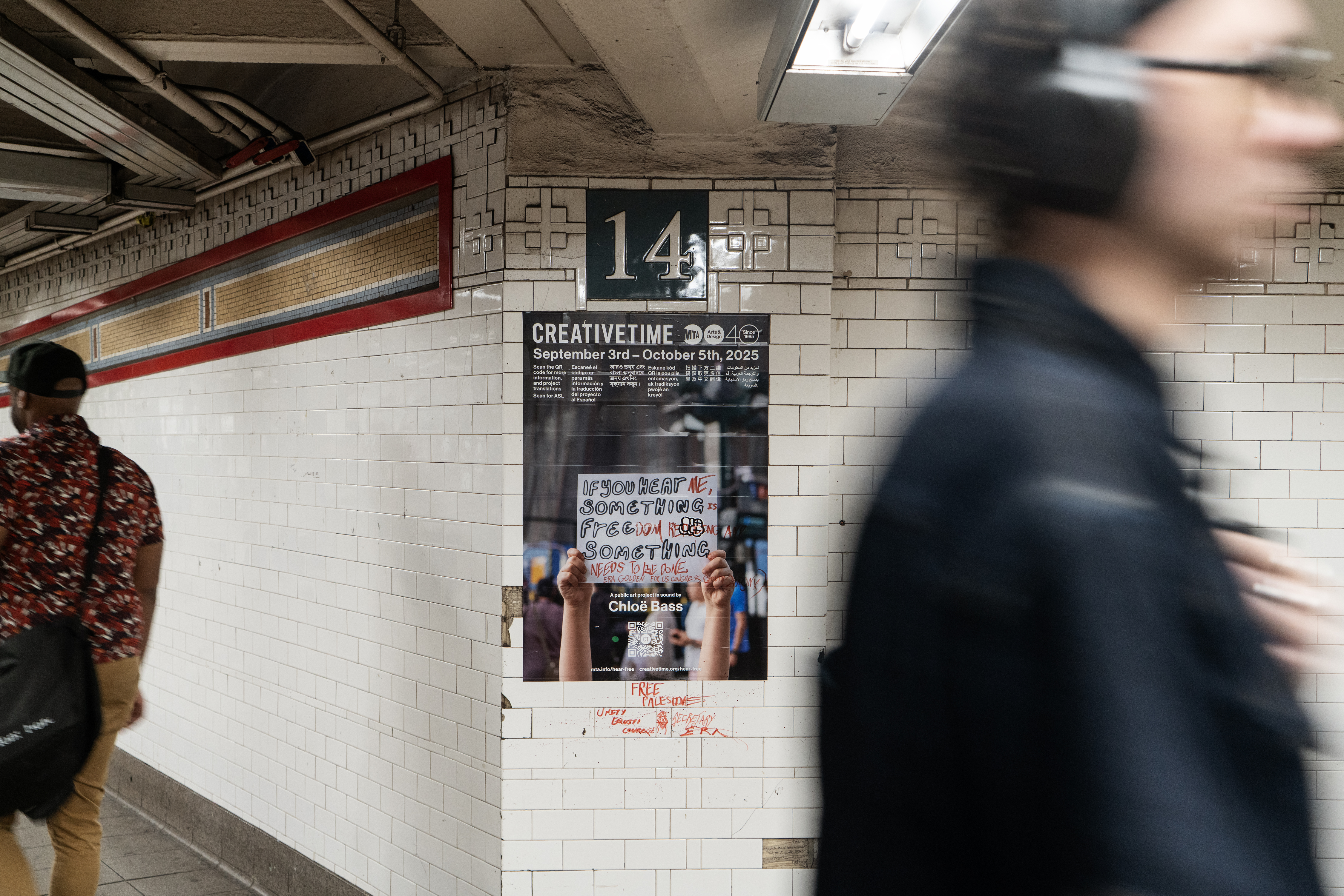

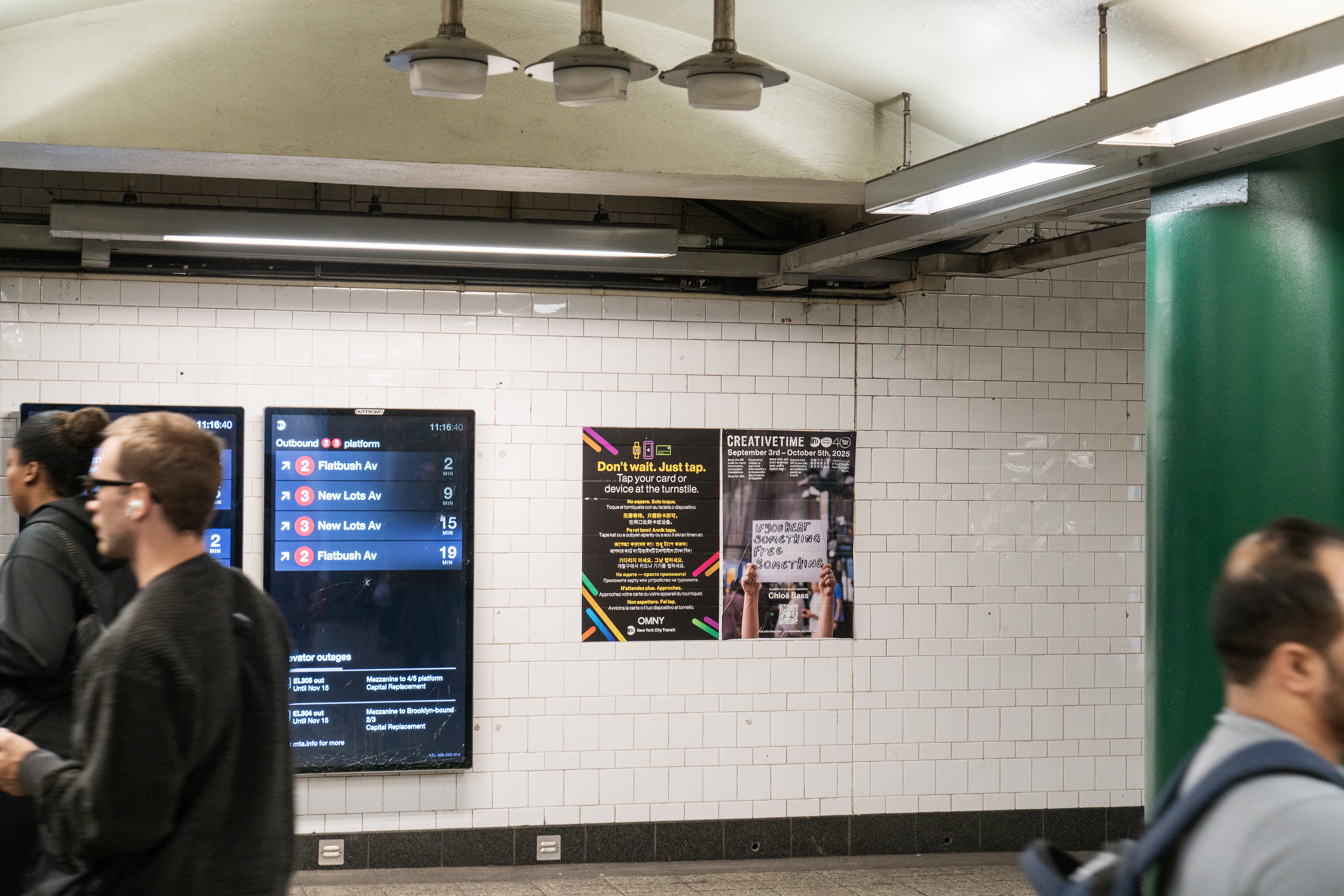
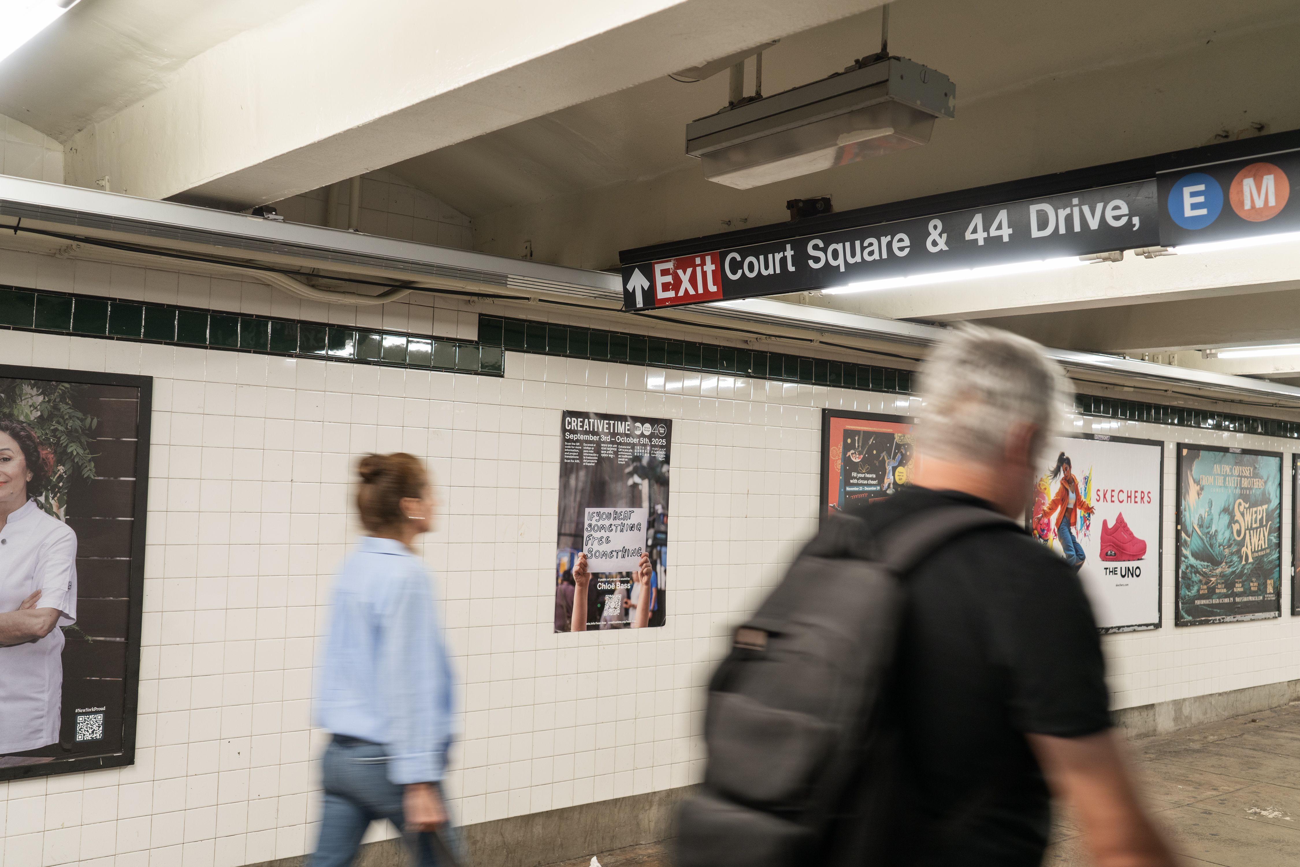

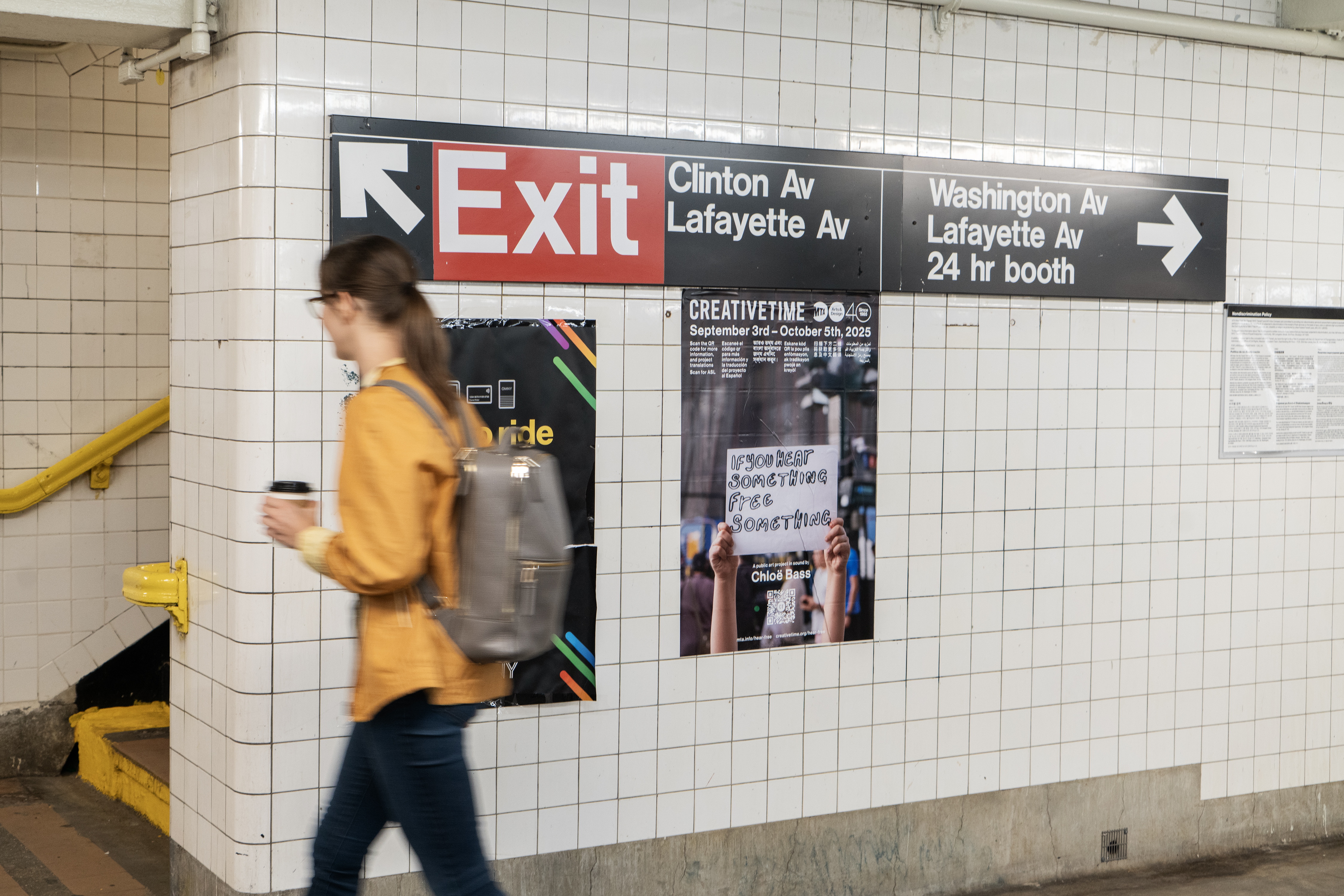
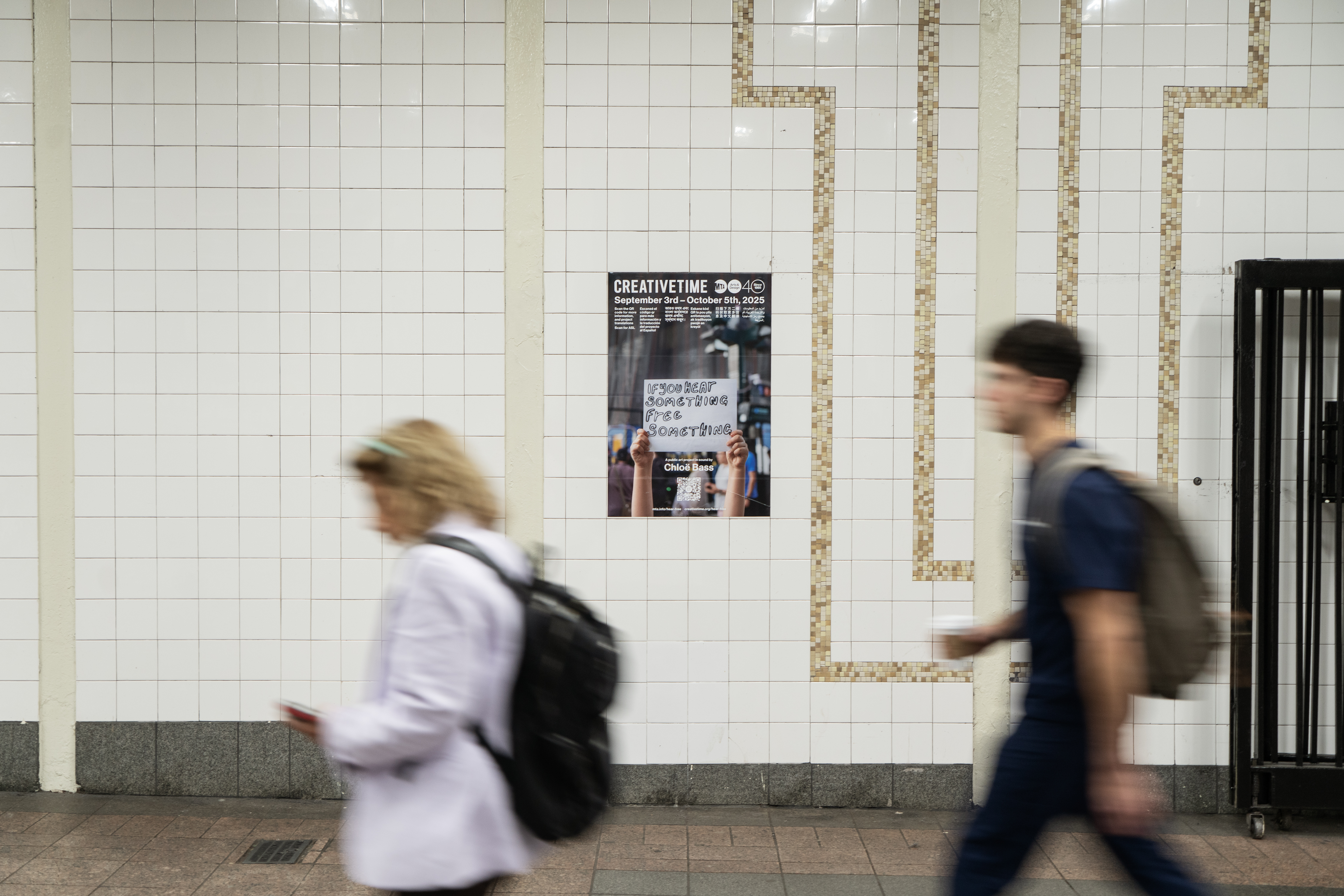
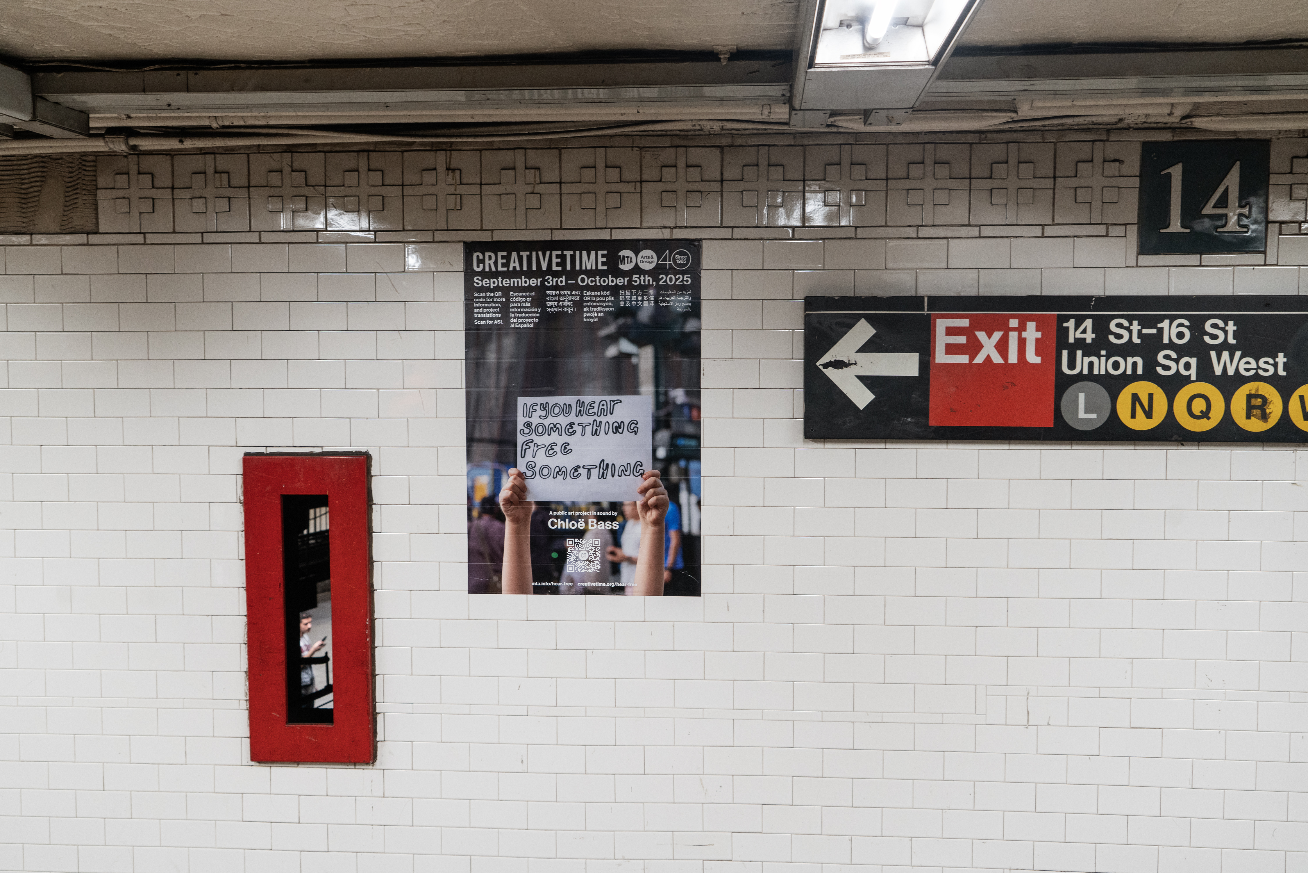
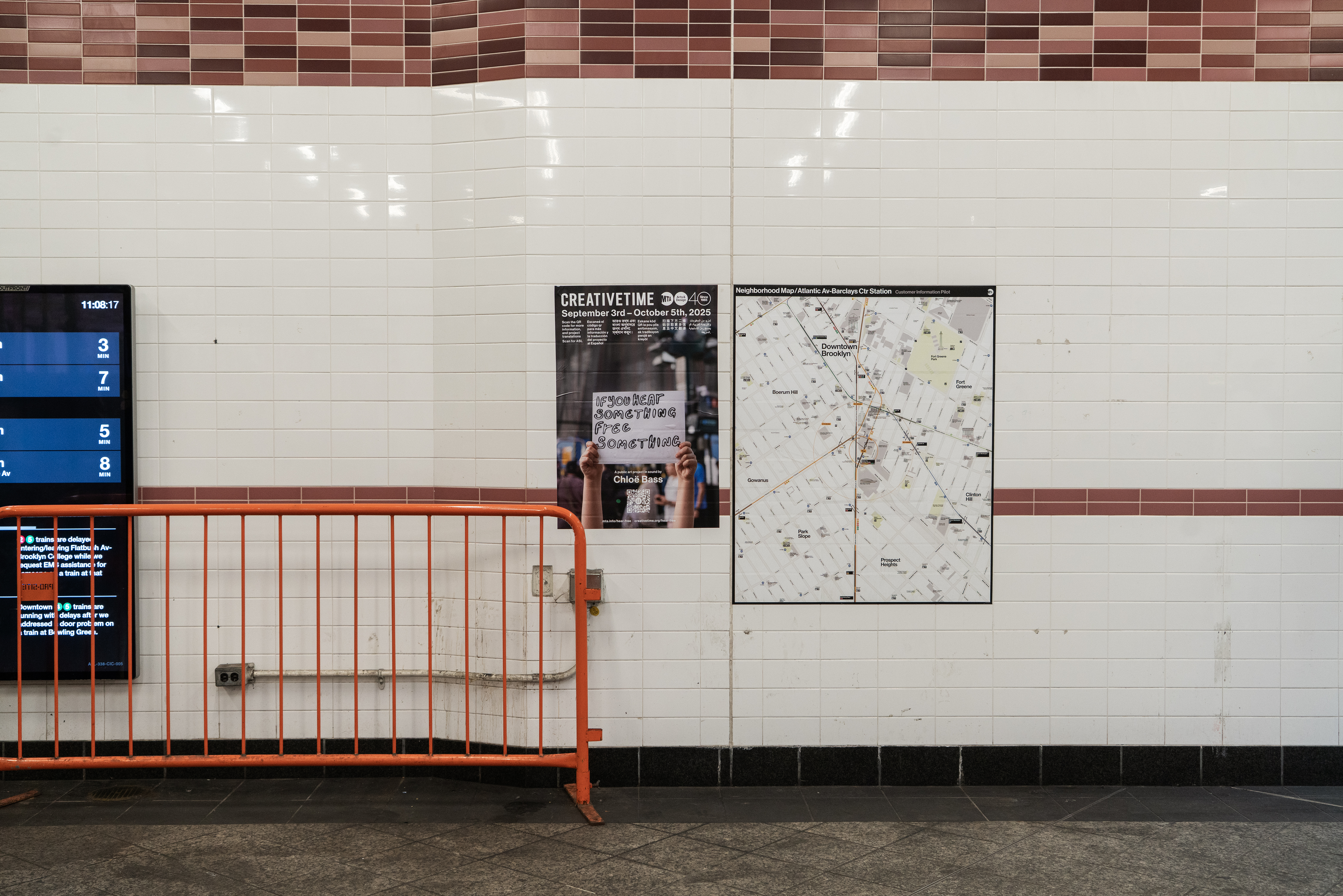
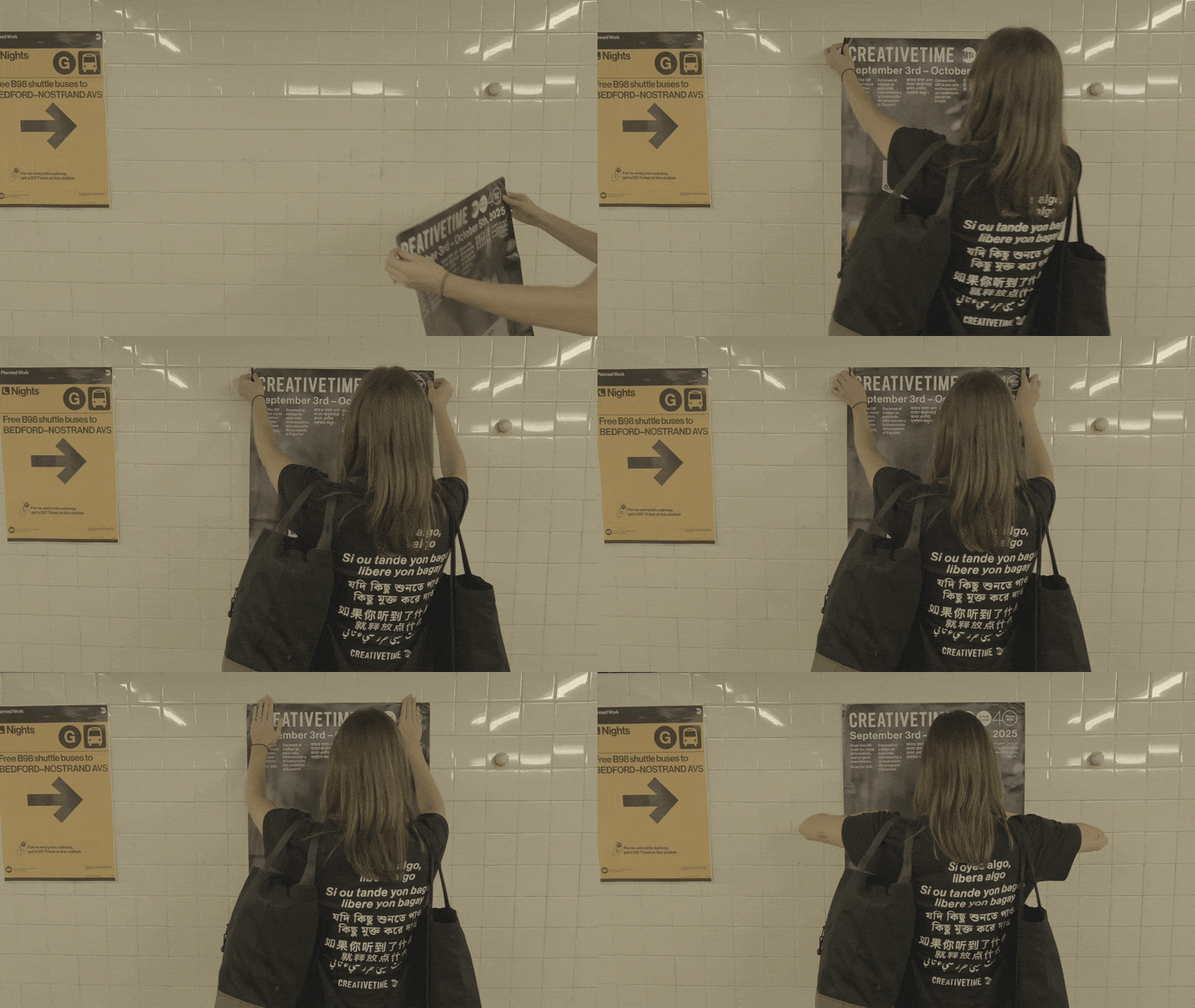
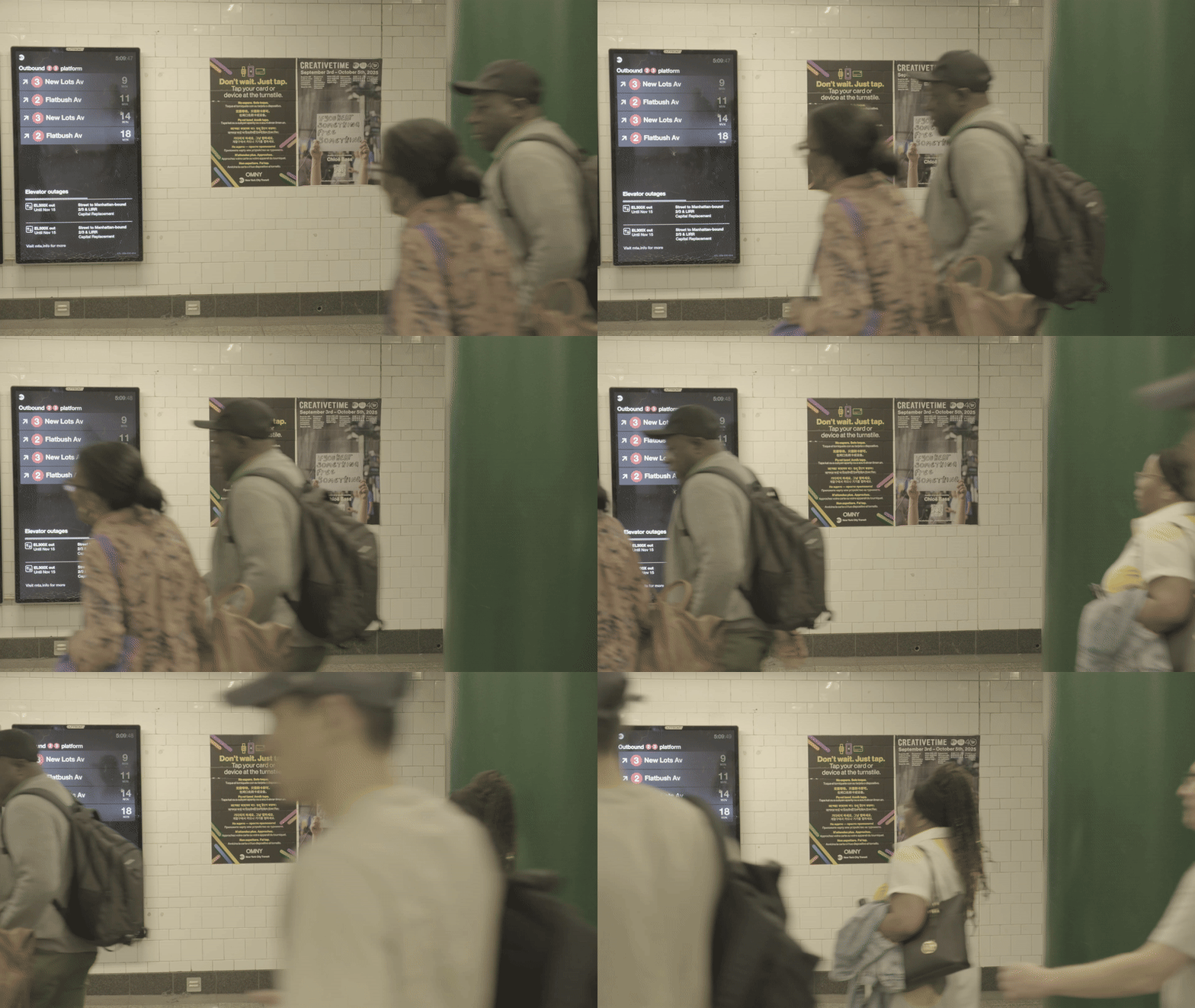
Posters (in seven languages) were (rather ad-hokishly) placed in every station where the project was installed. The design system uses a medium weight of Neue Haas Grotesk, the MTA’s official typeface, to frame the campaign imagery, providing nothing more than what is necessary to communicate.
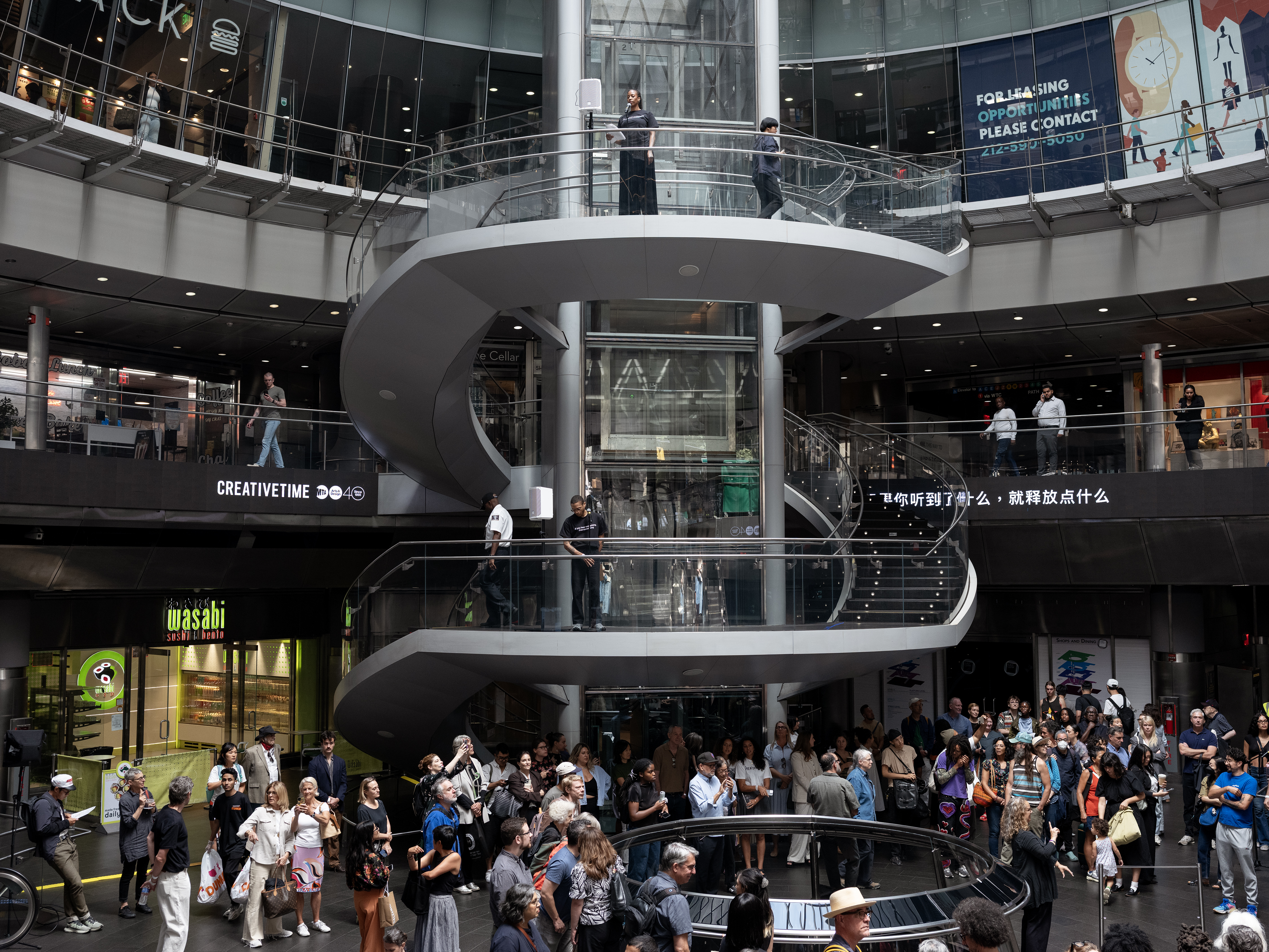
There was also a live performance in Fulton Station, which featured all of the voice actors Chloe worked with for the project.
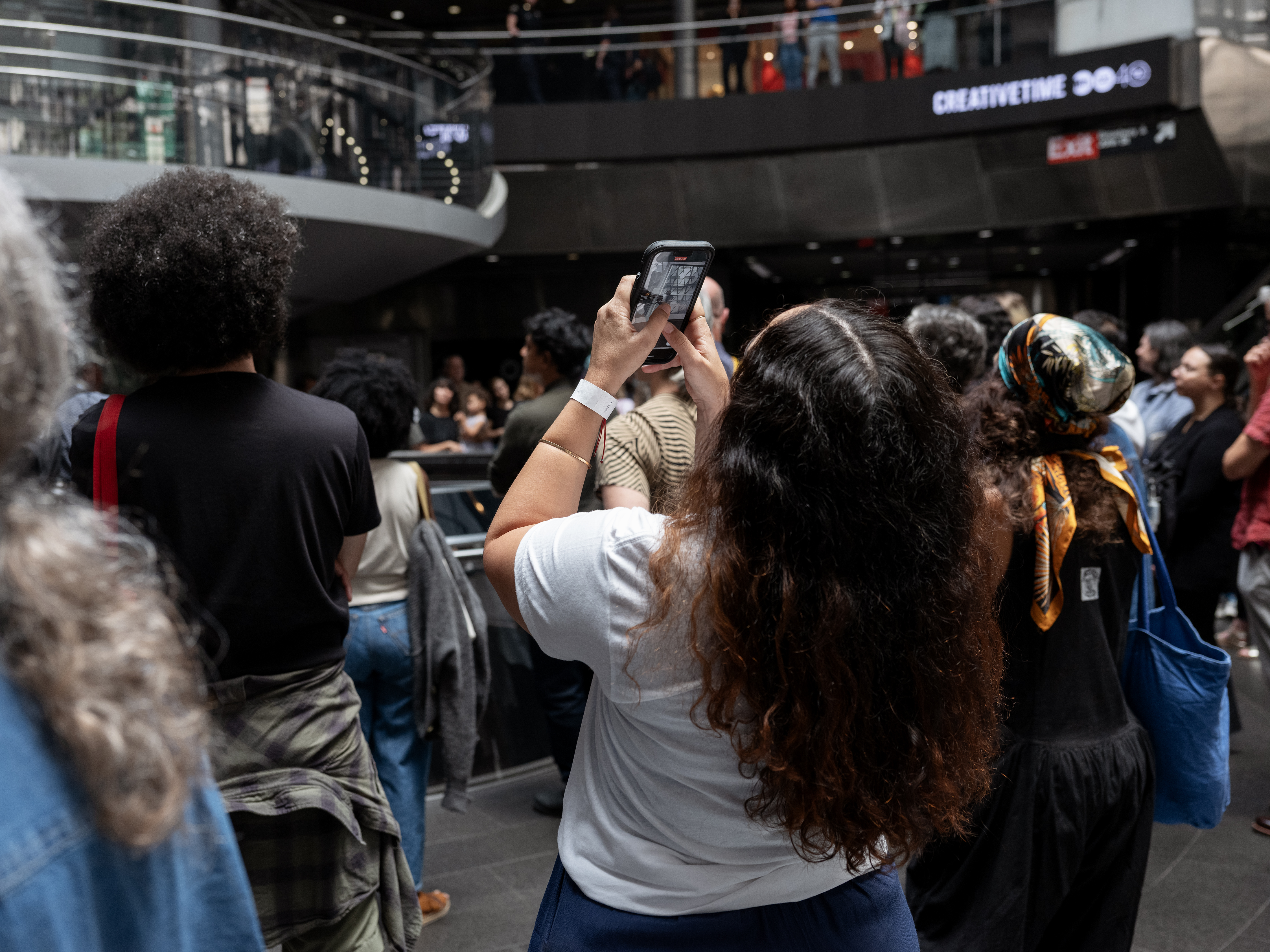
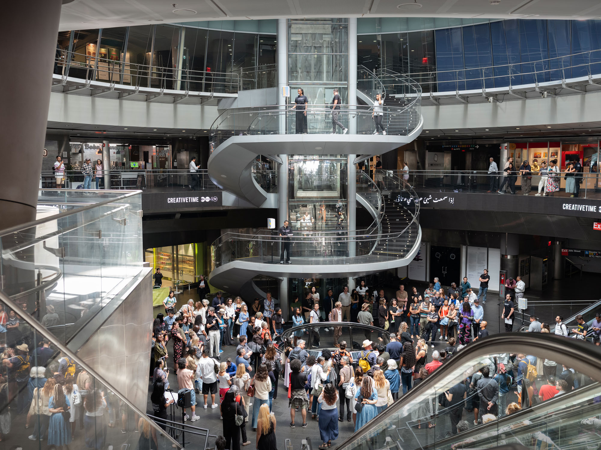
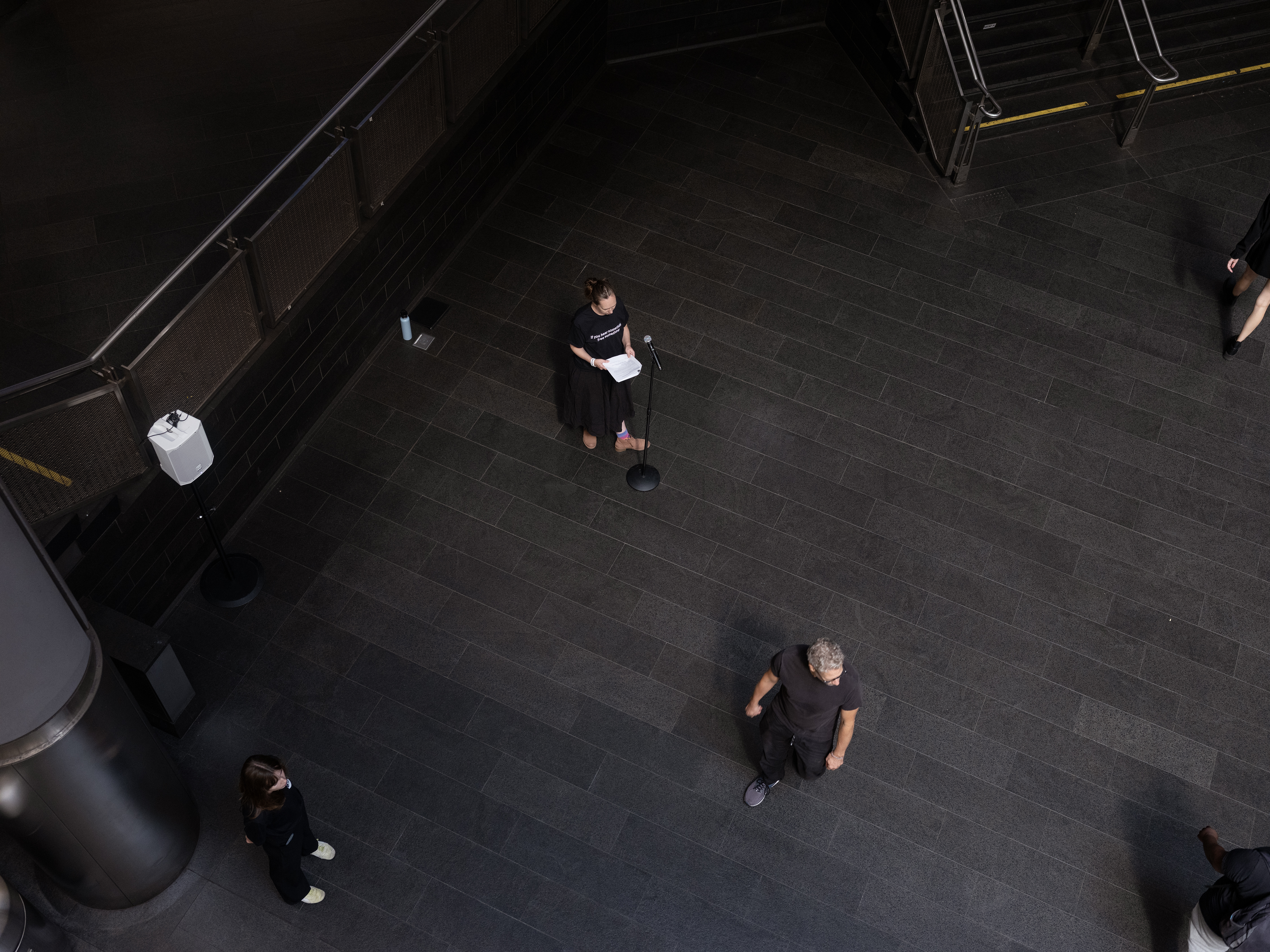
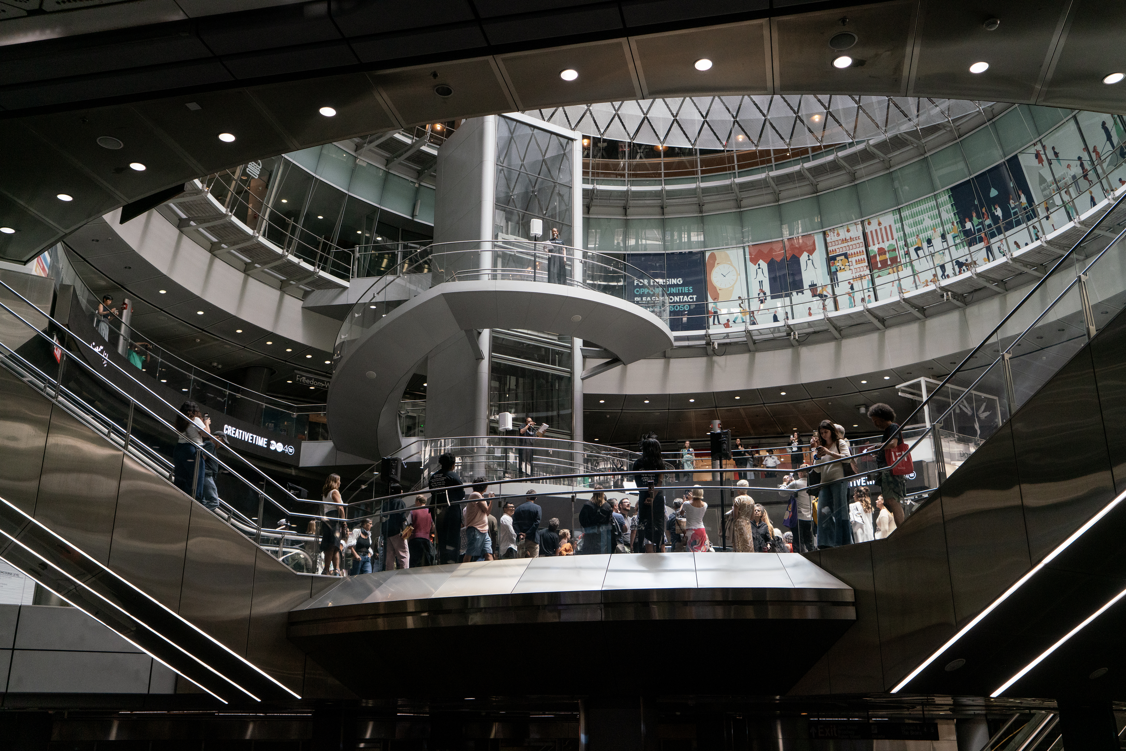
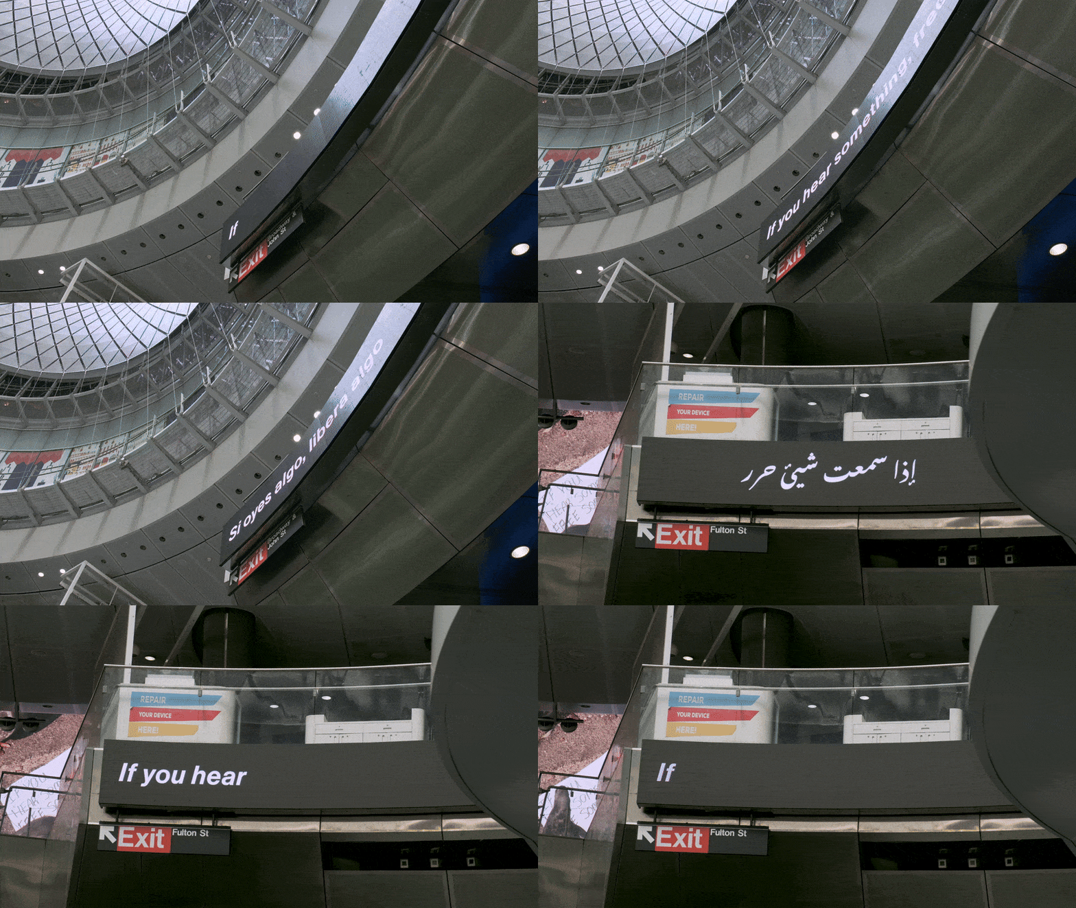
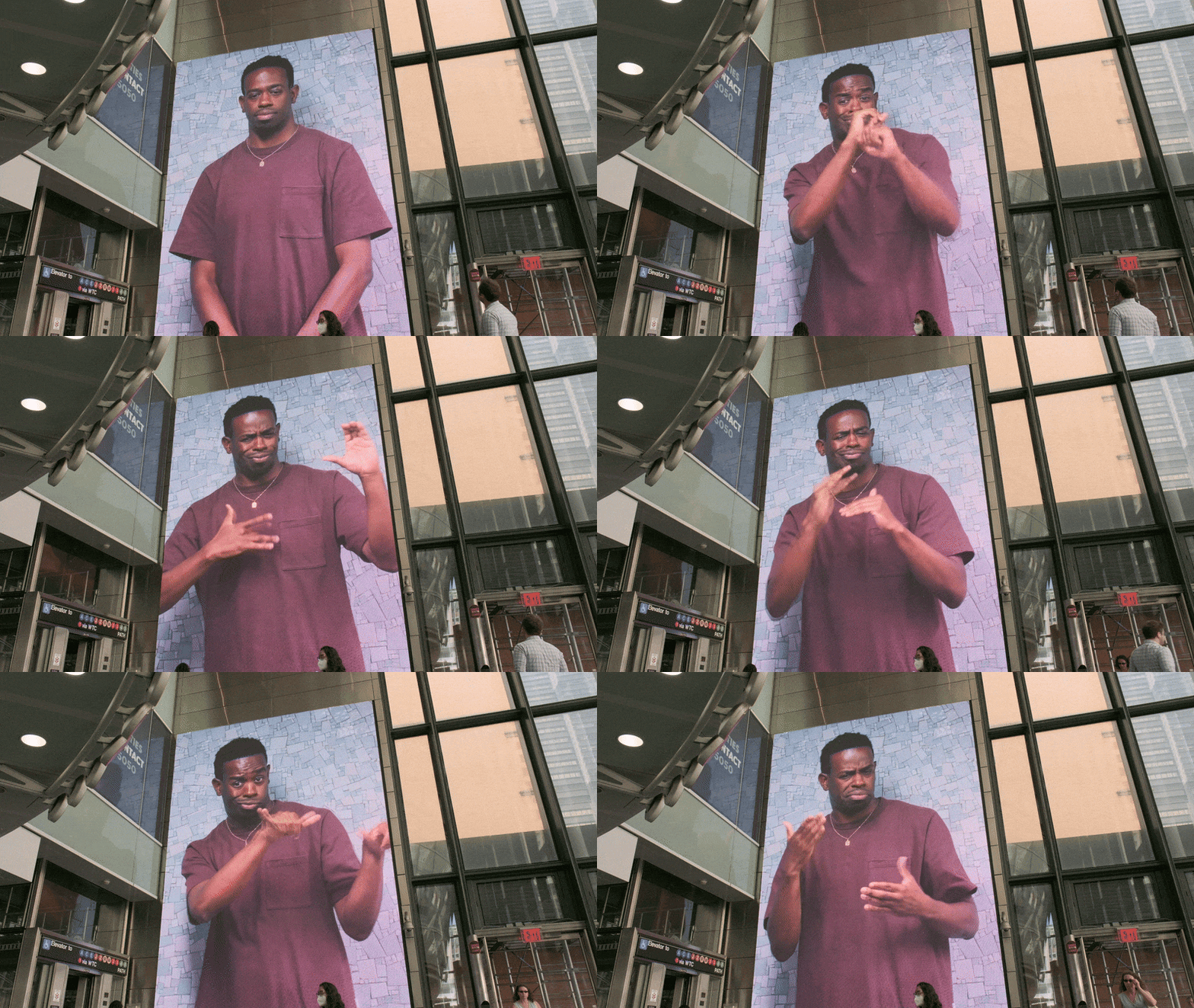
After the performance, the campaign still occupied the screens for several minutes at the top of every hour for the entire month.
Including a massive Jumbotron screen.

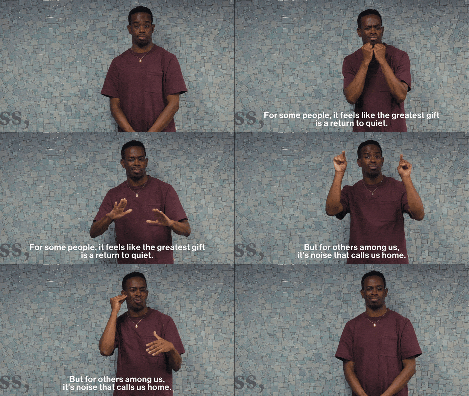
These were preceded by title cards that named the theme of the announcement and incorporated more of the campaign imagery.
I’m currently working on the design of a vinyl record, featuring audio recordings from the project. Will post once here once the project has been released.
