Lauren Wegel, Architect, 2015
website and identity for an architect
designed reflect her delicate and precise style
website and identity for an architect
designed reflect her delicate and precise style
for lauren wegeL
design with megan feehan
Architect Lauren Wegel cut her chops working for Annabelle Seldorf, who was described by PIN—UP magazine as the “bourgeois badass.” The influence is apparent, though Wegel’s work has an ease that Seldorf can sometimes lack. She approached us several years into her private practice when it came time to share and promote her work —something she deeply abhorred. Our task was to find a way to reflect her quiet, delicate style while assuaging any apprehension about her work being exposed to the public.
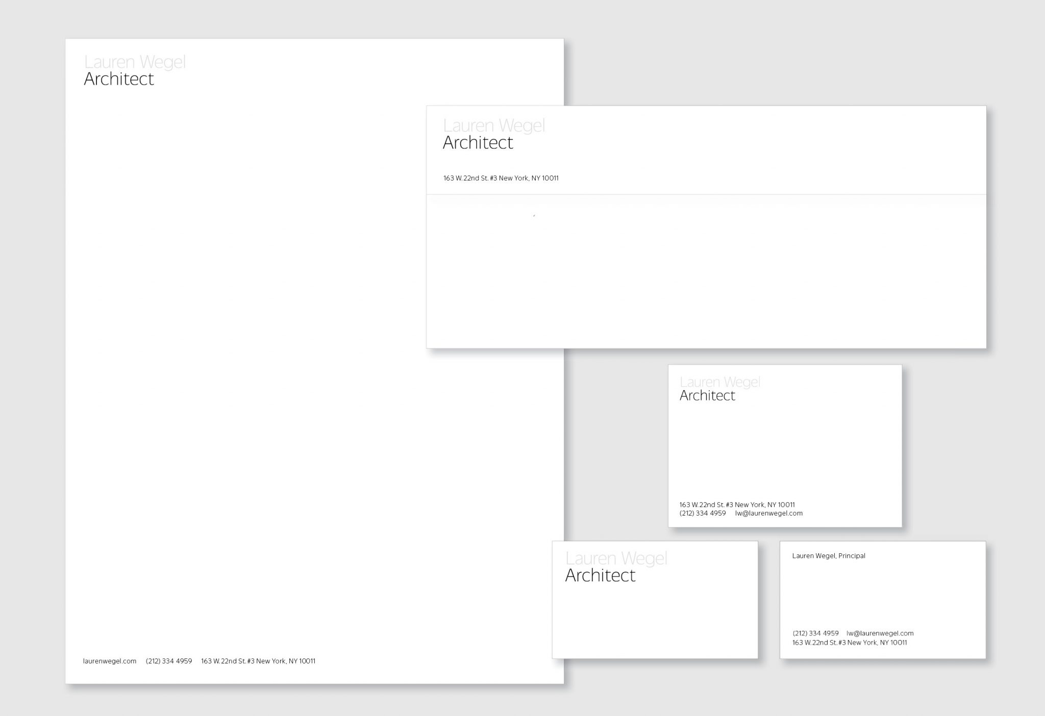
We looked for ways to reflect her strength and precision as an architect, while respecting the lightness of her hand. We used a light-weight typeface with subtle, anachronistic details appearing only at the junctures of lines that are otherwise free of fivolity.
Lauren’s preference is to make herself recede, so her name appears grayed out in the logotype—offering nuance and depth within the starkness of a grayscale scheme.
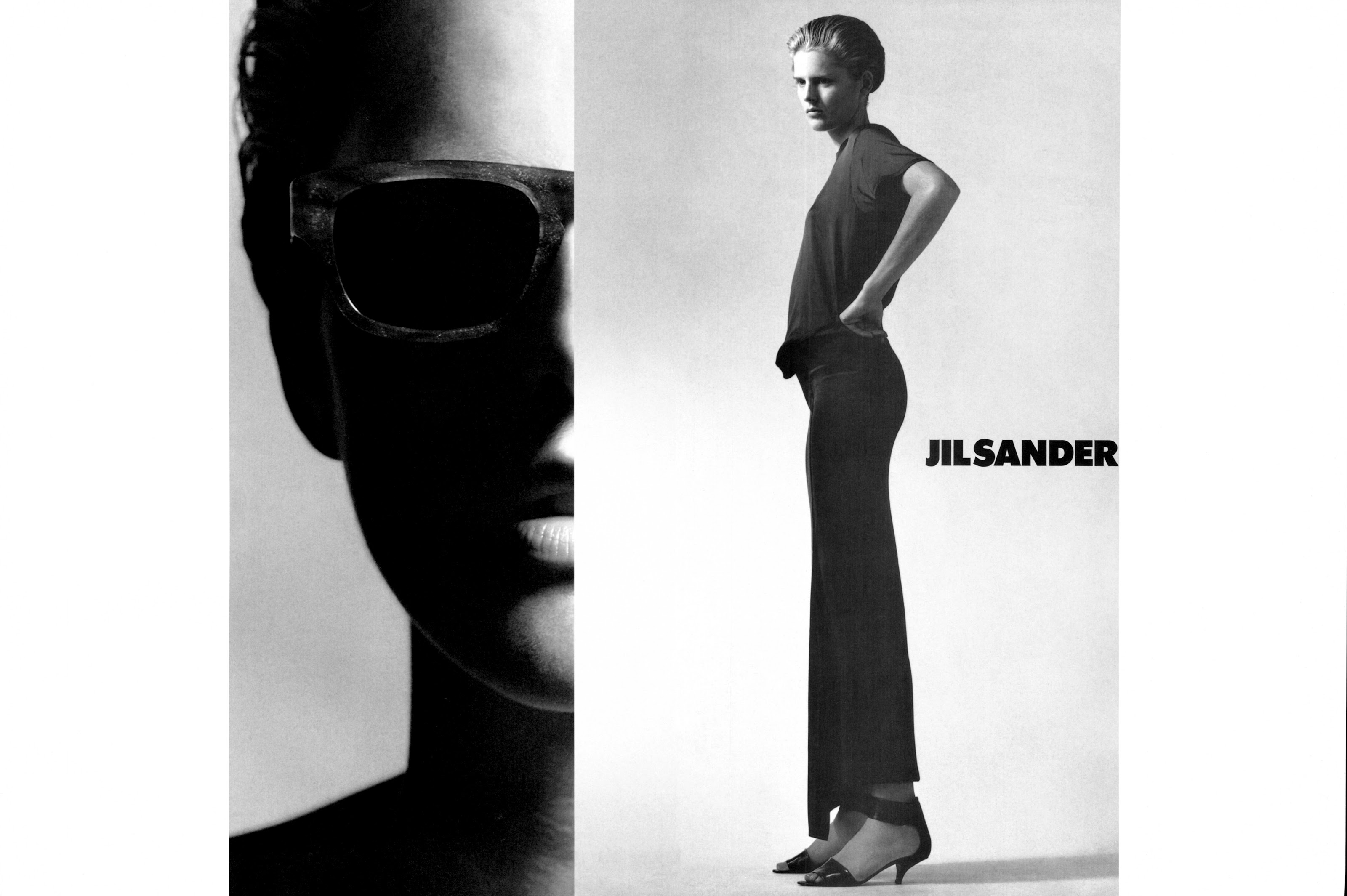

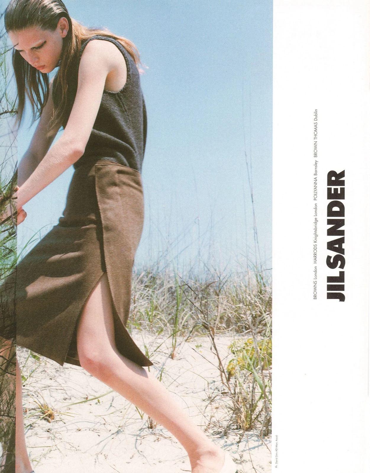

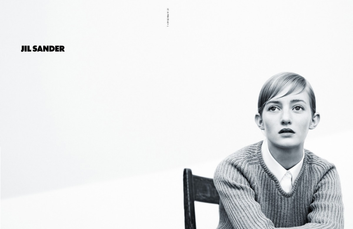
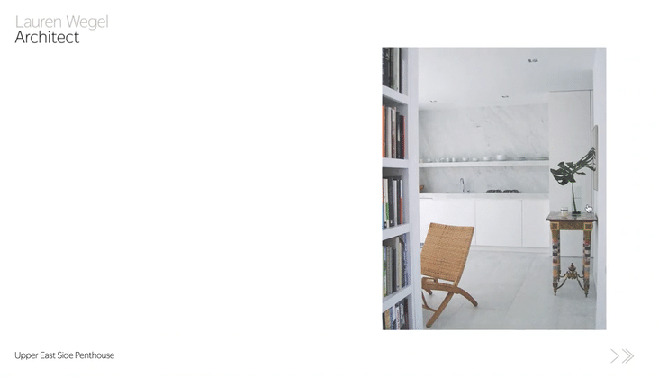
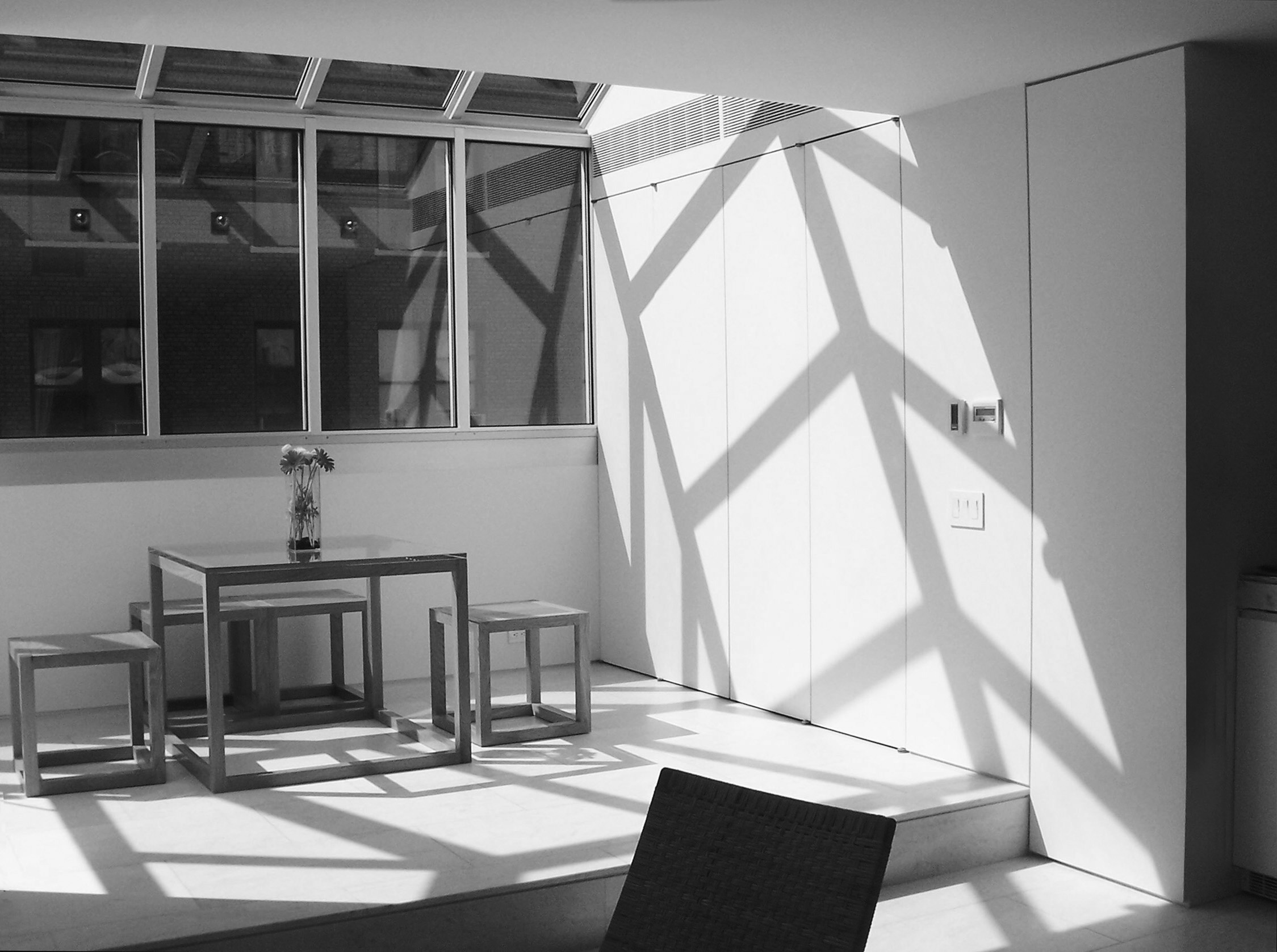
In designing her website, we wanted to present her projects in a way that showcases her prowess in precision and harmony. We found inspiration in Jil Sander ad campaigns from the mid 2000s, which I worked on at Lloyd+Co during that era. The images use spacious crops and strict proportions to create dynamic margins that provide intention, pause, and control.
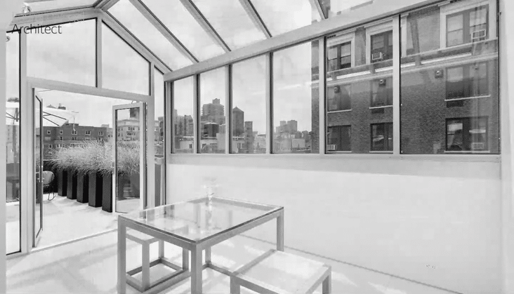
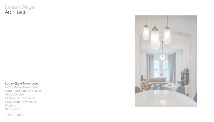
We appreciate a similar quality in Lauren’s images, which which she takes herself. We further editorialized her photography by making the landing page imagery grayscale. Elsewhere on the site we use a combination of precisely cropped vertical shots with generous margins and fullscreen images, dually permiting the eye to focus on detail and frame the work as a whole. We further enhanced this game of proportions by modifying the slideshow script to create half-step advances, creating a harmonious rhythm to the pace of the slideshow. An unobtrusive intervention that slows the consumption of images while nearly doubling the perceived amount of imagery.