
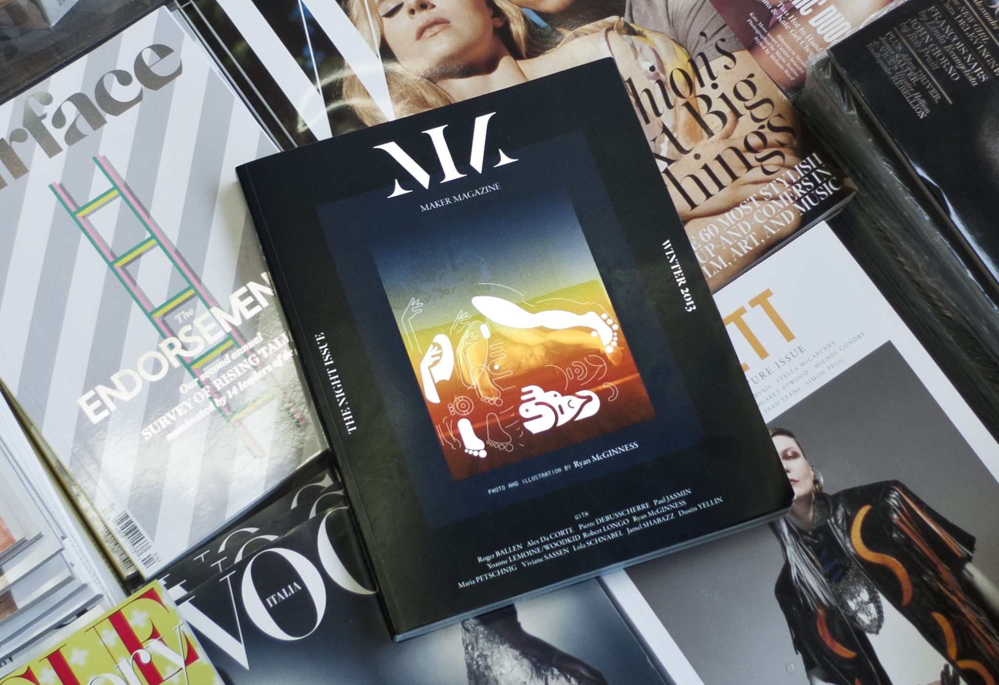
Maker Magazine, 2013
Complete re-design of a short-lived biannual-ish
art and fashion magazine
Complete re-design of a short-lived biannual-ish
art and fashion magazine
for Maker Magazine
Designed with Megan Feehan

Some magazines come in to being through a sharp observation made with critical distance from thier subject. Others spill out directly from an editors social reality—a way to document and archive a moment in time. Maker magazine was definitely the later, so the most significant contribution we made as designers was probably in how the content was organized. The meaningful relationships that can be revealed through a structural intervention are often diminished or overlooked entirely in graphic design thinking. A lot more attention goes towards stunty typography and layouts (no shade, we like those too) which can loose their appeal about as quickly as it comes on, and, for better or for worse, place an object in time.
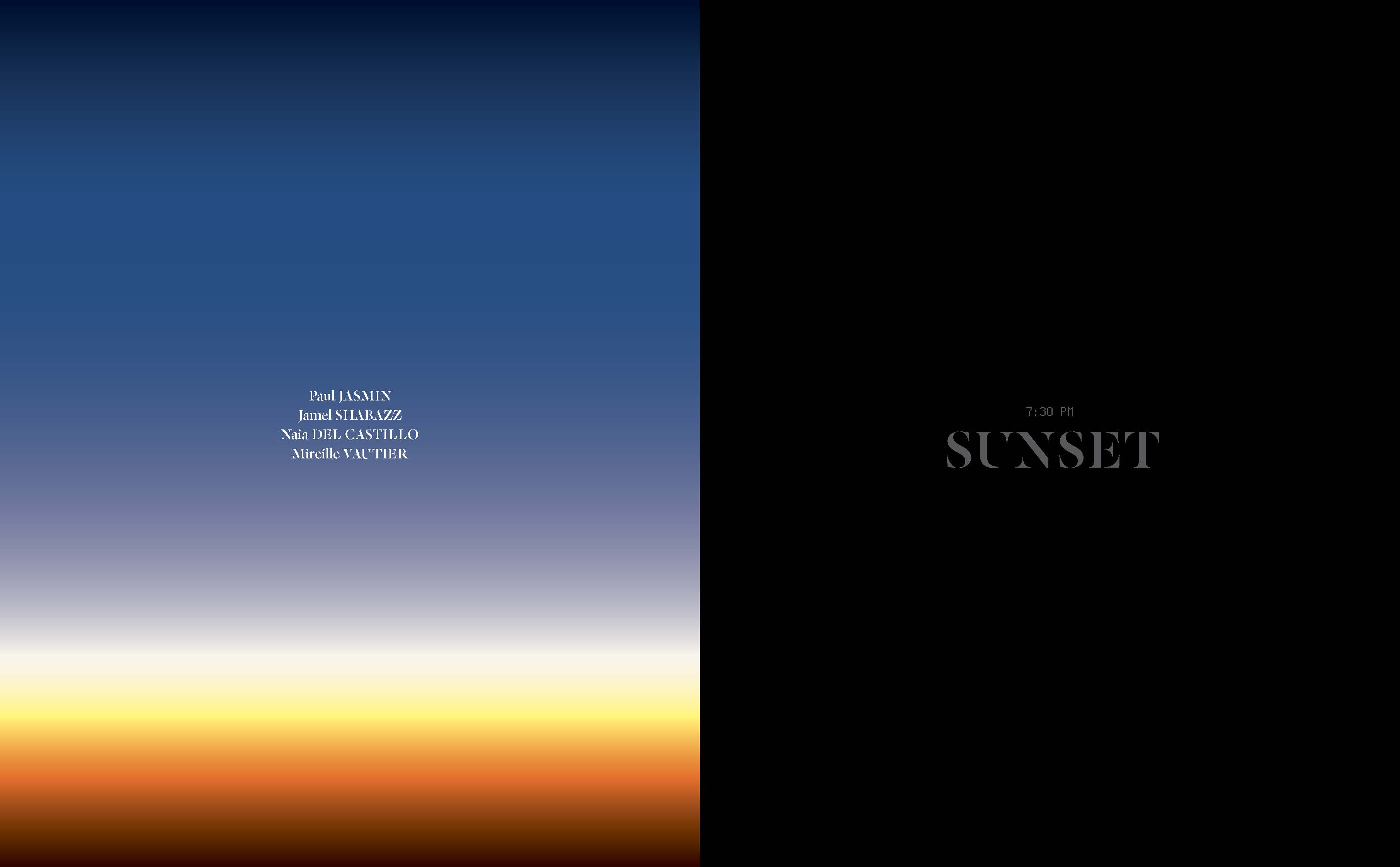
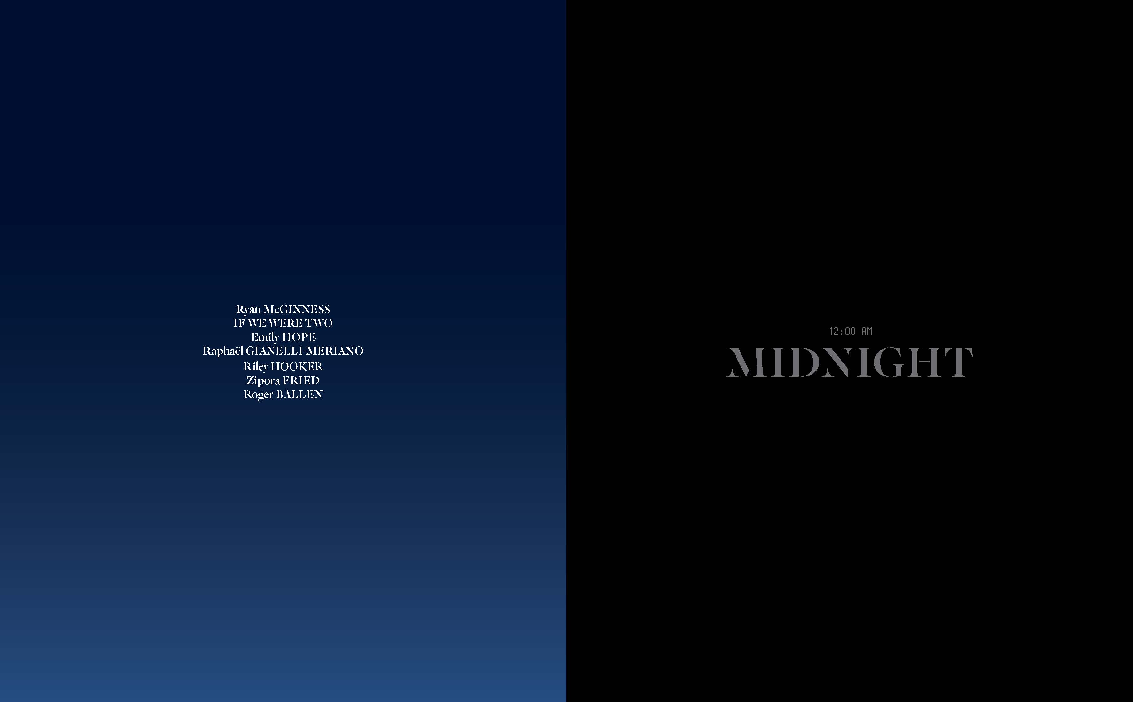
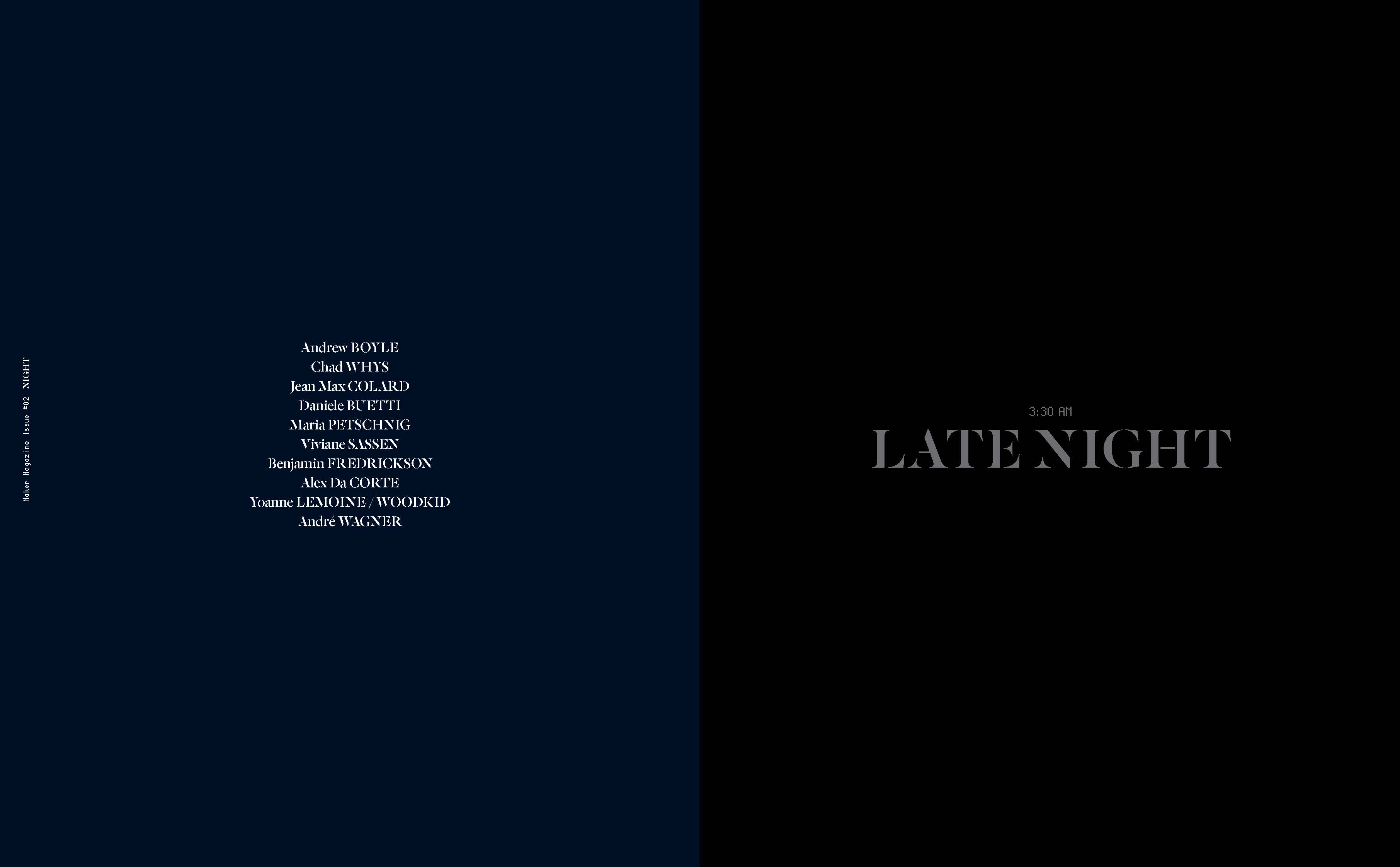
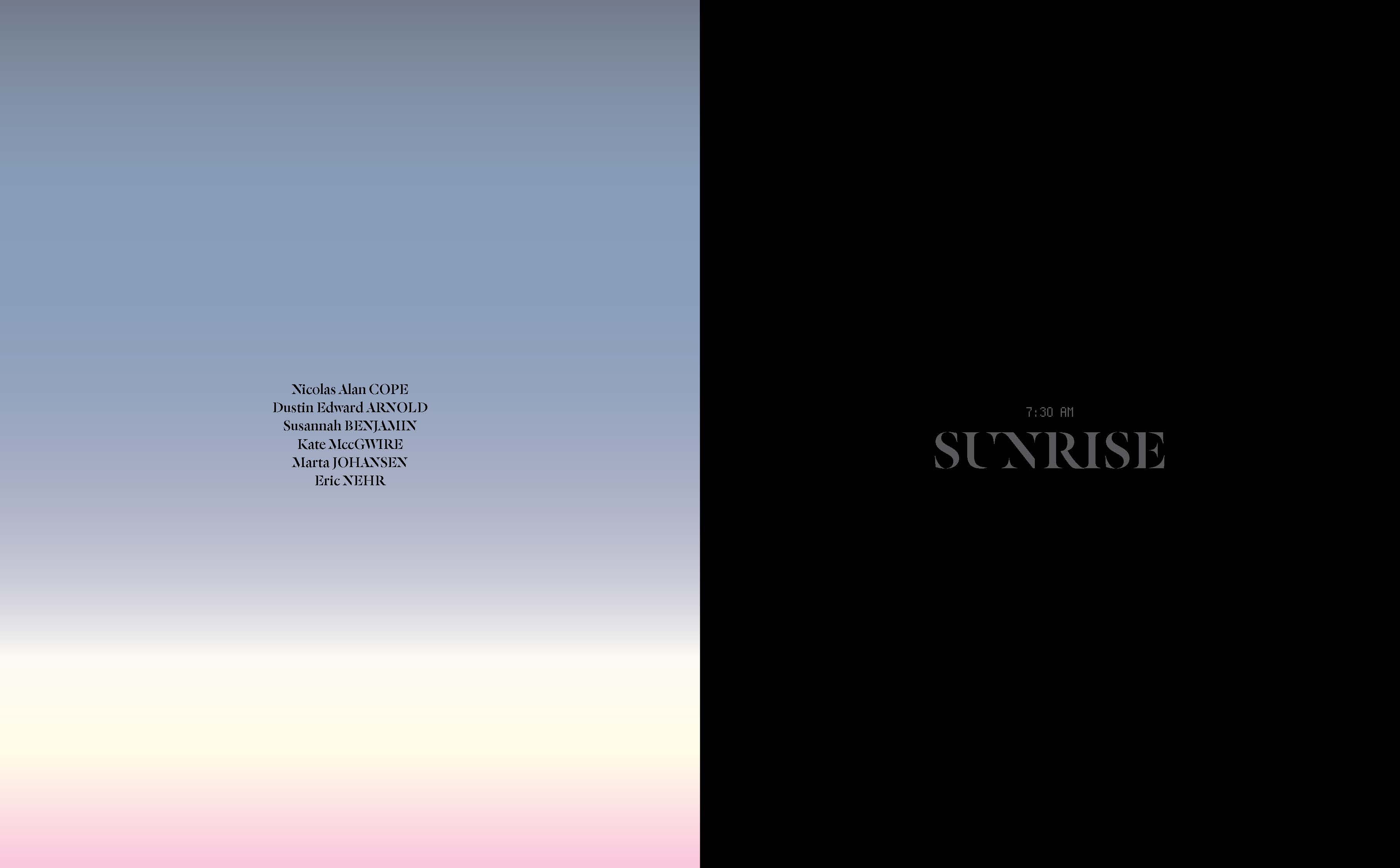
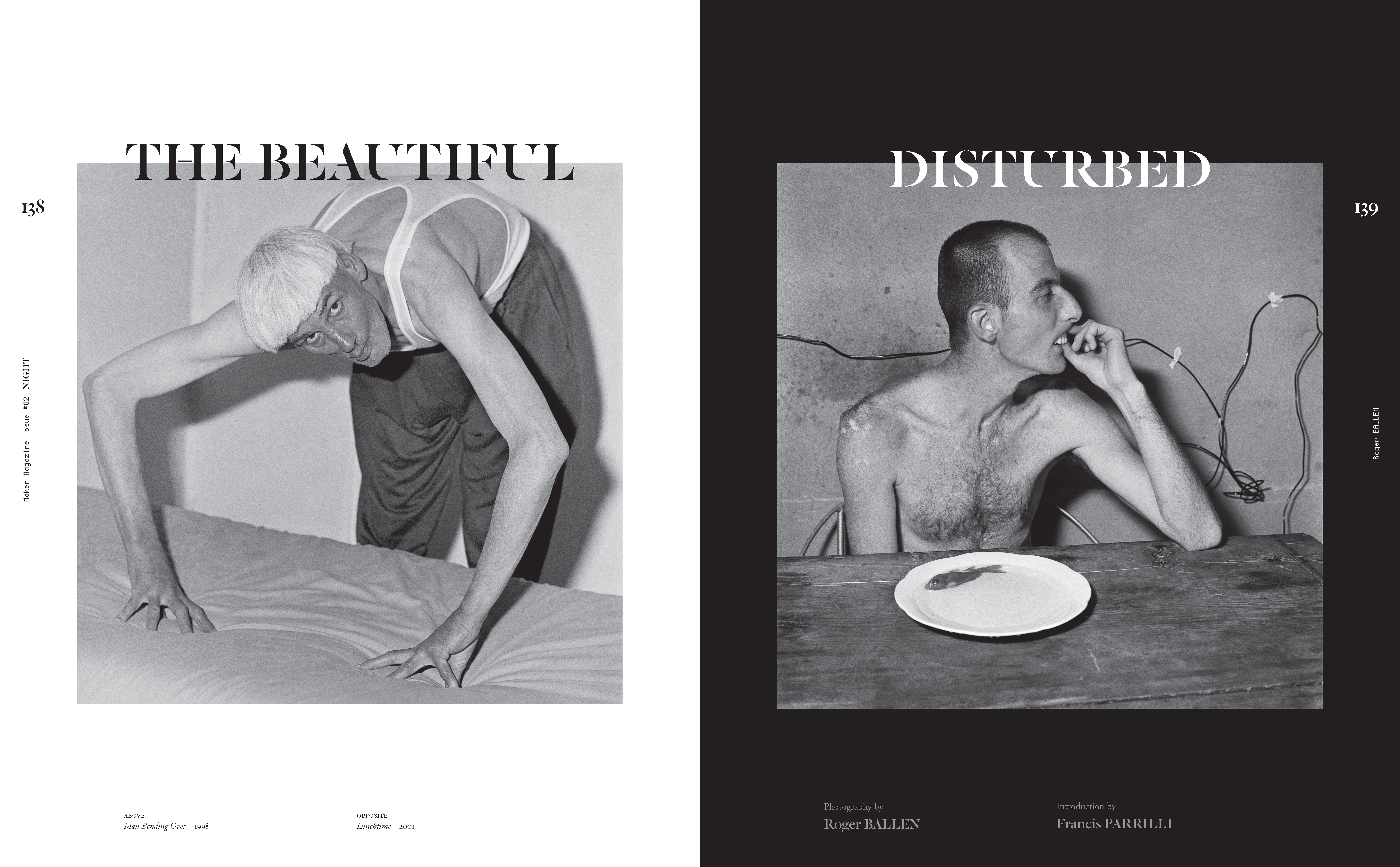
“The Night Issue” theme was interpreted loosely by the editors so we created four distinct sections to help build more intentional parallels between the featured artists; Sunset, Midnight, Late Night and Sunrise. This also became a pacing device to create rhythm across the 300+ pages.

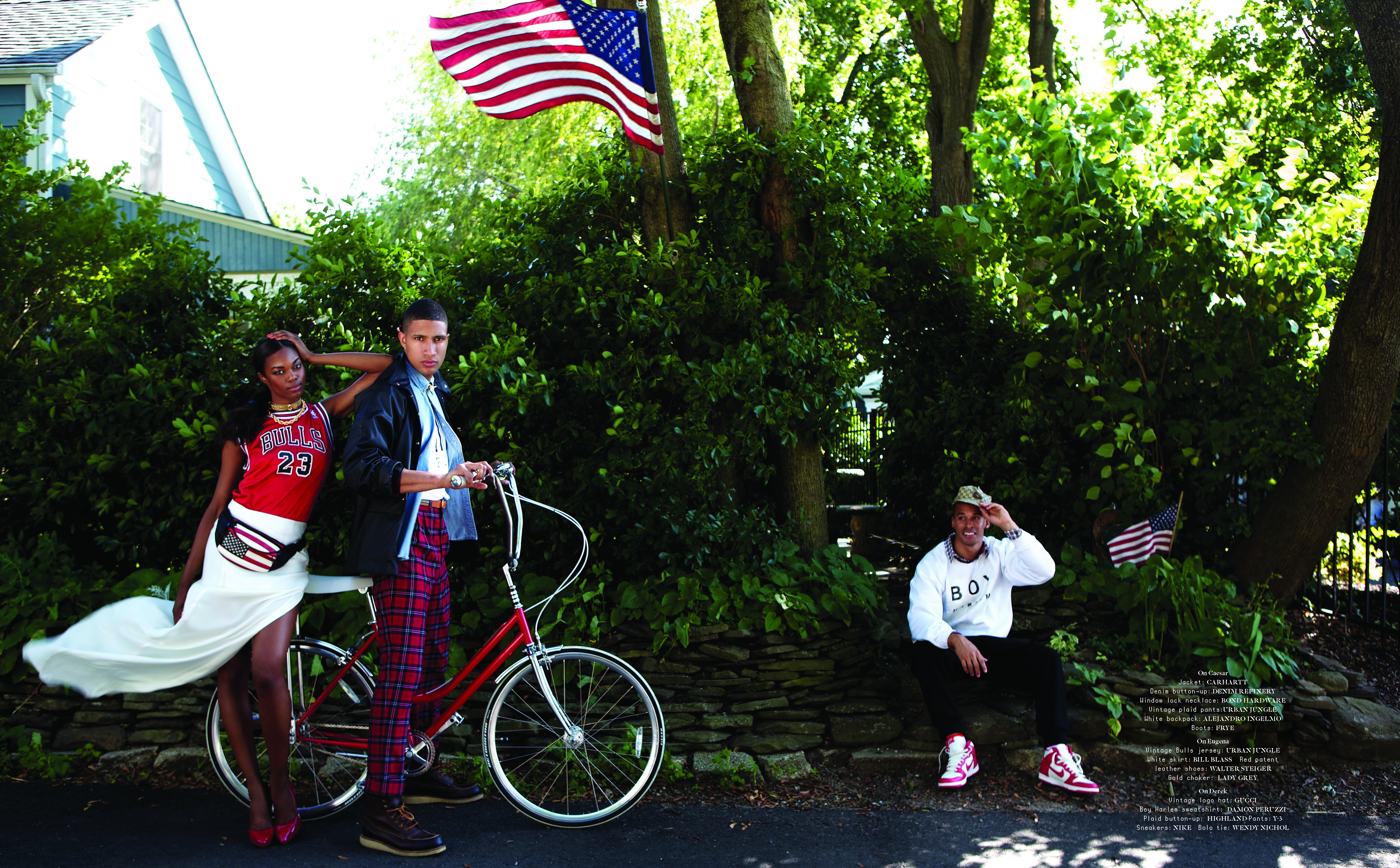
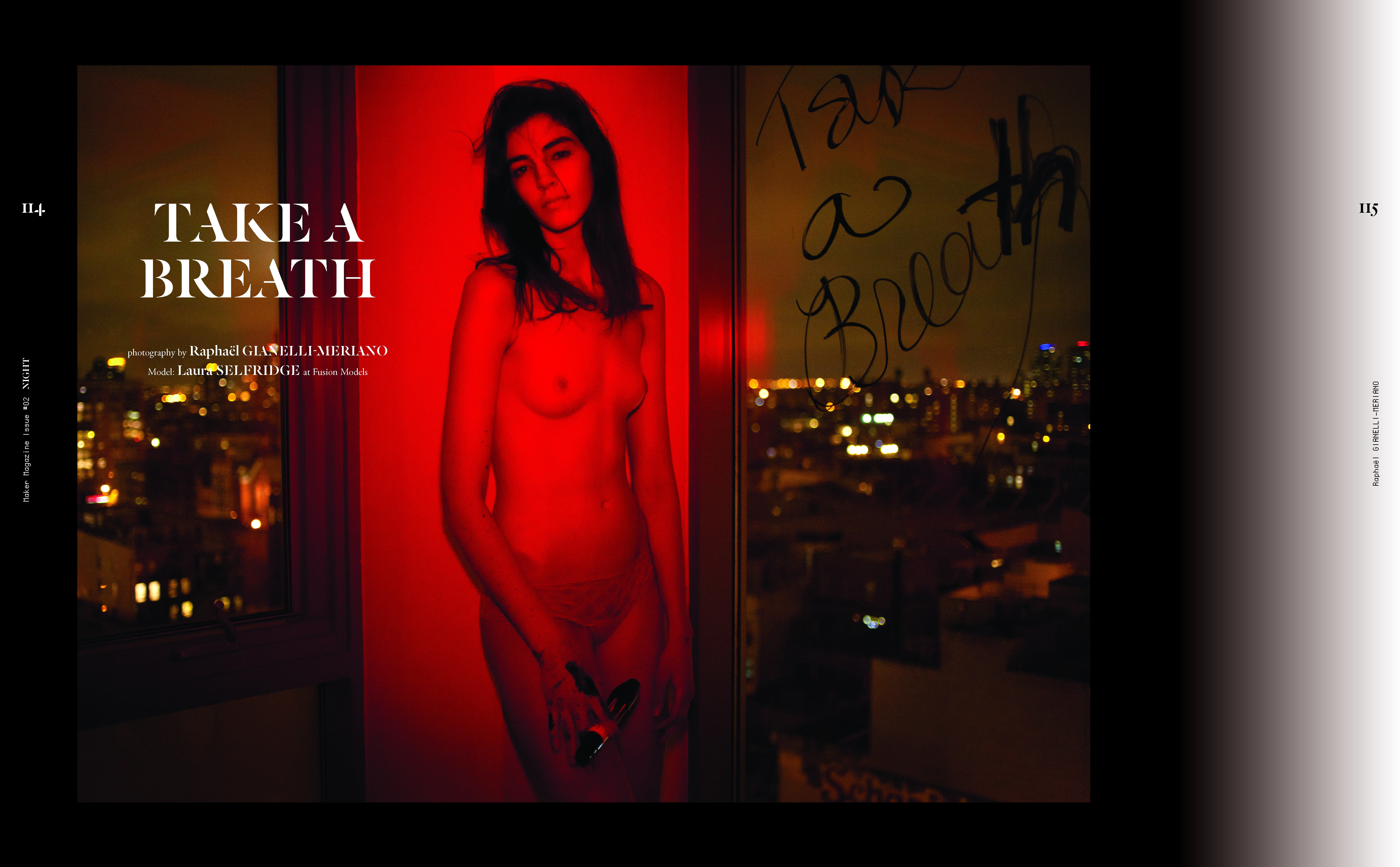

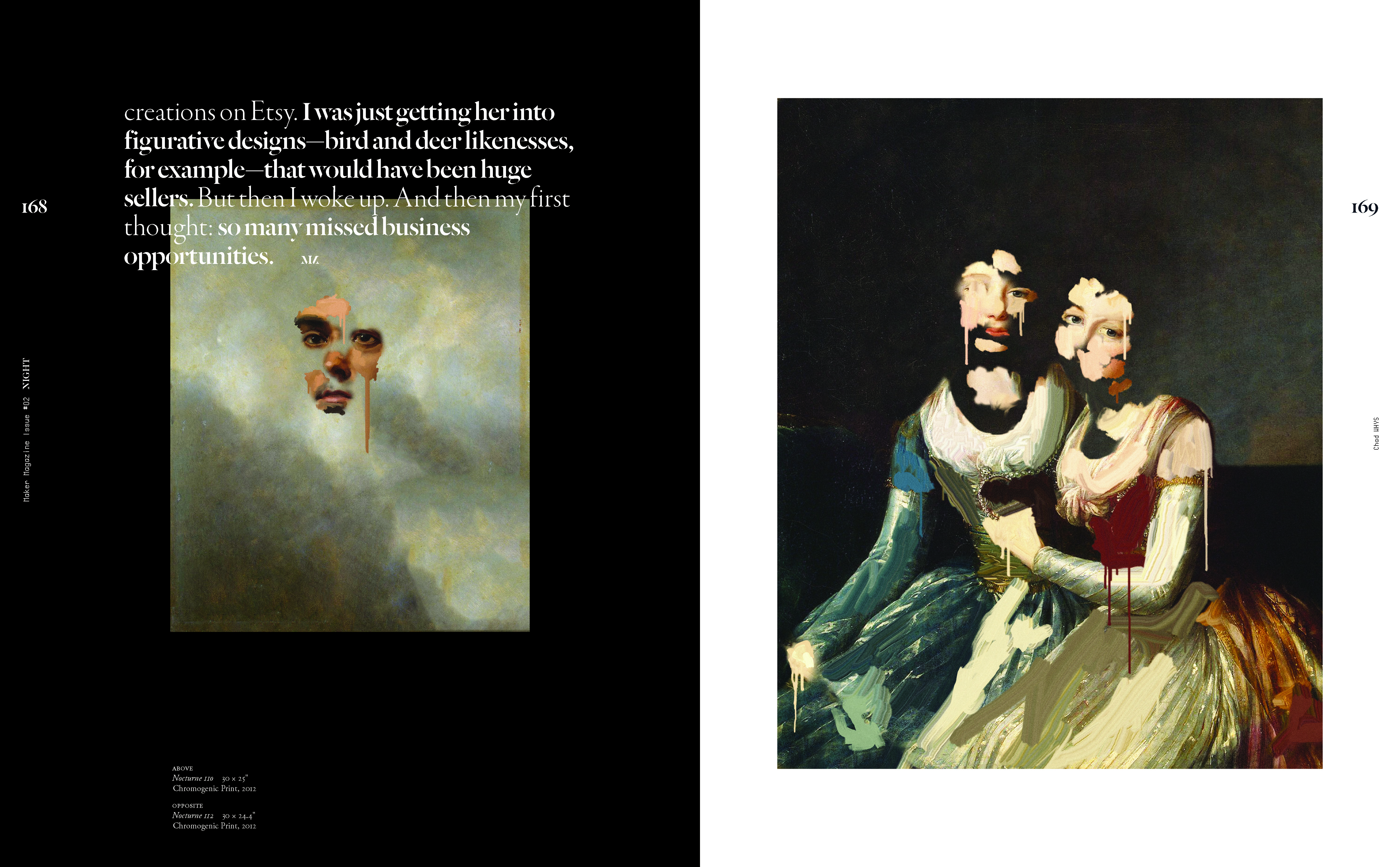


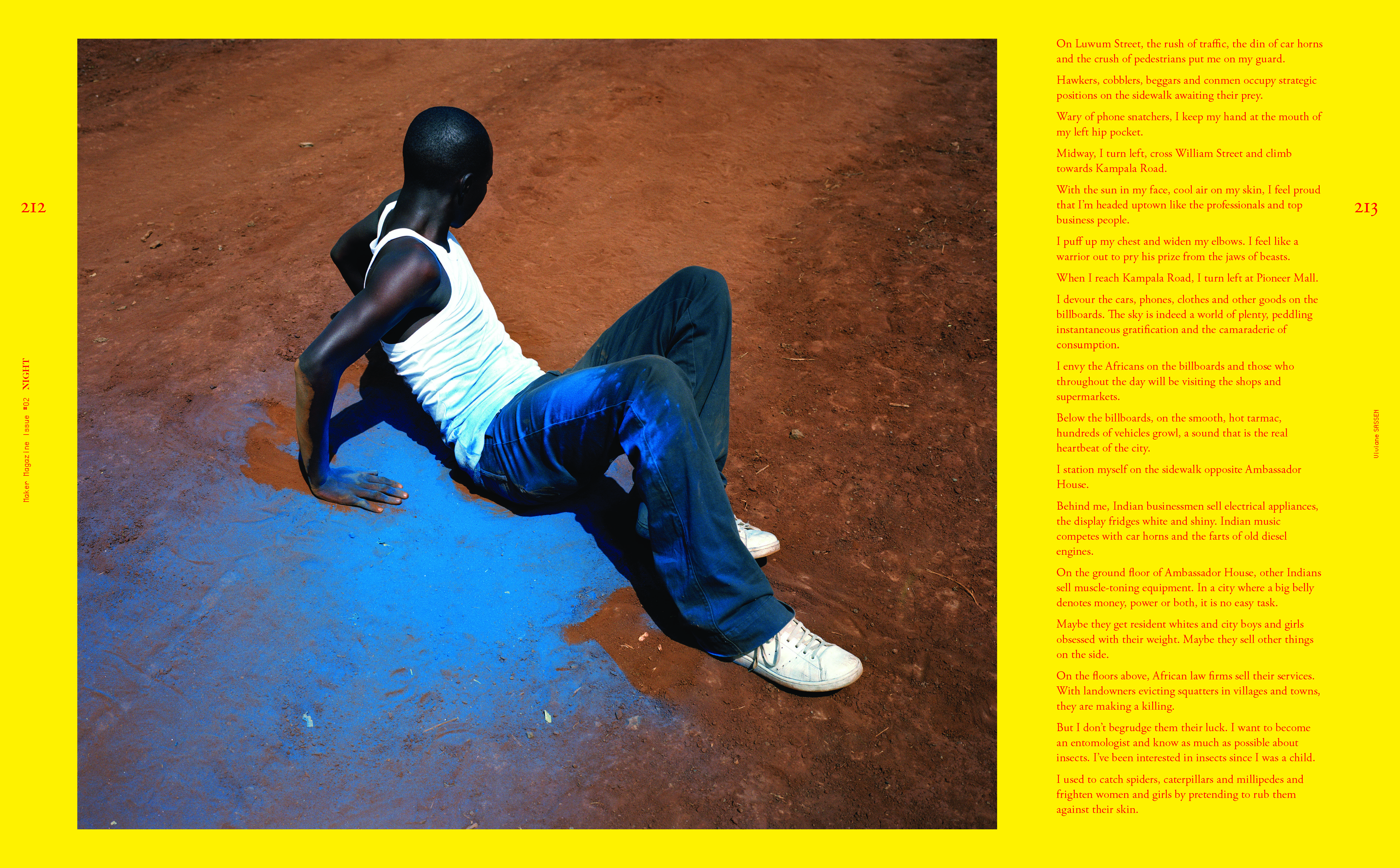


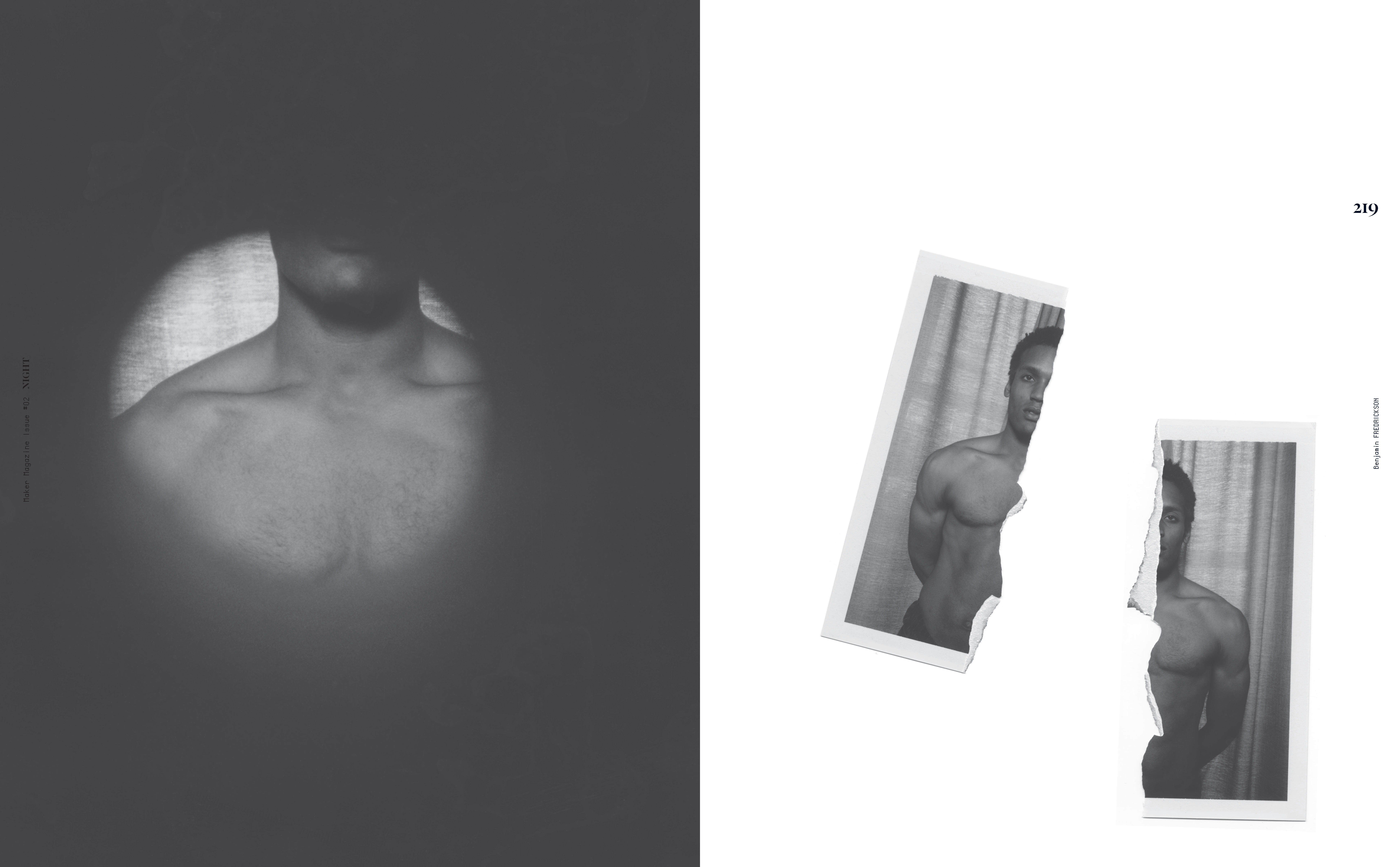


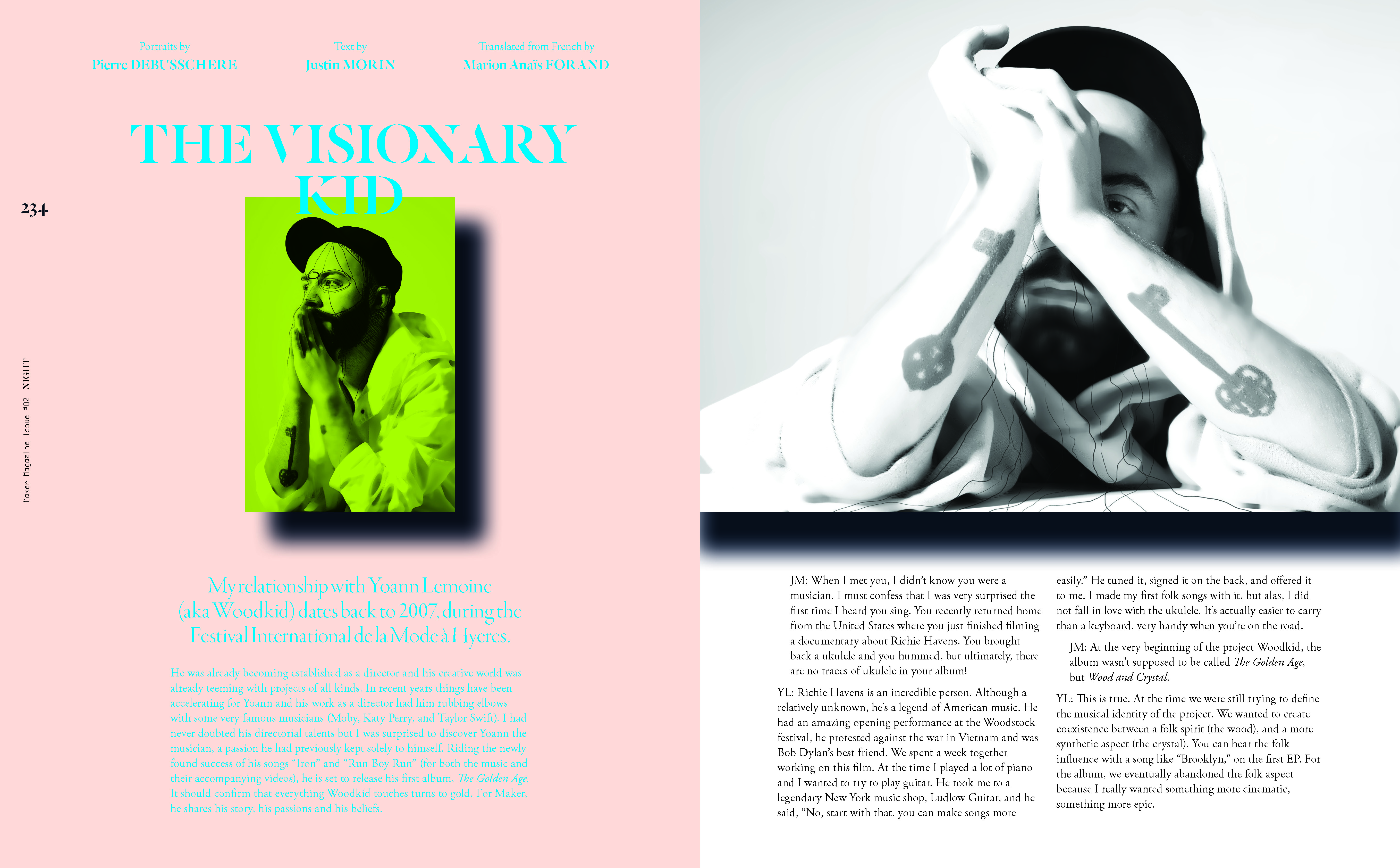


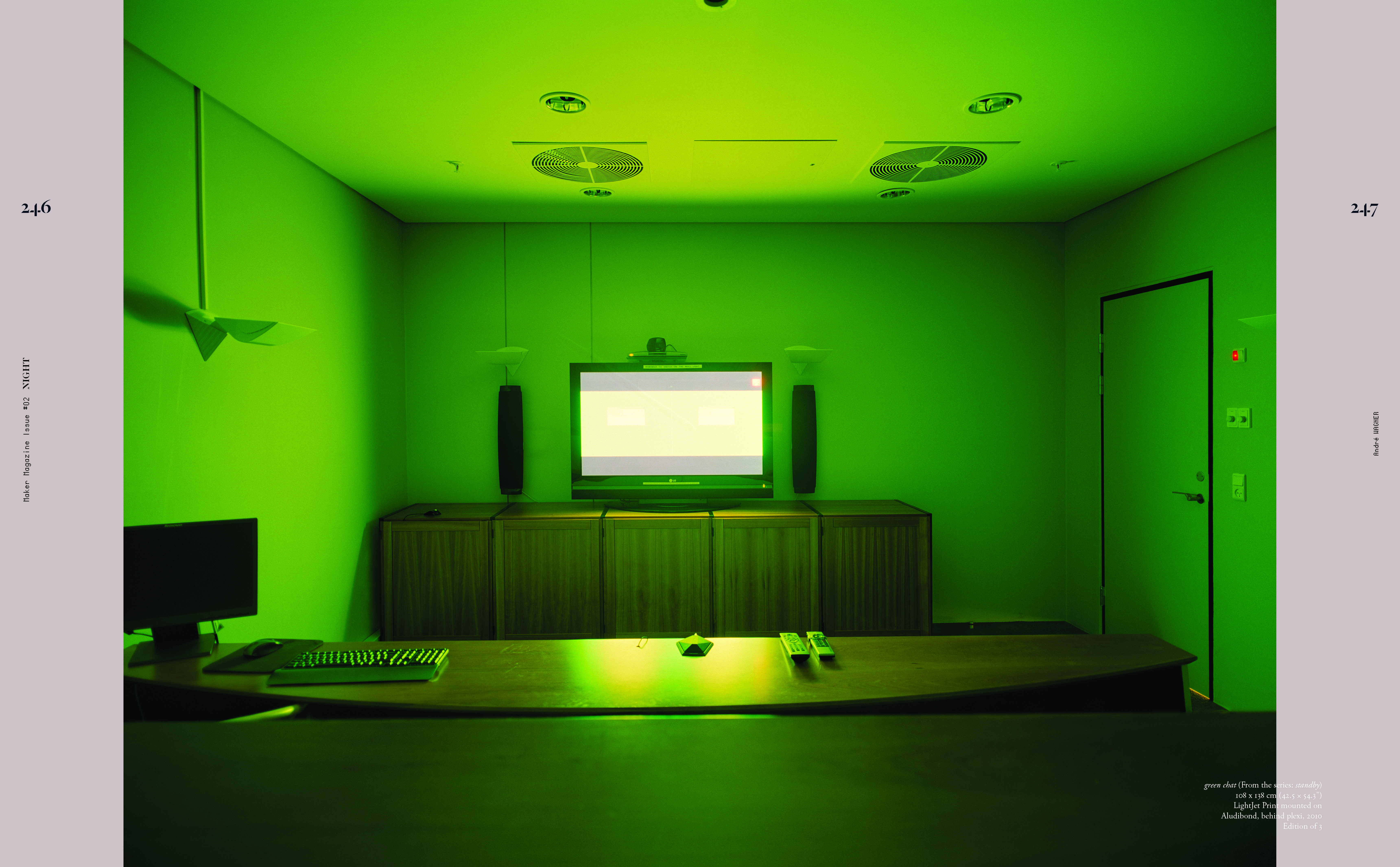


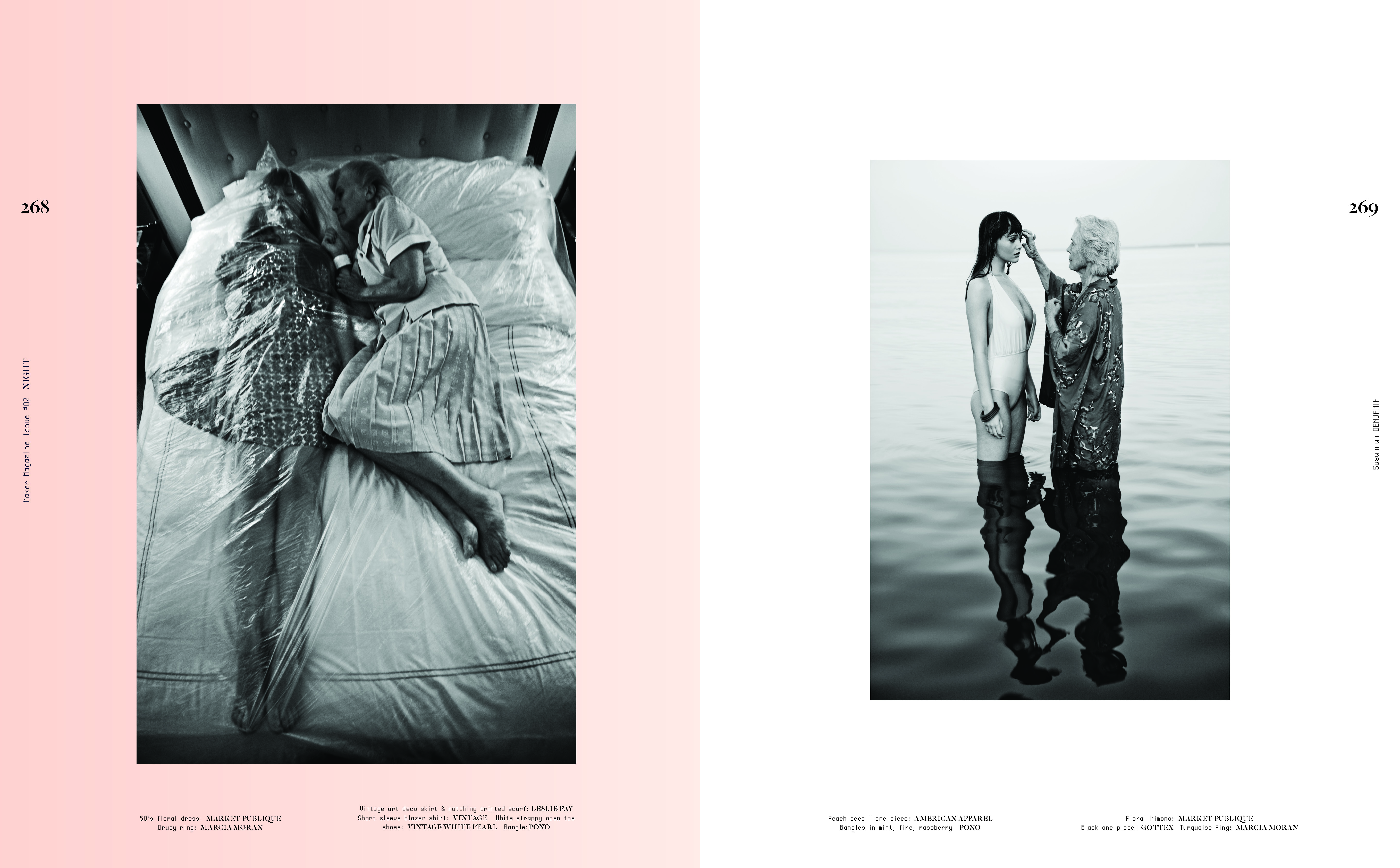


The typography ahered to a strict grid and the sizes were kept very consistent, leaving the architecture of each spread laid bare and bringing the wildly varying contents in to a semblance of cohesion (aka graphic design). Color and alignment were used like elements of interior design to carve out distinct moments within the time/space sequence of the publication.
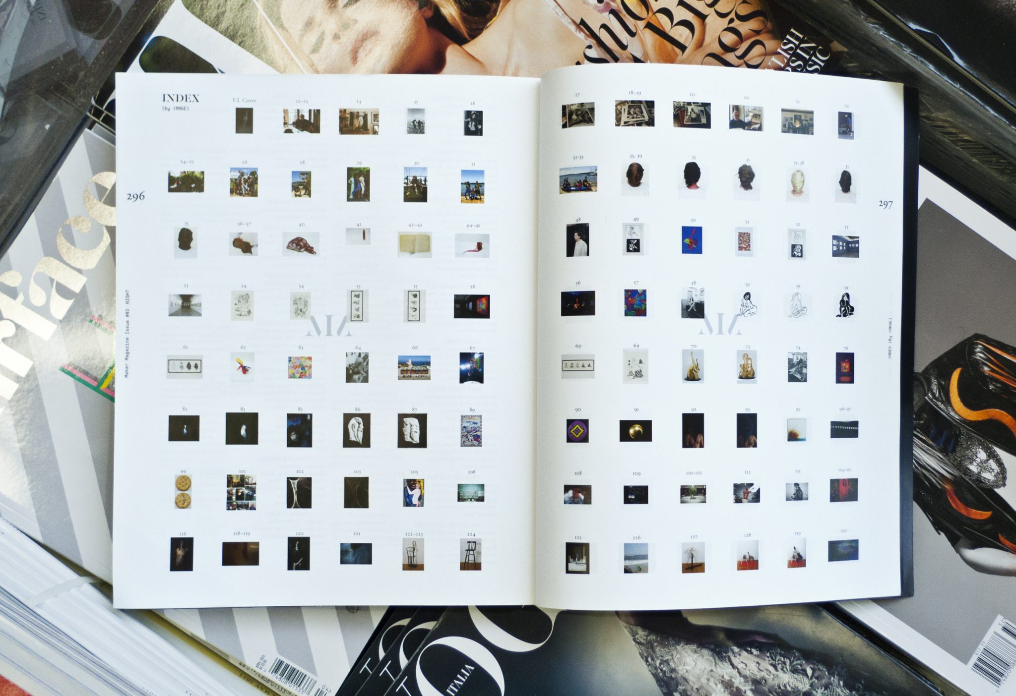
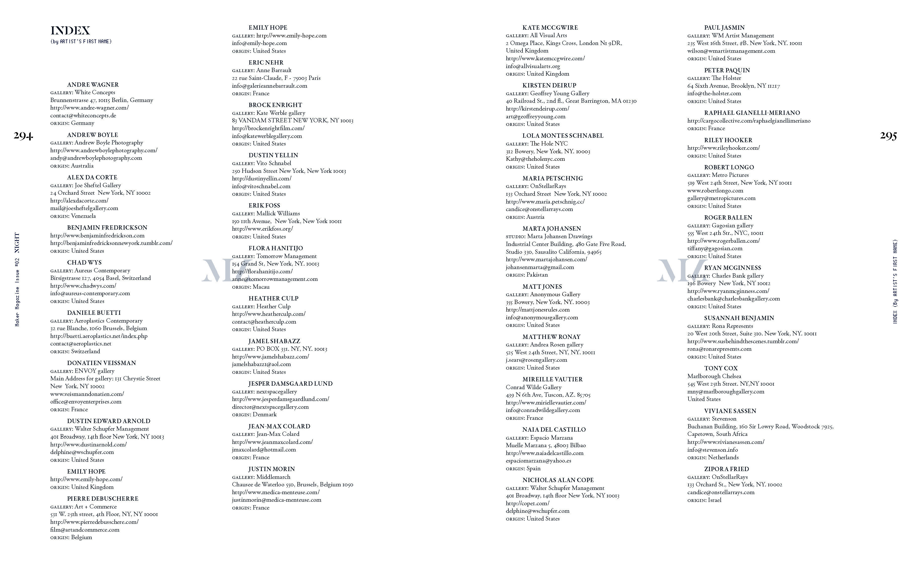
From a graphic design perspective the climax comes at the end when the reader encounters an exhaustive index—another feature that is often overlooked in large surveys of artists. The index is organized in two ways: one spread lists all artists by name, including contact info and place of origin. The second includes every image in thumbnail view alongside the page number so an artist’s work can easily be found at a glance.