Mix NYC, 2006
Catalogue design for a queer film festival
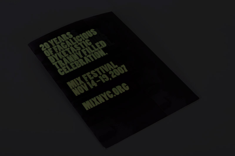
featuring a glow-in-the-dark varnish
used to reveal aN ALTERNATE DARK-ROOM TITLE
Catalogue design for a queer film festival
featuring a glow-in-the-dark varnish
used to reveal aN ALTERNATE DARK-ROOM TITLE
For Mix NYC Film Festival


POST SCRIPTUM: My 24 year old self did not know any better than to choose the words that appear in the glow-in-the-dark varnish! This was my first freelance gig in New York, which I snagged by chatting with the festival’s then director Stephen Kent while at The Cock, one of NYC’s most notorious gay bars
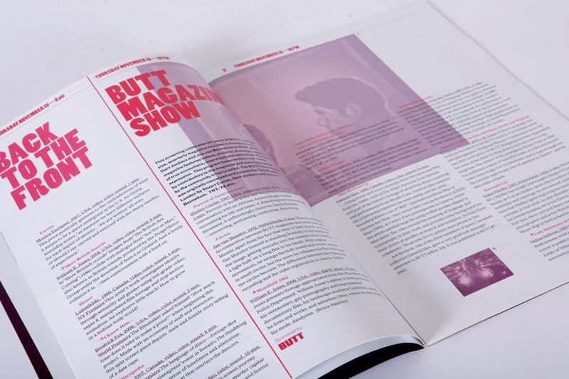
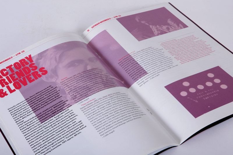
Both the cover image and the organizing principal of the design uses the motif of a film strip. Strong red vertical lines divide content, starting with the cover and throughout the pages. Imagery within is tinted back with duotone spot color treatments to allow for a playful image layer to exist underneath a much stricter typographic structure. The display typography, set in Poplar, was chosen for it’s unique quality of being both strong and whimsical. Fleshy, even.


