The World’s UnFair
Poster campaign for a public art installation
in the form of a satire on a World’s fair
Poster campaign for a public art installation
in the form of a satire on a World’s fair
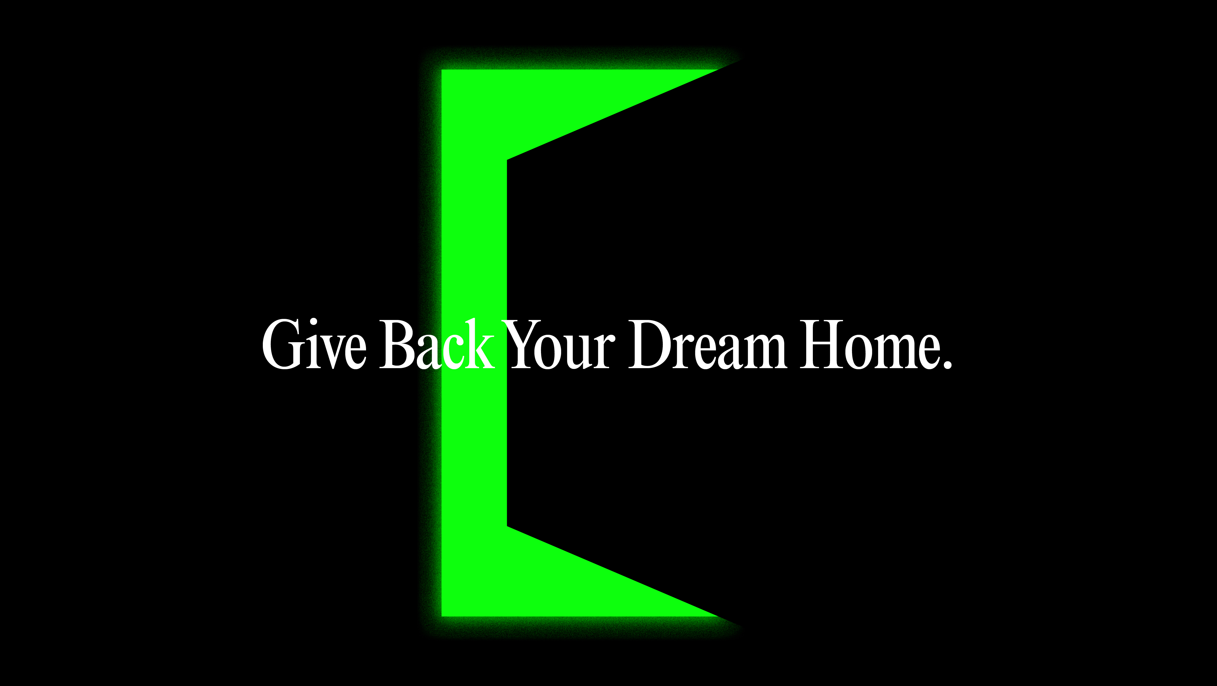
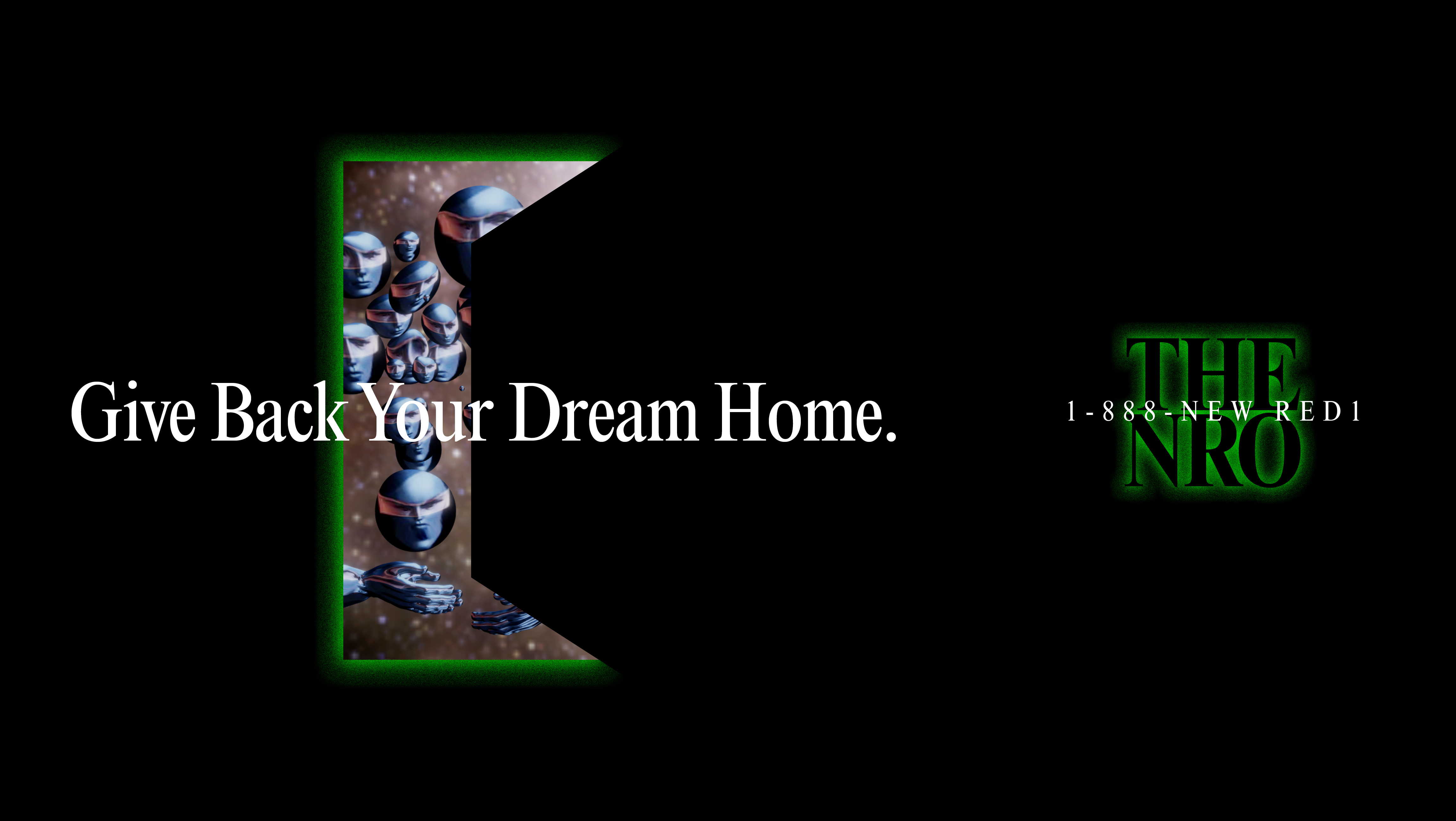
WITH NEW RED ORDER (NRO)
PRODUCED BY CREATIVE TIME

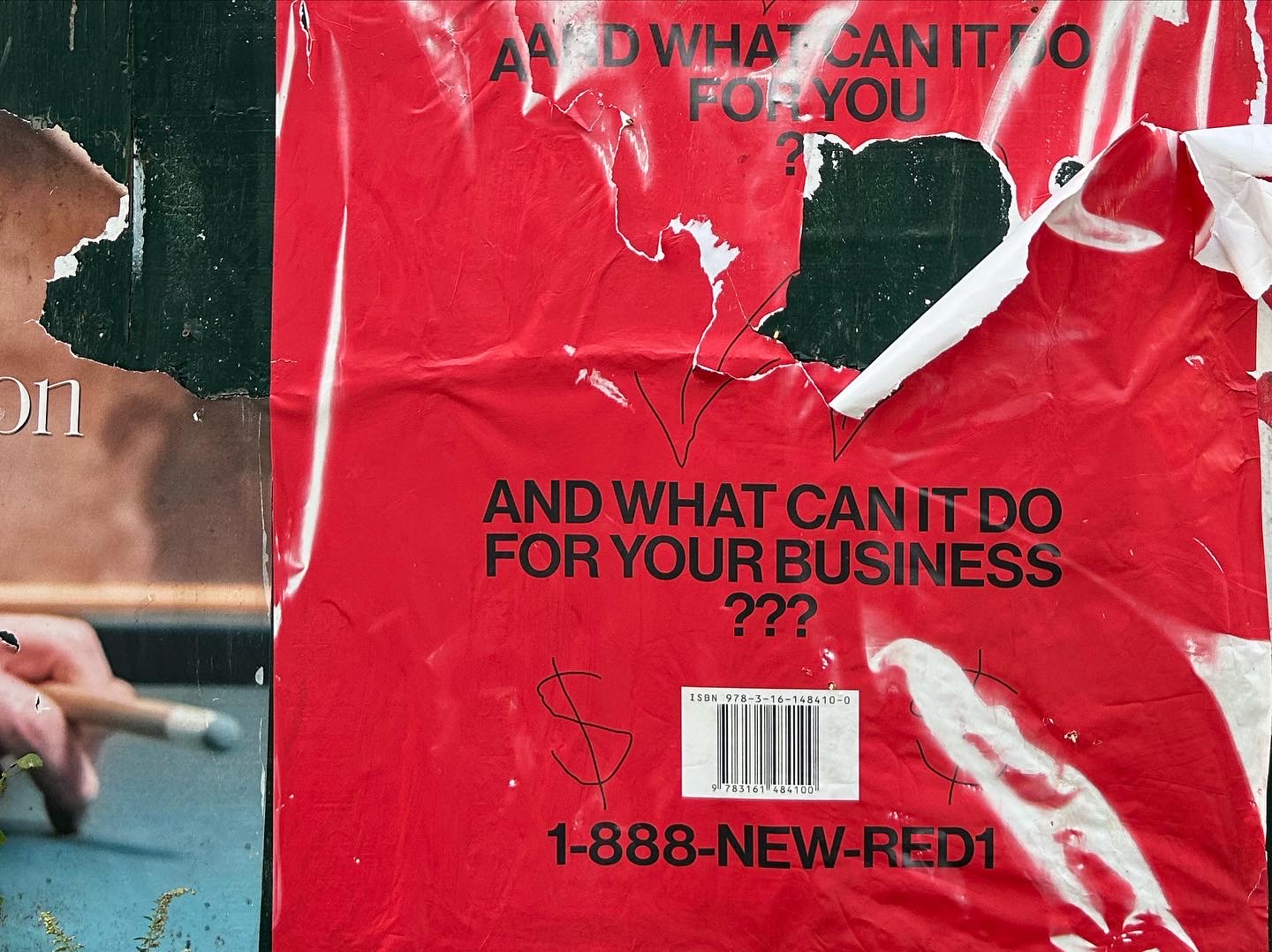
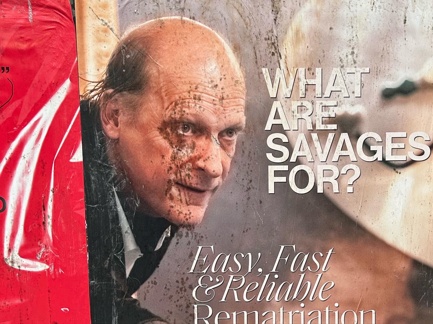
Scans of postcard sized copies of the posters created for a feature in Document Journal
I was approached by a member of the New Red Order—who describe themselves as a “Public Secret Society” to create a poster campaign for their exhibition The Worlds Unfair commissioned by Creative Time, curated by Diya Vij.
I had already been a huge fan of their work since seeing their show Feel at Home Here at Artist Space in 2021, so I was *thrilled* to say the least. Their practice borrows heavily from graphic design elements in consumer culture to create their mind-bending brand of highly effective (and affective) semantic confusion.


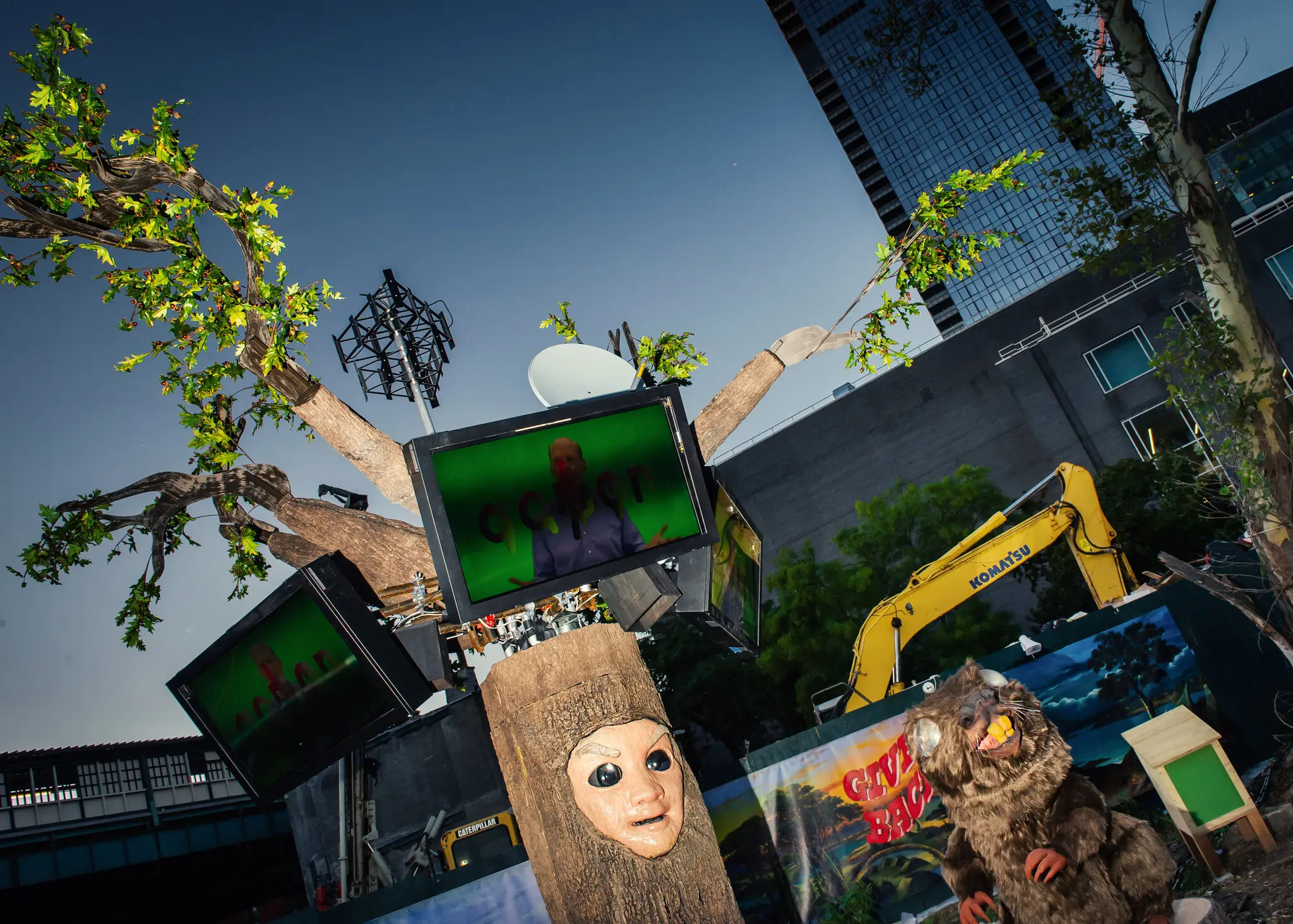
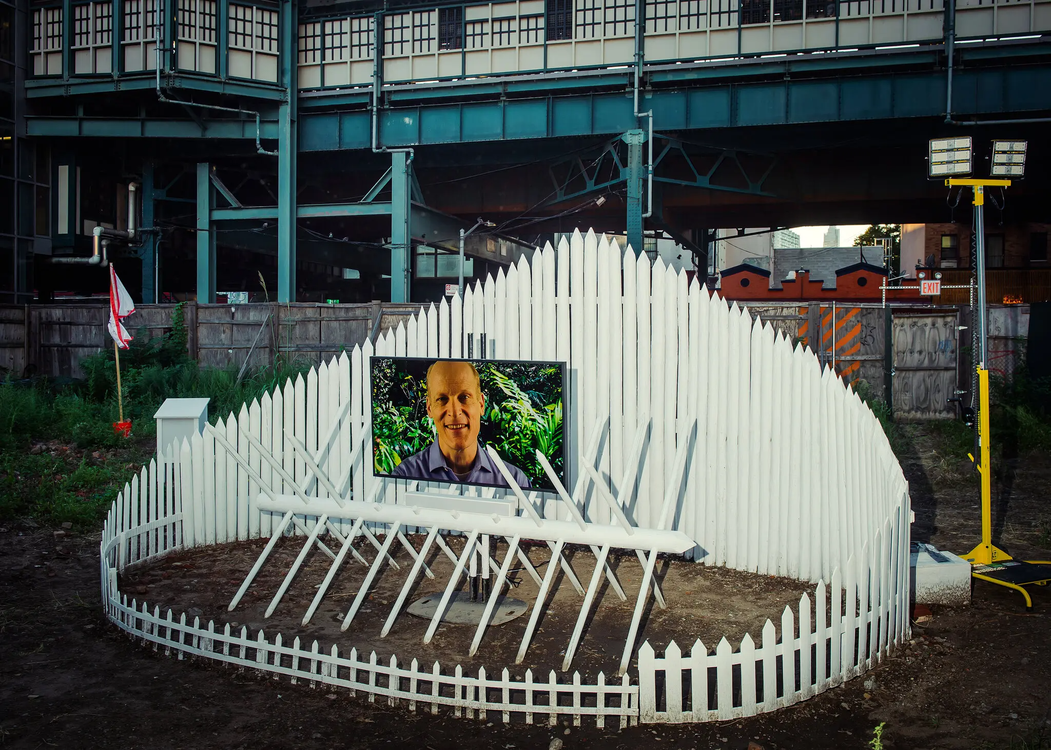
The campaign features brilliantly demented illustrations by Dylan Clancy, that Disney-fy themes of settler colonialism. In addition to illustration NRO took some Materpiece Theater style photos of legendary underground actor Jim Fletcher, a regular collaborator, posing as a whealthy art patron surrounded by his collection of native art.
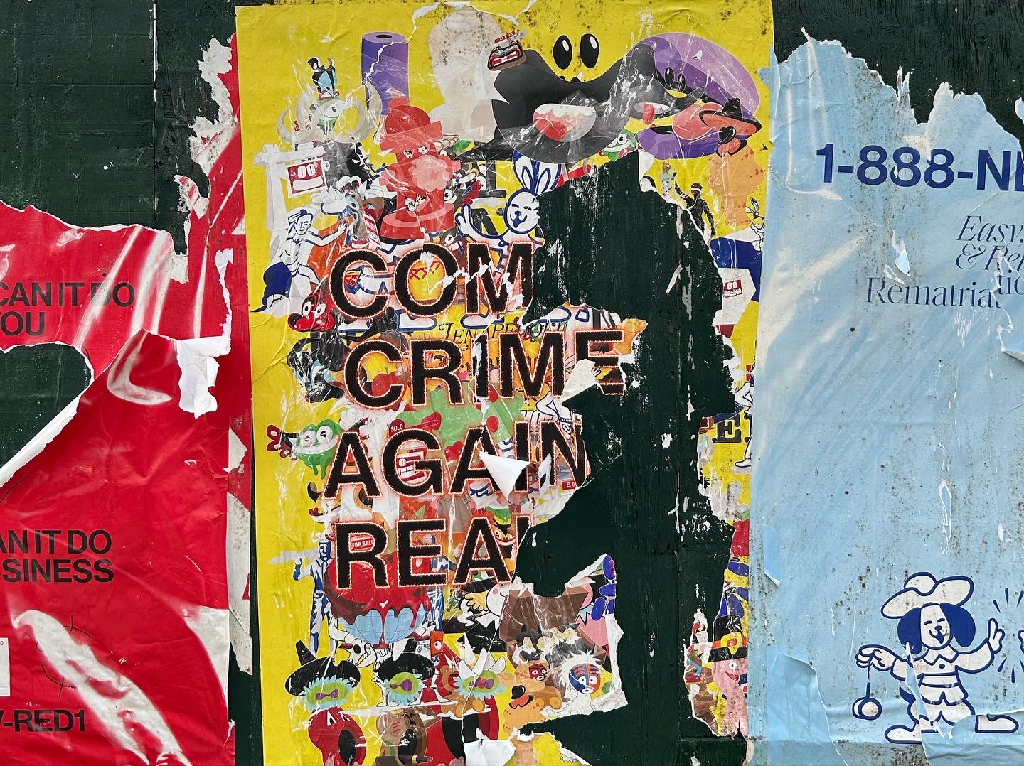
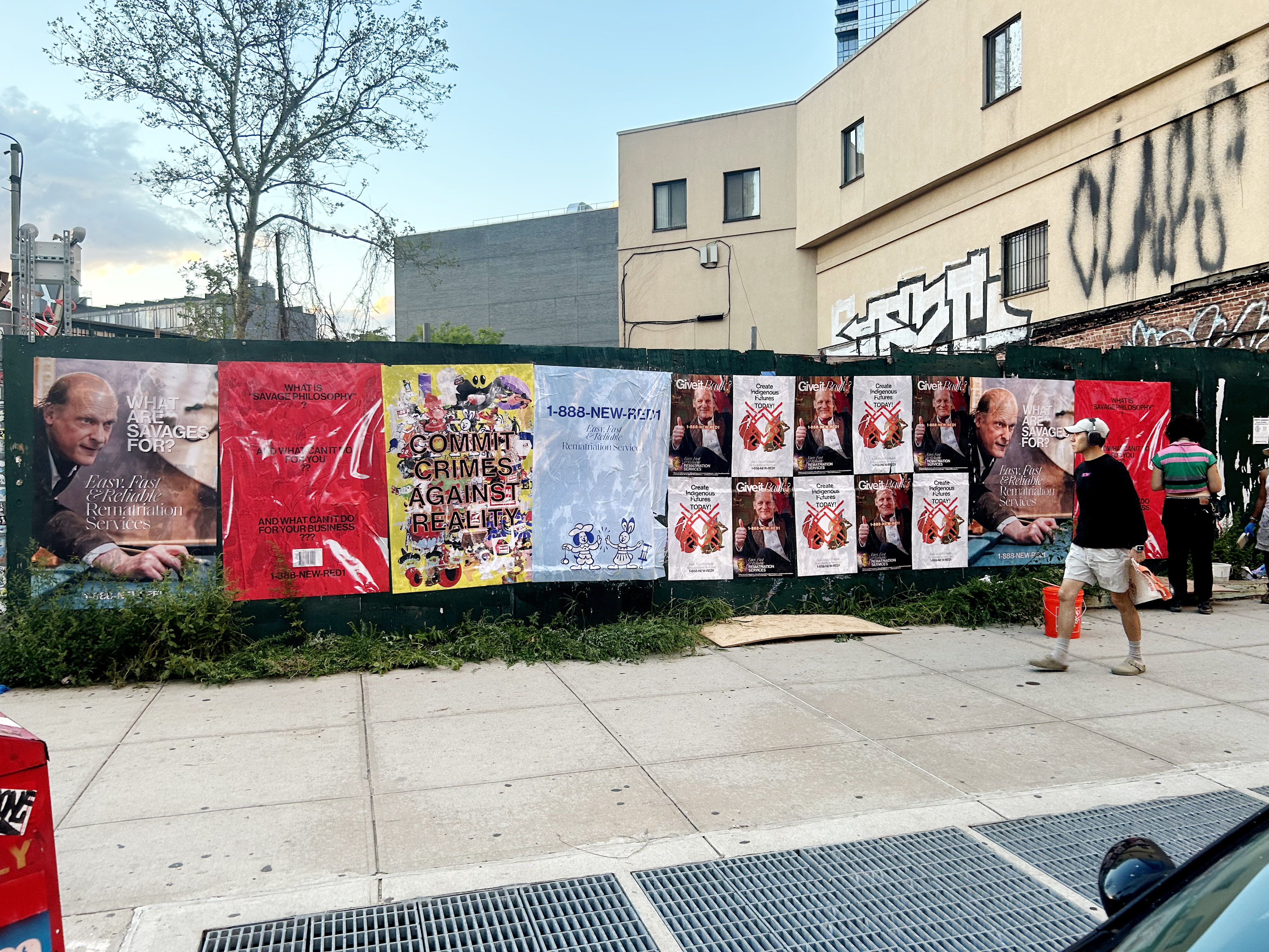
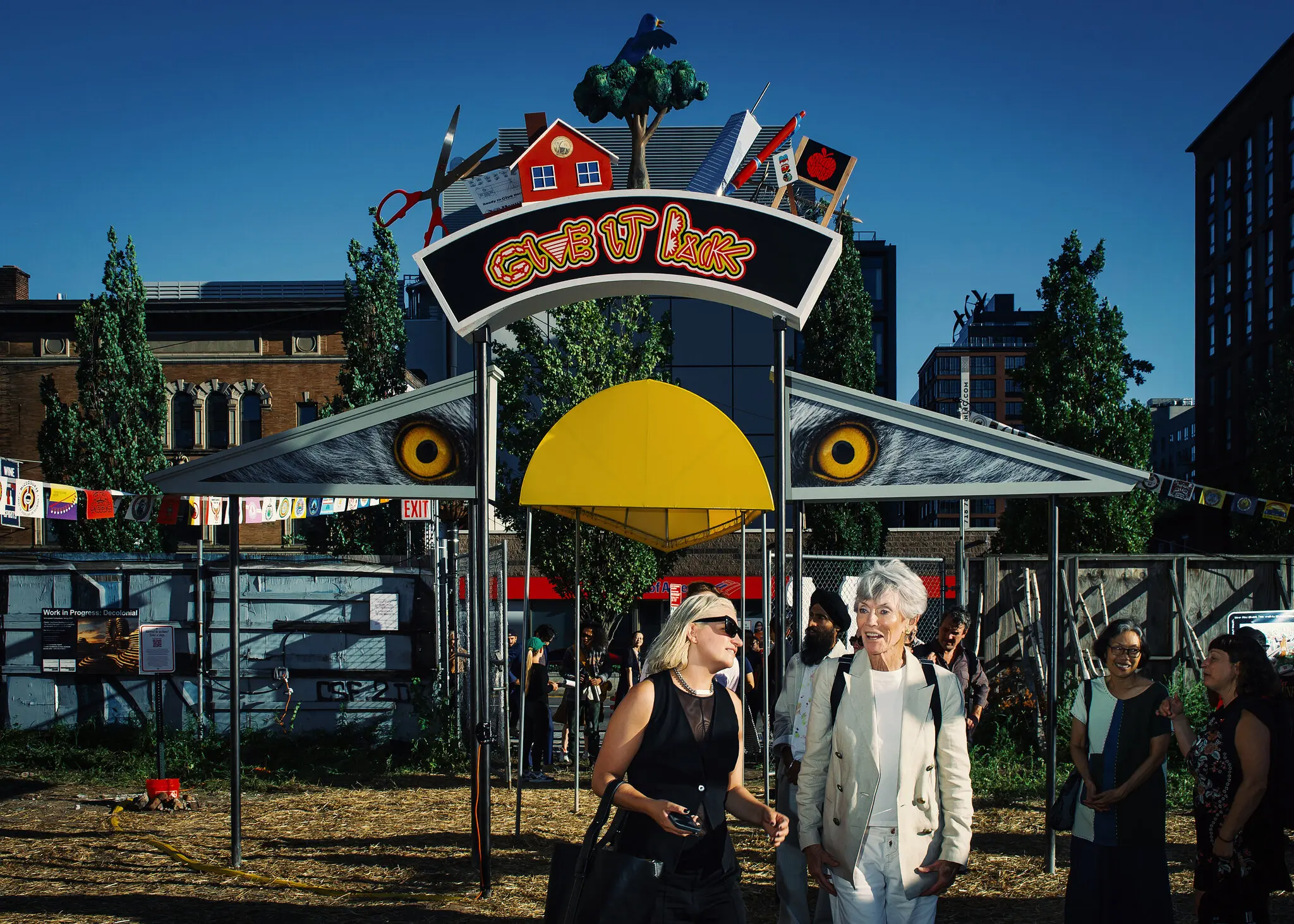

The critique emerges through the congnitive dissonance. On one hand they stage a Worlds Fair where, historically, “Indigenous people were often dehumanized or romanticized in exhibits used to dispossess them of their lands and legitimize colonial plunder.” On the other hand they invert that model through the use of satire—creating an environment that pairs a spectacle of contemporary art with cold hard facts that lay out historical examples of colonial violence
![]()
![]()
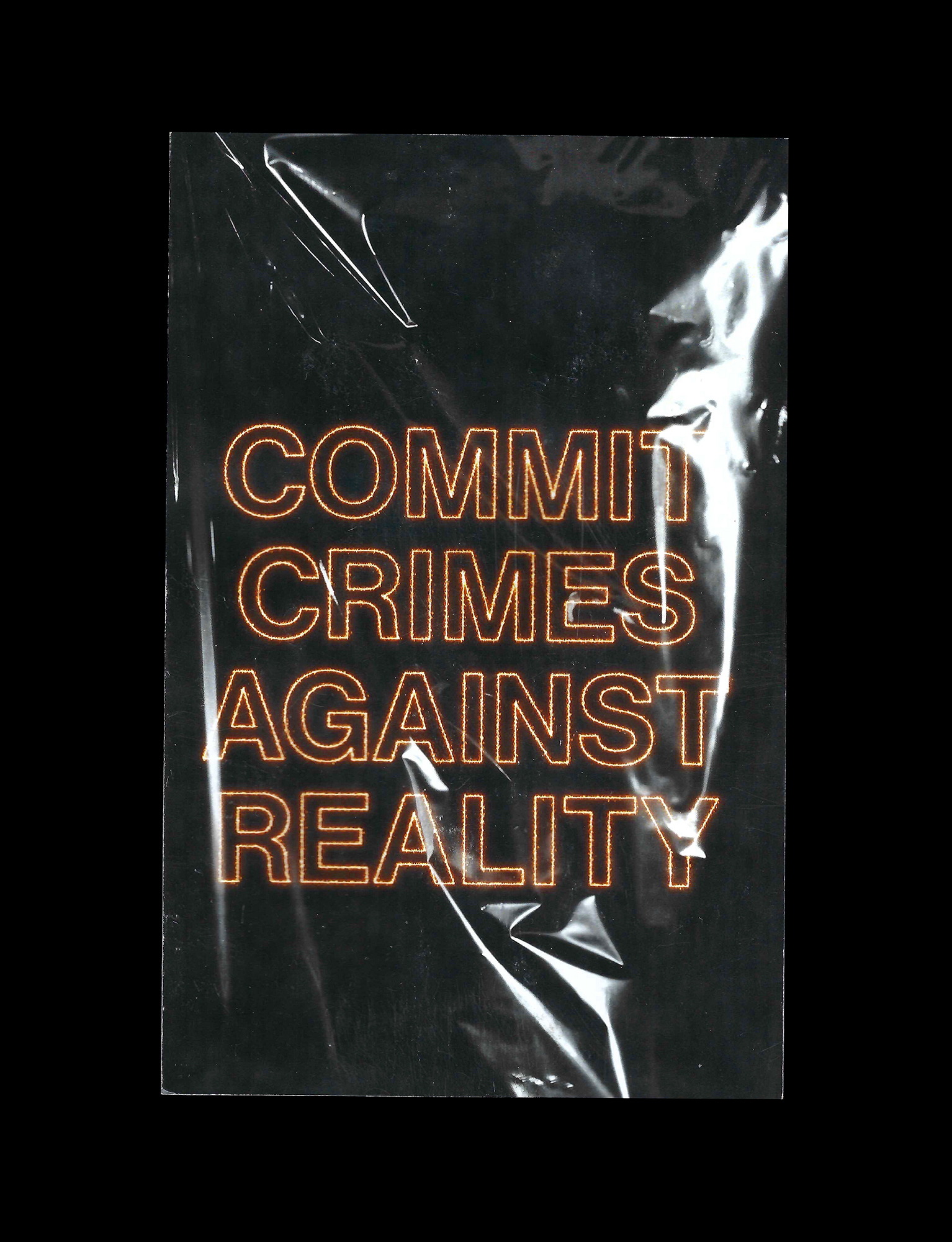
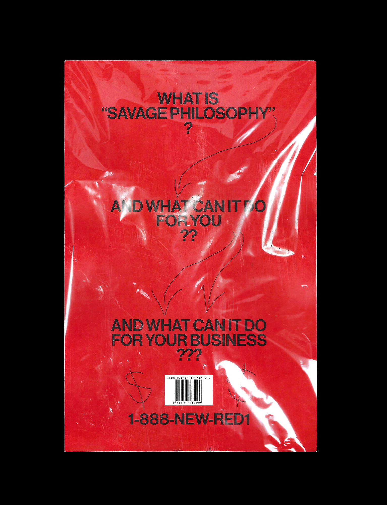
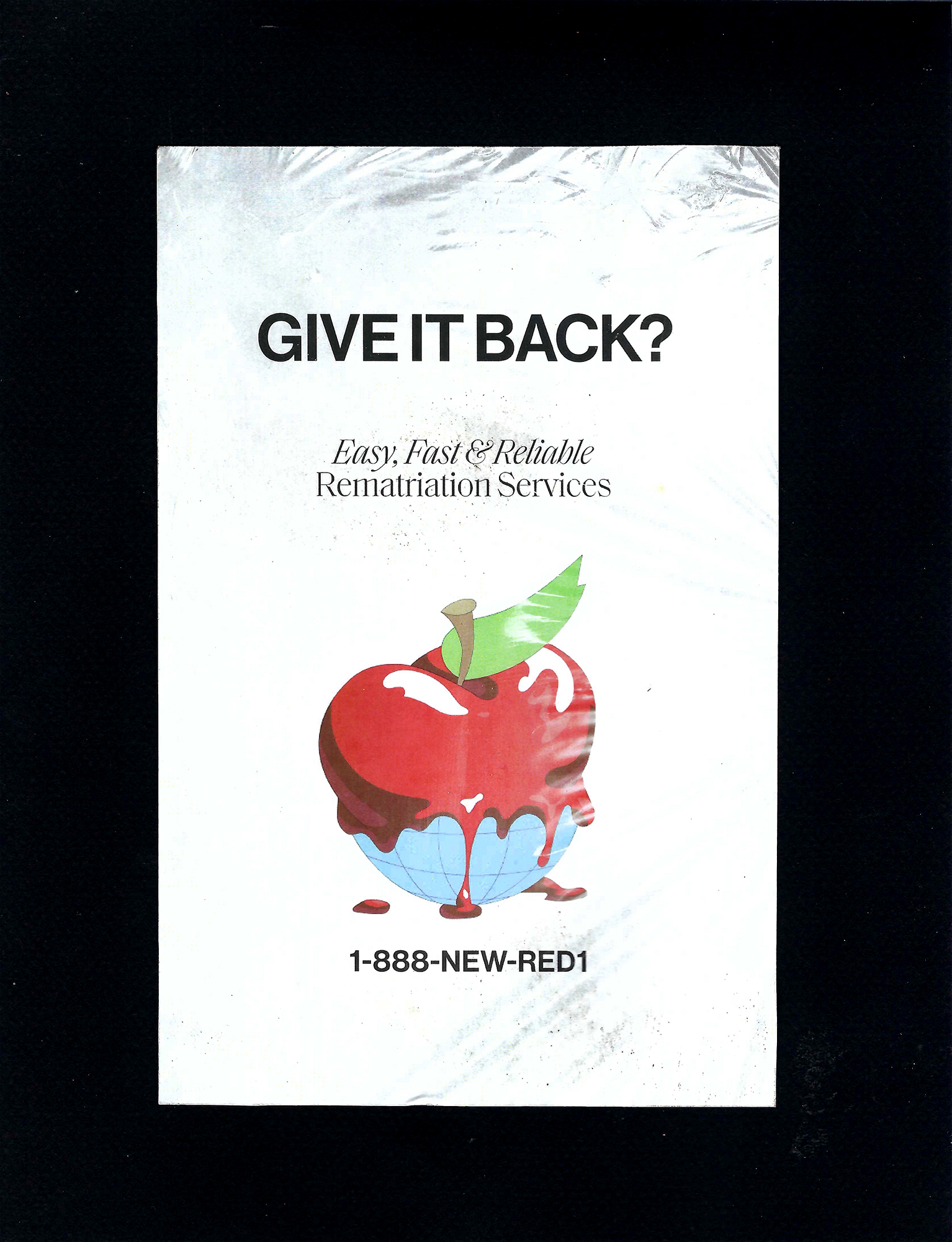
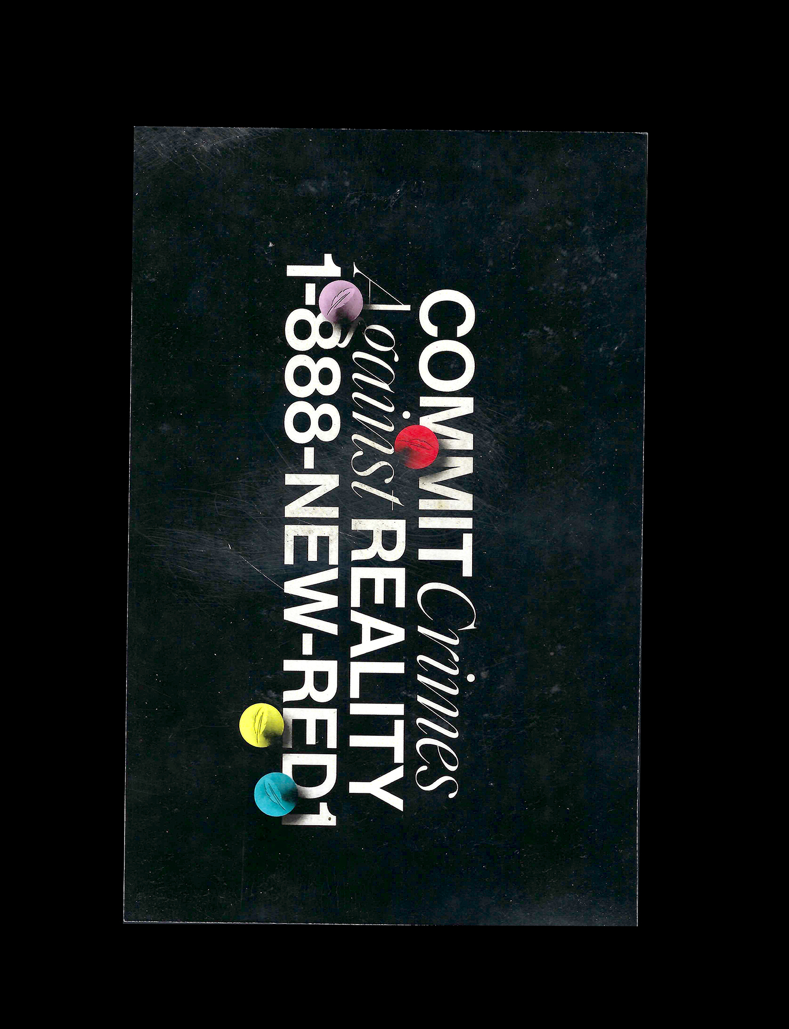
The campaign pulls from a range of influence I’ll get into below. Many of them are shown with a layer of plastic covering the layout, dually acting as a refernce to moving and packing while it creates a veil of critical distance between the viewer and the message.
Below are just a few of the many aesthetics I explored early on. They range from ultra corporate bank inspired ads (a nod to the Bank of America building that towers over the project site), to a range of alternative realitites that may or may not be desireable. In the end I realized that a.) I was making ads so they should feel like a campaign b.) the more blunt and deadpan the delivery the more they read as satire.


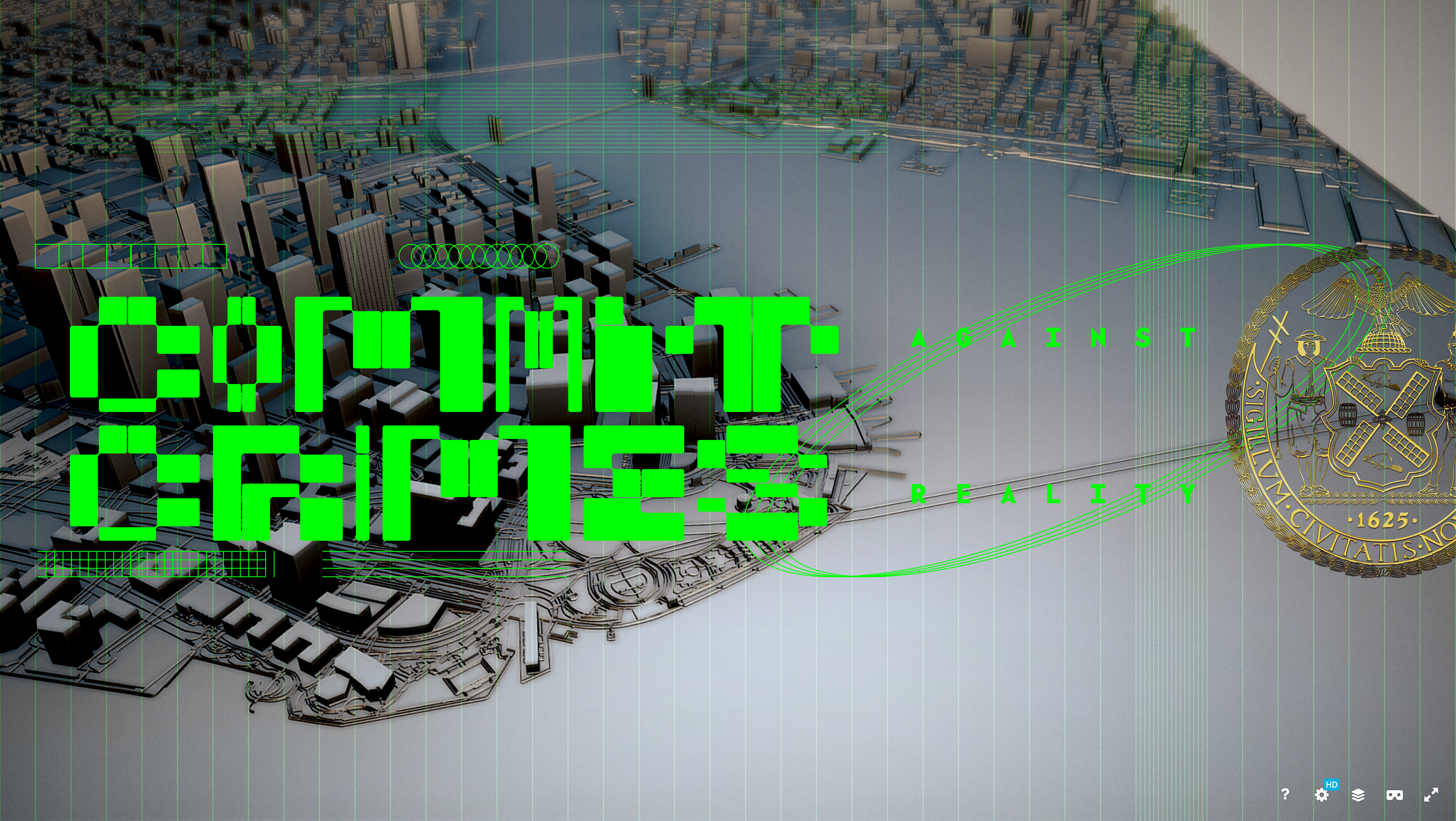

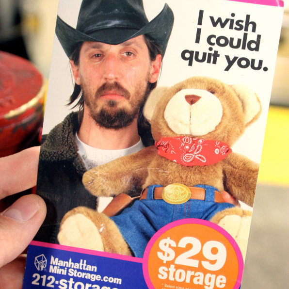
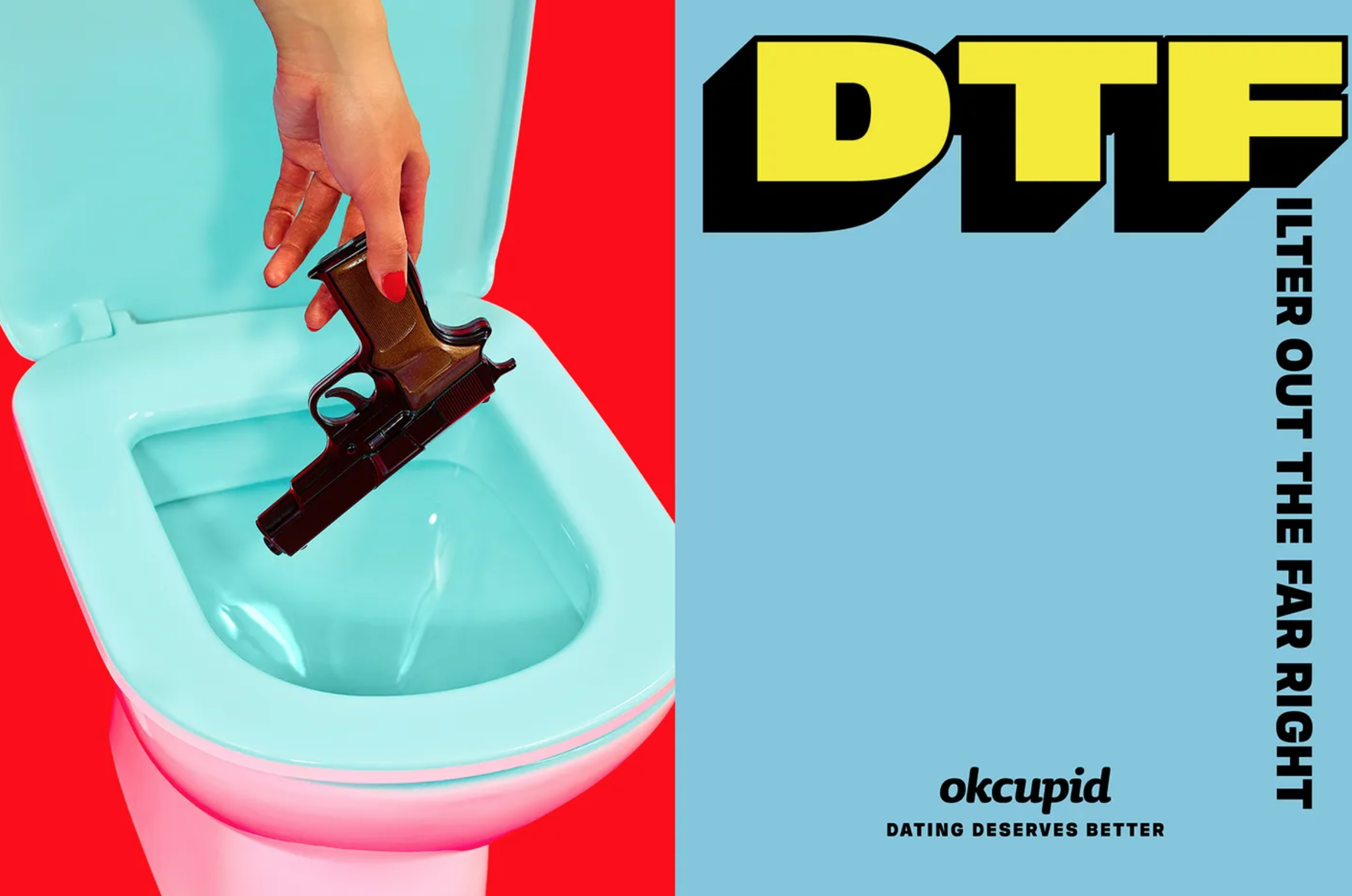
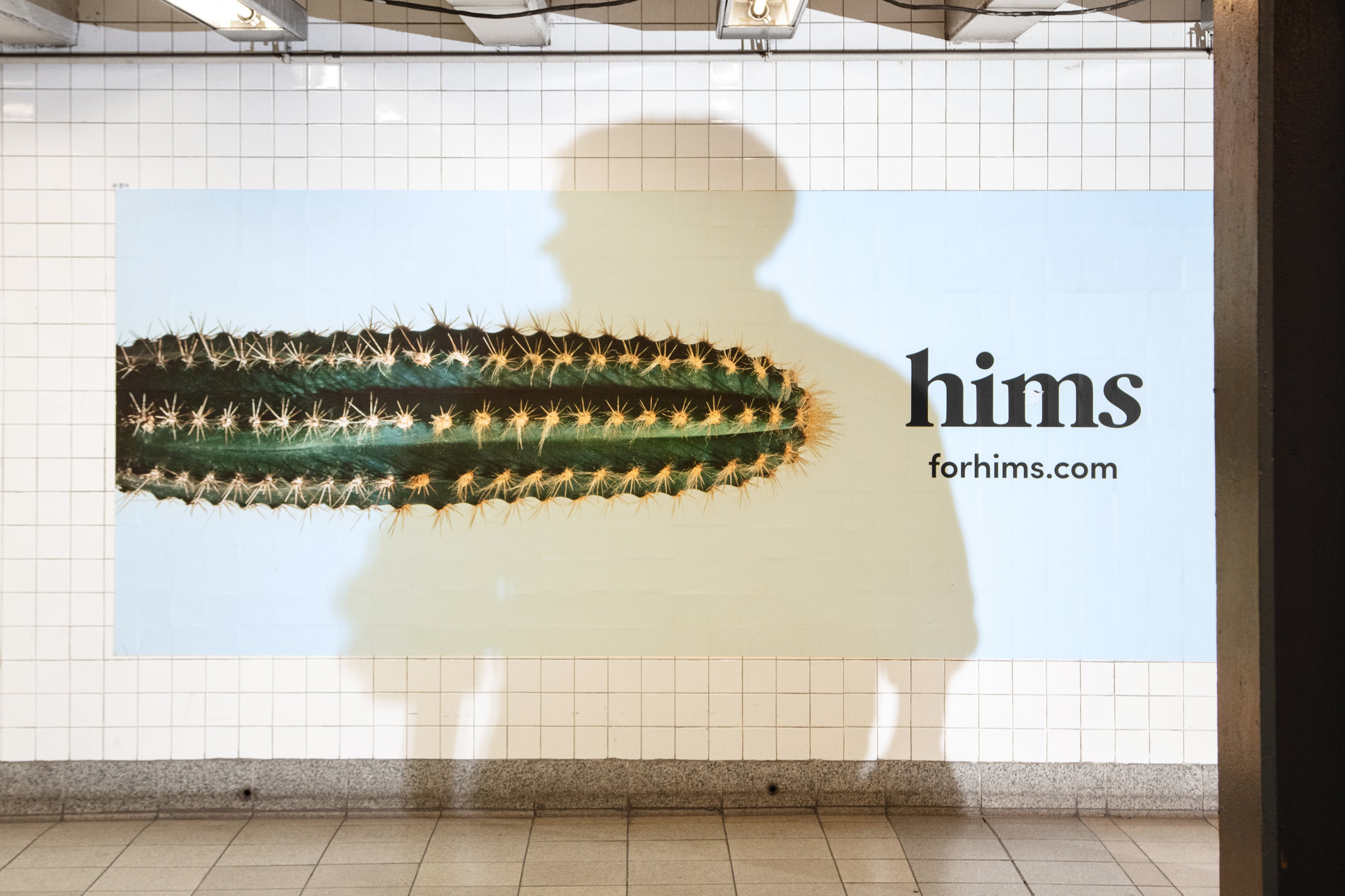
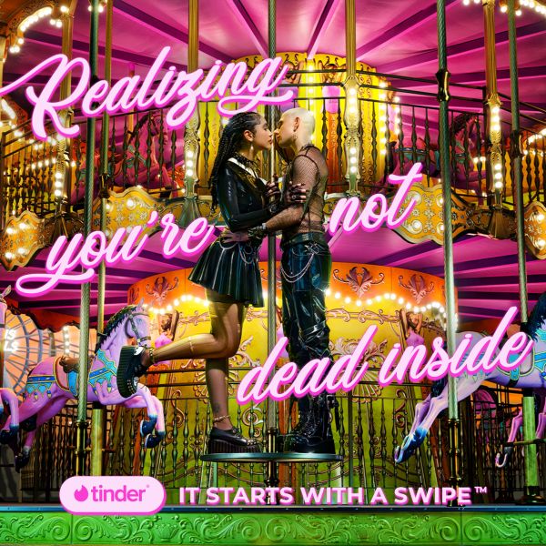
As I honed in on a direction I looked to the weirdness of MTA advertisting for inspiration. A hallmark of this regional vernacular is a distinct crassness in tone. The messaging is shameless, judge-y, and decidedly liberal—evoking the pain of being human, hot button issues in bi-partison pollitics, and unabashed references to identity tropes. The sensibility feels at home on the subway, the neural net of a wildly diverse megalopolis the both encourages and rewards obsessive, neurotic personalities. An on aesthetic level, this type of ad tends to be rendered in amateurish strokes, which make the overly confident tone even more unhinged.