Queer Landscapes, 2022
Website and identity design for An online archive
of landscape architecture projects
as seen through the lens of queer theory
Website and identity design for An online archive
of landscape architecture projects
as seen through the lens of queer theory
for Sami Sikinas
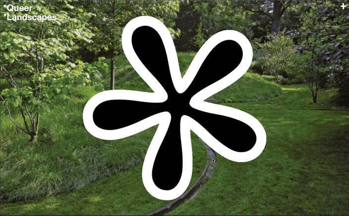
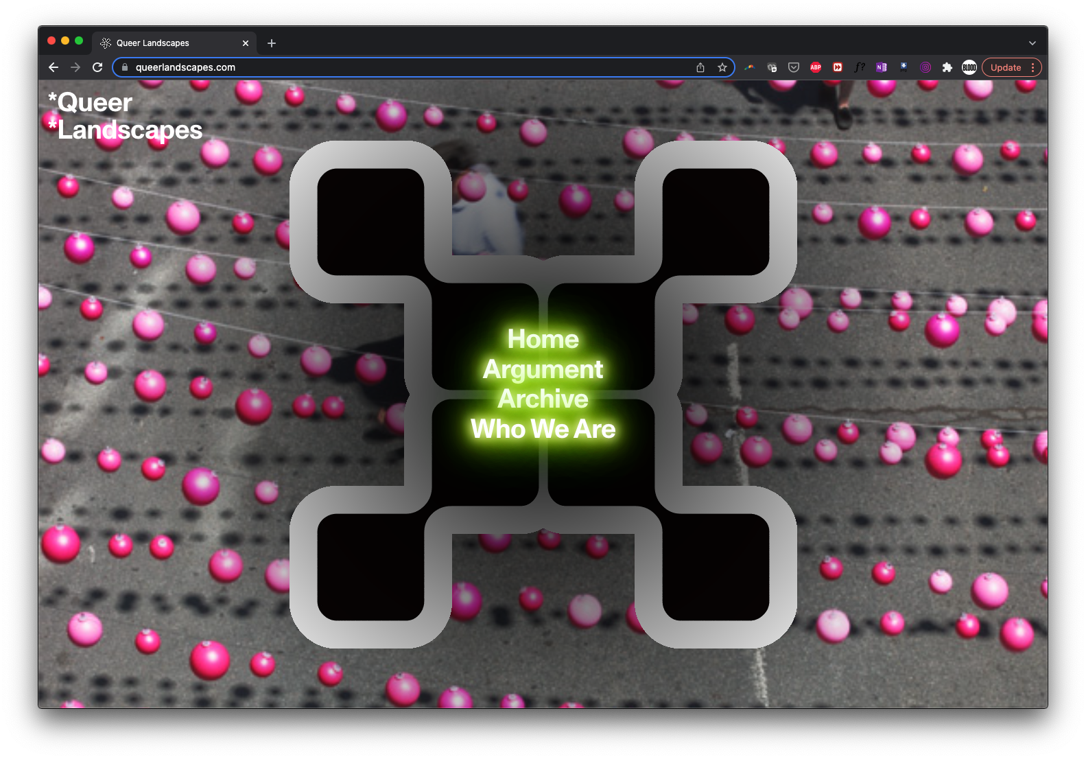
Sami and I agreed on feeling as though the word “queer” has been used and abused to the point of ad nauseam. As Lee Edelman posits in the book No Future: Queer Theory and the Death Drive the radical inclusivity of queerness has reached a logical conclusion—becoming so inclusive that it fails to signify with any real specificity. Regardless we both recognize the value in applying a queer lens to landscape architecture (or anything, really), as long as the terms are clearly defined. We honor this by using an astrix for the logo (implying further reading is required) and use it at a monolithic scale—one of the oldest tricks in the architect’s book—only now it becomes a confident display of instability.
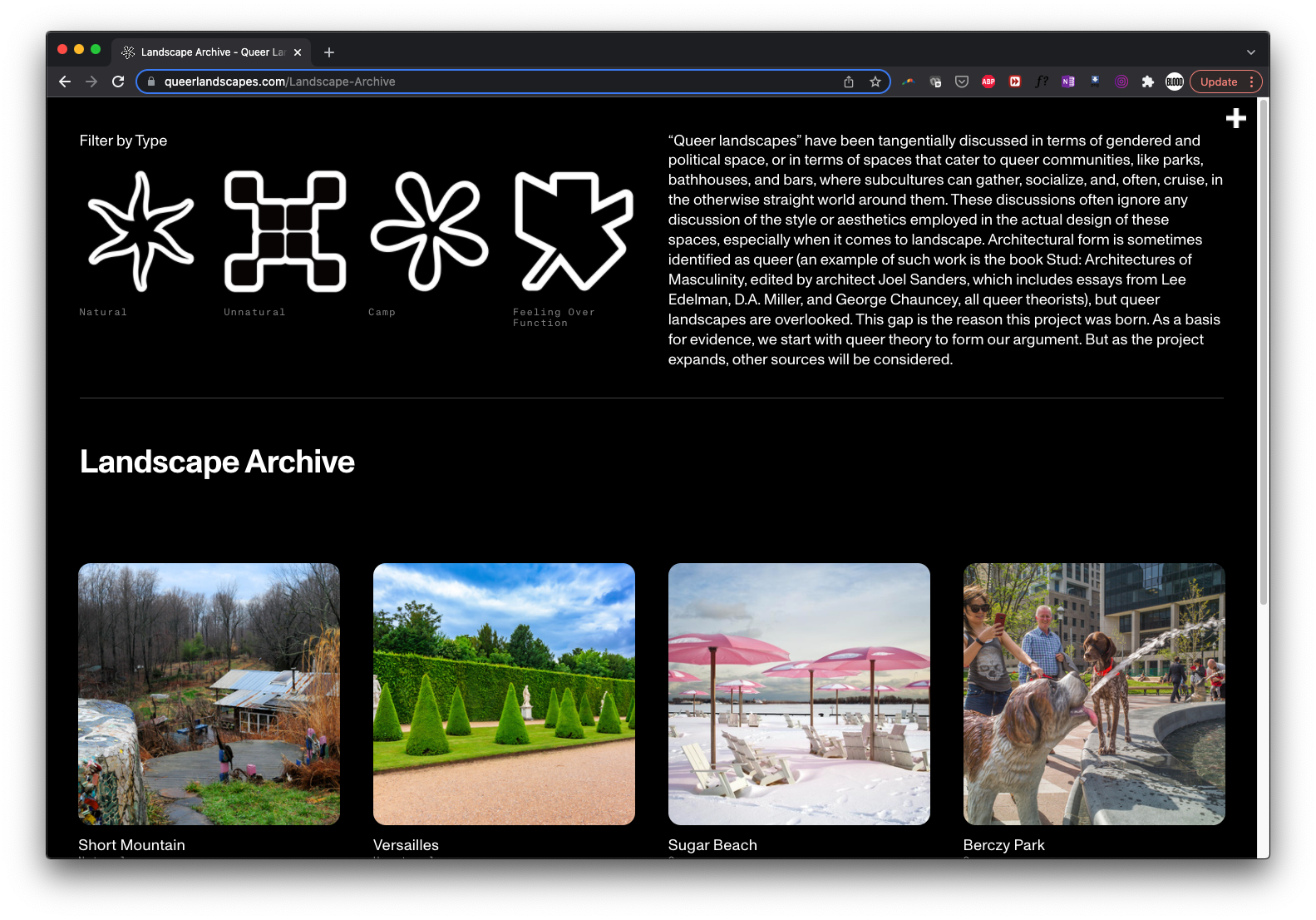
Playing a bit more with architectural tropes, we (further) complexified things by animating the logo, a roulette of astrices, each pertaining to a category defined within the project. The logo is decidedly not singular, nor is it binary in its working logic. Furthermore still, both words in the title appear with an asrtix, destablizing the meaning of each word to an absurd degree. As a final nod, the hierarchy between the astrix and the title of the project is reversed, subverting the power dynamic in a way that (at least to me) feels queer.
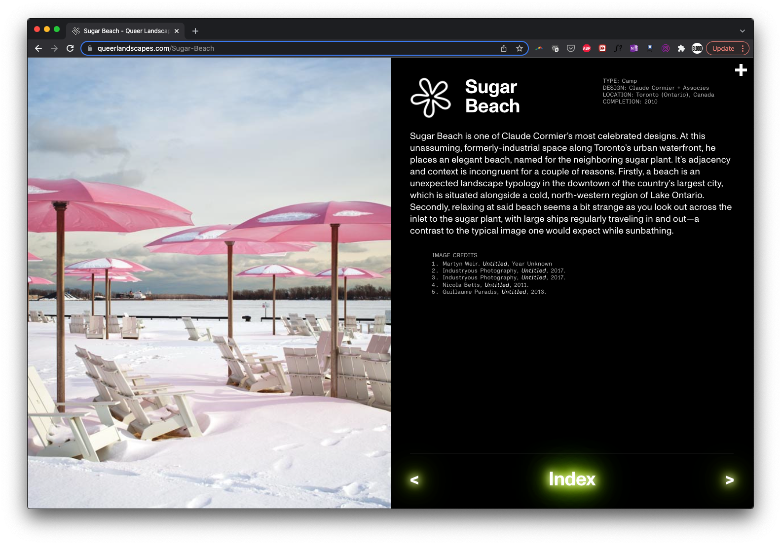
![]() Landcape design often feels a bit utopic to me, and the editorial lens for the archive definitely has a flair for the eccentric. To honor this quality, a supernatural glow is used—creating depth within the picture plane and adding some friction against the otherwise tasteful (even if exaggurated) institutional design scheme. The glow conjurs an otherworldly sensibility, a quality that I imagine one must need to design environments that toe an uncanny line between nature and artifice.
Landcape design often feels a bit utopic to me, and the editorial lens for the archive definitely has a flair for the eccentric. To honor this quality, a supernatural glow is used—creating depth within the picture plane and adding some friction against the otherwise tasteful (even if exaggurated) institutional design scheme. The glow conjurs an otherworldly sensibility, a quality that I imagine one must need to design environments that toe an uncanny line between nature and artifice.