Taking Buildings Down, 2016
identity and newsprint design for a competition soliciting ideas for how to make architecture from subtraction rather than addition
identity and newsprint design for a competition soliciting ideas for how to make architecture from subtraction rather than addition
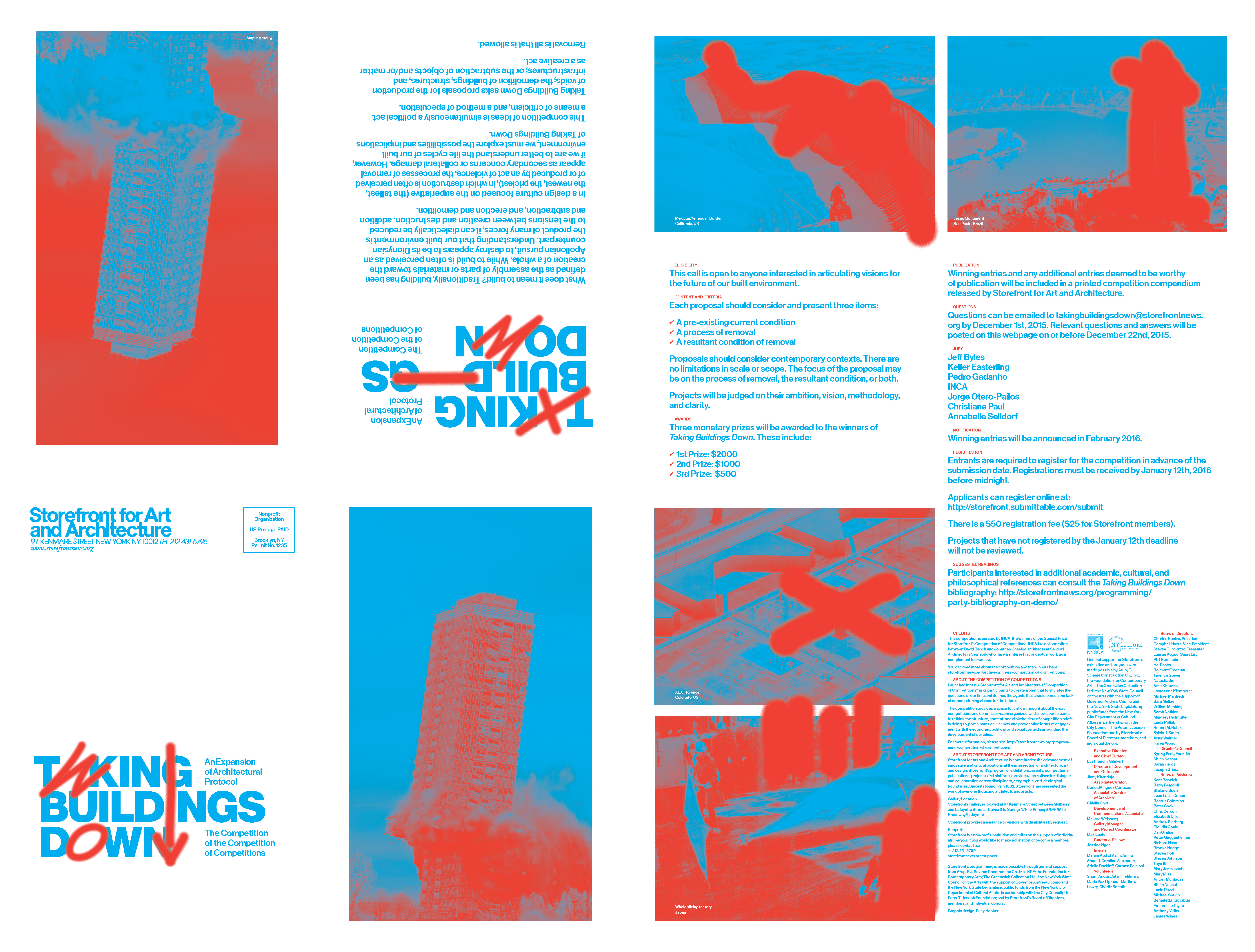
I worked with (then) Storefront director Eva Franch i Gilabert to develop the identity and design for a call for ideas, the winner of a previous call for ideas, the Competition of the Competition of Competitions. The premise was simple but provocative—in an age of excess building, what possibilities does subtraction offer?

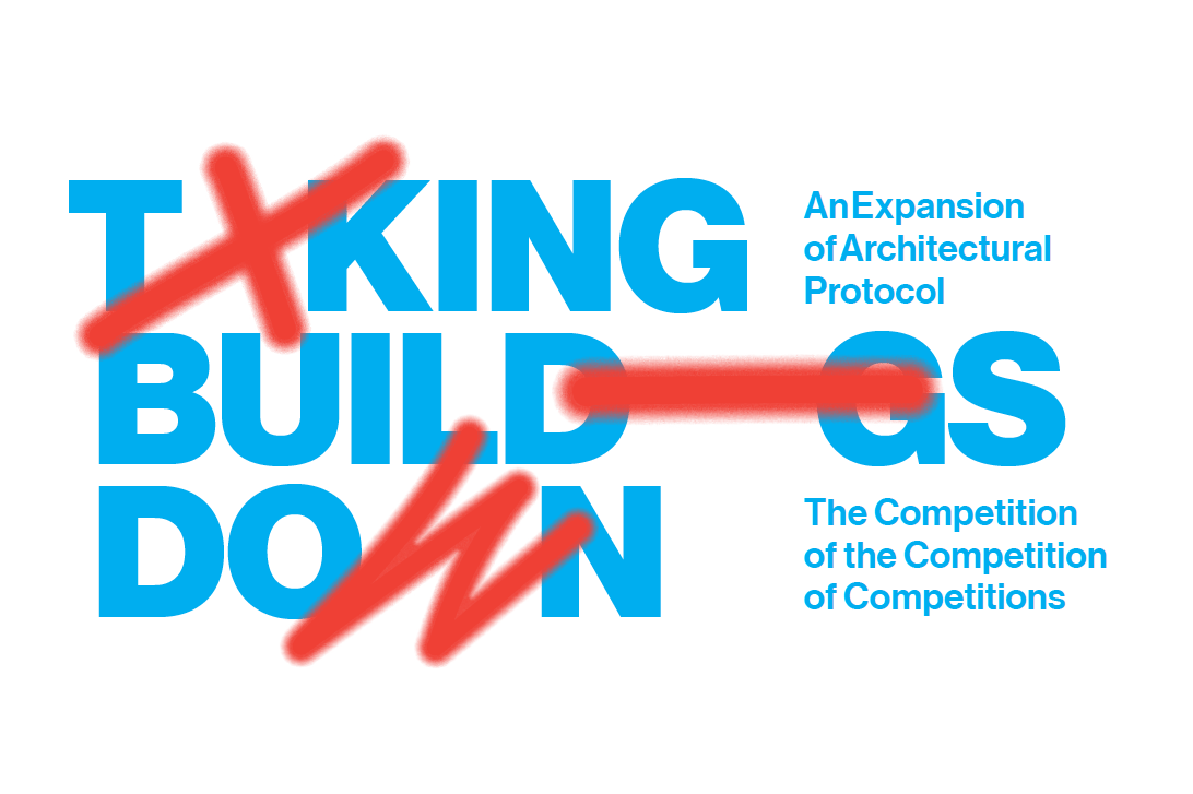
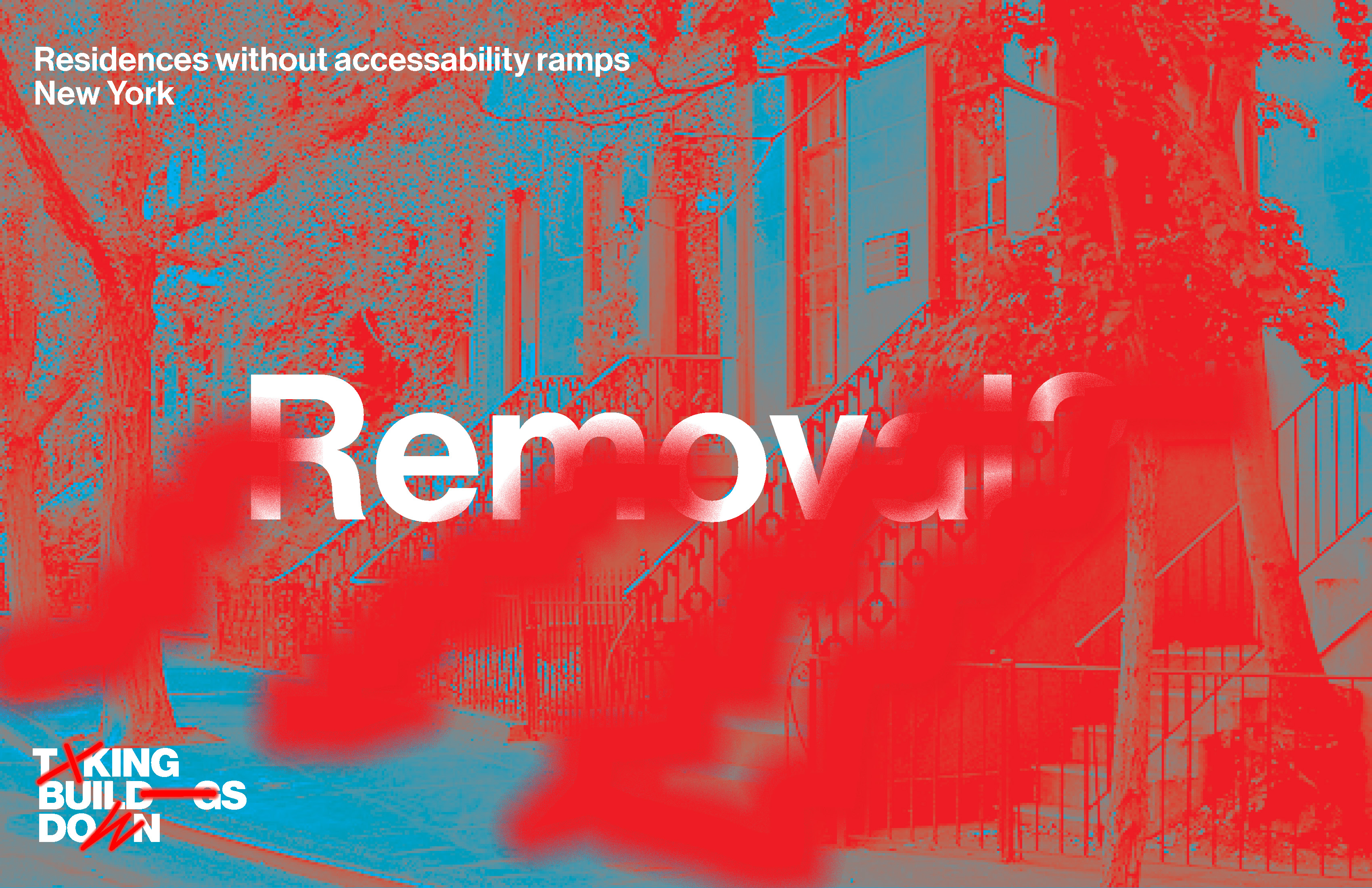
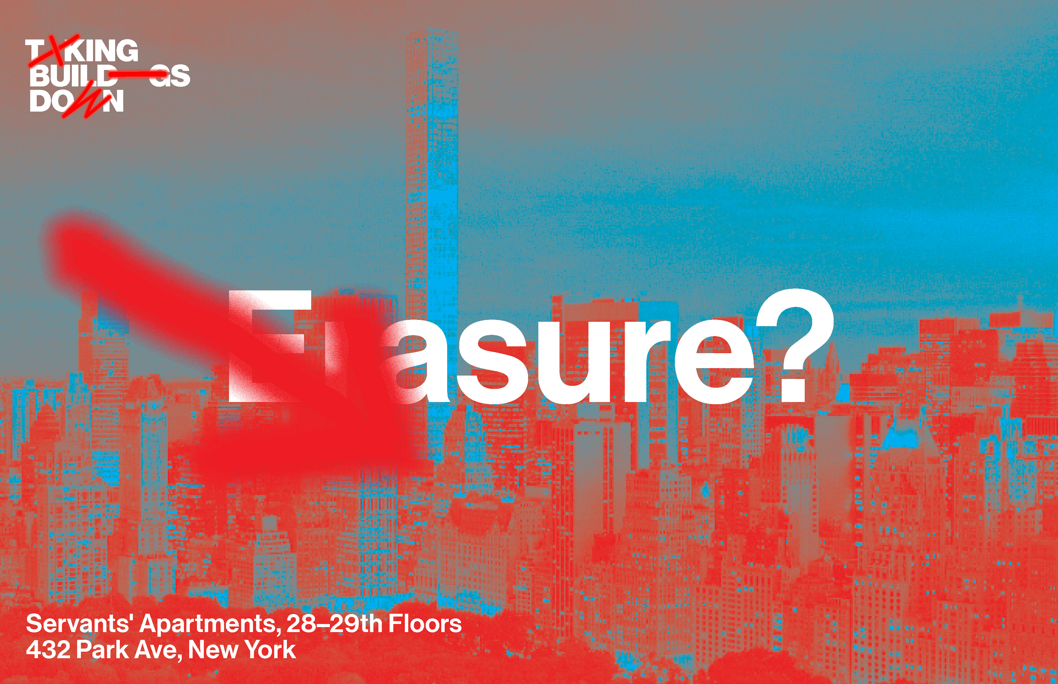
The idea for the logo incorporates spray painted symbols used to mark buildings for demolition and subs them for letterforms. A bit dumb (as I like it), and also recognizeable by contractors and architects alike. So it signifies outside the academic realm, at least in theory ;P
![]()
![]()
![]()
![]()
![]()
![]()
![]()
![]()
![]()
![]()
![]()
![]()
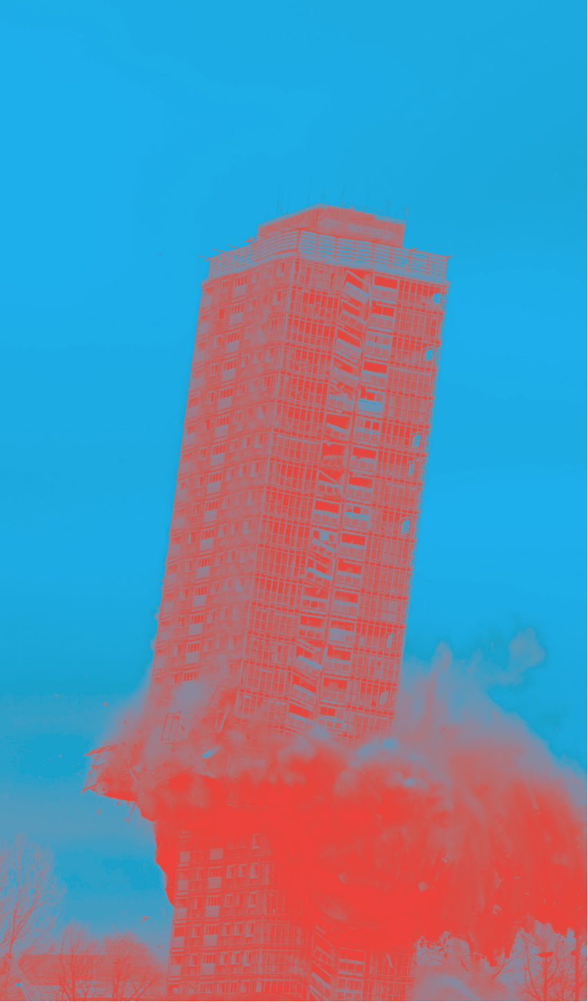
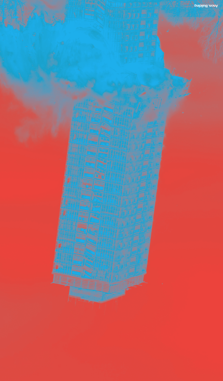
The spray-painted gesture was then extended to scenes we imagined together, alongside a set of words that illustrate different expressions of non-building architecture.
![]()
![]()
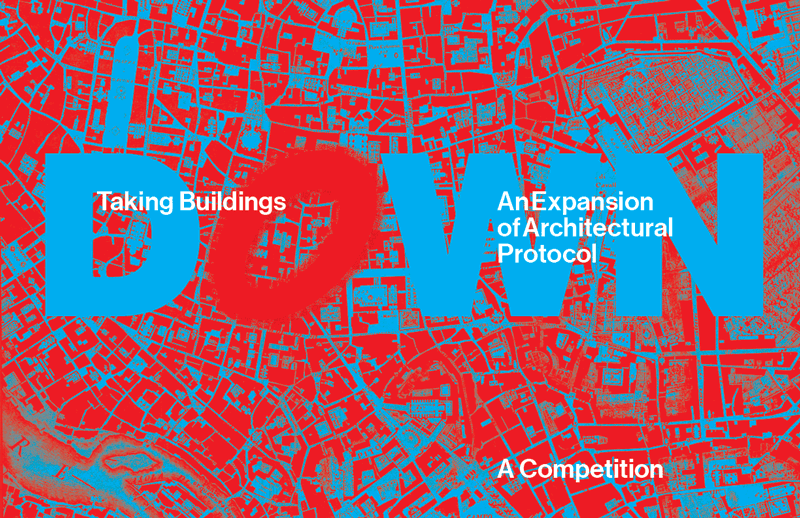
The color scheme is like psycedelic version of the Nolli plan—an almost nausiating game of positive and negative where neither is quite either, but its exciting to look at and sells the provocation embedded into the premise.
![]()
![]()


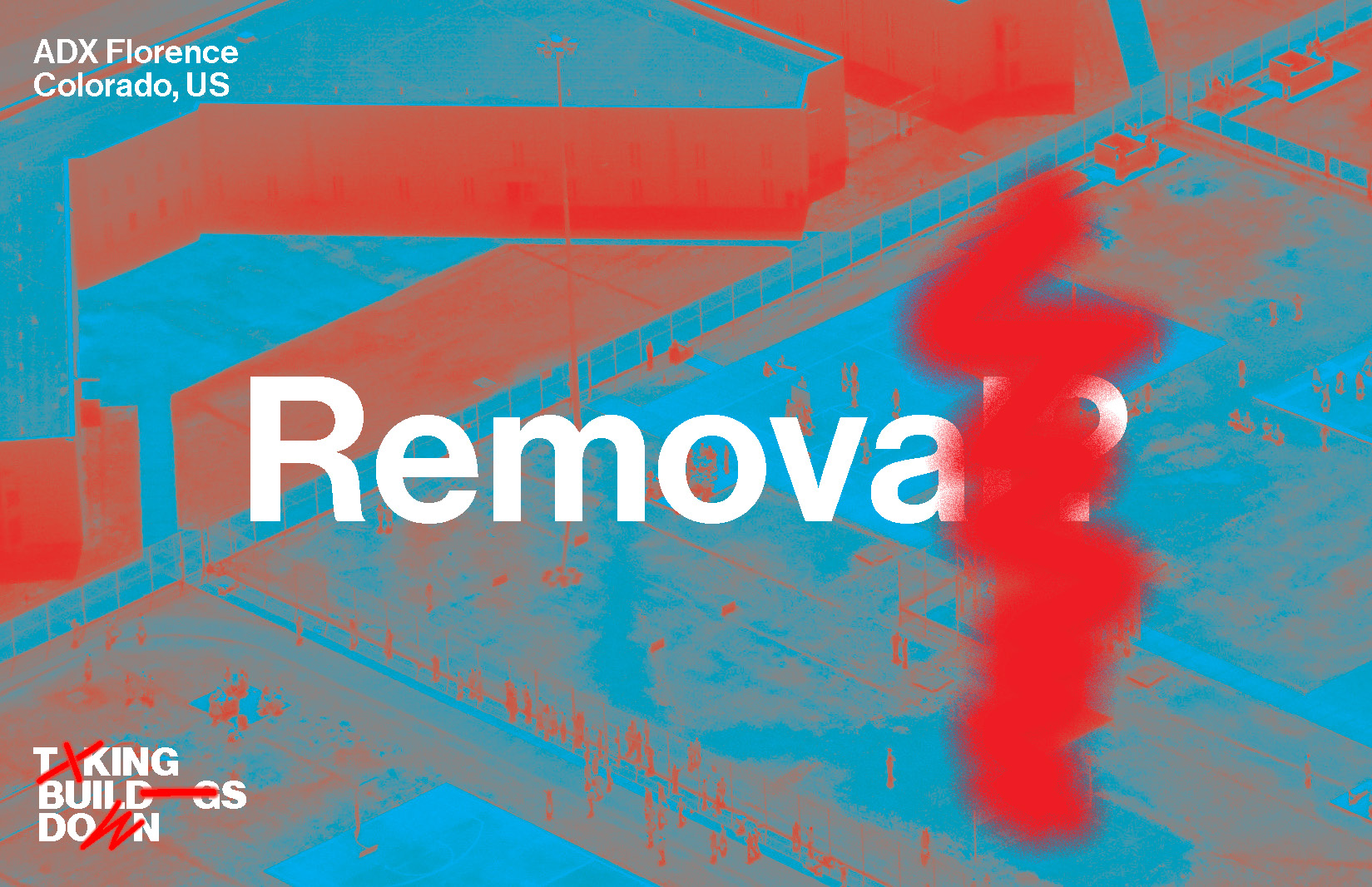


The spray-painted gesture was then extended to scenes we imagined together, alongside a set of words that illustrate different expressions of non-building architecture.
The color scheme is like psycedelic version of the Nolli plan—an almost nausiating game of positive and negative where neither is quite either, but its exciting to look at and sells the provocation embedded into the premise.