Yardy World, 2022
Brand identity system for queer caribbean
food project featuring a custom typeface that
merges bauhaus letterforms
with glyphs from african script
Brand identity system for queer caribbean
food project featuring a custom typeface that
merges bauhaus letterforms
with glyphs from african script
For Devonn Francis
Design with Rush Jackson
Web dev by Camila Mercado
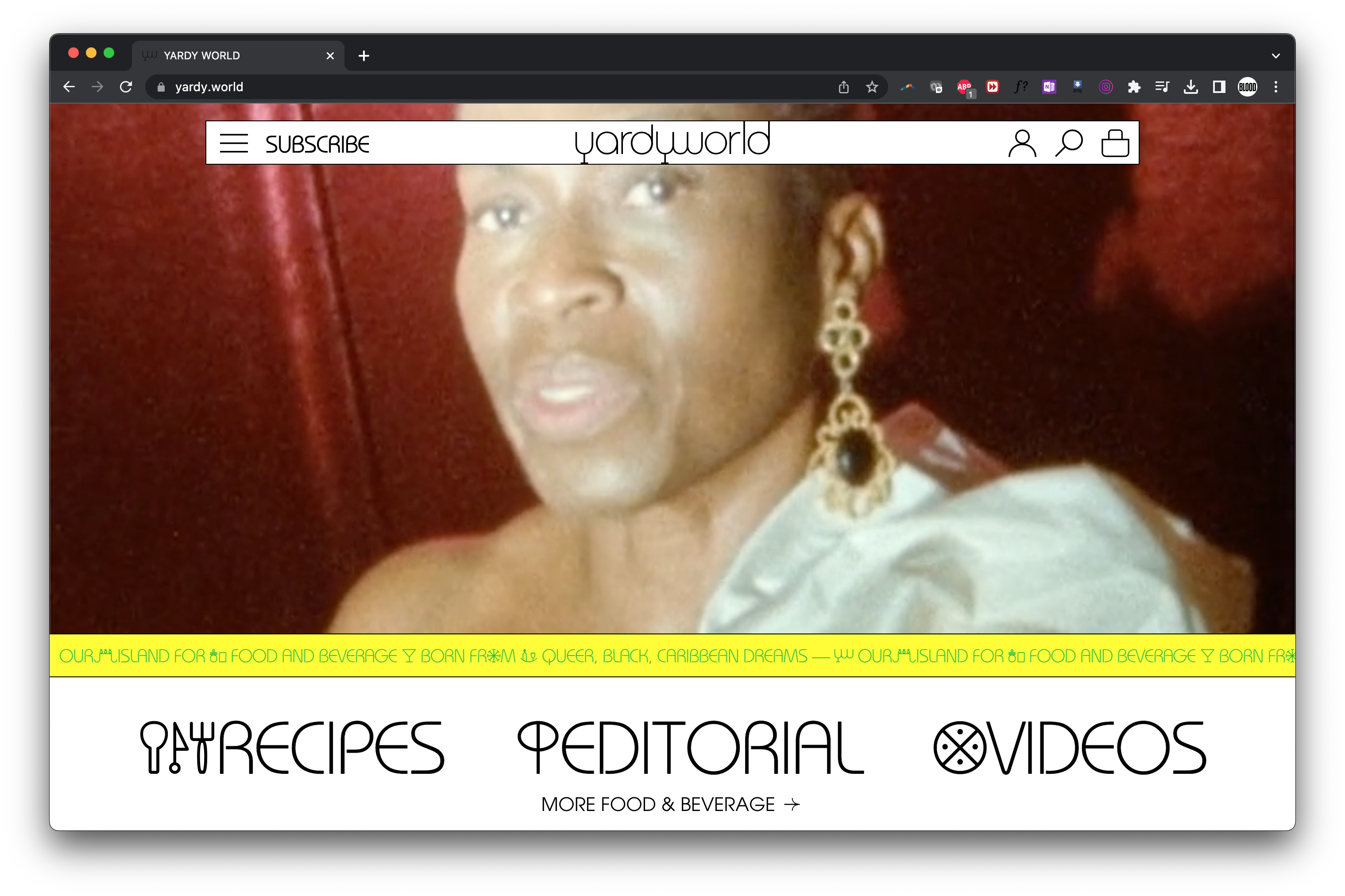
At its core, Yardy World is about community. The way this ethos gets expressed by founder, artist and chef Devonn Francis, is through sharing meals. So much of what makes community important—shared dreams, frustrations, gossip—all goes down while breaking bread. While the project centers queer, black, caribbean community, it still exists (quite elegantly) in a world that doesn’t. When Devonn approached me for this project I thought about turning it down and recommending a queer black designer. After sitting with that notion a bit longer, I came to the conclusion that the intersections and goals of the project would be better honored if I found a black or POC collaborator so that the design process would behave more like the project itself. This began what has been an ongoing and very fruitful working relationship with my dear friend and regular collaborator, Rush Jackson—whom I had been wanting to work with for a while.


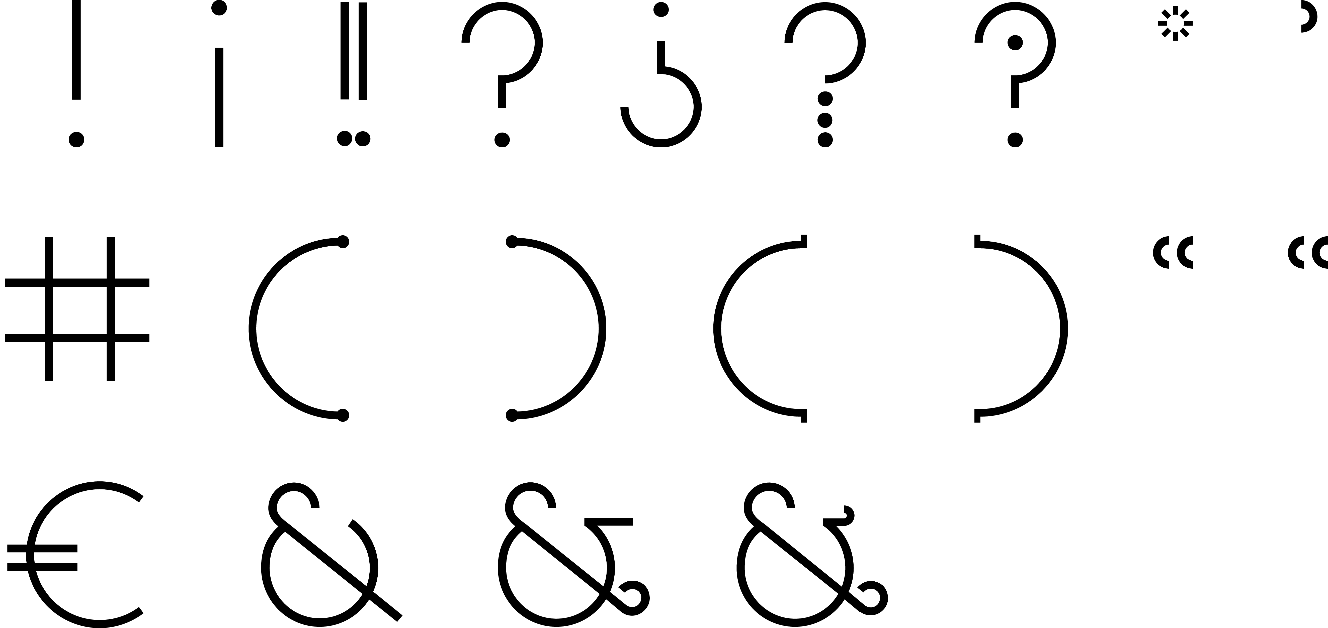
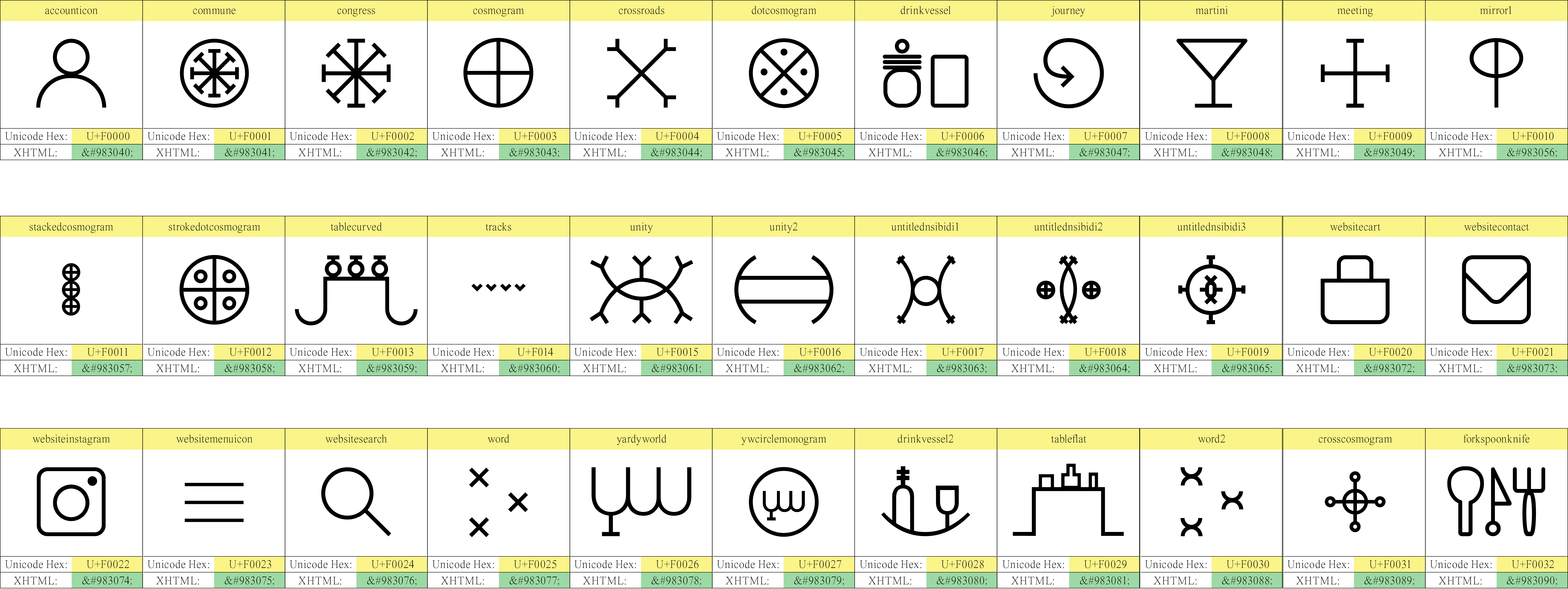
logo and monogram variants
Nsibidi and bauhaus references
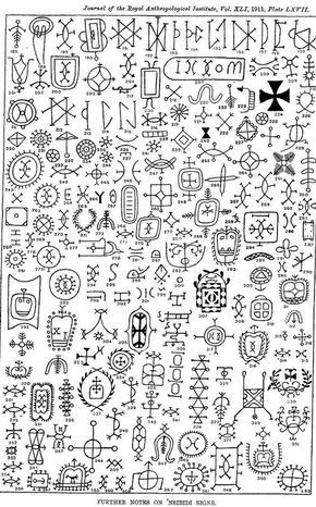
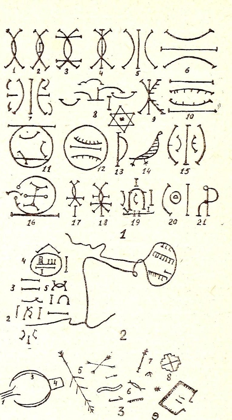
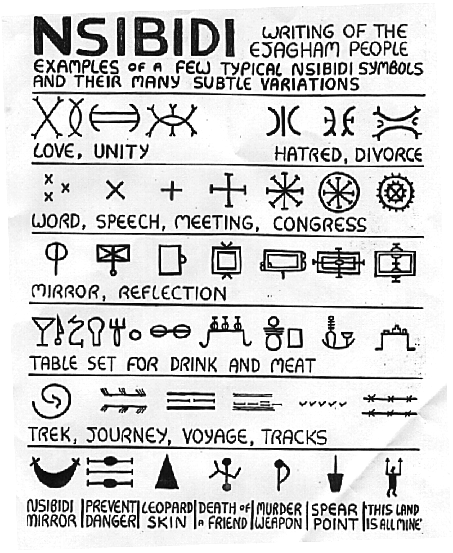
During the research phase Rush pulled some some images of Nsibidi glyphs—a captivating and extensive pictographic language originating in what is now known as southern Nigeria. While both enamored with the strangely familiar allure of these glyphs, at first we were unsure how to incorporate them, or if we should at all.
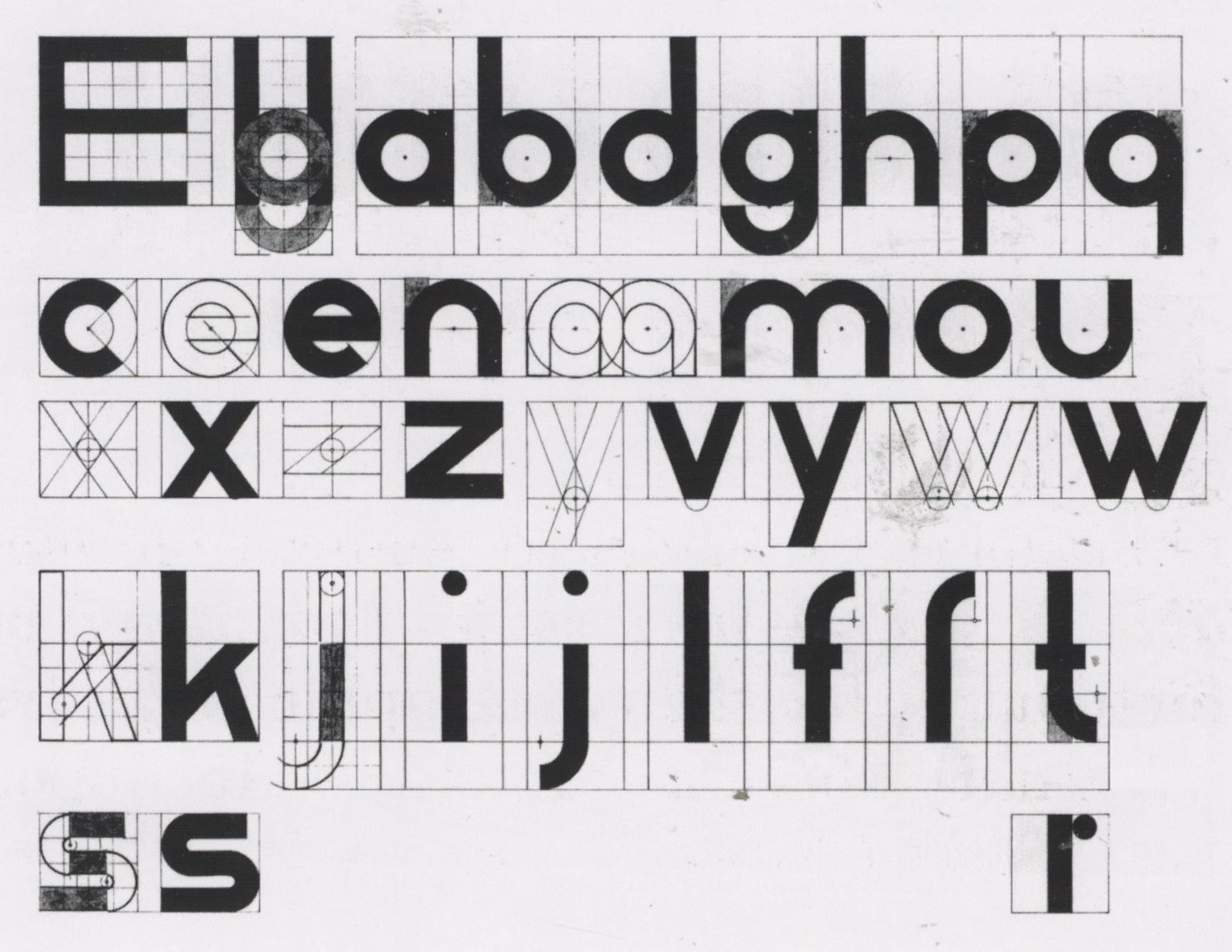
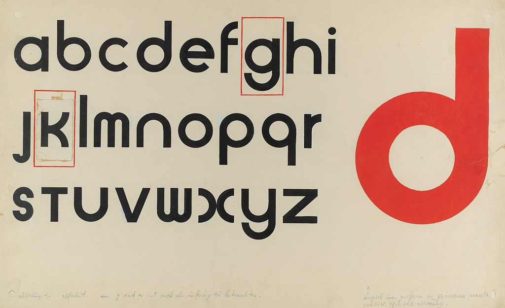
We had discussed a direction where glyphs could be substituted for letterforms, but nothing had quite come of it until I was cycling through my font library and landed on ITC Bauhaus Light on a whim. The contentious historical entanglement between modernism, and art from the African continent came in to sharp focus—only instead of Picasso it was Herbert Bayer. The beauty and the violence was all right there.
We had discussed a direction where glyphs could be substituted for letterforms, but nothing had quite come of it until I was cycling through my font library and landed on ITC Bauhaus Light on a whim. The contentious historical entanglement between modernism, and art from the African continent came in to sharp focus—only instead of Picasso it was Herbert Bayer. The beauty and the violence was all right there.
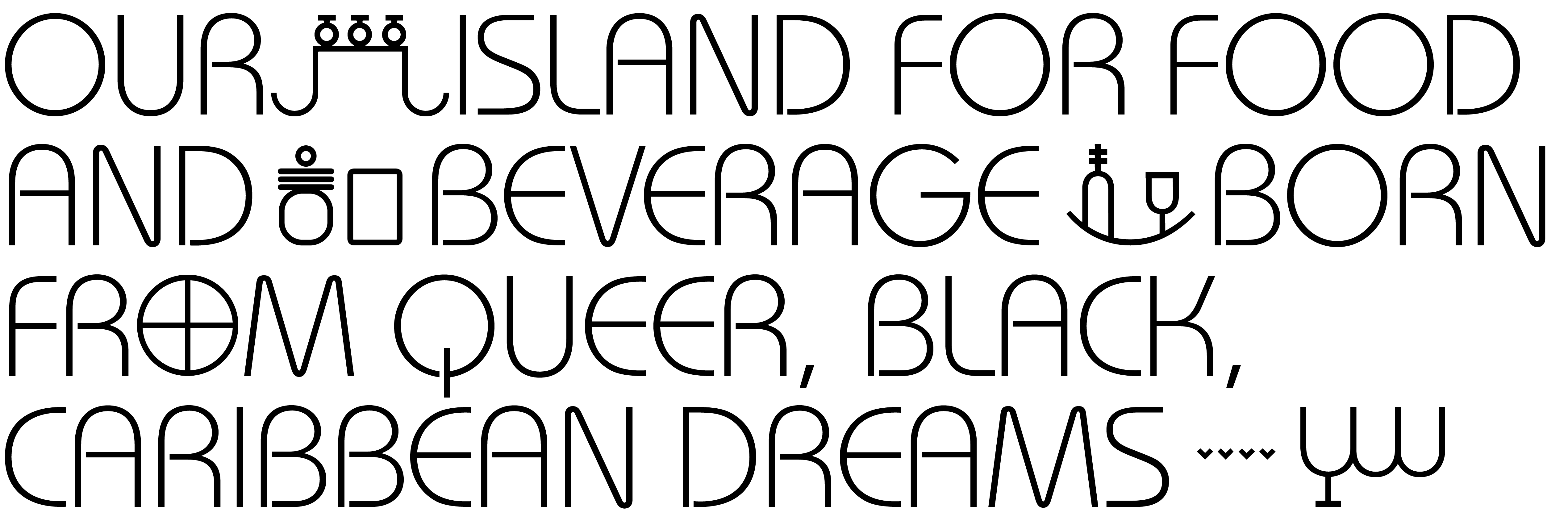
The core of the identity became a bespoke typeface we call Bauhaus Nsibidi, which merged a selection of pre-existing and newly formed glyphs into the infamous , problematic fav, Bauhaus. We see this as a reconsiliation of sorts—injecting the source material back in to that which was plundered by centuries of colonial violence, and at least a century of European graphic designers making absurd claims around inventing a universal visual language. A gesture that not only reveals such a divide, but attempts to bridge the gap (or at least propose that it is possible).
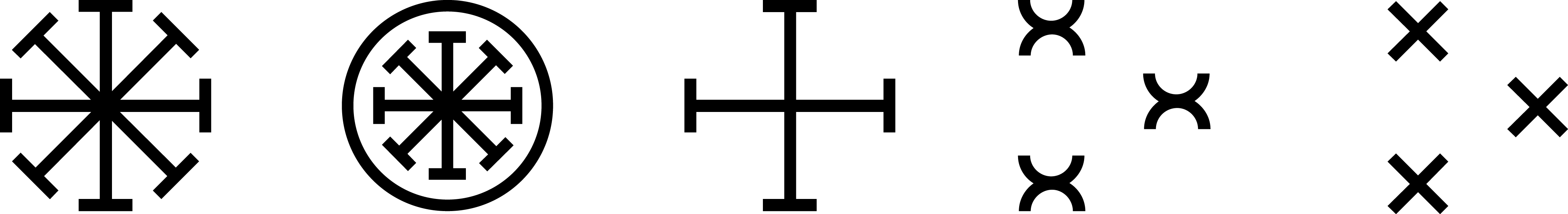
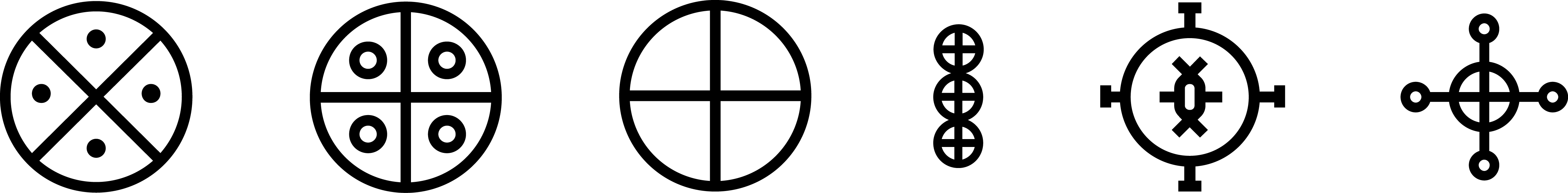
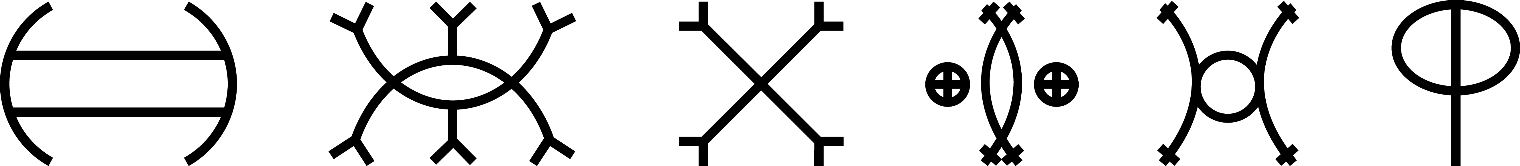


Going back to the project ethose we focused on glyphs that speak to meal-sharing, community, love and unity.