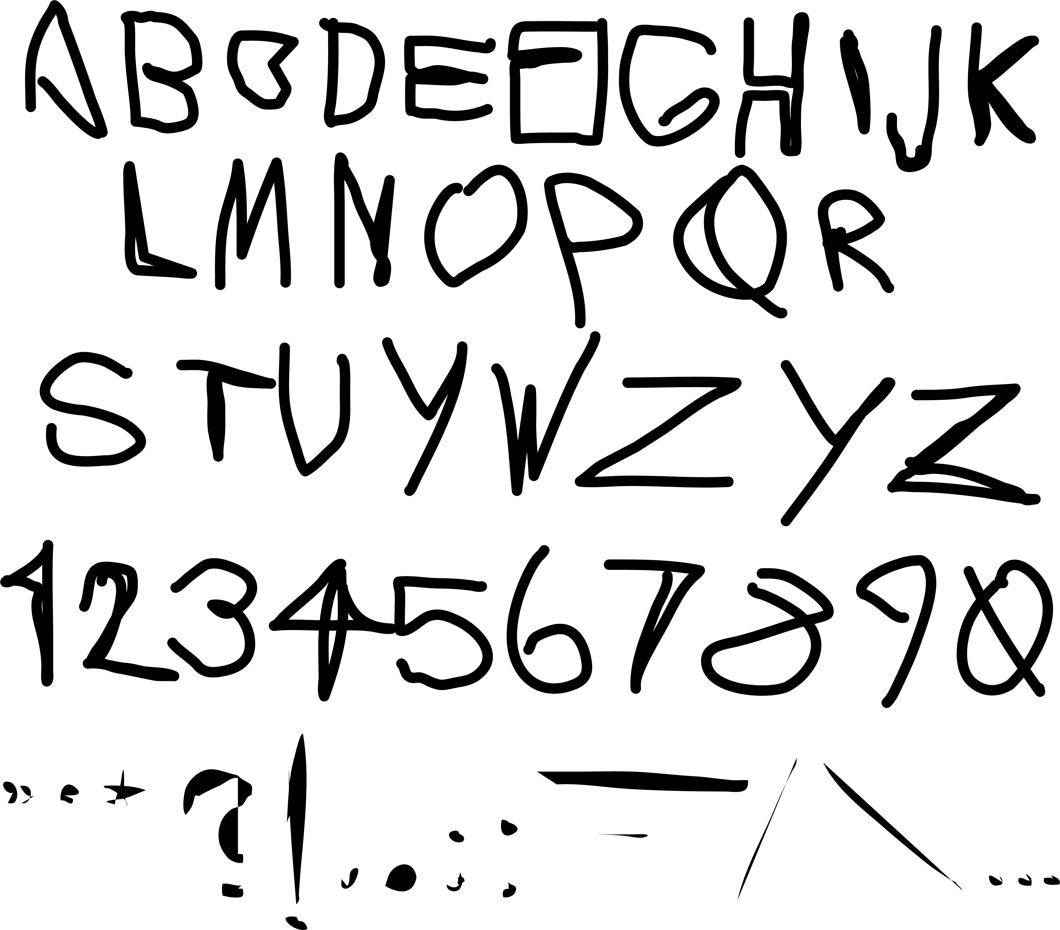
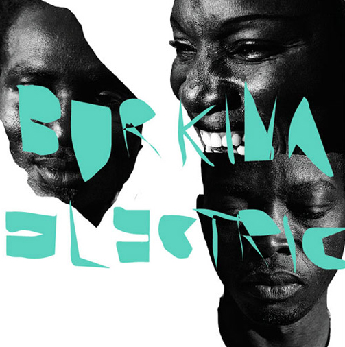
Burkina Gothic, 2009
TYPE DESIGN BASED ON ARTIFACTS FROM BURKINA FASO
TYPE DESIGN BASED ON ARTIFACTS FROM BURKINA FASO
a #rejectedbutloved proposal
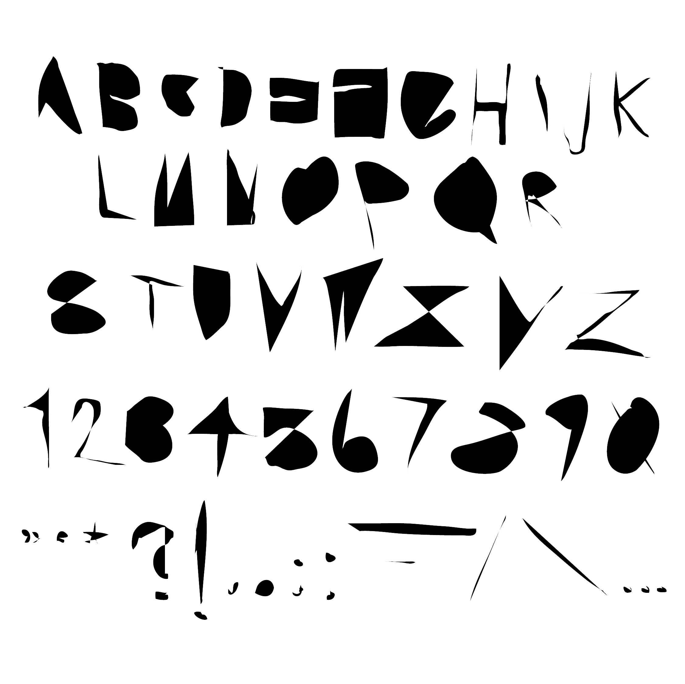
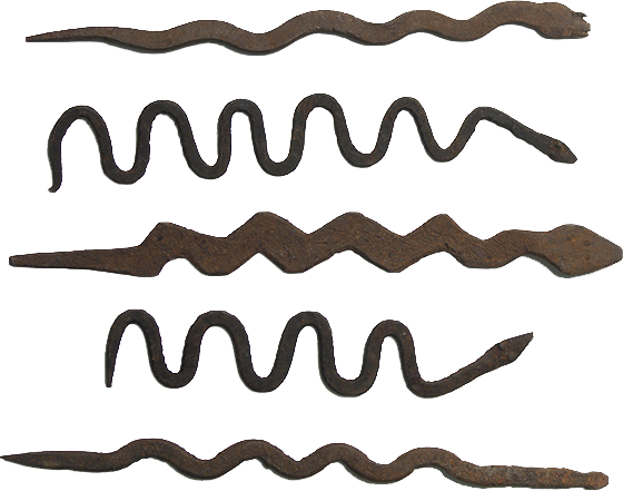
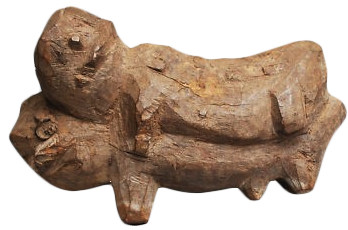
The alphabet is inspired by mid-20th century iron currencies and other sculptures from the Lobi tribe of Burkina Faso. The band wanted to appear more modern, understandably, and they felt this design was a bit too rough. I have some reservations showing this myself, mostly because the history of western graphic design and art stealing from the art of the African continent, and making a lot of money off of what are essentially bootlegs of their cultural traditions are long and very contentious. I explored this notion in the YARDY WORLD branding. To emulate the organic quality in the forms, I drew it very quickly, much more quickly than these sculptures were made. I don’t want to give the impression that I think the Lobi’s visual culture is crude or unsophisticed. Quite the oppostie. I kept it here because it was an honest expression of my own curiousity, rooted in a desire to veneration of the Lobi Tribe’s visual culture.
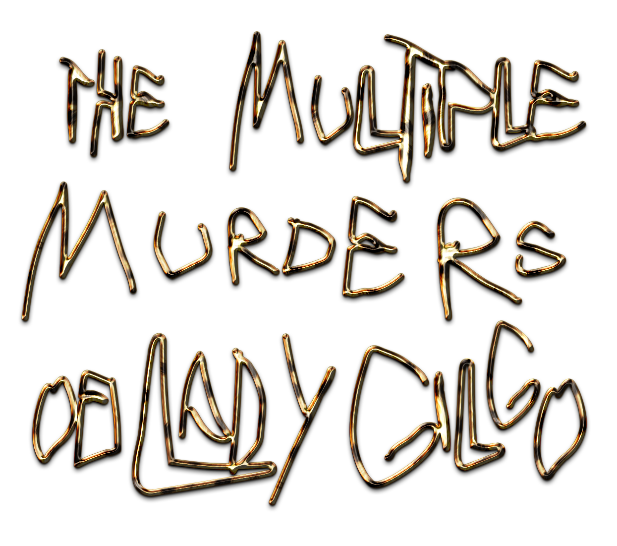
Many years later I revisited this alphabet when artist Jake Brush approached me to make the title for his show The Multiple Murders of Lady Gilgo. For this I created a lighter version by using the stroke of the original alphabet.